I have been playing around with transitions, transformations, keyframes and other types of subtle animations to use with the Divi Blurb Icons. In this tutorial I am going to give you 12 different Divi Blurb Icon animations for your next Divi project.
Let’s Get Started
Creating the Modules
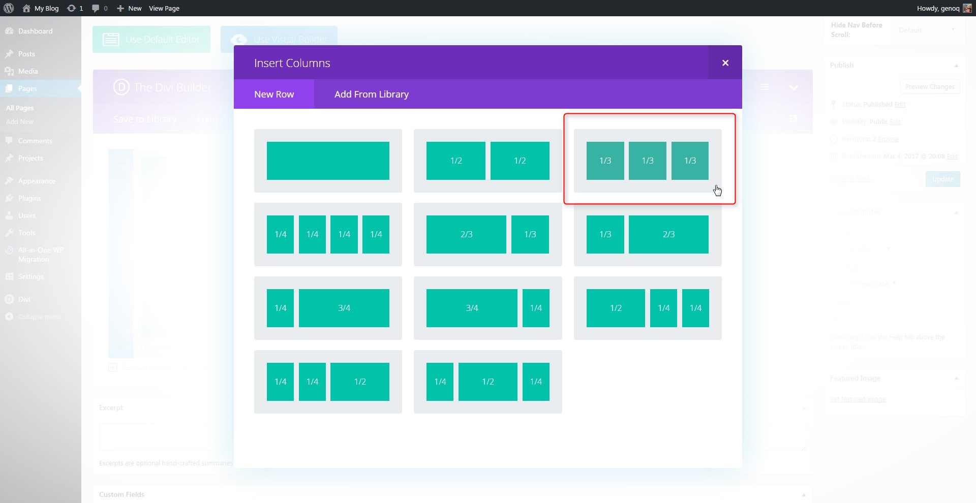
The first thing we are going to do is create a 3 column row. You can use other column options but I think 3 is the perfect layout for this feature.
1. In the section you want to add the modules, create a new 3-column row
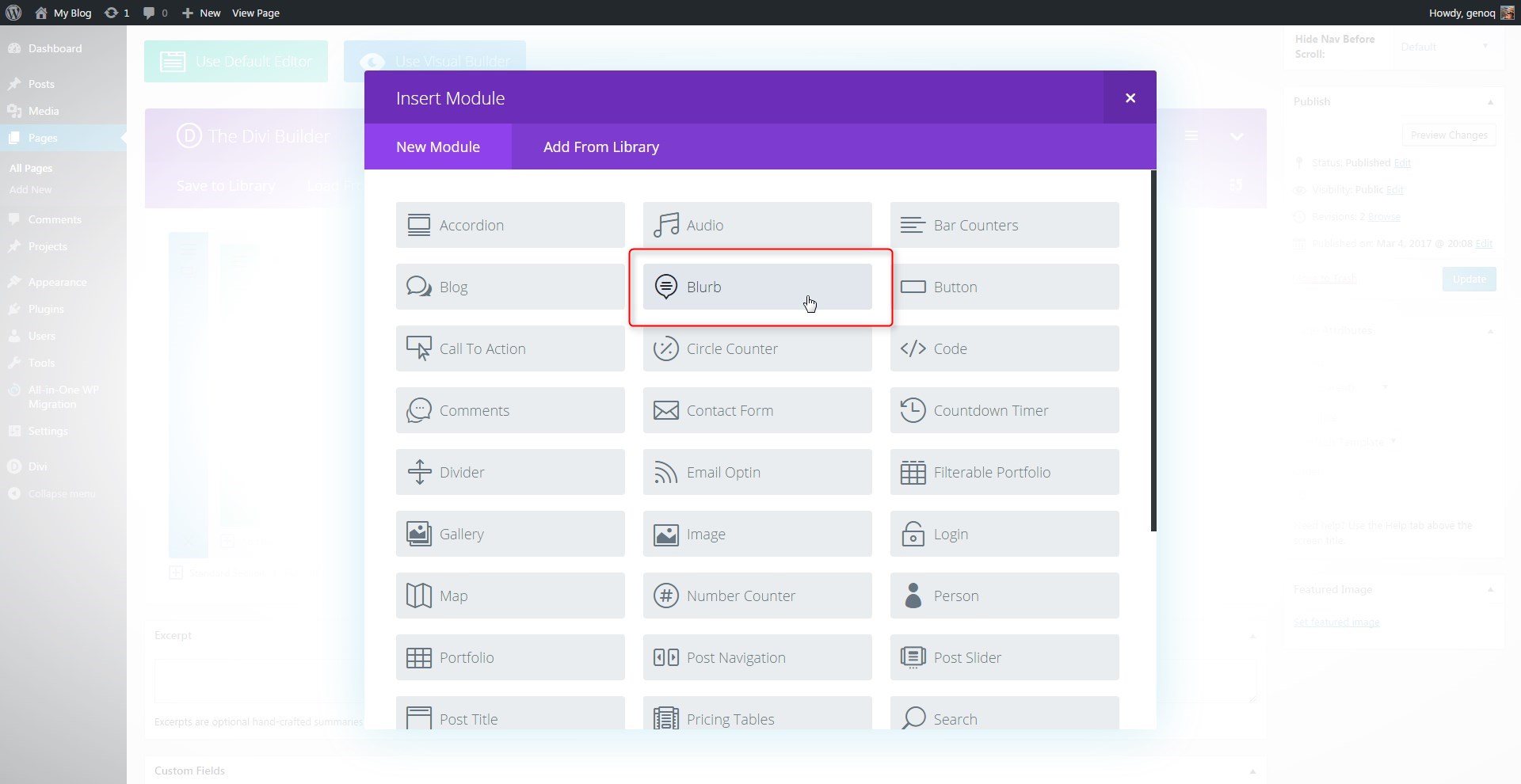
2. Next you will add a blurb module in the first column.
3. Open up the blurb settings and give it a title, url and an Icon.
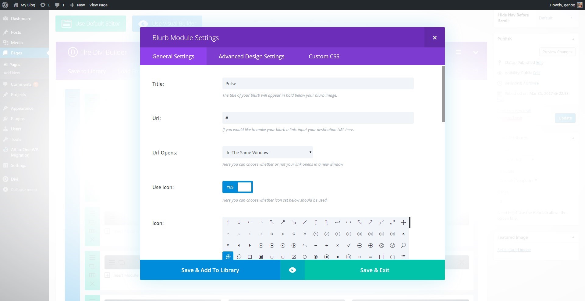
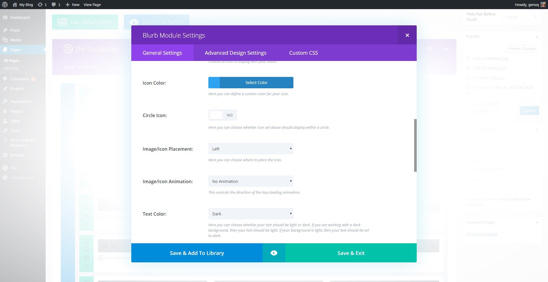
4. Give the icon a color, Image Placement is on the left, turn off animation and add content.
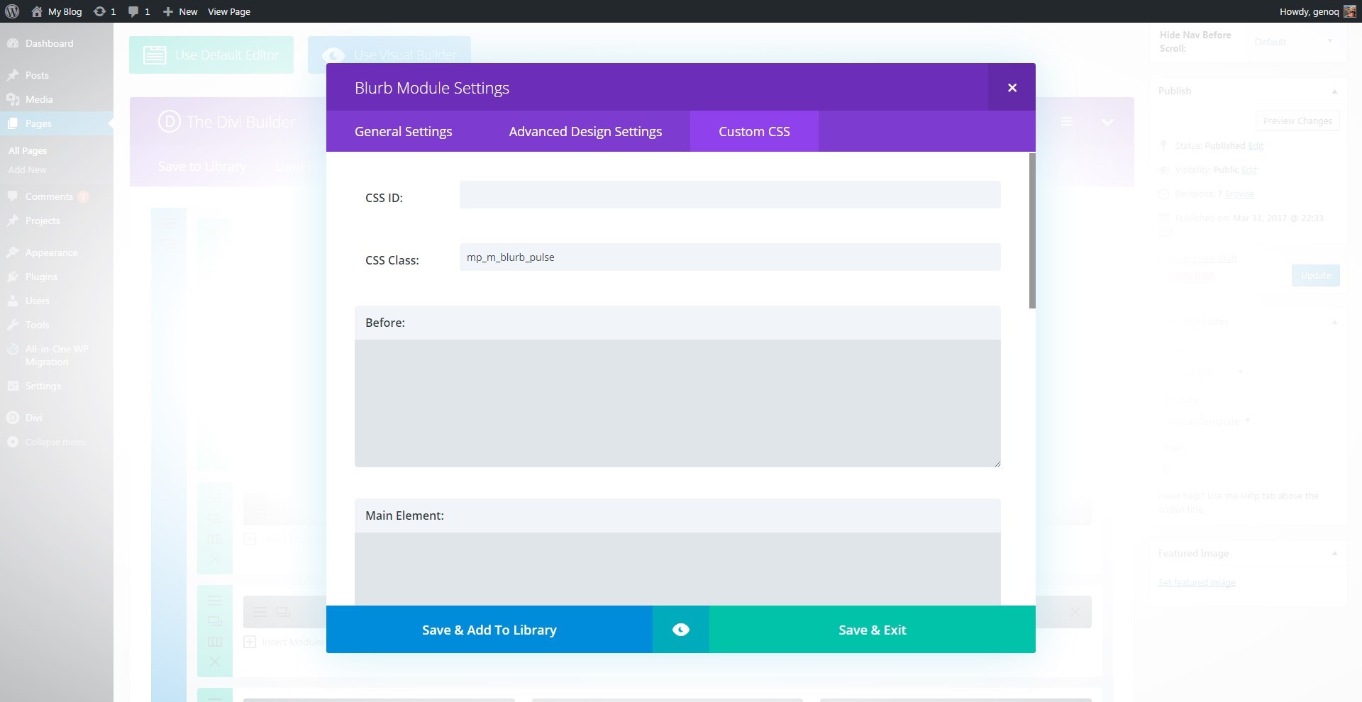
5. Now open up the “Custom CSS” tab and give the blurb module the following class: mp_m_blurb_pulse
*This is for only 1 of the 12 animations. See below for the CSS and class names for the other 11 animations.
6. Select “Save and Exit” and then clone the blurb module twice and then move the extra two over into the next two columns. That way you only have to change the title, image and content on the other two.
Adding The Custom CSS
If you are working with a child theme you can go to Appearance>Editor and open your stylesheet. If not, go to Appearance>Divi Theme Options>Custom CSS (which is located at the bottom of the first tab in Theme Options)
Add this CSS
/*------------------------------------------------*/
/*-------------[GQ BLURB ANIMATIONS]--------------*/
/*------------------------------------------------*/


/* pulse icon */

	.mp_m_blurb_pulse:hover .et-pb-icon {
	  	-webkit-animation-name: gq_pulse_icon;
  		animation-name: gq_pulse_icon;
  		-webkit-animation-duration: 1s;
  		animation-duration: 1s;
  		-webkit-animation-timing-function: linear;
  		animation-timing-function: linear;
  		-webkit-animation-iteration-count: infinite;
  		animation-iteration-count: infinite;}

	@-webkit-keyframes gq_pulse_icon {
  		25% {-webkit-transform: scale(1.3);transform: scale(1.3);}
  		75% {-webkit-transform: scale(0.8);transform: scale(0.8);}}
	@keyframes gq_pulse_icon {
  		25% {-webkit-transform: scale(1.3);transform: scale(1.3);}
	  	75% {-webkit-transform: scale(0.8);transform: scale(0.8);}}
Additional Animations
That tutorial was for the very first animation. To use any of the other 12, just use the module class names and CSS below.
Grow Icon
a. Open up the “Custom CSS” tab and give the blurb module the following class: mp_m_blurb_grow
b. Add this CSS
/* grow icon */

	.mp_m_blurb_grow:hover .et-pb-icon {
		-webkit-transition-duration: 0.3s;
  		transition-duration: 0.3s;}

	.mp_m_blurb_grow:hover .et-pb-icon {
  		-webkit-transform: scale(1.3) translateZ(0);
  		transform: scale(1.3) translateZ(0);}
Push Icon
a. Open up the “Custom CSS” tab and give the blurb module the following class: mp_m_blurb_push
b. Add this CSS
/* push icon */

	.mp_m_blurb_push:hover .et-pb-icon {
	    	-webkit-animation-name: gq_push_icon;
    		animation-name: gq_push_icon;
    		-webkit-animation-duration: 0.4s;
    		animation-duration: 0.4s;
    		-webkit-animation-timing-function: linear;
    		animation-timing-function: linear;
    		-webkit-animation-iteration-count: 1;
    		animation-iteration-count: 1;}

	@-webkit-keyframes gq_push_icon {
  		50% {-webkit-transform: scale(0.5); transform: scale(0.5);}}
	@keyframes gq_push_icon {
		50% {-webkit-transform: scale(0.5); transform: scale(0.5);}}
Bounce Icon
a. Open up the “Custom CSS” tab and give the blurb module the following class: mp_m_blurb_bounce
b. Add this CSS
/* bounce icon */

	.mp_m_blurb_bounce .et-pb-icon {
	  	-webkit-transition-duration: 0.3s;
  		transition-duration: 0.3s;
  		-webkit-transition-property: transform;
  		transition-property: transform;
  		-webkit-transition-timing-function: ease-out;
  		transition-timing-function: ease-out;}

	.mp_m_blurb_bounce:hover .et-pb-icon {
	   	-webkit-transform: scale(1.5);
  		transform: scale(1.5);
  		-webkit-transition-timing-function: cubic-bezier(0.47, 2.02, 0.31, -0.36);
  		transition-timing-function: cubic-bezier(0.47, 2.02, 0.31, -0.36);}
Rotate Icon
a. Open up the “Custom CSS” tab and give the blurb module the following class: mp_m_blurb_rotate
b. Add this CSS
/* rotate icon */

	.mp_m_blurb_rotate .et-pb-icon {
	  	-webkit-transition-duration: 0.3s;
  		transition-duration: 0.3s;
  		-webkit-transition-property: transform;
  		transition-property: transform;
  		-webkit-transition-timing-function: ease-out;
  		transition-timing-function: ease-out;}

	.mp_m_blurb_rotate:hover .et-pb-icon {
		-webkit-transform: rotate(20deg);
  		transform: rotate(20deg);}
Bob & Float Icon
a. Open up the “Custom CSS” tab and give the blurb module the following class: mp_m_blurb_bob
b. Add this CSS
/* bob icon */

	.mp_m_blurb_bob:hover .et-pb-icon {
  		-webkit-animation-name: gq_bob_float_icon, gq_bob_icon;
  		animation-name: gq_bob_float_icon, gq_bob_icon;
  		-webkit-animation-duration: .3s, 1.5s;
  		animation-duration: .3s, 1.5s;
  		-webkit-animation-delay: 0s, .3s;
  		animation-delay: 0s, .3s;
  		-webkit-animation-timing-function: ease-out, ease-in-out;
  		animation-timing-function: ease-out, ease-in-out;
  		-webkit-animation-iteration-count: 1, infinite;
  		animation-iteration-count: 1, infinite;
  		-webkit-animation-fill-mode: forwards;
  		animation-fill-mode: forwards;
  		-webkit-animation-direction: normal, alternate;
  		animation-direction: normal, alternate;}

	@-webkit-keyframes gq_bob_icon {
  		0% {-webkit-transform: translateY(-6px);transform: translateY(-6px);}
  		50% {-webkit-transform: translateY(-2px);transform: translateY(-2px);}
  		100% {-webkit-transform: translateY(-6px);transform: translateY(-6px);}}
	@keyframes gq_bob_icon {
  		0% {-webkit-transform: translateY(-6px);transform: translateY(-6px);}
  		50% {-webkit-transform: translateY(-2px);transform: translateY(-2px);}
  		100% {-webkit-transform: translateY(-6px);transform: translateY(-6px);}}
	@-webkit-keyframes gq_bob_float_icon {
  		100% {-webkit-transform: translateY(-6px);transform: translateY(-6px);}}
	@keyframes gq_bob_float_icon {
		100% {-webkit-transform: translateY(-6px);transform: translateY(-6px);}}
Buzz Icon
a. Open up the “Custom CSS” tab and give the blurb module the following class: mp_m_blurb_buzz
b. Add this CSS
/* buzz icon */

	.mp_m_blurb_buzz:hover .et-pb-icon {
  		-webkit-animation-name: gq_buzz_icon;
  		animation-name: gq_buzz_icon;
  		-webkit-animation-duration: 0.15s;
  		animation-duration: 0.15s;
  		-webkit-animation-timing-function: linear;
  		animation-timing-function: linear;
  		-webkit-animation-iteration-count: infinite;
  		animation-iteration-count: infinite;}

	@-webkit-keyframes gq_buzz_icon {
  		50% {-webkit-transform: translateX(3px) rotate(2deg);transform: translateX(3px) rotate(2deg);}
  		100% {-webkit-transform: translateX(-3px) rotate(-2deg);transform: translateX(-3px) rotate(-2deg);}}
	@keyframes gq_buzz_icon {
  		50% {-webkit-transform: translateX(3px) rotate(2deg);transform: translateX(3px) rotate(2deg);}
  		100% {-webkit-transform: translateX(-3px) rotate(-2deg);transform: translateX(-3px) rotate(-2deg);}}
Push Down Icon
a. Open up the “Custom CSS” tab and give the blurb module the following class: mp_m_blurb_down
b. Add this CSS
/* push down icon */

	.mp_m_blurb_down:hover .et-pb-icon {
  		-webkit-animation-name: gq_push_down_icon;
  		animation-name: gq_push_down_icon;
  		-webkit-animation-duration: 0.75s;
  		animation-duration: 0.75s;
  		-webkit-animation-timing-function: ease-out;
  		animation-timing-function: ease-out;}
	@-webkit-keyframes gq_push_down_icon {
  		0%, 50%, 100% {-webkit-transform: translateY(0); transform: translateY(0);}
  		25%, 75% {-webkit-transform: translateY(6px);transform: translateY(6px);}}
	@keyframes gq_push_down_icon {
  		0%, 50%, 100% {-webkit-transform: translateY(0);transform: translateY(0);}
  		25%, 75% { -webkit-transform: translateY(6px); transform: translateY(6px);}}
Push Up Icon
a. Open up the “Custom CSS” tab and give the blurb module the following class: mp_m_blurb_up
b. Add this CSS
/* push up icon */

	.mp_m_blurb_up:hover .et-pb-icon {
  		-webkit-animation-name: gq_push_up_icon;
  		animation-name: gq_push_up_icon;
  		-webkit-animation-duration: 0.75s;
  		animation-duration: 0.75s;
  		-webkit-animation-timing-function: ease-out;
  		animation-timing-function: ease-out;}

	@-webkit-keyframes gq_push_up_icon {
  		0%, 50%, 100% {-webkit-transform: translateY(0);transform: translateY(0);}
  		25%, 75% {-webkit-transform: translateY(-6px); transform: translateY(-6px);}}
	@keyframes gq_push_up_icon {
  		0%, 50%,100% {-webkit-transform: translateY(0); transform: translateY(0);}
  		25%, 75% {-webkit-transform: translateY(-6px);transform: translateY(-6px);}}
Spin Icon
a. Open up the “Custom CSS” tab and give the blurb module the following class: mp_m_blurb_spin
b. Add this CSS
/* spin */

	.mp_m_blurb_spin .et-pb-icon {
  		-webkit-transition-duration: 1s;
  		transition-duration: 1s;
  		-webkit-transition-property: transform;
  		transition-property: transform;
  		-webkit-transition-timing-function: ease-in-out;
  		transition-timing-function: ease-in-out;}

	.mp_m_blurb_spin:hover .et-pb-icon {
	    	-webkit-transform: rotate(360deg);
    		transform: rotate(360deg);}
Drop Icon
a. Open up the “Custom CSS” tab and give the blurb module the following class: mp_m_blurb_drop
b. Add this CSS
/* drop */

	.mp_m_blurb_drop:hover .et-pb-icon {
	    	opacity: 0;
  		-webkit-transition-duration: 0.3s;
  		transition-duration: 0.3s;
  		-webkit-animation-name: gq_drop_icon;
  		animation-name: gq_drop_icon;
  		-webkit-animation-duration: 0.5s;
  		animation-duration: 0.5s;
  		-webkit-animation-delay: 0.3s;
  		animation-delay: 0.3s;
  		-webkit-animation-fill-mode: forwards;
  		animation-fill-mode: forwards;
  		-webkit-animation-timing-function: ease-in-out;
  		animation-timing-function: ease-in-out;
  		-webkit-animation-timing-function: cubic-bezier(0.52, 1.64, 0.37, 0.66);
  		animation-timing-function: cubic-bezier(0.52, 1.64, 0.37, 0.66);}

	@-webkit-keyframes gq_drop_icon {
  		0% {opacity: 0;}
  		50% {opacity: 0;-webkit-transform: translateY(-100%);transform: translateY(-100%);}
		51%, 100% {opacity: 1;}}
	@keyframes gq_drop_icon {
  		0% {opacity: 0;}
  		50% {opacity: 0;-webkit-transform: translateY(-100%);transform: translateY(-100%);}
  		51%, 100% {opacity: 1;}}
Horizontal Wobble Icon
a. Open up the “Custom CSS” tab and give the blurb module the following class: mp_m_blurb_horizontal_wobble
b. Add this CSS
/* horizontal wobble */

	.mp_m_blurb_horizontal_wobble:hover .et-pb-icon {
  		-webkit-animation-name: gq_horizontal_wobble;
  		animation-name: gq_horizontal_wobble;
  		-webkit-animation-duration: 1s;
  		animation-duration: 1s;
  		-webkit-animation-timing-function: ease-in-out;
  		animation-timing-function: ease-in-out;
  		-webkit-animation-iteration-count: 1;
  		animation-iteration-count: 1;}

	@-webkit-keyframes gq_horizontal_wobble {
  		16.65% {-webkit-transform: translateX(6px);transform: translateX(6px);}
  		33.3% {-webkit-transform: translateX(-5px);transform: translateX(-5px);}
  		49.95% {-webkit-transform: translateX(4px);transform: translateX(4px);}
		66.6% {-webkit-transform: translateX(-2px);transform: translateX(-2px);}
  		83.25% {-webkit-transform: translateX(1px);transform: translateX(1px);}
  		100% {-webkit-transform: translateX(0); transform: translateX(0);}}
	@keyframes gq_horizontal_wobble {
  		16.65% {-webkit-transform: translateX(6px);transform: translateX(6px);}
  		33.3% {-webkit-transform: translateX(-5px);transform: translateX(-5px);}
  		49.95% {-webkit-transform: translateX(4px);transform: translateX(4px);}
		66.6% {-webkit-transform: translateX(-2px);transform: translateX(-2px);}
  		83.25% {-webkit-transform: translateX(1px);transform: translateX(1px);}
  		100% {-webkit-transform: translateX(0); transform: translateX(0);}}
And that’s it.
As you can see there are a lot of combinations you can use. I encourage you to experiment and make adjustments to see what happens. Keyframes are really fun once you get the hang of it.
If you used this on one of your projects, please share a link below so we can see how you used it.
Have fun!
Well, that’s all for now. I hope you find this article useful.


ERMAGERD! So awesome, Geno! Thanks!!!
My pleasure 😀
Again, very nice and useful collection from Geno Quiroz!
Thanks Cysoon.
Hello Geno, it’s not working. I have done all you said but there is no hover effect.
Where are you adding the CSS? Be sure to add it in the Child Stylesheet or the CSS box in the Theme Customizer
Hey Geno, first off have to say I love the site, your resources have been insanely helpful in my DIVI improvement 🙂
I just tried 4 of these blurb animations, once on my blurb with an image, and then once using an icon. No animations happen though, any idea why this may be?
Where are you adding the CSS?
Assuming the blurbs are created or embedded into a section, should the CSS be added on the parent section or the individual blurbs CSS?
Add the CSS in the Custom CSS Box in the Divi Theme Options WordPress Panel.
This is not working with images right ? I am not able to get the effects using images ,but in icon its working.
I have not tried this with images. I am using the CSS that calls for this to work with the icons. You can probably just change out the classes from the icon to the image class Divi uses when you use images.
Thank you for the great share.
I was wondering what are the other divi related tricks that you have up your sleeve? Also would love to know the resources that you use regularly to keep yourself updated specially about Divi.
Personally I have just started using Divi though I have been using WordPress for donkey years.
Cheers.
Thanks Palimadra. I keep updated simply by working in it everyday and trying to experiment with new things. I like pushing the boundaries to see what kind of customizations I can do with Divi.
That makes it two of us!
Very very very awesome article.
Could you please just explain why in the bounce effect, there are 2 transition-timing-function please ?
Thank you very much for your great job !
Great one and moreover, easy to implement!
Thank you
If you’re using images instead of icons, just replace .et_pb_icon by .et_pb_image_wrap . It worked for me 🙂
Great tip. Thank you.