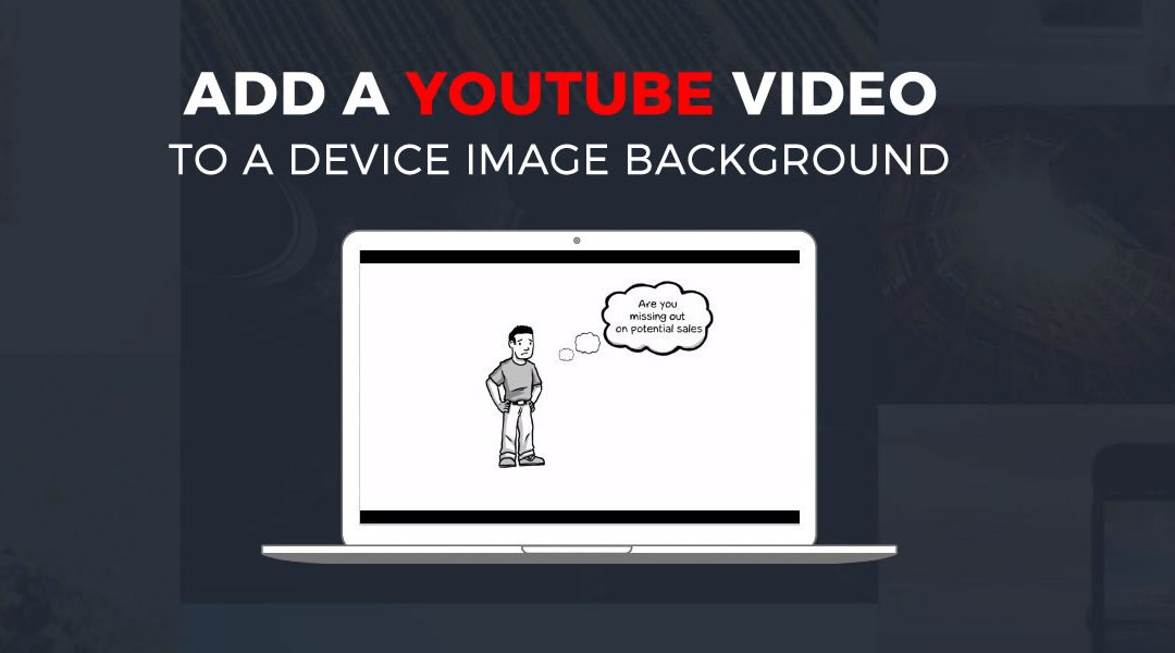
Have you ever wanted one of your videos to display as if it was playing on a laptop or desktop PC monitor? It’s easy using the Divi Code Module and just a little CSS.
You can check out the demo here.
Lets Get Started
1. Create a regular section, single column row and a Code Module.

2. I did not want the laptop to fill the whole page. So I added a little left and right padding to the row. Open row settings and change the left and right padding to 15% for desktop, 5% for tablets and 0 for mobile..

3. Now going back into the Code module settings you are going to add this html. Substitute the src with your YouTube video url. You might also need to adjust the height and width a little depending on the background image you end up using.
<div id="video-laptop" > <iframe width="560" height="390" src="https://www.youtube.com/embed/S_QemrZbOIk" frameborder="0" allowfullscreen></iframe> </div>
Now save and update page.
The Magic of CSS
Now lets start to dazzle things up a bit with some CSS.
If you are working with a child theme you can go to Appearance>Editor and open your stylesheet. If not, go to Appearance>Divi Theme Options>ePanel>Custom CSS (which is located at the bottom of the ePanel)
/*------------------------------------------------*/
/*------------------------------------------------*/
/*--------------[VIDEO ON LAPTOP]-----------------*/
/*--------------[BY GENO QUIROZ]------------------*/
/*------------------------------------------------*/
/*------------------------------------------------*/


#video-laptop {
    position: relative;
    padding-top: 25px;
    padding-bottom: 67.5%;
    height: 0;}

#video-laptop iframe {
    box-sizing: border-box;
    background: url(http://i.stack.imgur.com/zZNgk.png) center center no-repeat;
    background-size: contain;
    padding: 11.9% 15.5% 14.8%;
    position: absolute;
    top: 0;
    left: 0;
    width: 100%;
    height: 100%;}
You can substitute the background device image with your own by changing the url in the background above. You may have to adjust padding depending on the dimensions of the device and where on the image the video needs to display. The image used in this tutorial is 1034×543.
And that’s it! Have fun!
Credit: JSFiddle
Well that’s all for now. I hope you find this article useful.


Another awesome tutorial. Thanks!
Geno, good night. First of all, thank you for sharing your knowledge!
I need to do just that with a notebook !!!!! However, it would not be with video more yes with 3 or 5 images ….. this could be done with slider or carroussel, this would be possible, could you help me in this for kindness?
I am sure there is a solution but unfortunately I do not have any tutorial on that.
Sick, man.
Great, Tutorial, Quiroz! Thank you so much for sharing!
I would love to do his on a site but I cannot for the life of me get it to work
Which part?
Great tutorial! I wolud like to play .mp4 video from my webserver. How to set the video does not start up automatically? Thanks
Im not sure on that one.
Awesome !
I’m trying to use this, but instead of your laptop image, i want to use an smartphone image. The smartphone image is 640×1280. If I use your code, the iphone image is very reduced and appears smaller than the video : what shall I adjust in the CSS code to let the Iphone Image in its original size ?
Thanks a lot !
This is really designed for that particular laptop image. If you want to use a different image you will have to modify the CSS padding, as well as the iframe width and height in the code module. It is a tricky combination, you will have to try different values to find the perfect fit.
Oh really ? 🙂
If you give me a link to the image you are using I can try to figure out a good set of padding values for you.
It is very kind of you even if maybe you can just tell me which values to moove to keep my iphone at its normal size, don’t spend much of your time on that.
But to give you an idea, here is the frame I would like to use : http://i1178.photobucket.com/albums/x378/Riresque/iphonevide_zps0lmanzdh.png
Thanks a lot for your help Jerry
Hey Eric! I think I have figured out a good combination for you.
1st – Adjust the iframe height and width values in the code module to this: width=”600″ height=”800″
Even if the size ends up being smaller than that keep those values, it sets the proportions for the video frame.
2nd – Update the padding numbers in the CSS to this: padding: 19% 22% 18% 23%;
Note: The video thumbnail might look cut off, but the video itself will play within the width of iphone screen.
Another note: You can reduce the size of the phone image if needed by setting a Max Width value in the module settings, under the Advanced Design Settings tab.
That should get you up and running!
Yes it does Jerry, awesome ! Thanks a lot !!;-)
Glad to help!
Thank you a lot for this one! The video in the default Divi Video Module was too small. Now I not only have a bigger one, but it also looks way cooler.
Took me a while to get the padding just right though, using my own laptop image. It looks perfect in Chrome now, but in Safari it’s little off. Can’t figure out how to get them right. Any suggestion?
The right combination of padding values can be tricky. Can’t think of any reason that Safari would be a little off. If you’d like to post the link I can take a look at it to see if I can spot the issue.
Really? Much appreciated! Search for “gedragscode” on this page: https://www.symbisionacademy.eu/simulaties-games/ipma-projectmanagement-belevenis/ (although it will be used on 68 pages in total).
These are my current padding values:
padding-top: 11%;
padding-right: 17.4%;
padding-bottom: 14.8%;
padding-left: 17%;
68 pages?! That’s quite a project!
I checked out the video from Safari and Chrome on a Mac, as well as an iPad. Both look great and I don’t see any alignment problems. I don’t have a PC handy at the moment to check that.
I did notice that the video itself has a thin black line on the right border. Is that what is concerning you?
It really is quite a project, you should see how I get the content! Love doing it though 🙂
And apologies, I forgot to mention one little detail… I meant to say Safari Mobile
Ok, I see what you are talking about now on mobile. I think that is fixable by adding in specific dimensions to the iframe in the code module on your page. For example, I setup a quick test with your video adding this to the iframe: width=”470″ height=”317″
It seems to work well on my laptop as well as my phone.
You might need to play with the numbers a little to get it exactly right.
@Jerry:
Thank you very much for you effort. Sadly, this did not solve the ‘problem’. Not matter what size I put in, your or the intended width=“862” height=“640”, it makes no difference.
It’s not a big issue so I have time to figure this one out. Further suggestions are welcome, but don’t waste time on it.
I sent you an email with some more info, we can move this conversation there if you’d like to continue troubleshooting.
Hi Jerry,
like that one a lot!
I have inserted it on my page, the only thing that bothers me is the top and bottom padding.
Also the fact that the video (It is my own mp4-video) starts automatically.
Is there a way the insert a play button??
Here is the URL:
http://www.die-reiseboutique.de/ueber-uns/
Thank you very much!
Chris
The padding happens because the dimensions of the video are different than the typical youtube video. If you update the code inside the iframe to have width=”640″ height=”360″ then it will fill the space better.
The autoplay is not as easily resolved for your own videos, you have to change it from an iframe to a video tag. The video tag may not be supported by all browsers, but most modern ones handle it fine. And the padding is still visible with this method. Here is the code for that if you want to try it…
Code Module:
CSS Code:
#video-laptop-mp4 { position: relative; padding-top: 25px; padding-bottom: 67.5%; height: 0;} #video-laptop-mp4 video { box-sizing: border-box; background: url(http://i.stack.imgur.com/zZNgk.png) center center no-repeat; background-size: contain; padding: 8.9% 15.5% 15.25%; position: absolute; top: 0; left: 0; width: 100%; height: 100%;}Thank you Jerry!
First of all that you very much for your verywuick response!
Worked fine for my now – have a look at the URL just to make sure everything is fine.
The padding, well I think I just have to live with htis issue.
Chris
Looks great Chris! I just had a thought on how to hide the padding…if you modify the image to fill in the screen area with black then the padding won’t be so obvious.
Sorry, but I Do Not unterstand What you mean and how to Do this.
Try this. In the original CSS for this is the link to the laptop image. Replace that url with the following one: http://montereypremier.com/temp/modified-laptop-image.png
The gray area is now black, so it won’t be obvious that the video doesn’t fill the laptop screen.
It’s really stange ! When I add the code to my page, my fullwidth header change and the footer disappears. When i disable the code bloc evething is ok on my page. The video works when it’s enable but without footer and the hamburger menu that i use don’t work too !
Any idea ? Bruno
The website is sadly not yet online.
I can’t imagine what could cause the issues you are describing. We haven’t seen that before. If you get it figured out, or online, let us know.
Woah. The video trick is very slick. Nice one! Definitely will come in handy on future projects.
Glad you like it 🙂
Hello, Jerry Simmons, good morning …
I used the tips here and got to do … I think … lol
But in my case it has a large upper and lower margin ….. how can I do to decrease this distance from these banks, I tried the theme and did not solve ….
Can you take a look here, please, man?
Thank you!!!
https://mauticparaempreendedores.com
I just checked and it looks like you got it sorted out. I do see a little black space above and below the video but that’s because of the dimensions of the video. You would have to replace the image with a custom made image to match the appropriate dimensions of your video.
Hello thank you for the tutorial. But I can’t see anything on my page, it is blank even thought i have followed the tutorial 🙁
Probably still need to do a hard refresh to clear your browser…
Windows
Firefox: CTRL F5
Chrome: Shift F5
MacOS:
Chrome: Shift Command R
Firefox: Shift Command R
You are great man! 2020 and this post help me a lot!