Are Homepage Sliders Really Dead?
The topic of whether or not to use sliders on the top of your homepage comes up quite often. I have come across several good articles that explain the cons of taking that approach to your design. But that does not mean the homepage slider should be abandoned all together. I think sliders can be effective if used appropriately.
Top of the page
Take a magazine or news website for example. That media motion gives the user a sense that they are watching news or TV. It gives the user a sense of plenty of content to choose from. Sure not every user will choose to go through each slide but something may catch the corner of their eye as they are reading the other info on the page. That’s why I opted to use it on my own Travel/Destination Website MontereyBayFun.com
Mind you this was built in Divi a year before Extra came out. 🙂
Further down the page
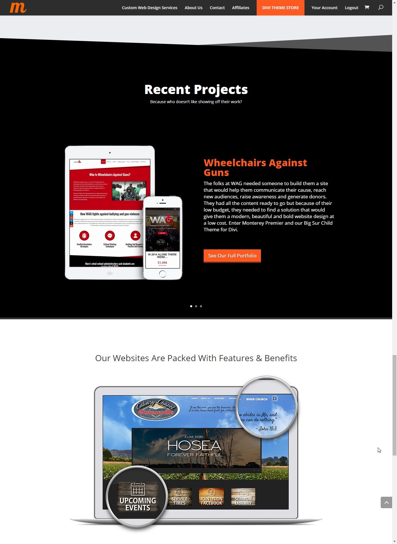
Also keep in mind maybe a better spot for the slider is further down the page. That way you still give the user the option to see several items/events via slider without trying to force them to see it on the top of the page. This is great for testimonials or showing off recent projects. For example on the Pacific Grove Divi child theme, we opted for a Hero Video on the top of the page and used the slider to show off testimonials further down the page.
Also great for Recent Projects like I used it towards the bottom of the homepage of my own website MontereyPremier.com
Image Grid Alternative
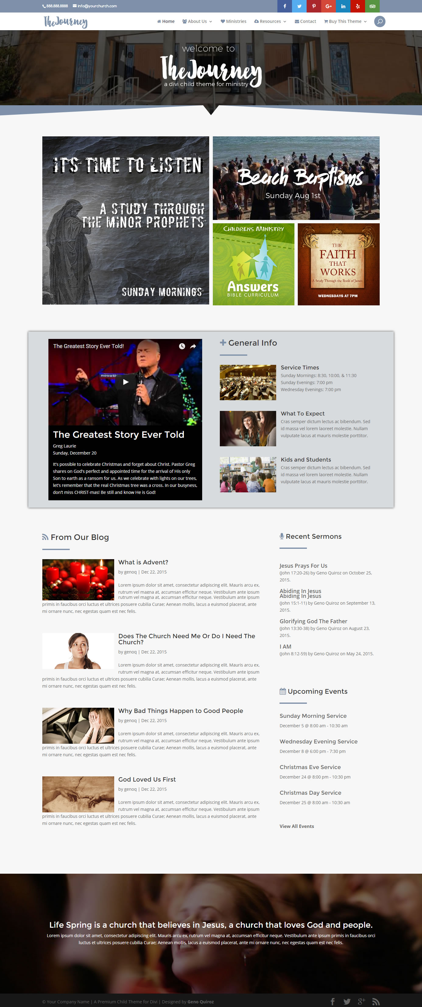
Church websites are notorious for sliders because they have a load of information they need to disseminate and they want the user to see it right away. Upcoming events, services, dates, sermons etc…
I have built several church sites over the years and most of them wanted a slider. But a great alternative to the slider is a media grid. You basically have multiple slides all showing up at once and the user gets to see all your slides without clicking the “next/previous” buttons. I built The Journey so that I can show prospective clients how it can be a good alternative solution to the top page slider.
So as you can see there is still room for the slider to co-exist in modern web design. Its just a matter of thinking about the user and how it will be useful to them.
And also think about how important the information each slide is. If the info on each slide is very important and you need the visitor to see all the slides, then perhaps a slider is not the best solution and using a media grid would be a better solution.
Well that’s all for now. I hope you find this article useful.


Most of the companies using custom animated video for promotion. I think its a great way to make to deliver your message to the your client.
Nice post.