*This tutorial has not been tested in Divi 2.4 or above
One of the many features of the Divi Theme by Elegant Themes is the custom header layout options. I love them all.
But lately I had been wanting to do something a little different and when Eileen approached me to see if centering the logo between the menu was going to be possible with Divi, I had an excuse to jump right in. So here is a brief tutorial on how to center your logo in the middle of the menu starting from the basic homepage template from Divi.
Centered Header Layout
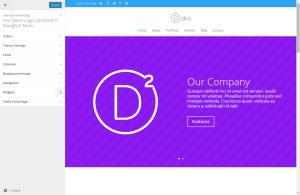
Start off by customizing the header layout using the built in WP “Customize” options. Go to Appearance>Customize.
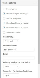
Adjust the following theme settings
Select the Save and Publish button on the top
Turn Off Fixed Navigation Bar
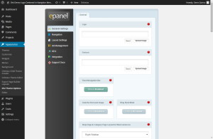
Go to Appearance>Divi Theme Options>General Settings
Disable Fixed Navigation Bar then hit Save
Upload Logo
Go to Appearance>Divi Theme Options>General Settings
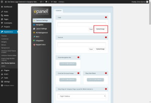
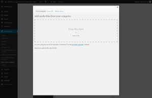
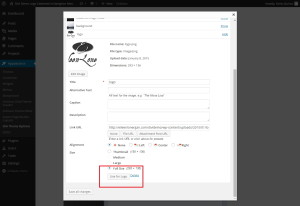
Select “Upload Image” and then drag and drop your logo into the box.
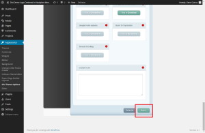
You will select Use Logo button and then be sure to select Save button on the bottom of the Divi Theme Options ePanel page.
Layout The Home Page and Hero Section
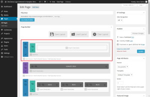
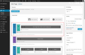
Open up your Home Page and create a new section on the top of the page.
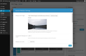
In this section you can add the background image you want to use.
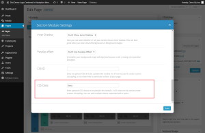
Now give the section a unique CSS Class. In this case I will use the word hero.
Hit save and then insert a single column within the section and then insert a text module within the section.
In our case I will simply use this as a place holder but here you can insert an image or add text to be displayed over the image. But today we just want people to see the image and we are going to add text below it so that we can focus on the header.
Update or Publish the page and then move on to where the magic happens
The Magic of CSS
If you are working with a child theme you can go to Appearance>Editor and open your stylesheet. If not, go to Appearance>Divi Theme Options>ePanel>Custom CSS (which is located at the bottom of the ePanel)
The Header
Lets start by customizing the menu. This snippet of CSS will do the following…
Drop logo, adjust size of logo, make the header background transparent, remove the main header shadow, space out the menu links, transform the menu to uppercase letters & adjust the menu link colors.
/*------------------------------------------------*/
/*-----------------[HEADER-MENU]------------------*/
/*------------------------------------------------*/

#logo {margin-bottom: -80px; max-height:143px;}
#main-header {background-color: rgba(255, 255, 255, 0)!important;}
#main-header{ -webkit-box-shadow:none !important; -moz-box-shadow:none !important; box-shadow:none !important; padding-bottom: 50px;}
#top-menu li {padding-right: 35px; font-size: 14px; text-transform: uppercase;}
#top-menu li.current-menu-item > a{color:#000!important;}
#top-menu a:hover {color: #000;}
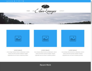
Now go to view the page and it may look something like this
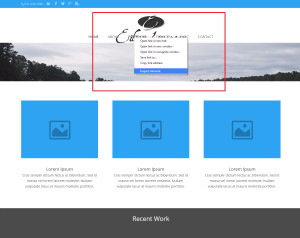
Using Chrome Dev Tools or Firebug (using Chrome or Firefox will come with these tools by default) move your mouse cursor over to the third menu item or which ever item is going to be just to the left of the logo. And then right click and select “Inspect element”.
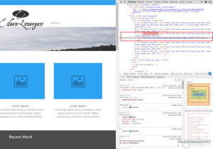
On the right (or bottom) of the screen you will see a window appear showing you the css for the page. In that section you should be able to identify that menu’s unique id. It should be right above the line that was automatically highlighted when you clicked on “Inspect Element”. For example ours is menu-item-118 which I highlighted in red in the image below.
Now that you have that unique id, you can insert this CSS into you panel/sheet. You will have to replace the id number with your own. You may also adjust the padding depending on how wide your logo is.
This element will add space between the third and fourth menu item making room for the logo.
li#menu-item-325 {padding-right: 355px;}
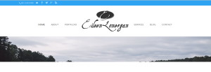
BE SURE TO REPLACE THE ID NUMBER WITH YOUR SPECIFIC ID NUMBER. Your header should now look something like this…
The Hero Section
Now you are going to add this next snippet to adjust the Hero Section/Image. This element will do the following…
Move the section up behind the headers, increase the height, reduce the padding on the bottom and make sure that it stays behind the “Top Header”
/*------------------------------------------------*/
/*-------------------[HERO]-----------------------*/
/*------------------------------------------------*/

.hero {height: 1100px; margin-top:-223px; z-index: -1; padding-bottom:0px;}
The Top Header
Now lets give that top header a little more style. This element will do the following…
Contain the top header so that it does not spread across the screen, space out the social icons and remove the unused email logo.
/*------------------------------------------------*/
/*------------------[TOP-MENU]--------------------*/
/*------------------------------------------------*/

#top-header, #et-secondary-nav li ul {
background-color: #333333!important;
max-width: 1080px;
margin-right: auto;
margin-left: auto;
padding-left: 20px;
}

#et-info-email {display: none;}
#et-info-phone {color: #fff!important;}
#top-header .et-social-icon a {font-size: 14px;padding-left: 20px;}
.et_nav_text_color_light .et-social-icon a, .et_nav_text_color_light #et-info a { color: rgba( 255, 255, 255, 1 );}
.et_nav_text_color_light .et-social-icon a:hover, .et_nav_text_color_light #et-info a:hover { color: rgba( 255, 255, 255, 0.6 )!important;}
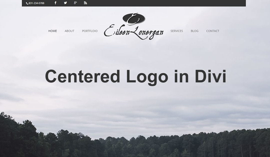
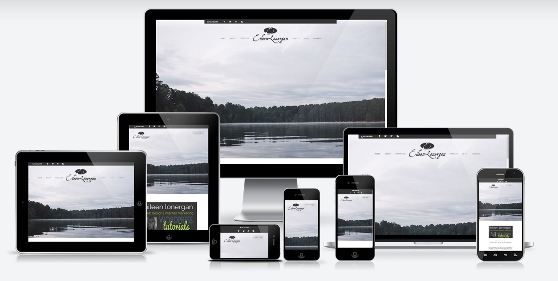
And your end result should look something like this depending on your images and color choices 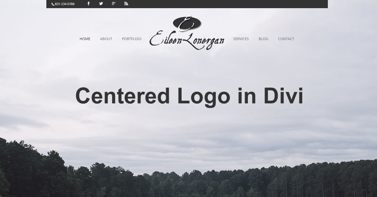 You will find a demo of
Responsive CSS
- As with all my tutorials, the RWD CSS I provide will fluctuate based on your personal image sizes and how many screen sizes you want to adapt to.
- But to get you started, here is some CSS you can add to cover most of the basics. With a little experimentation, you should be able to tweak these elements until you get what you want, on the display sizes you want.
/*------------------------------------------------*/
/*--------------------[RWD]-----------------------*/
/*------------------------------------------------*/

/* --------- iPads (landscape) --------- */
@media only screen and (max-width: 1100px) and (min-width: 981px){
.hero {height: 680px;}}

/* --------- iPads (Portrait) ---------- */
@media only screen and (max-width: 980px){
.et_header_style_centered #logo {float:left; max-height: 73px;}
.et_header_style_centered #main-header .mobile_nav {float: right; width: 100px;}
.mobile_menu_bar:before {display:none;}
.et_header_style_centered .mobile_nav .select_page {padding-left: 12px;}
ul#mobile_menu {margin-top: 40px;}
.hero {height: 700px;}
li#menu-item-118 {padding-right: 0px;}}

/* ------- iPhone5 (landscape) --------- */
@media only screen and (max-width: 767px) {}

/* ------- iPhone5 (portrait) ---------- */
@media only screen and (max-width: 479px){
#top-header {display:none;}}
And that’s it! Have fun!
This article was originally featured as a guest post on www.eileenlonergan.com. You can view the original post here http://www.eileenlonergan.com/centered-logo-between-menu
Well that’s all for now. I hope you find this article useful.









Hi –
First of all, thank you for all the tutorials. Hopefully, I’ll be able to donate to your awesome site soon.
I just discovered Divi and I tried doing this, and at the point where I get the menu item number, mine shows up differently. It only shows a “li class =page_item page-item-59” and not a menu item. Did I set something differently?
Thanks,
Shenz
Hi Geno! I’m about to update a site to 2.4 where I used this tutorial because the site hasn’t launched yet. Any suggestions before I do that?
Geno, this is great. Do have a slight issue though. As is present in the demo site, the menu overlays atop the logo and prevents the hyperlink capability in that area. Attempted z-indexing with no avail but I may be completely off base. Thoughts?
Got it.
Add to custom CSS or replace style.css > Line 188 with:
.et_header_style_centered #et-top-navigation, .et_header_style_centered nav#top-menu-nav, .et_header_style_centered #top-menu { float: none; }
Then add new line directly beneath:
.et_header_style_centered #logo { float: none; position: relative; z-index: 10; }
Quick fix and seems to be working for me. Not sure how well it will carry over outside of this structuring though. If you know of a cleaner alternative I’d be interested.