*This tutorial has not been tested in Divi 2.4 or above
So today I helped someone change their footer columns from 4 to 3 simply using a little CSS. And since the change was easy enough, I thought it would make a great tutorial material for today.
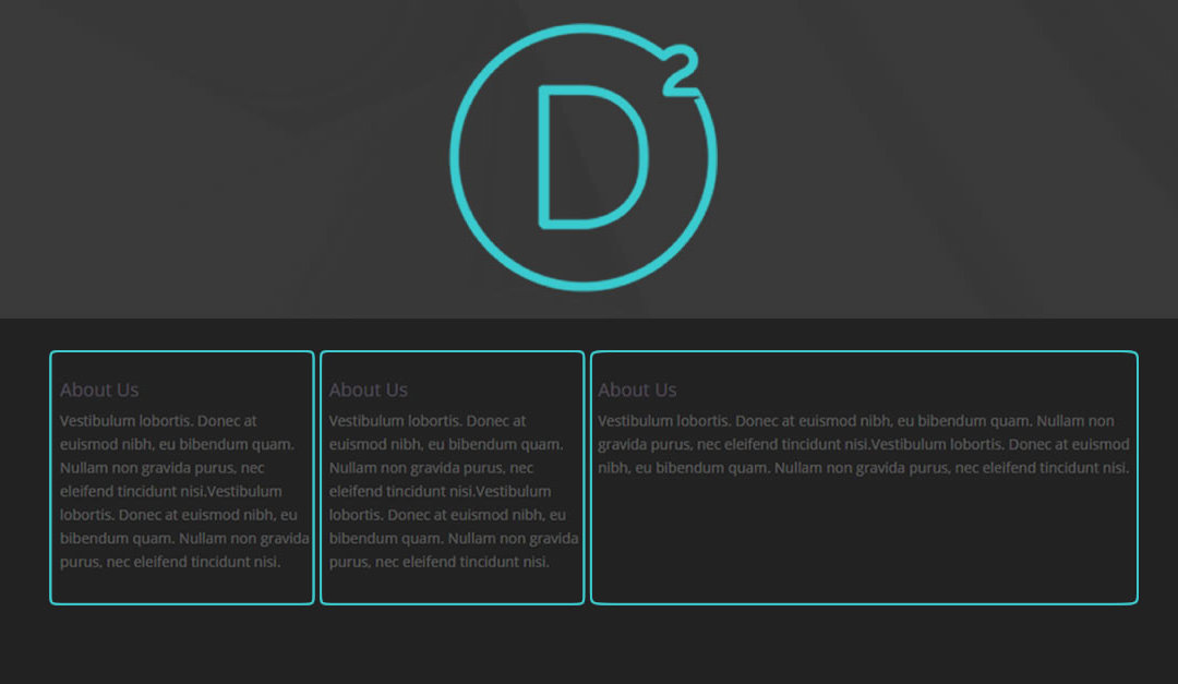
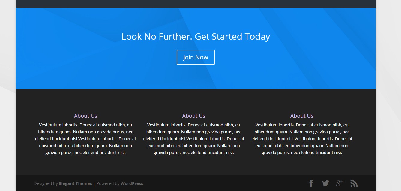
By default the Divi theme comes set up with 4 columns in the footer like in this example below.
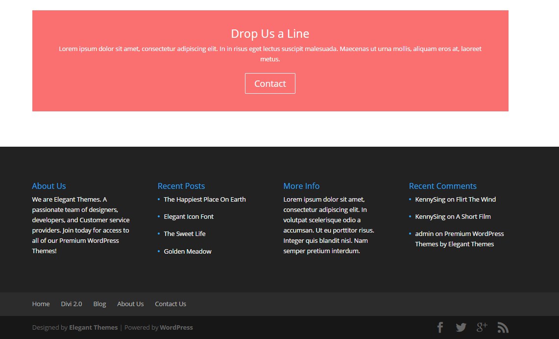
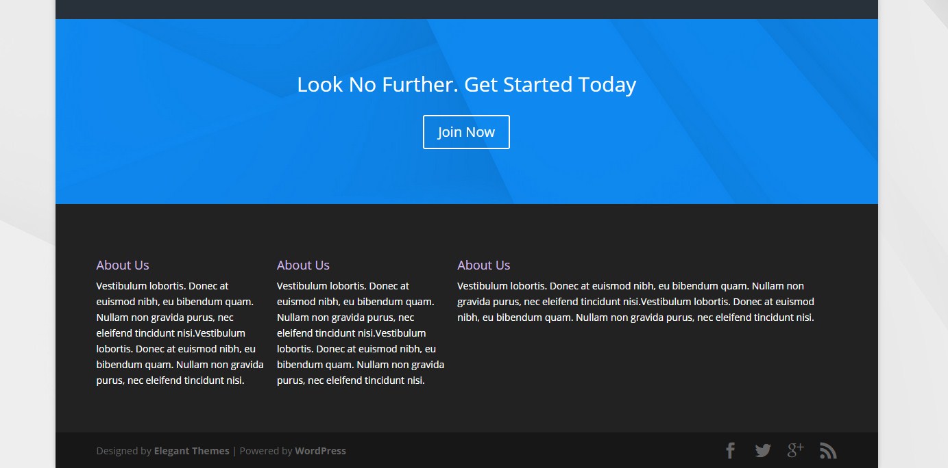
But lets say you only want 3 columns like this example below.
Easy Peasy!
3 Footer Columns Instead of 4
1. Go to your Divi theme ePanel . Go to Appearance>Divi Theme Options
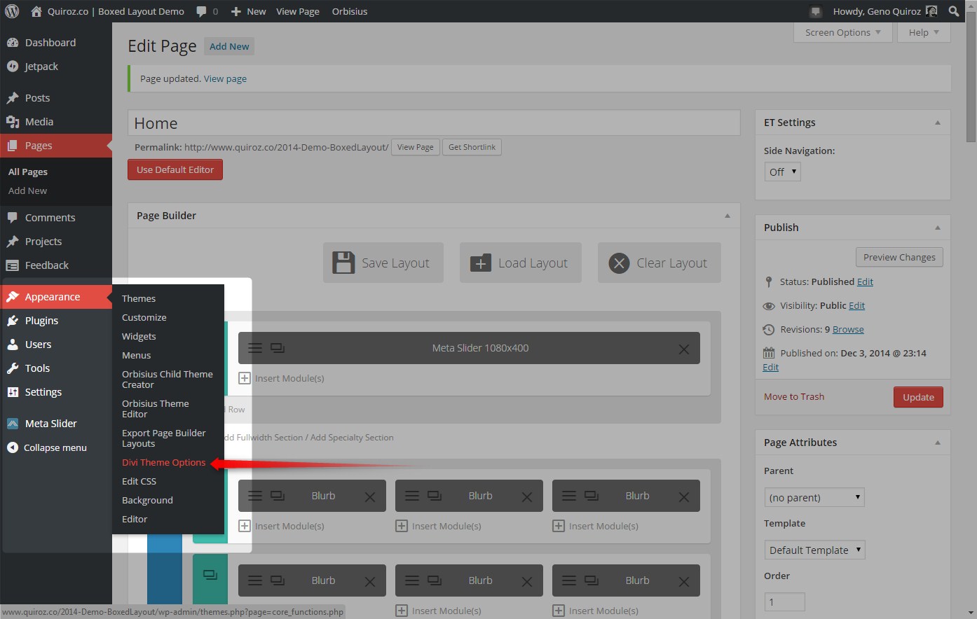
2. Scroll down to the bottom of the page down to the Custom CSS panel where you will copy this CSS and paste it into that ePanel.I included the code needed to make it render nicely in smaller devices
.footer-widget { margin-right: 0;}
.footer-widget:nth-child(1) { width: 32%; padding-right:15px;}
.footer-widget:nth-child(2) { width: 32%; padding-right:15px;}
.footer-widget:nth-child(3) { width: 32%; margin-right:0;}
.footer-widget+.last{display:none;}

@media only screen and (max-width: 980px){
.footer-widget:nth-child(1) { width: 30%; padding-right:15px;}
.footer-widget:nth-child(2) { width: 30%; padding-right:15px;}
.footer-widget:nth-child(3) { width: 30%; margin-right:0;}}

@media only screen and ( max-width: 767px ) {
.footer-widget:nth-child(1) { width: 100%; padding-right:15px;}
.footer-widget:nth-child(2) { width: 100%; padding-right:15px;}
.footer-widget:nth-child(3) { width: 100%; margin-right:0;}}
3. You can also make it centered. Just use this code instead.
/* Footer Columns - Centered */

.footer-widget { margin-right: 0; text-align:center;}
.footer-widget:nth-child(1) { width: 32%; padding-right:15px;}
.footer-widget:nth-child(2) { width: 32%; padding-right:15px;}
.footer-widget:nth-child(3) { width: 32%; margin-right:0;}
.footer-widget+.last{display:none;}

@media only screen and (max-width: 980px){
.footer-widget:nth-child(1) { width: 30%; padding-right:15px;}
.footer-widget:nth-child(2) { width: 30%; padding-right:15px;}
.footer-widget:nth-child(3) { width: 30%; margin-right:0;}}

@media only screen and ( max-width: 767px ) {
.footer-widget:nth-child(1) { width: 100%; padding-right:15px;}
.footer-widget:nth-child(2) { width: 100%; padding-right:15px;}
.footer-widget:nth-child(3) { width: 100%; margin-right:0;}}
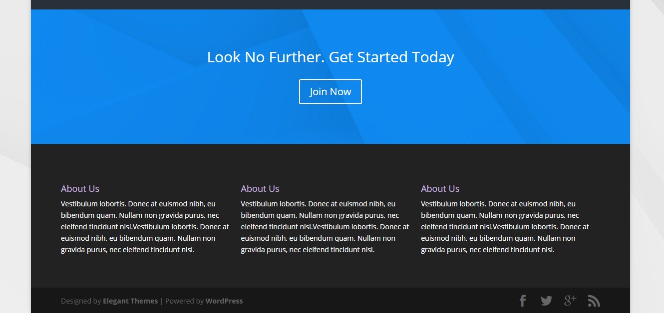
And now you should have this…
1/4 Column – 1/4 Column – 1/2 Column
But lets say you want to be a little more trick and have your footer columns 1/4 Column – 1/4 Column – 1/2 Column like the image below.
Easy. Just use this code instead of the others.
/* Footer Columns - Qtr-Qtr-Half */

.footer-widget { margin-right: 0px;}
.footer-widget:nth-child(1) { width: 23%; padding-right:15px;}
.footer-widget:nth-child(2) { width: 23%; padding-right:15px;}
.footer-widget:nth-child(3) { width: 50%; margin-right:0;}
.footer-widget+.last{display:none;}

@media only screen and (max-width: 980px){
.footer-widget:nth-child(1) { width: 45%; padding-right:15px;}
.footer-widget:nth-child(2) { width: 45%; padding-right:15px;}
.footer-widget:nth-child(3) { width: 100%; margin-right:0;}}

@media only screen and ( max-width: 767px ) {
.footer-widget:nth-child(1) { width: 100%; padding-right:15px;}
.footer-widget:nth-child(2) { width: 100%; padding-right:15px;}
.footer-widget:nth-child(3) { width: 100%; margin-right:0;}}
And now you have your very own customized footer columns. Good job!
Check out the demo here: http://montereydev.com/demos/slideralternative/
Well that’s all for now. I hope you find this article useful.


Love it Geno
Clear info, useful screenshots and lovely CSS that works.
Keep up the good work sir – much appreciated.
Much appreciated Keith. I always appreciate your visits, comments and your own great posts!
Come on Geno… we must stop thanking each other. LOL
Haha. Thanks for the great point 😀
Nice and cool, than you Geno. What if you want to make blurb content be in a transparent background?
Thanks. Are you talking about the blurb module somewhere on the page or are you talking about a footer widget. give me a little more detail as to what you are trying to do and I will see if I can help.
Your posts are so good. I’m very new at this – built a personal travel blog site a few months ago, started editing it and giving it a makeover (read endlessly playing with css) over the last two weeks – and your tutorials have been such a help! They’re so clear and easy to follow AND have given me awesome inspiration. Thanks! 😀
Thanks Jennifer. I appreciate your visits to the site. Glad to be a help!
What do I need to change to make it only show 1 footer area? I tried, but failed… 🙁
Just replace the above mentioned code with this and remove the media queries as well …
.footer-widget { margin-right: 0px;} .footer-widget:nth-child(1) { width: 100%;} .footer-widget:nth-child(2) { display:none;} .footer-widget:nth-child(3) { display:none;} .footer-widget+.last{display:none;}Geno,
You are great contribution to the Divi society.
Thanks for your explanation.
Thanks Gerard! 🙂
Quiroz! I would like to ask you if you could show us how to better the blog sidebar of divi ^^ something like you have !
Thanks for the request. That one is already on my to do list. Be sure to sign up for the newsletter to be alerted when that tutorial has been created 🙂
Hi Gino, I feel so stupid for asking what may be an obvious question. You mentioned “Divi theme comes set up with 4 columns in the footer” but I cannot for the life of me, find the default 4 column footer. Is it just a matter of adding “Text” in a 4 Column module? Appreciate your help. John.
Hi Gino,
Please disregard my previous comment. I am a newbie and so my apologies again. I found out how to get the “4 columns in the footer”.
– Click: Appearance > Widgets
– Click and Drag the Available Widgets (left hand side) to the Footer (right hand side).
Thought I make a note for other newbies also. Again my apologies.
Thanks again for your awesome site. Very helpful!!!
John
Glad you got it sorted out John 🙂
Thanks for this John. I’m a reasonable newbie and I have been searching around for how to do this!
Hello Quiroz, I want to add another column in Divi footer? (for having 5) and insert a line between every column. Can you help me? Thank you so much!
Thanks for visiting the blog Fernando. I have not tried this yet although I think I remember seeing something about this in the ET support forum. I will take a look when I get a chance.
Hi Fernando. After scouring through the ET Support forums it appears that it is possible to add the fifth column but it takes modifying the default function of the theme and adding some additional code to the footer.php file. I have not tried this but if you dig through the forums, you might be able to find the solution as the post I read referred to a few others. Here is the post I read. If you log in to the support forum, then insert this url and you will find the article I referenced. https://www.elegantthemes.com/forum/viewtopic.php?f=187&t=371765&hilit=add+columns+to+footer
Thank you so much for taking some time to help me, really appreciate it!
No problem. Please let us know if you get this resolved. We would love to know how you did it. 🙂
Hi Geno, we are trying to find out how to have 5 blurb entries in a section. Can you help
Sorry Kevin. I have not tried that one yet. Let us know if you get it figured out!
Hi Geno
First off – thanks for the amazing tutorials. I have found so many great tips and tricks here. Seems you are the go-to person for Divi.
I have used the above code for three columns in the footer, but unfortunately this has messed a little with my mailchimp newsletter signup widget. All the input boxes have come up to be on the same line as their labels, when before they used to sit below each label. As the labels are different sizes, the alignment is now all off. See here: http://voguevinyls.co.za/home
Any idea what I can do to solve this?
Thanks Gavin. That’s strange because the the css for the columns does not in any way conflict with the code from the mailchimp widget. Perhaps there is a syntax issue somewhere in the css. Can you remove the custom footer css for the column modification and see if the mailchimp form reverts or looks the same. Then let me know.
Whoops, it seems my client doesn’t want the First Name and Last Name fields. However it would be nice to bring the input box and the signup button down to the next line. Any idea how I would do this?
Try this…
input[type=text]{display: inherit;}Ha. Thanks for the help.
That seems to have fixed it for that column. But for some reason in the middle column the search bar is still up next to the Heading text. Weird. Any idea why that’s happening?
Gavin
Don’t worry about it. I just moved the Search bar down below the menu and It sorted itself out. Thanks for all the help!
Glad to hear you worked it out Gavin.
Argh. Now I’m trying to add contact details in the third column and it’s still happening?? For some reason all breaks seem to be ignored. I even added an html after the email address to see if that would work. Nada.
Any ideas?
Hi Gavin. Try using a plug-in called Black Studio TinyMCE Widget. It adds a new “Visual Editor” widget type based on the native WordPress TinyMCE editor and it will give you more control of the layout for your text widgets. I use it on just about all my projects.
Thanks, Geno! I used this code, with a small adjustment to make the middle box 1/2 span, and the left and right 1/4. Worked like a charm. Thanks for getting me going in the right direction. You saved me a lot of trial and error!
Awesome Kathy. Glad to be of service 🙂
Hi Geno!
You’ve really been helping my site come along way. I super appreciate it!
I’m wondering if you have any advice or Tuts that would allow me to stack the footer widget areas fullwidth horizontally on top of one another, rather than vertically side by side.
Seems that the whole thing would line up nicer that way.
Thoughts?
B
Hi Brent. I am glad you are finding the tutorials useful. If you modify the above code so that the first widget area is 100% wide and set the others to display:none, then you can stack all your widgets in Footer Area 1
Thanks for this! I, for some reason, cannot get the middle column to be centered on desktop. When I shrink the browser to check mobile sizes, it centers automatically, but when it’s on full screen, it’s aligned left. And yes, I did use the code to center it and even tried to manually center the image in the middle column, but with no success… Any ideas?
Not sure whats going on but if you email me a link to the site then I can take a quick look when I get a chance.
You should change your name from Geno to Cenius. Need I say more?
Hi Geno,
I love your tutorials and am using them to learn quite a bit about divi. However, I attempted to use another tutorial and could not get any changes to appear with the css code placed in divi theme options e-panel. So I found this modification and thought I would try it. Copied and pasted the code, saved…and still no changes. Ever had this happen? I am not sure if it is a setting or what. I do have other code placed in there already…but when I add your code for these modifications no change occurs. I’m stumped. :/
Ok…. interesting. I copied your css and put it before all the other custom css… and it worked. What the heck! I ended up buying the divi booster to fix my subscribe bar because no matter what I did I couldn’t get it to work… but voila! Crazy.
Glad you got it working 🙂
Hey Geno! I love this tutorial!
I was trying this tutorial, but for some reason it just didn’t work. Could you help me to know what is happening?
I was trying to adjust with CSS Hero, but it didn’t work…
http://109.73.235.32/~jobflex/
Regards!
Looks like you got it going now. Good job.
Hi Geno,
I was trying to change the height of a single column divi footer. I have used the following code in custom CSS:
.footer-widget { margin: 0;}
.footer-widget:nth-child(1) { width: 95%; padding:3px;}
.footer-widget+.last{display:none;}
I already have a fixed credit line at the bottom of the page using the following code:
#main-footer {
background-color: transparent !important;
bottom: 0;
position: fixed;
width: 100%;
z-index: 999;
}
I need a single line (catch line of the site theme) to be displayed just above the credit line. The catch line is displaying, but too much space used at top & bottom of the line. I am very new to Divi & CSS, and trying to learn.
— Manas Mitra
Obrigada! Foi muito útil 🙂
It was distorted in mobile
This written for 2.3.2 users. It still works but it needs a little extra tweaking. I hope to update it at some point 🙂
Hi Quiroz, do you know if it is possible to center the widgets in a one colom footer? Trying to center a image in the footer widget but cant seem to find an option for this.
Thanks!
Hi Quiroz, I have a problem with the one column footer and hope you can help with that. I am trying to center an image in a one column footer trough a widget but can’t seem to find a way to do that. When I put an image or even text in a widget it places this to the left of the column. Do you now of any way to fix this? I would really appreciate your help on this issue.
Thanks!
You may try the following:
.et_pb_gutters3.et_pb_footer_columns1 .footer-widget .fwidget {
padding-left: 400px;
}
Thank you vers much. I will give it a try and let you know if this worked.
Hi – this tutorial was great, thank you. I’m having one problem though I hope you can help with.
I need my footer (text, single widget/one column) centred. I used your script and this worked – expect for on tablet. I’ve then used your media code for max-width:980 and repeated my code (nth and last childs are set to don’t display).
But on Tablet, my footer text gets push into a 1/3 column to the left. Can you help with how to fix this?
I don’t really understand this, as on mobile and PC, the single column centering works fine! Thanking you in advance
The newest Divi has this option in the Customizer making this tutorial unnecessary for anything other than learning purposes or for legacy Divi users 2.3 and below. Sorry about that. I just hate to remove it in case I ever need it as a reference for a client with an old Divi install 🙂
Thanks for the follow up! Yes, Divi 2.4 offers multiple columns, but there’s no way (I’ve found) to centre the text in a single widget. I think it still needs CSS to do this. Any thoughts on how to alter the code to work in Divi 2.4 for –
– single column text footer
– centred
– appears as single column, centred on tablet as well?
Sorry to ask for help, but this is such a small item in the total website, and I’ve spent plenty of time trying to find the answer to this simple formatting display! Your code to centre the text in the footer is the only technique that’s worked so far, but just not on tablet. A big big thank you in advance!
Can you share a link to the site?
I inherited a site and I am having no luck with tightening the footer and reducing it to 3 columns. I’m pretty new to both Divi and WP.
I tried the 1/4 – 1/4 – 1/2 shown here, and I didn’t end up seeing the third column at all (in Widgets, the “third column” I refer to is called “Footer Area #4”. I can’t get rid of “Footer Area #3”.(?)
I then tried going into the Customizer -> Footer -> Layout, and choosing 3 columns, and then the 3rd column wraps.
Can anyone advise? I just want 3 columns, either equally spaced or 1/4 – 1/4 – 1/2. I’d also like to tighten the footer vertically overall. Can anyone advise?
http://allegiancelaw.com
Thanks!
Remove my code. Change the settings in customer to 1/4 1/4 1/2. And use only widget #1, 2 & 3.
Love your tutorials, been referencing them quite a bit since I started using Divi recently…one thing I am trying to do is split the footer into two rows…I would like 3 columns on top and then the 2nd row would just be centered text (business tag line)…any thoughts? Thanks in advance!
Hi Andy! I think for that type of footer you might want to try using the Page Builder to create the footer and then saving that Section to the Divi Library and making it Global. Here is an article that talks about doing that: http://www.elegantthemes.com/blog/tips-tricks/exploring-divi-2-4-the-power-of-divis-global-modules-and-how-to-use-them
That option may not work for every situation, so if you need to make it work in the footer.php file you can get ideas for how to do that from this tutorial: https://quiroz.co/adding-footer-section-to-divi-theme/
Gino – using the new layout feature in the updated Divi we can of course now have up to 9 different layouts….that being said I an not figure out how to reduce the height of the entire footer section. It is HUGE. I really only want/need it to be about 150px high. Any thoughts?
The height of the section is based upon the widgets you have setup in the footer. You should be able to adjust the height by editing the taller widgets.
I would like to change the layout just for tablets. Is that possible? If yes the how? I tried using media queries but nothing seems to work.
Yeah the only way is to use custom media queries.