*This tutorial has not been tested in Divi 2.4 or above
Divi 2.0 is one of the most flexible themes I have ever worked with. There are just so many things you can do with it. It puts the power of customization into your hands.
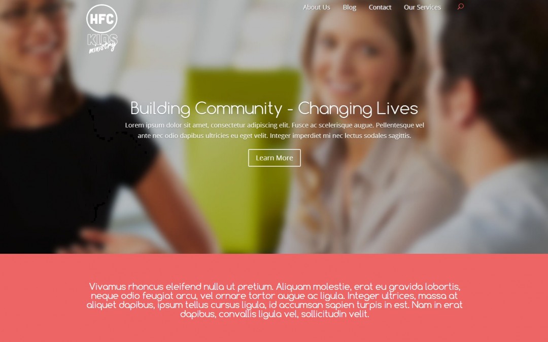
On one particular project, I wanted to experiment with a ghost style page using Divi 2.0. Where the image is the main background above the fold. Something like this image below. Just click on it to enlarge it.
You will note that I removed the menu background so that the image starts at the top of the page and is the menu header background. Now I did not think this was the best approach for the whole site.
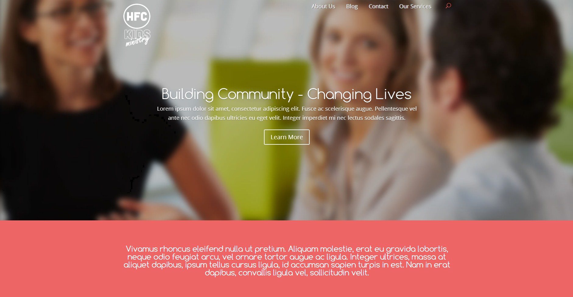
I figured the other pages should have the normal Divi 2.0 menu header background so as to take up minimal space on smaller devices so I wanted to keep that in mind. Just like the image below. Just click on it to enlarge it.
So the first step was that I needed to use a different logo on the homepage than I was going to be able to use on the rest of the site. This logo would be named logo2.png. and I would have to modify the header.php in order to bring that up.
So after uploading logo2 through the dashboard’s media section, I needed to find the following original logo code in the header.php file.
<a href="<?php echo esc_url( home_url( '/' ) ); ?>">
<img src="<?php echo esc_attr( $logo ); ?>" alt="<?php echo esc_attr( get_bloginfo( 'name' ) ); ?>" id="logo" />
</a>
and then I added the following code after the original logo code.
<a href="<?php echo esc_url( home_url( '/' ) ); ?>">
<img src="2nd logo url" alt="<?php echo esc_attr( get_bloginfo( 'name' ) ); ?>" id="logo2" />
</a>
You will have to change “2nd logo url” to the actual url for logo2. And then I added the following CSS to my stylesheet.
.page #logo2 {display:none;}
.single #logo2 {display:none;}
.home #logo {display:none;}
.home #logo2 {display:inline;}

.home #main-header {
  background:transparent;
  position:absolute;
  box-shadow: 0 0 7px rgba(0, 0, 0, 0.0) !important;
  -moz-box-shadow: 0 0 7px rgba(0, 0, 0, 0.0) !important;
  -webkit-box-shadow: 0 0 7px rgba(0, 0, 0, 0.0) !important;
  }
Now of course the last thing I needed to do was to move the main image up into the menu header area. So the first thing I did was modify the Section Module Settings CSS Class as “home-slider”
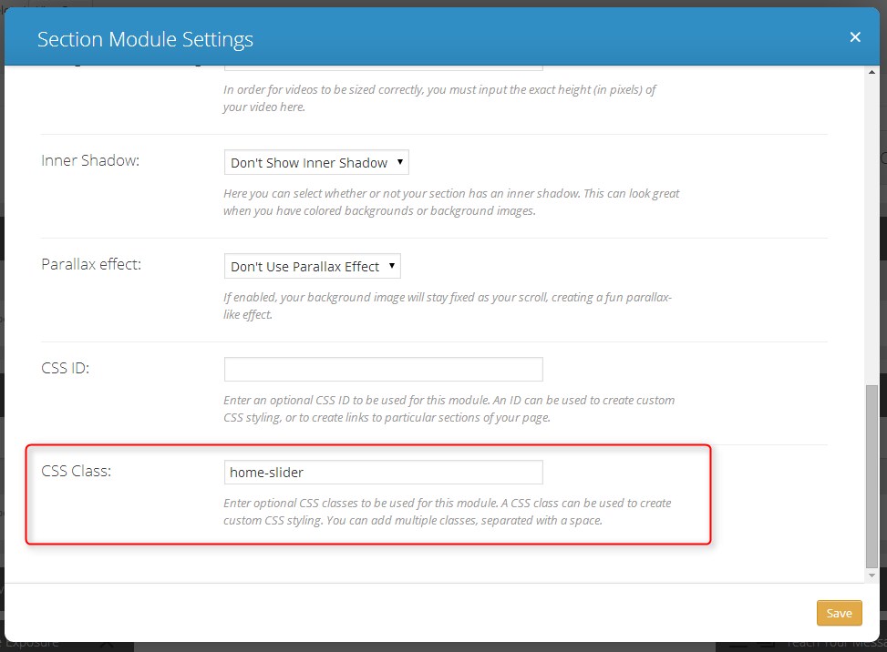
And then I added the following code to my stylesheet.
.home-slider {margin-top:-175px; height:800px;}
You will want to adjust the margin and height to place the picture exactly where you want it and to determine your backgrounds height.
Of course you will most likely have to do some tweaking for the responsive css so that you get the perfect layout on all devices. But once you have this main structure in place, the responsive codes are easy to do. Let me know how it works for you.
Well that’s all for now. I hope you find this article useful.


Hi Geno,
Can you tell me where I can find the header.php file. I work with ePanel, and I do not see any codes in the editor.
thanks a lot
The header.php can be found by going to “Appearance –> Editor”. But if you have not done any editing in this area before, I highly recommend you create a child theme first. A child theme is beneficial for a number of reasons. Most importantly, so that you don’t mess up the original files and so that your changes don’t get erased in your next theme update. I wrote up an easy to follow method of creating a child theme. You can check it out here.
Hello!
thanks for the post! works perfect.
one question: why the menu disappears when one goes to the bottom of the page?
is it posible to resolve?
Thanks!! Best regards!!
Hi Leo,
Thanks for stopping by. Did you make sure the “Fixed Navigation Bar” is enabled in the “Divi Theme Options” ePanel? It might require a different solution all together. I sent you an email as well so that we can follow up.
Do you know a way to alter the featuted image of a post to be like this. I really like the way Ghost and Medium setup with full-width image at top, post title over that and centred.
Came across a lil tutorial that made featured images full width but that wasn’t full width.
Thanks in advance,
Chris
Thanks Chris,
i will have to give that one some thought. In the meantime checkout this post I wrote on anoter blog on how to add a custom header on your post page. Its not using a featured image per say but it allows you to add your own custom image for each post. You can have two versions of your post image. One being the standard featured image dimensions you are currently using and one with this custom header dimensions as described on this other post. Check it out and come back over here and let us know if it works for you. http://www.eileenlonergan.com/adding-a-custom-header-on-your-blog-post-in-divi
Hi Geno
This is a great little edit. However I’d like this behaviour site wide. I’ve fiddled with the CSS and tried it with the original PHP but couldn’t get it to work. Any chance you could give me some pointers?
Thanks in advance, Rob
I will play around with it and see what I can come up with.
Hi Geno.
Thanks, but I’ve actually just figured it out. I just changed the .page #logo2 from none to inline, then duplicated the .home #main-header section and just replaced the .home with .page. Not sure if I’ve explained that right, but here is the CSS that worked.
.page #logo2 {display:inline;}
.single #logo2 {display:none;}
.home #logo {display:none;}
.home #logo2 {display:inline;}
.home #main-header {
background:transparent;
position:absolute;
box-shadow: 0 0 7px rgba(0, 0, 0, 0.0) !important;
-moz-box-shadow: 0 0 7px rgba(0, 0, 0, 0.0) !important;
-webkit-box-shadow: 0 0 7px rgba(0, 0, 0, 0.0) !important;
}
.page #main-header {
background:transparent;
position:absolute;
box-shadow: 0 0 7px rgba(0, 0, 0, 0.0) !important;
-moz-box-shadow: 0 0 7px rgba(0, 0, 0, 0.0) !important;
-webkit-box-shadow: 0 0 7px rgba(0, 0, 0, 0.0) !important;
}
Nice. Thanks for sharing. I would love to see your website when your done. Feel free to post it on here if you would 🙂
Thank you very much. I tried this trick and I got what I was looking from last 3 hours on other websites 🙂
Just wanted to drop some appreciation words for you.
Thanks Roby. Glad it worked for you 🙂
Absolutely love this…what CSS code can i put in so that the slider padding is NOT changed at all for smaller devices? say below 750 px
I tried this but it didnt work:
@media only screen and ( min-width: 750px )
.home-slider {margin-top:-175px; height:800px;}
Justin
Sorry for the delay Justin. But I see you have it worked out. You were missing the media querys open and close brackets. I just saw that SJ helped your out in the FB group. Cheers and nice site by the way 😀
@media only screen and ( min-width: 750px )
{
.home-slider {margin-top:-175px; height:800px;}
}
Thanks for the reply…and thanks again for the code!!!
Anytime 🙂
Thank you so very very much! I had to remove this bit because my logo image was too big and the page got jumbled:
.home #main-header {
background:transparent;
position:absolute;
box-shadow: 0 0 7px rgba(0, 0, 0, 0.0) !important;
-moz-box-shadow: 0 0 7px rgba(0, 0, 0, 0.0) !important;
-webkit-box-shadow: 0 0 7px rgba(0, 0, 0, 0.0) !important;
}
I used your “home-slider” code to move my H1 up closer to the header. I like it! Wouldn’t have even know where to start without you!
Awesome. Glad it helped Ivy!
Awesome tips man! I found you through this page looking for divi tips- eileenlonergan.com/centered-logo-between-menu. I do have an issue where it will not move the background image up behind the header, regardless of the changes I make to:
.home-slider {margin-top:-175px; height:800px;}
I’ve tried renaming the CSS ID and even tried over on different pages?
Hi James. When you renamed the CSS Class, make sure you don’t use the “period” in the Divi Module Settings
Thanks. I fixed it last night by deleting and redoing exactly the same way, but it worked this time 🙂 the header was showing as transparent with the background color showing. It was the same on IE FF & Chrome, but redoing it exactly the same way fixed it. Looked on another machine just in case was cache issue
Glad it worked out for you James.
Hi Geno how do one rename the CSS CLASS in DIVI ? as suggested above: “Now of course the last thing I needed to do was to move the main image up into the menu header area. So the first thing I did was modify the Section Module Settings CSS Class as “home-slider””
Thanks!
Geno,
Did you figure out the answer to Leo’s question? I’m trying to achieve a transparent header, and a solid fixed header (on scroll.) I’m pretty sure this can only be achieved with javascript, but I’d like to see if there’s a workaround.
Thanks!
https://www.interactivered.com/ is an example of what I’m trying to achieve.
This alternative tutorial should get you going in the right direction. Although it does not offer using an alternative logo but it does give you basically the same effect as your example.
https://quiroz.co/ghost-home-page-and-change-menu-background/
I am using basically the same concept on a project I am getting ready to launch next week. http://66.147.244.140/~whaleyb1/wp2015/
Love your work!
I tried this but I seem to keep getting a double menu?
Like they stagger on top of each other?
Any idea? The blog page is really getting funky.
Thanks Albert. Double check your header.php code to make sure it is exactly like the tut. Seems to be an error on that page somewhere.
I reloaded the theme, it seems fine, however the blog page still have this double menu issue. link is below.
One more question, I noticed that your home page menu font is light, but on “normal” header pages your font is dark, how do i go about doing that?
Hi Albert. Add this
.blog #logo2, .archive #logo2 {display: none;}Im not sure what you mean by the menu font color. I use the same menu font color on the majority of the site.
Geno,
I have another question, but it’s a little far-reaching from this blog topic.
I’m trying to create a submenu underneath the main navigation header on particular pages. Here is the page: http://duautogroup.com/prime-products/conquest-email/ — you can see here how on scroll there is no difference in padding/position like there is on the main header. I want to fix that.
Is this a javascript tweak? Can it be achieved?
Thanks,
-B
Yes. Just give that header a unique CSS Class and then target all your changes using that class before the elements rest of the menu elements.
Hello Gino,
your topic always interesting, but i really curious about DIVI primary menu,
could it modified like menu on discoverlosangeles.com ?
Its menu: what to do – how to explore – where to stay,
Its look like using meag menu advance, or could you suggest me which of WP mega menu plugin fit for that layout.
Thank you very much for your help
Hello Hans. Thanks for visiting the blog. I think you would need to incorporate a premium plug-in for that kind of functionality. It looks like Ubermenu might do the trick for you. It seems to have a lot of customization abilities. Although I not tested it in Divi. But here is the link for your reference. http://wpmegamenu.com/
Hi, good morning, can you tell me how i can change the menu style, for convert the links in buttons whit color and border but in the ssame position? Only need add color
Hi Miguel. I hope to do a tutorial on that soon. Make sure you are subscribed to the newsletter so that you will be updated when I do 🙂
hi thanks for this i love divi and its always good to try new layouts, have a slight problem though i’m not sure why but the normal logo is missing of all my other pages
Hmm. Not sure.
Hi thanks for taking your time to reply its much appreciated…o right so if i followed your instructions exactly and on a default installation of divi I should still have the old logo on all the pages except the home page
Correct.
ok great thanks
Hi Geno, I’ m an amateur and i follow your advises, however y have problem with css responsive with the logo, could you help me with this? please.
Thanks for share your knowledge and experiences, God’ll bless you for that.
🙂
What is the problem you are having?
I’m trying to do something similar, but I can’t quite get it working. I have a header with a dark grey logo against a white background. When someone scrolls, the background changes to a darker color, so I want to switch to a white logo. Do you know of a way to basically switch to a different logo after the scroll occurs (on every page)?
Yes it’s possible. I don’t have the steps written down at the moment but I may just make that my next tutorial. Make sure you are signed up for the newsletter so that you are notified as soon as it is completed.
I would LOVE to see a tutorial of how to change to a different logo on scroll, similar to this site, http://roryoneill.net/ Thanks so much!
sorry i’d like to sign up to your newsletter but i don’t see you newsletter signup
No problem. Its just above my Author Bio Box before the comments start.
Thanks Gino – after playing around with the CSS I got it to work it LayerSlider also.
🙂
Hi Gino,
I’m trying this with another site and LayerSlider. I had to set the home slider to:
.home-slider {margin-top:-225px; height:800px;}
now the next section is coming up underneath the slide and you only see about an 1/8″ of it. Unfortunately, I only have it on my localhost, but can take a screenshot if that helps.
Thanks
Patti
Try increasing the margin height of the second section so that its pushed further down the page.
Hi, I’m very amateur at this so your posts are being very helpfull, there are 2 things I’m trying to do and haven’t found the way.
First I’m trying to replace the plane solid of my header/menu with an image,,. as i haven’t find how i tried adding it as the logo so it would be full-wide and the menu link would show on top; then the result was it got smaller. The main problem with this is that i dont want to use a background image that fill the page i only want it for the header
the other thing is i want my footer to show the social icons and my privacy, terms and conditions, etc… links on the same bar.
do you have any clue how can i achieve this?
Thank you
For some reason, both logos are showing up on all pages except my home page. I entered everything exactly as stated. The home page is correct. And I show NONE in the stylesheet for logo2 everywhere except home.
Hi Jason. I need to go back and look at this one. I wrote it pre-2.4 and there were a lot of changes between 2.3-2.4. I will put it on my list. 🙂
Hello Geno. Do you know how to put an image as menu backround in divi? Im using Divi 2.7 if its important and i create a child theme as you explained in other post.
You could but it would not be responsive. To make it responsive would take a lot of work. But basically you can start with this.
#main-header { background-image: url("http://i2.wp.com/quiroz.co/wp-content/uploads/2014/05/HOME-OF-THE-ORIGINAL.png?resize=500%2C333"); } .logo_container { background-color: transparent; }I found an alternative way to do this in Divi without CSS, if it helps anyone.
I wanted just one image to be called rather than two, and then hide the unwanted one. This will remove the image that in the above demonstration is set to display:none so that it is not even called.
It worked great for me — but if anyone more knowledgeable has a reason why this way is not a good way to do it vs the CSS method, please comment.
Anyway, in your child theme’s header.php,
REPLACE THIS:
WITH THIS,
and drop in your two images’ urls.
For the img src part, you’re using the most of what’s right above, but just replacing a small bit
<?php
$img_src = '';
if ( is_front_page() ) {
  $img_src = 'your-homepage-logo-url';
} else {
  $img_src = 'your-alternate-logo-url';
}
?>

<img src="<?php echo $img_src; ?>" alt="<?php echo esc_attr( get_bloginfo( 'name' ) ); ?>" id="logo" data-height-percentage="<?php echo esc_attr( et_get_option( 'logo_height', '54' ) ); ?>" />
(NOTE your ( ‘logo_height’, ’54’ ) might vary, that’s just what happened to be in mine, just copy whatever’s there)
(((Thanks to my pal Jacob for helping me figure this out)))
Thank you to you and Jacob for sharing this cool tip[ 🙂