On many of my projects and child themes I like to use these fancy lines to accent my header text
You can see them in action on my demo here: https://previewmysitelive.com/temp-tutorial-demos-for-multisite/
Lets Get Started
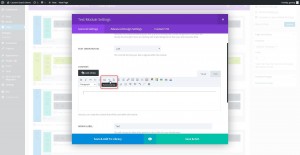
1. Start with a blank text module and insert a horizontal line using the default editor.
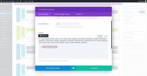
2. Now open the Text tab and add this class to the html between hr and /: class=”line-blue-left”
3. Now save and update page.
The Magic of CSS
Now lets start to dazzle things up a bit with some CSS.
If you are working with a child theme you can go to Appearance>Editor and open your stylesheet. If not, go to Appearance>Divi Theme Options>ePanel>Custom CSS (which is located at the bottom of the ePanel)
/*------------------------------------------------*/
/*-------------[GQ - FANCY LINE 1]----------------*/
/*------------------------------------------------*/

	hr.line-blue-left {
	    border: 0;
	    height: 5px;
	    background-color: #41a9c6;
	    width: 66px;
	    margin-left: 0px;}
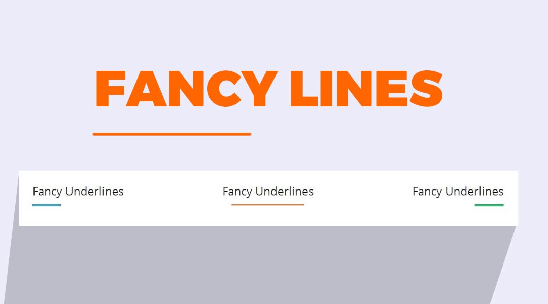
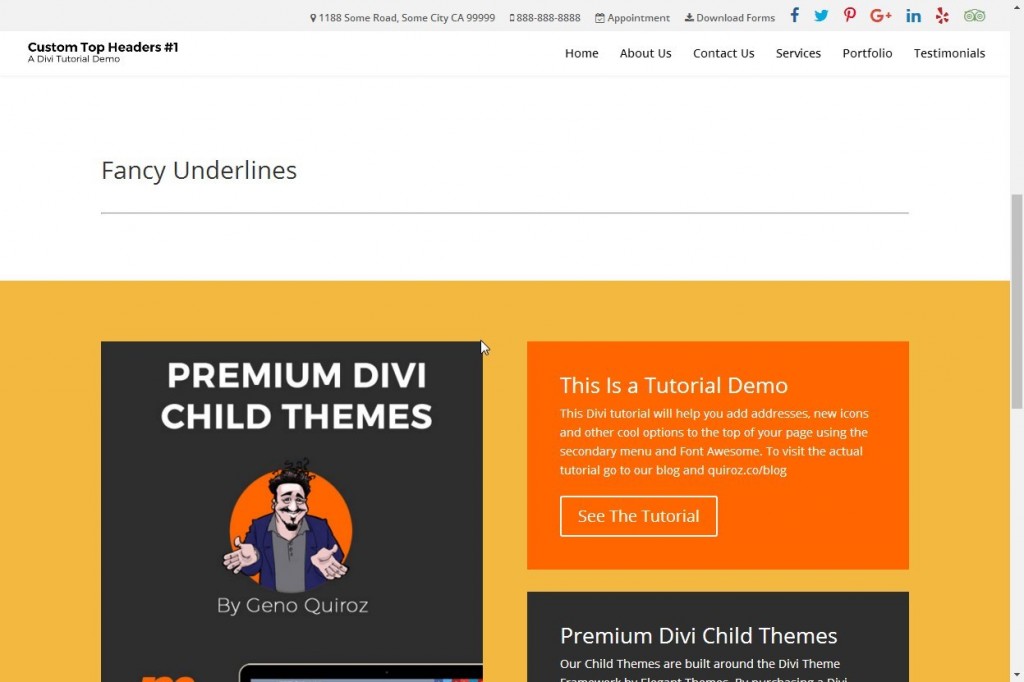
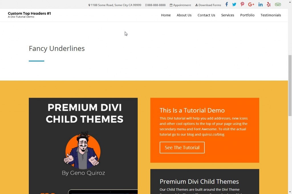
This bit of code makes the standard line on the left look like the line on the right.
To make the line thicker you can increase the height.
To make the line wider you can increase the width
To align to the left just change margin-left:0 to margin-right:0
To make the line centered remove the margin all together.
You can also add padding if you want to give it a little breathing room.
And here is a cheat sheet you can use for various fancy lines. You can actually just copy and paste the html into text modules and copy and paste the appropriate css into your stylesheet.
These are various html lines you could add to your text module in the text editor.
<hr class="line-orange-center">
<hr class="line-green-right">
<hr class="line-blue-left">
And here is the corresponding html for each one.
/*------------------------------------------------*/
/*--------------[GQ - FANCY LINES]----------------*/
/*------------------------------------------------*/

	hr.line-blue-left {
	    border: 0;
	    height: 5px;
	    background-color: #41a9c6;
	    width: 66px;
	    margin-left: 0px;}


	hr.line-orange-center {
    		border: 0;
    		height: 3px;
    		background-color: #f57e3a;
    		width: 166px;}


	hr.line-green-right {
    		border: 0;
    		height: 5px;
    		background-color: #2cba6c;
    		width: 66px;
    		margin-right: 0px;}
And with a few minor adjustments you can have long lines,fat lines, short lines and more.
Here is a Divi Quick Tip. Save each one as a Global Module and add lines anywhere throughout your build in seconds.
And that’s it! Have fun!
Well that’s all for now. I hope you find this article useful.







Thank you Geno! So simple & cool idea!
Hello (sorry for my poor english)
You save my life, i was searching for one way to have two line under my title. I mean two colors, one under title and another on the right grey.
You can use the underline combine with your trick.
To use the underline without problem in chrome, you must make it with span. My exemple, My title</h2
In CSS
#my_underline h2, h3 {
font-weight: bold;
border-bottom: solid 0.05em; display: inline-block; border-bottom-color: #dd9933;
position: relative; top: 6px
}
Adjust the position of your cool fancy line and the underline and put z-index: -1; to your hr.
In this case, you have one orange line (underline) under my title and a full line grey (that you just see on the right of title).
I hope my explanation is not so bad and that you understand my idea.
Thanks for your work.
Bruno
Awesome. Thanks for the share 🙂
Hi Geno,
Thanks for this and all your other very cool tuts. I was looking to apply something like this to the H4 Title in the blurb module but just couldn’t figure it out and was wondering it is something that is possible?
Thanks again. 🙂
Hi Geno… Managed to puzzle it out – was trying to apply the CSS to the wrong element. Thanks for all your wonderful tutorials and tips. You have been a great inspiration. 🙂
Awesome. Thanks for following up 🙂
Hi Geno!
Thank you for sharing this!
So I have copied to my stylesheet. The measurements for this line is set by this step. Can I change the width for each individual line within the individual text-module, or do I have to change settings in the stylesheet. That again means that I have to set many different CSSs??!!
Hope I made myself clear?
I use multiple css classes on my stylesheet for projects that require various lines. centered,right,left,width etc…
Is there anyway to do this with the Full Width Post Title module on divi? It would be great 🙂
Thanks for your great tutorials!
I am sure where there is a will, there is a way 😉
Hi Geno, I tried to use the “left blue line” and it works on chrome and firefox, but when I test it on edge, the line shows up in the center. Any way to fix this so it works on all browsers?
We don’t have a full solution to this right now, the Edge browser does render some things differently. I have worked up an alternate method that may work for you. Try using the CSS below…
    hr.line-blue-left {
        border: 0;
        height: 5px;
        background-color: #41a9c6;
        width: 25%;
        margin-right: 75%;}
That seems to work for me on Edge, Chrome, Safari and Firefox. If you need to adjust the width of the line, make sure you also adjust the margin, the sum of both should equal 100%.
I would like to mention that your fancy lines tutorial is awesome but it doesn’t work properly in internet explorer. All the alignment of fancy lines change when you view it in internet explorer.
Thank you for letting us know. You can modify the CSS a little bit to make the lines consistent for IE, as well as Chrome, Firefox, and Edge. Below is the code for the blue line. If you’d like help modifying a different one just let us know.
hr.line-blue-left { border: 0; height: 5px; background-color: #41a9c6; width: 25%; margin-right: 75%;}You ROCK Jerry!
Thanks Jerry, just changed it in the stylesheet. Works perfect.
Chris
Well it doenst work on any IE version is there a fix?
Hi Denis! You do have to take a different approach for these to work in IE. Here is an example for the left blue line…
hr.line-blue-left {
    border: 0;
    height: 5px;
    background-color: #41a9c6;
    width: 25%;
    margin-right: 75%;}
You can adjust it for the specific size you need.
How can I apply an underline for active menu navigation?
There will be a tutorial on that coming out soon.
hi
how can i made this line , vertical , left or right position , modify the length to ???
thks
The length is referred to as width in the CSS so you can adjust it there. In the first one I have it set to the left using “margin-left:0px;”. To have it positioned to the right I replace that with “margin-right:0px;”. As for the vertical lines, that would require a different approach.
Hey Geno! I LOVE your tutorials! One question though; I have too much of a gap between the blue line and the bottom of the header text. I’ve tried adjusting the padding, etc, but it doesn’t give me the desired result. Many thanks!