This is the second in a series on adding some cool customizations and hover effects to the Divi Blog Grid layout.
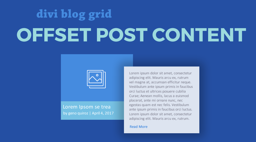
In this tutorial I am going to show you how you can create a horizontal blog grid layout with the post-content/excerpt offset to the right of the image. The post-content/excerpt will also have a subtle shadow and animation on hover.
Let’s Get Started Making The Divi Blog Grid Offset Content with Hover Animation
Adding The Blog Modules
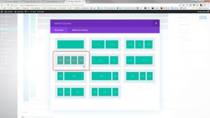
1. Create a row and give it 4 columns.
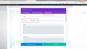
2. Open up the row settings, go to the Custom CSS Tab and assign each Column a CSS Class. Please use these classes
- Column 1 CSS Class: mp_blog_grid_offset_row_c1
- Column 2 CSS Class: mp_blog_grid_offset_row_c2
- Column 3 CSS Class: mp_blog_grid_offset_row_c3
- Column 4 CSS Class: mp_blog_grid_offset_row_c4
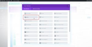
3. Add a Blog Module to the first column.
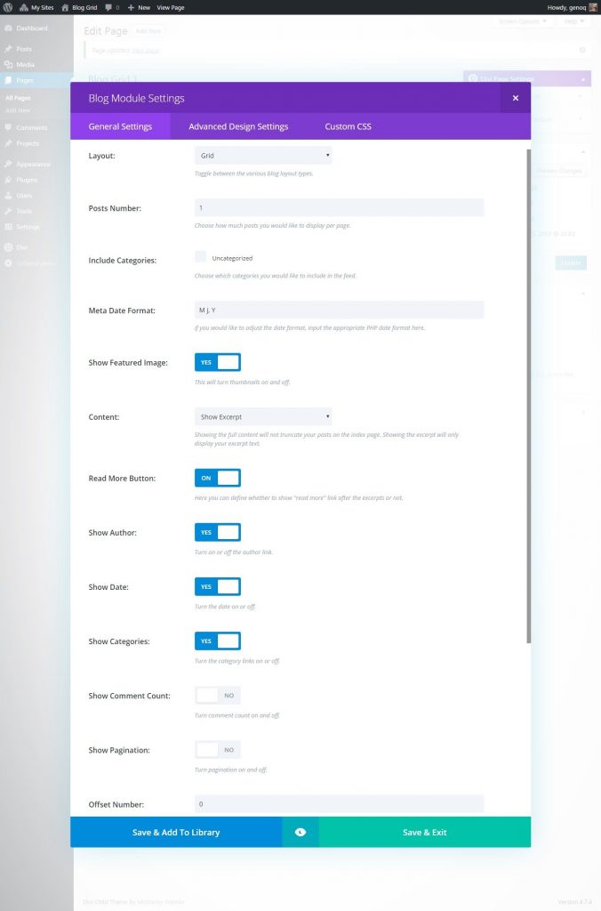
4. Next you will adjust the blog module settings as follows.
- Layout: Grid
- Posts Number: 1
- Show Featured Image: Yes
- Content: n/a
- Read More Button: n/a
- Show Author: Yes (optional)
- Show Date: Yes (optional)
- Show Categories: Yes (optional)
- Show Comment Count: No
- Show Pagination: No
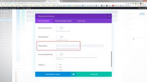
- Offset Number: 0
5. In that same module, go to the Custom CSS tab and assign the module the following CSS Class: mp_blog_module_a
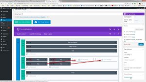
6. Now duplicate the blog module and move it into the second column.
7. Next you will adjust the second blog module settings as follows.
- Layout: Grid
- Posts Number: 1
- Show Featured Image: n/a
- Content: Show Excerpt
- Read More Button: Yes
- Show Author: n/a
- Show Date: n/a
- Show Categories: n/a
- Show Comment Count: No
- Show Pagination: No
- Offset Number: 0
8. In that same module, go to the Custom CSS tab and assign the module the following CSS Class: mp_blog_module_b
9. Clone the module in Column 1 and drag it to column 3. Clone the module in Column 2 and drag it to Column 4
10. In both of the new modules in columns 3 & 4, you are going to change the offset number from 0 to 1.
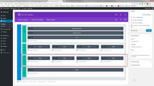
11. If you want to add a second row, just duplicate the entire row and then:
- In both of the modules in columns 1 & 2, you are going to change the offset number from 0 to 2.
- In both of the modules in columns 3 & 4, you are going to change the offset number from 1 to 3.
12. Save your page and move on to the magic of adding a little CSS.
Adding The Custom CSS
If you are working with a child theme you can go to Appearance>Editor and open your stylesheet. If not, go to Appearance>Divi Theme Options>Custom CSS (which is located at the bottom of the first tab in Theme Options)
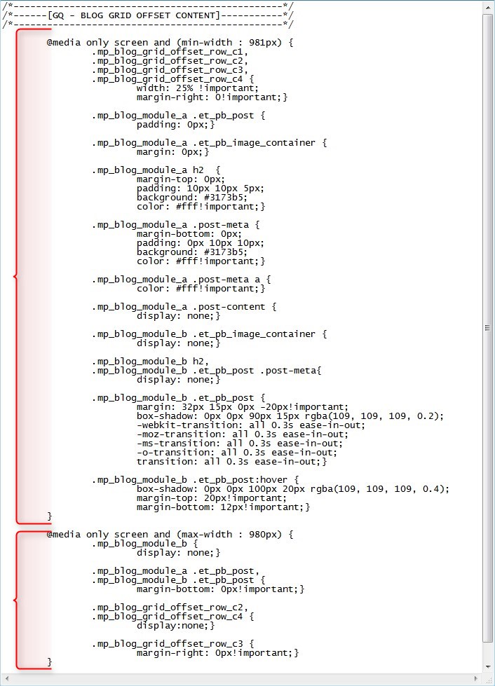
Add this CSS.
/*------------------------------------------------*/
/*------[GQ - BLOG GRID OFFSET CONTENT]-----------*/
/*------------------------------------------------*/

	@media only screen and (min-width : 981px) {
		.mp_blog_grid_offset_row_c1,
		.mp_blog_grid_offset_row_c2,
		.mp_blog_grid_offset_row_c3,
		.mp_blog_grid_offset_row_c4 {
			width: 25% !important;
			margin-right: 0!important;}

		.mp_blog_module_a .et_pb_post {
			padding: 0px;}

		.mp_blog_module_a .et_pb_image_container {
			margin: 0px;}

		.mp_blog_module_a h2  {
			margin-top: 0px;
			padding: 10px 10px 5px;
			background: #3173b5;
			color: #fff!important;}

		.mp_blog_module_a .post-meta {
			margin-bottom: 0px;
			padding: 0px 10px 10px;
			background: #3173b5;
			color: #fff!important;}

		.mp_blog_module_a .post-meta a {
			color: #fff!important;}

		.mp_blog_module_a .post-content {
			display: none;}

		.mp_blog_module_b .et_pb_image_container {
			display: none;}

		.mp_blog_module_b h2,
		.mp_blog_module_b .et_pb_post .post-meta{
			display: none;}

		.mp_blog_module_b .et_pb_post {
			margin: 32px 15px 0px -20px!important;
			box-shadow: 0px 0px 90px 15px rgba(109, 109, 109, 0.2);
			-webkit-transition: all 0.3s ease-in-out;
			-moz-transition: all 0.3s ease-in-out;
			-ms-transition: all 0.3s ease-in-out;
			-o-transition: all 0.3s ease-in-out;
			transition: all 0.3s ease-in-out;}

		.mp_blog_module_b .et_pb_post:hover {
			box-shadow: 0px 0px 100px 20px rgba(109, 109, 109, 0.4);
			margin-top: 20px!important;
			margin-bottom: 12px!important;}
	}

	@media only screen and (max-width : 980px) {
		.mp_blog_module_b {
			display: none;}

		.mp_blog_module_a .et_pb_post,
		.mp_blog_module_b .et_pb_post {
			margin-bottom: 0px!important;}

		.mp_blog_grid_offset_row_c2,
		.mp_blog_grid_offset_row_c4 {
			display:none;}

		.mp_blog_grid_offset_row_c3 {
			margin-right: 0px!important;}}
Making Adjustments
I wrapped this in a couple of media queries so that it only applies the CSS on typical desktop screen sizes and returns things to normal on desktop.
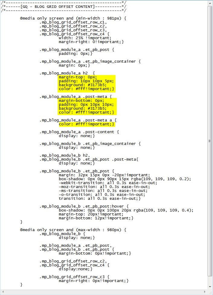
To adjust the margin, padding, background color, and font color for the post title, you can do so here:
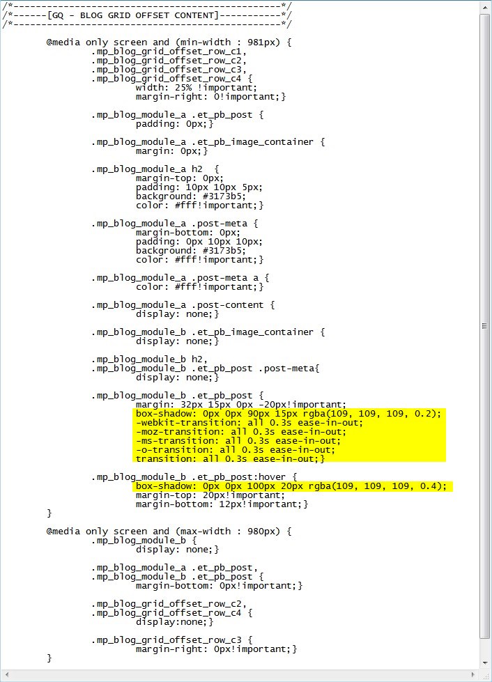
If you want to adjust the post-content/excerpt box shadow & animation on hover, for the you can do so here:
And that’s it.
If you used this on one of your projects, please share a link below so we can see how you used it.
Have fun!
Well, that’s all for now. I hope you find this article useful.









The box-shadow is off a bit. Should push it down a bit to really give it the look of “lifting up”.
Try this: “box-shadow: 0px 50px 100px 20px rgba(109, 109, 109, 0.4);”
Looks gorgeous with the blog btw!
Thanks for the great idea Malachai
Hi guys,
It works fine and very nice.
Only two doubts
how can I limit the excerpt because in my grid blog is too big .
I don´t know how to change the margin left between image and content .
I tried it but not well done.
Here mi tests .
https://www.fqeuskadi.org/?page_id=26028%2F&preview=true
Hi Jesus, I went to take a look but there is not content on that page.
hello sir, how can i make divi section module with cornors rounded,?? is there any tutorial here?
Sure thats pretty easy. It just depends on which module you want to do that with.
Fun idea Geno! Thanks for sharing it 🙂
Thanks Nathan. Appreciate you stopping by 😀
love this. Is there a way to adjust the length of the excerpt so that I do not have to do it manually each time. My excerpts are pulling with too many words. You can see what I mean at https://sexysuccesssystems.com
Thanks Shawna. Your website is looking great. Here is a tutorial on how to change the default excerpt length. It should work with this setup.
https://www.elegantthemes.com/blog/divi-resources/changing-the-length-of-your-divi-blog-post-excerpts
Hi! First of all, thank you for EVERYTHING.
I would love to know if is there a way to change the Read More button style after this blog setting..
Anyone could help? Thank you really much again!
Is there a way to have 3 of these in a column- displaying the 3 most recent blog posts on your site?
Yes. Instead of splitting the row into 4 columns, split it into two and only assign the CSS classes to the two columns. Then use the C3 & C4 CSS for the columns in the next row. Then add new CSS for C5 & C6.
Thank You- For some reason the read more button disappears as the screen size shrinks. Is there a way to keep the read more link there at all times?
Strange. I could not recreate the issue. My demo site still shows the read more link on smaller screens.
I tried this, but in DIvi 3.0.65 the only options in the blog module are to show either the content or the excerpt. There is no option to hide the content, so everything appears wrong on the page.
https://digitalinsite.ca/tina/blog-3/
Yes. That’s why we use the CSS to hide the content.
Is there a way to add a “read more” for older posts? It looks great displaying the four most recent posts, but there’s a lot of blog beyond that! Thanks for such great resources.
Hi Geno! Thanks a lot for this tutorial. I have a question. Is there a way to ad the sitebar on the page?
I am not sure what you mean by sitebar? Do you mean a sidebar?
I have more than 4 blog posts. How can I give the visitors the chance to “skip” to the next batch of 4 posts (post 5-8, then 9-12 etc.) ? Is there an easy way? If I create multiple pages, I would still bump the oldest post out unless I keep building these pages.
Thanks
I can not think of an easy way to do this. I recommend just adding a button below that sends them to the full blog whcih will have the pagination you are looking for.