This is the first in a series on adding some cool customizations and hover effects to the Divi Blog Grid layout.
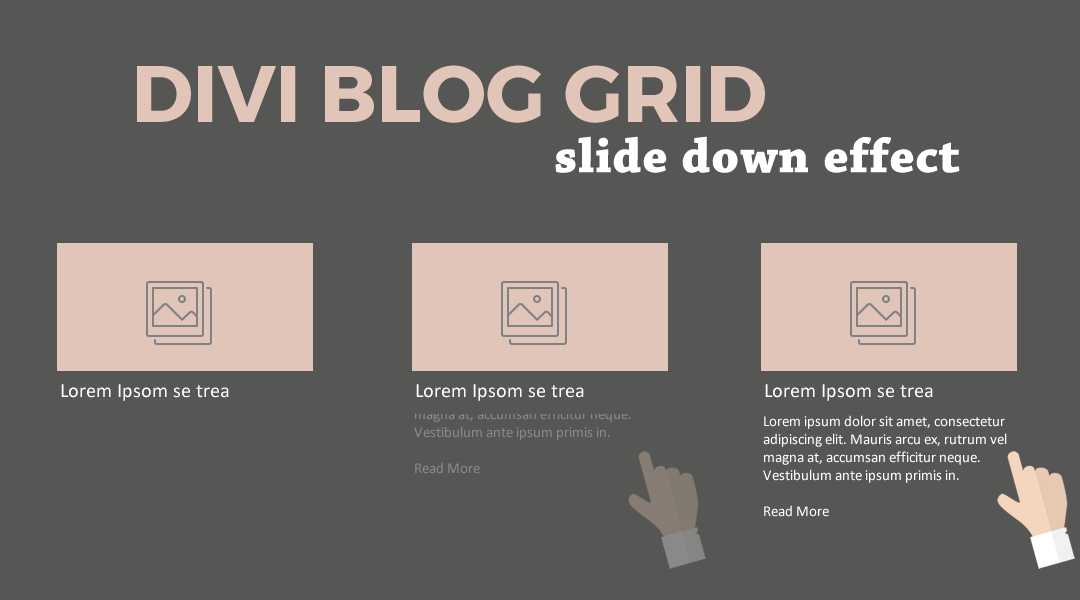
In this tutorial I am going to show you how you can make the excerpt, otherwise known as the post-content, slide down from behind the blog image and title when you mouse over them.
Let’s Get Started Making The Divi Blog Grid Slide Down Effect
Adding The Blog Modules
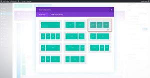
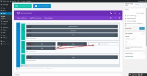
1. Create a row and give it 3 columns.
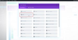
2. Add a Blog Module to the first column.
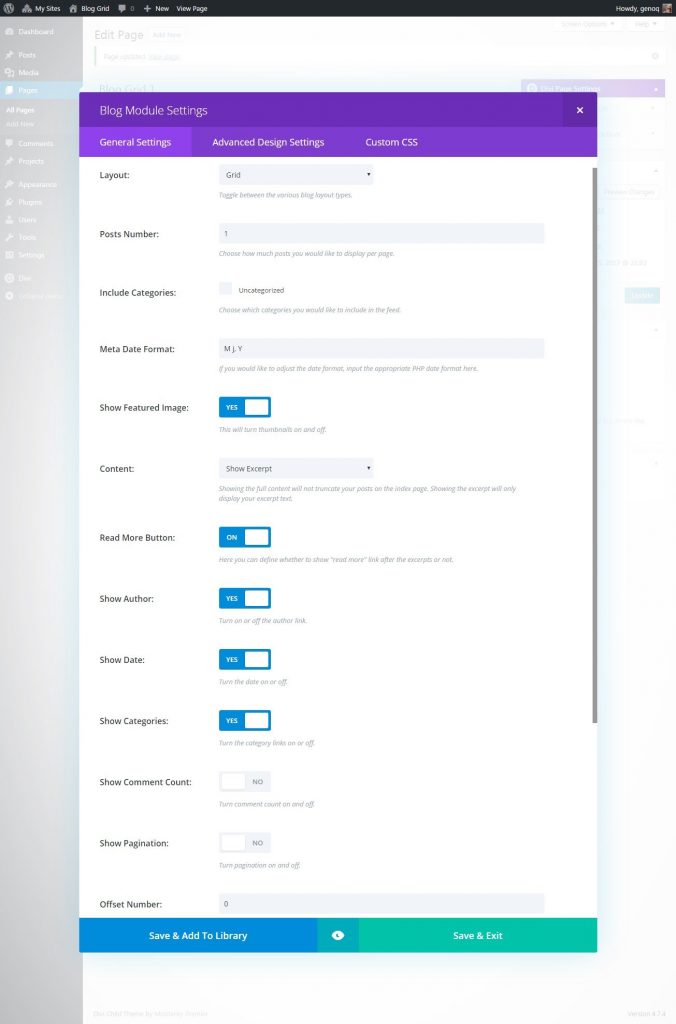
3. Next you will adjust the settings as follows.
- Layout: Grid
- Posts Number: 1
- Show Featured Image: Yes
- Content: Show Excerpt
- Read More Button: Yes (optional)
- Show Author: Yes (optional)
- Show Date: Yes (optional)
- Show Categories: Yes (optional)
- Show Comment Count: No
- Show Pagination: No
- Offset Number: 0
4. Now duplicate the blog module twice and move the extra two over into the next two columns.
5. In the second blog module change the offset number to 1. And in the third blog module change the offset number to 2.
6. Save your page and move on to the magic of adding a little CSS.
Adding The Custom CSS
If you are working with a child theme you can go to Appearance>Editor and open your stylesheet. If not, go to Appearance>Divi Theme Options>Custom CSS (which is located at the bottom of the first tab in Theme Options)
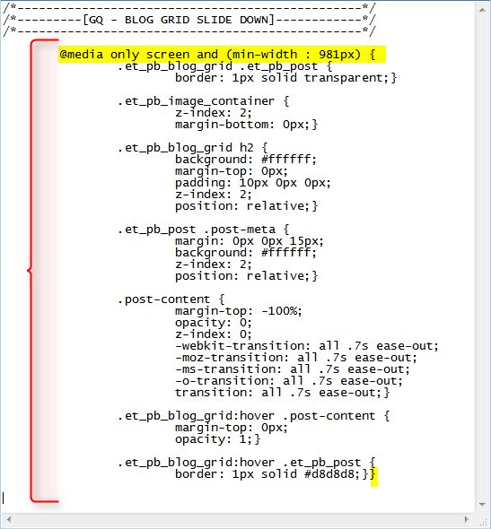
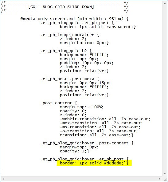
Add this CSS.
/*------------------------------------------------*/
/*---------[GQ - BLOG GRID SLIDE DOWN]------------*/
/*------------------------------------------------*/

	@media only screen and (min-width : 981px) {
		.et_pb_blog_grid .et_pb_post {
			border: 1px solid transparent;}

		.et_pb_image_container {
			z-index: 2;
			margin-bottom: 0px;}

		.et_pb_blog_grid h2 {
			background: #ffffff;
			margin-top: 0px;
			padding: 10px 0px 0px;
			z-index: 2;
			position: relative;}

		.et_pb_post .post-meta {
			margin: 0px 0px 15px;
			background: #ffffff;
			z-index: 2;
			position: relative;}

		.post-content {
			margin-top: -100%;
			opacity: 0;
			z-index: 0;
			-webkit-transition: all .7s ease-out;
			-moz-transition: all .7s ease-out;
			-ms-transition: all .7s ease-out;
			-o-transition: all .7s ease-out;
			transition: all .7s ease-out;}

		.et_pb_blog_grid:hover .post-content {
			margin-top: 0px;
			opacity: 1;}

		.et_pb_blog_grid:hover .et_pb_post {
			border: 1px solid #d8d8d8;}}
Making Adjustments
I wrapped this in a media query so that it only applies the CSS on typical desktop screen sizes.
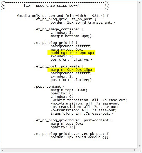
In case you want to adjust the padding a little for the title and the meta, you can do that here.
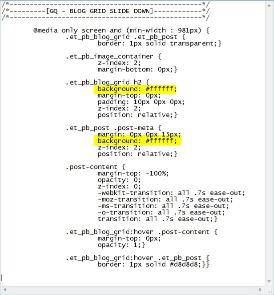
If you need the background color of the title and the meta to match the background color of the section, you can change that here:
If you want to change the color of the border, you can change that here:
And that’s it.
If you used this on one of your projects, please share a link below so we can see how you used it.
Have fun!
Well, that’s all for now. I hope you find this article useful.





Hey Geno, I followed your instructions to the t and didn’t even make any modifications, but it looks really off. Any idea why? http://the-translators.com (just before the map at the end of the page).
Never mind, my friend. I figured it out. I had the color settings messed up. Sorry. And thanks for this great tutorial!
Oh gosh, while it looks great on the home page, it looks super weird on my blog page http://the-translators.com/my-writings/. Can we add something to the code so it only applies to the home page? Pretty please? FYI, I want to display them on the blog page in Full Width. So perhaps we could add some code that only applies to Grid Layouts?
Hi xl8ors. Sorry about that. I should have added a custom class to the section and added that to the css so it only affects modules in that particular section. I will update the tutorial here shortly. Thanks for bringing this to my attention.
Hello Geno. Can you teach us how to do that? Please.
I love this, Geno. Is there any way to add a little padding to the date?
https://www.screencast.com/t/hhfEzxP85
See the word “Matter” on the right.
Thanks.
Hi Phil. Looks like you are using the Divi Article Card Plugin. I have not tested this with that plugin but you can try adding right padding to the header. This should get you pointed in the right direction. Just adjust the padding amount.
.et_pb_blog_grid h2 { padding-right: 40px!important; }Indeed I was. I deactivated it and it’s weird:
https://www.screencast.com/t/Nb7Hhw7TE
No rush. Thanks, mate.
You already have a lot of custom css and jquery being applied to those blog modules. This tut is for blog modules that dont have a lot of other custom css being applied. Try removing all the custom css being applied to those modules and that section. As you can see on the demo. Its works really easily when there is not a lot of other custom stuff going on to conflict with the css.
Makes sense. Thanks again.
Hello Geno, i’d like to specified the post id i want to display instead of an offset. Do you think this is possible ? For an other client i will need random post. Do you think this is possible too ?
Thx a lot for your help !!!
Hi Sebastien. If you want to target a specific post, then just assign a unique category to that post and use that category in the module. I am not sure about the client who needs random posts.
Any way to use this effect on a full blog? Seems it will only work if each post has a new module and a new offset number. Maybe I misunderstood something.
Hi Abbie, this is only designed to work with the individual modules. It is designed for a homepage where it might only show the most recent posts with a link to the rest of the blog. To do this on the rest of the blog would require quite a bit more customization.
Hi is there a way to get it to work only using the divi builder plugin. It only shows on hover not slide up. Thanks
This tutorial was designed for it to slide down when you hover over it.
Really cool this one, but, i can´t see the hover animation on chrome (yes in firefox). It´s only for me?
Great Effect!!
Thanks Tanausu. It is working in chrome for me. Are you still having the issue?
Can we make post style like this http://aalaz.com/post-example/ . My example is not a post I created via divi modules just to show my need but I need this style in post like you did. Thanks
Yes I think it is possible. I would detailed specs though in order to understand exactly what you need.
Hey ! Great Tuto !
It is really great when the Excerpts don’t have the same size !
I used it on one of a client website : https://madamepresse.com/
Almost at the end of the page 🙂
Ava
Very nice website. Great job and thanks for sharing. Very elegant. 🙂
Hello Geno,
In divi blog module, grid layout the minimum post displayed in a single line is 3. How can I display more than 3 in a single line.
That would require a lot of custom CSS. The easiest way to achieve this is to create four columns with a blog module in each column. Then adjust the offset value of each one so that you always see the four most recent and they will not be duplicates.