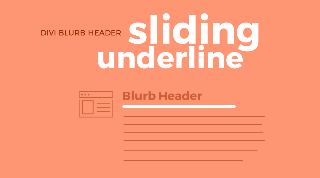
You have probably seen some cool menu animated underline effects floating around out there. I thought it would be cool to use some of those animated effects in other modules.
So in this tutorial I am going to show you how you give the Divi Blurb Header an animated sliding underline when you hover. This slides in from the left and slides out to the right making it a little different than the typical expanding or floating underline. I also threw in a little CSS that changes the color of the header as well to match the sliding underline.
Let’s Get Started
Creating the Modules
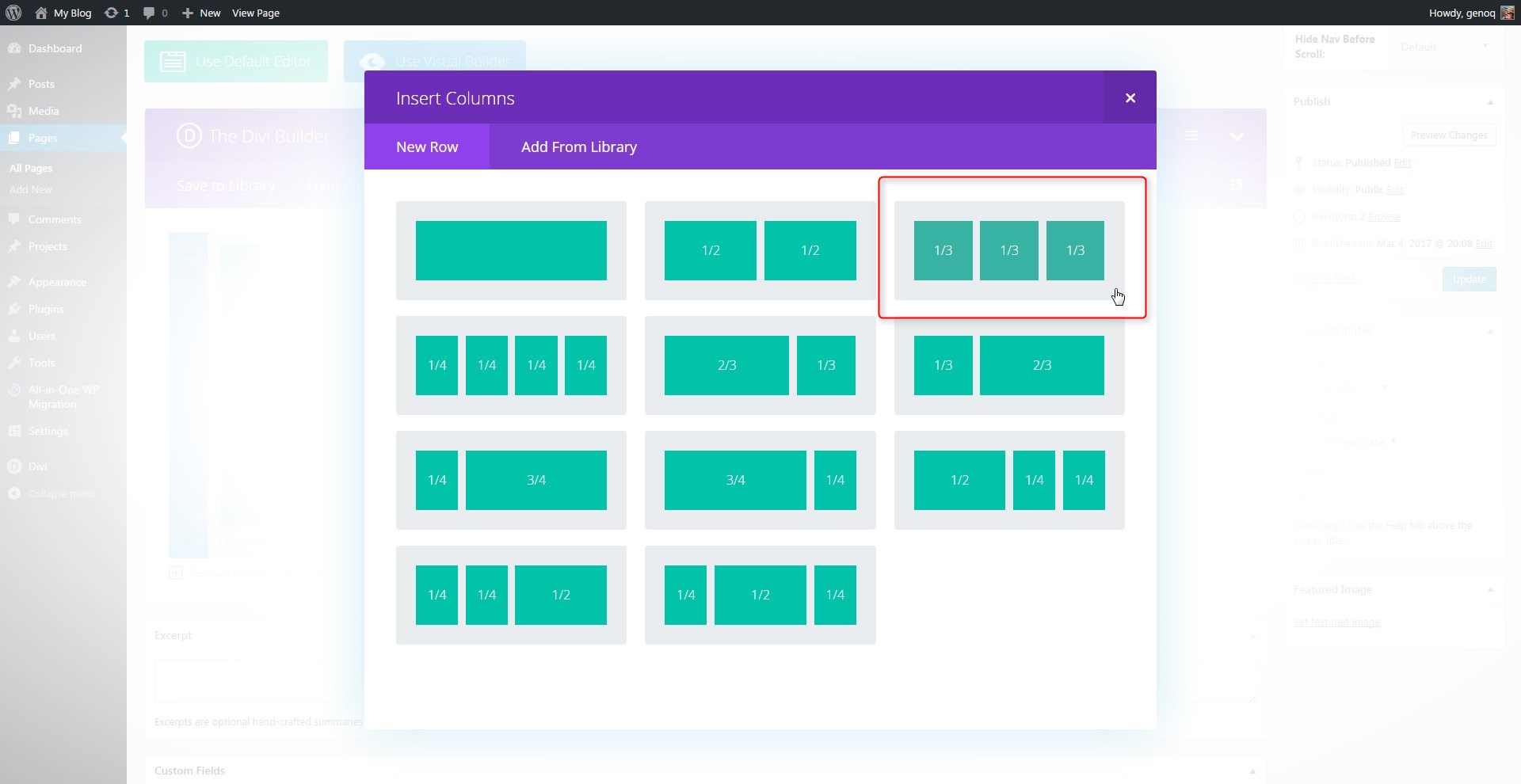
The first thing we are going to do is create a 3 column row. You can use other column options but I think 3 is the perfect layout for this feature.
1. In the section you want to add the modules, create a new 3-column row
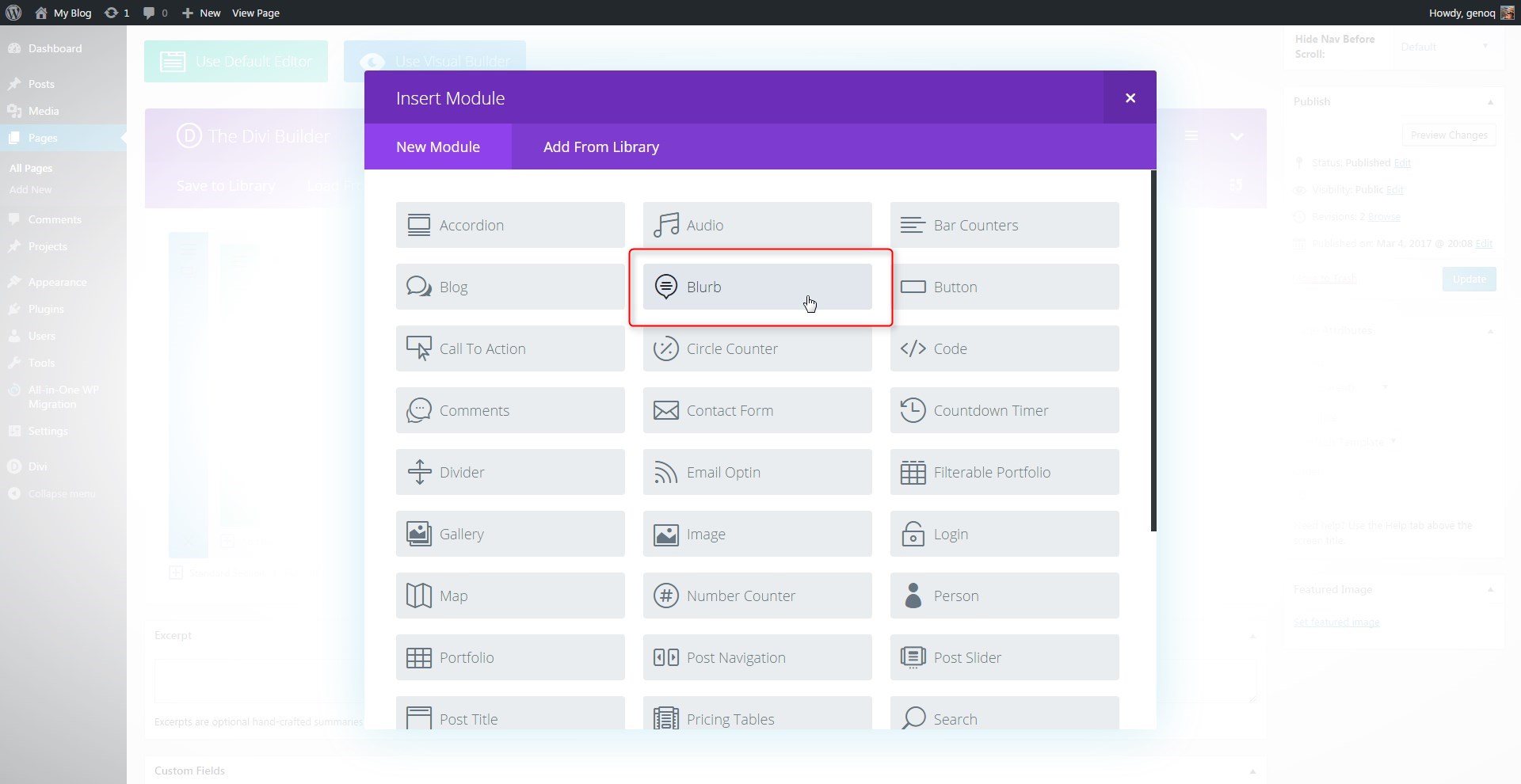
2. Next you will add a blurb module in the first column.
3. Open up the blurb settings and give it a title, url and an Icon. You could use an image if you wanted to but in this tutorial I will stick with the icons.
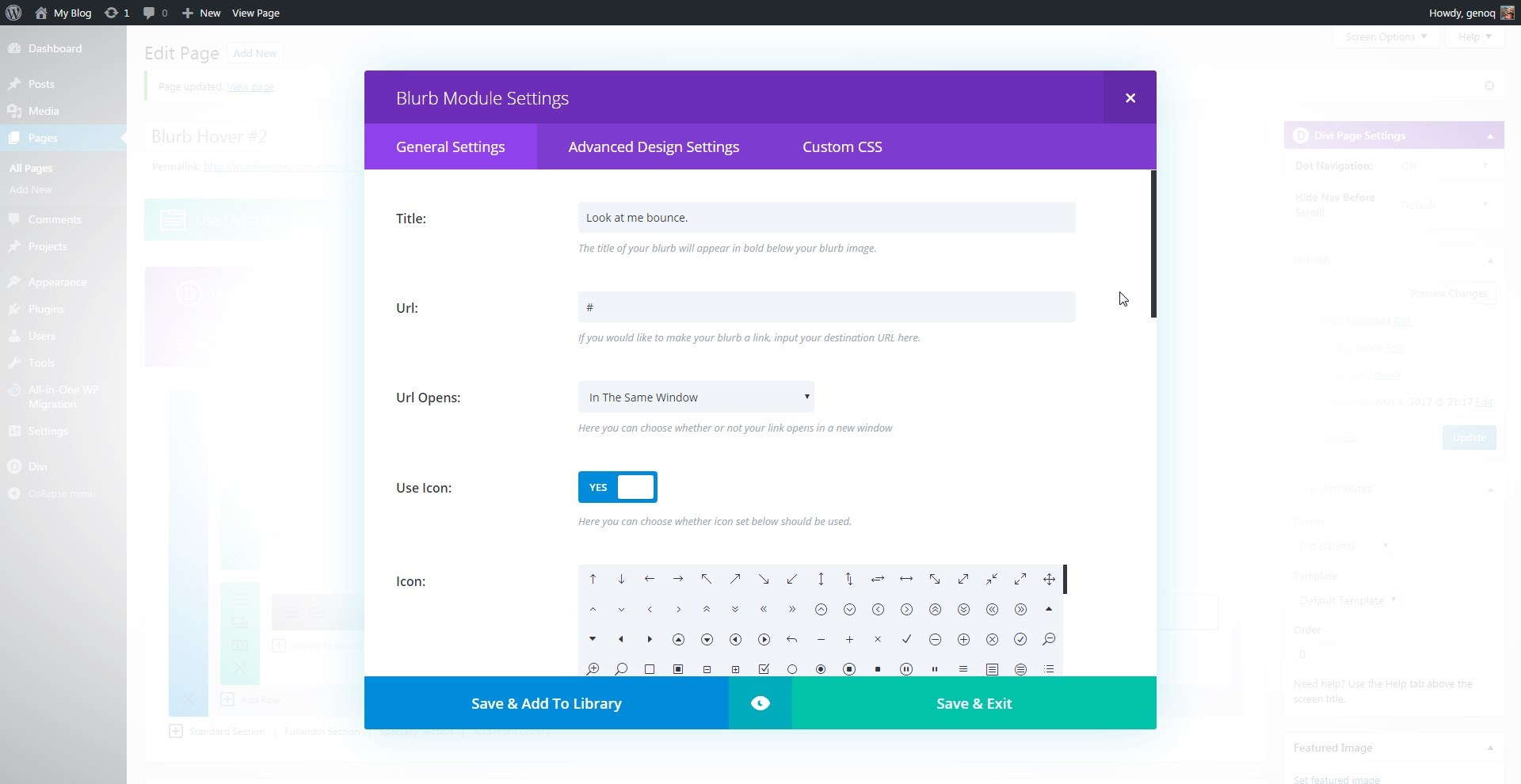
4. Give the icon a color, Image Placement is on the left, turn off animation and add content.

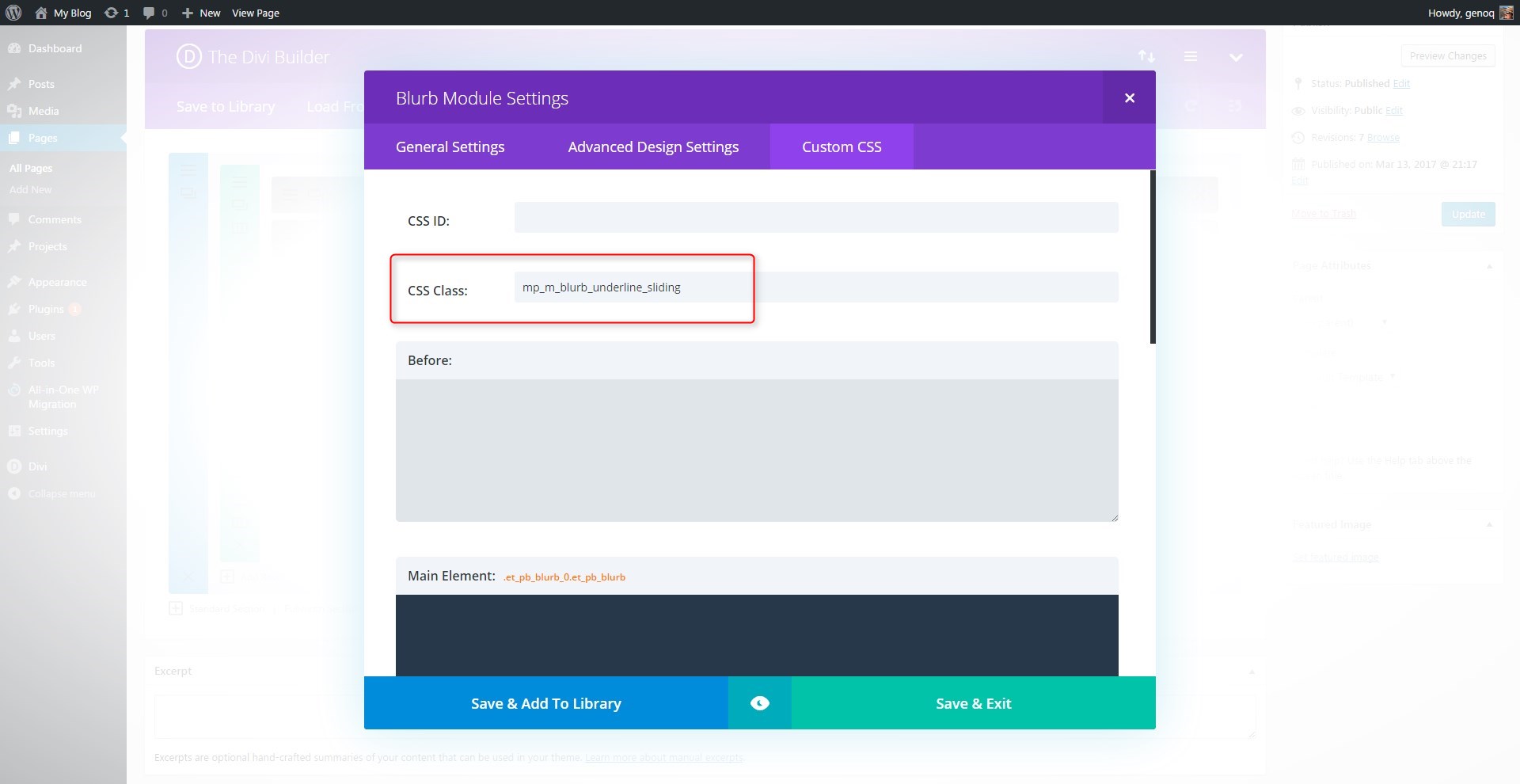
5. Now open up the “Custom CSS” tab and give the blurb module the following class: mp_m_blurb_underline_sliding
6. Select “Save and Exit” and then clone the blurb module twice and then move the extra two over into the next two columns. That way you only have to change the title, image and content on the other two.

Adding The Custom CSS
If you are working with a child theme you can go to Appearance>Editor and open your stylesheet. If not, go to Appearance>Divi Theme Options>Custom CSS (which is located at the bottom of the first tab in Theme Options)
Add this CSS
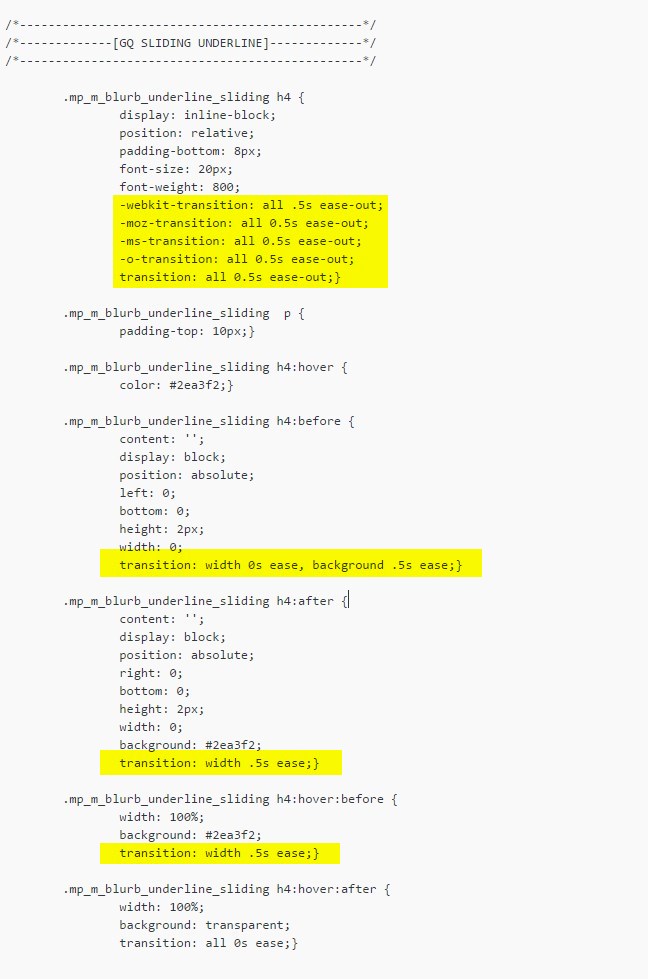
/*------------------------------------------------*/
/*-------------[GQ SLIDING UNDERLINE]-------------*/
/*------------------------------------------------*/

	.mp_m_blurb_underline_sliding h4 {
    		display: inline-block;
    		position: relative;
    		padding-bottom: 8px;
    		font-size: 20px;
    		font-weight: 800;
    		-webkit-transition: all .5s ease-out;
    		-moz-transition: all 0.5s ease-out;
    		-ms-transition: all 0.5s ease-out;
    		-o-transition: all 0.5s ease-out;
    		transition: all 0.5s ease-out;}

	.mp_m_blurb_underline_sliding  p {
    		padding-top: 10px;}

	.mp_m_blurb_underline_sliding h4:hover {
		color: #2ea3f2;}

	.mp_m_blurb_underline_sliding h4:before {
    		content: '';
    		display: block;
    		position: absolute;
    		left: 0;
    		bottom: 0;
    		height: 2px;
    		width: 0;
    		transition: width 0s ease, background .5s ease;}

	.mp_m_blurb_underline_sliding h4:after {
    		content: '';
    		display: block;
    		position: absolute;
    		right: 0;
    		bottom: 0;
    		height: 2px;
    		width: 0;
    		background: #2ea3f2;
    		transition: width .5s ease;}

	.mp_m_blurb_underline_sliding h4:hover:before {
    		width: 100%;
    		background: #2ea3f2;
    		transition: width .5s ease;}

	.mp_m_blurb_underline_sliding h4:hover:after {
    		width: 100%;
    		background: transparent;
    		transition: all 0s ease;}
If you want to speed up the animation process, just decrease the animation speed.
If you want to change the color of the underline and the hover color of the header, just change it in these places…

I also wanted to increase the header font weight and size in the css to keep it easier for me to change all of them throughout the website if I needed to. You can change that here or remove it altogether if you prefer to manage the font size in the module settings.

And that’s it.
If you used this one one of your projects, please share a link below so we can see how you used it.
Have fun!
Well, that’s all for now. I hope you find this article useful.


HI Geno, this is cool. 🙂 My only quibble is that you have to put the cursor directly over the header; could the effect happen if the cursor moved over the entire blurb block instead/as well?
Yes absolutely. It just requires a slightly different approach. Stay tuned for a few more blurb tutorials coming out over the next few weeks
Love it! A bit to of work for me to get this done but I bet it is amazing! Thank you!
My pleasure 🙂
Love that effect, thanks Gino 🙂
Thanks 🙂
how do i give the same effect when i hover over blurb instead of title
You would have to modify the CSS so that it applies the color changes when you hover over either the entire blurb or column instead of the h tag.
This is fantastic! How much adjustments would have to be made to the code to apply this to any header of choice outside of the Blurb module?
Not much. I will do a tutorial on it soon.
Hello Geno,
Many thanks for your tutorials, are great!
I have some problem with this CSS. I try to align the Title and the body text to center of the module but I can manage to obtain this. Can you please help me on this?
Many thanks
Kind regards
Dragos
Unfortunately I have not tried it on centered blurb titles yet.
hey there Geno,
Great tutorial! I was just wondering wether this CCS code can be applied to other modules such as text modules? I really love the hover effect and would like to apply it to other modules.
Thanks in advance!