With so many Divi websites out there, it is important for us to keep coming up with new little tricks to help our sites stand out. It does always need to be something major to make it stand out because sometimes it’s those little things that does the trick.
So in this tutorial I am going to show you how you can make your Blurb Module have a little bounce animation upon hover.
Let’s Get Started
Creating the Modules
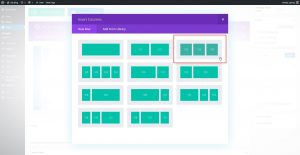
The first thing we are going to do is create a 3 column row. You can use other column options but I think 3 is the perfect layout for this feature.
1. In the section you want to add the modules, create a new 3-column row
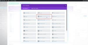
2. Next you will add a blurb module in the first column.
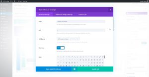
3. Open up the blurb settings and give it a title, url and an Icon. You could use an image if you wanted to but in this tutorial I will stick with the icons.
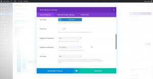
4. Give the icon a color, Image Placement is on the left, turn off animation and add content.
5. Now open up the “Custom CSS” tab and give the blurb module the following class: mp_m_blurb_vertical_wobble
6. Select “Save and Exit” and then clone the blurb module twice and then move the extra two over into the next two columns. That way you only have to change the title, image and content on the other two.
Adding The Custom CSS
If you are working with a child theme you can go to Appearance>Editor and open your stylesheet. If not, go to Appearance>Divi Theme Options>Custom CSS (which is located at the bottom of the first tab in Theme Options)
Add this CSS
/*------------------------------------------------*/
/*--------------[GQ BLURB WOBBLE]-----------------*/
/*------------------------------------------------*/

/* blurbs - vertical wobble on hover */

	.mp_m_blurb_vertical_wobble:hover {
    		-webkit-animation-name: hvr-wobble-vertical-sm;
    		animation-name: hvr-wobble-vertical-sm;
    		-webkit-animation-duration: 1.5s;
    		animation-duration: 1.5s;
    		-webkit-animation-timing-function: ease-in-out;
    		animation-timing-function: ease-in-out;
    		-webkit-animation-iteration-count: 1;
    		animation-iteration-count: 1;}

	@keyframes hvr-wobble-vertical-sm {
		16.65% {
		    -webkit-transform: translateY(4px);
		    transform: translateY(4px);}
		33.3% {
		    -webkit-transform: translateY(-3px);
		    transform: translateY(-3px);}
		49.95% {
		    -webkit-transform: translateY(2px);
		    transform: translateY(2px);}
		66.6% {
		    -webkit-transform: translateY(-1px);
		    transform: translateY(-1px);}
		83.25% {
		    -webkit-transform: translateY(1px);
		    transform: translateY(1px);}
		100% {
		    -webkit-transform: translateY(0);
		    transform: translateY(0);}}
If you want to speed up the animation process, just decrease the animation speed.
If you want to increase the bouncing action you can replace the keyframes above with this one.
	@keyframes hvr-wobble-vertical-sm {
		16.65% {
		    -webkit-transform: translateY(8px);
		    transform: translateY(8px);}
		33.3% {
		    -webkit-transform: translateY(-6px);
		    transform: translateY(-6px);}
		49.95% {
		    -webkit-transform: translateY(4px);
		    transform: translateY(4px);}
		66.6% {
		    -webkit-transform: translateY(-3px);
		    transform: translateY(-3px);}
		83.25% {
		    -webkit-transform: translateY(1px);
		    transform: translateY(1px);}
		100% {
		    -webkit-transform: translateY(0);
		    transform: translateY(0);}}
And that’s it.
If you used this one one of your projects, please share a link below so we can see how you used it.
Have fun!
Well, that’s all for now. I hope you find this article useful.








Hi, that’s quite a nice effect and i’ll most probably implement it. I was wondering, though, if there was a way to simply make the blurb icon change colour when you hover over header / icon and content section of the blurb. A more subtle fancy nancy.
Love your work by the way its very impressive.
Thanks Nicholas. Yes that’s possible. I will work on a tutorial for that one.
That’s so awesome. Really love that effect. Thanks for all you do!
My pleasure 😀
You da man Geno! Such a legend sharing this stuff. Thanks 🙂
Thanks Steve 🙂
Cool Effects !!!!
Thanks
Dear Geno, thanks a lot for all the tutorials!
Thanks for taking the time to comment Joachim. It means a lot 🙂