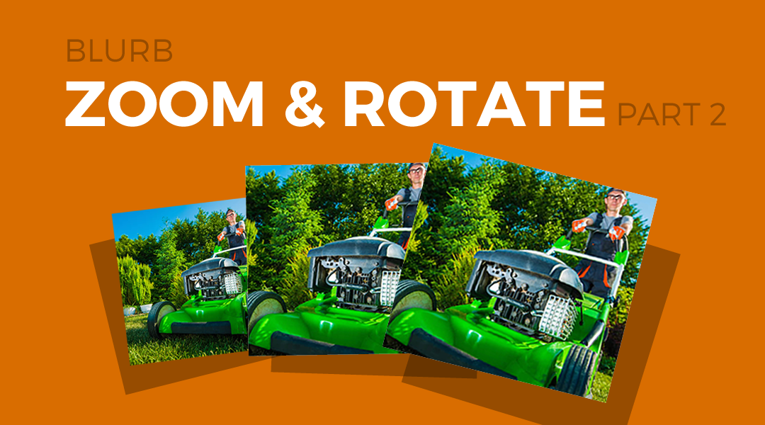
Back in March of 2016 I wrote a tutorial on how to make the Blurb Module Image zoom & rotate on hover.
But on a recent project I added a nice boxed shadow effect to each column that I really think adds a special touch and so I thought I would share that here with you today.
Let’s Get Started
Creating the Modules
The first thing we are going to do is create a 3 column row. You can use other column options but I think 3 is the perfect layout for this feature.
1. In the section you want to add the modules, create a new 3-column row
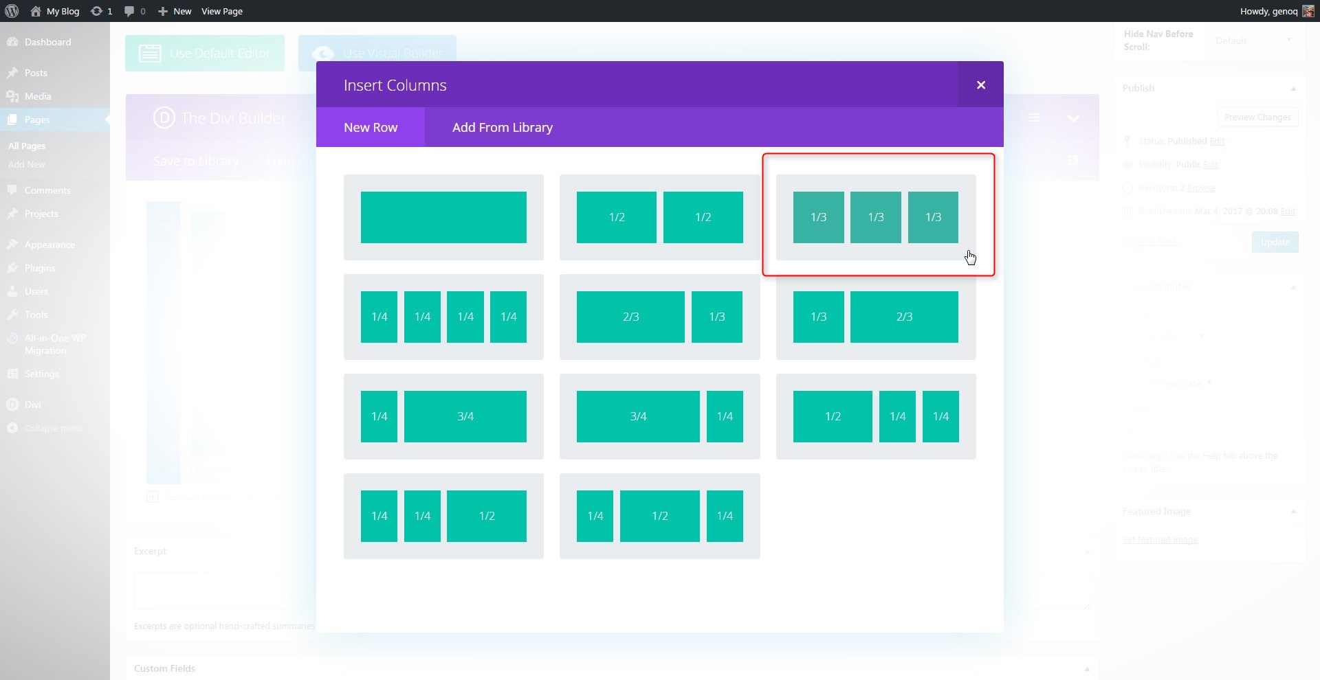
2. Open up the row settings, go to Custom CSS tab and add the following CSS Class: mp_r_blurb_zoom


3. Next you will add a blurb module in the first column.
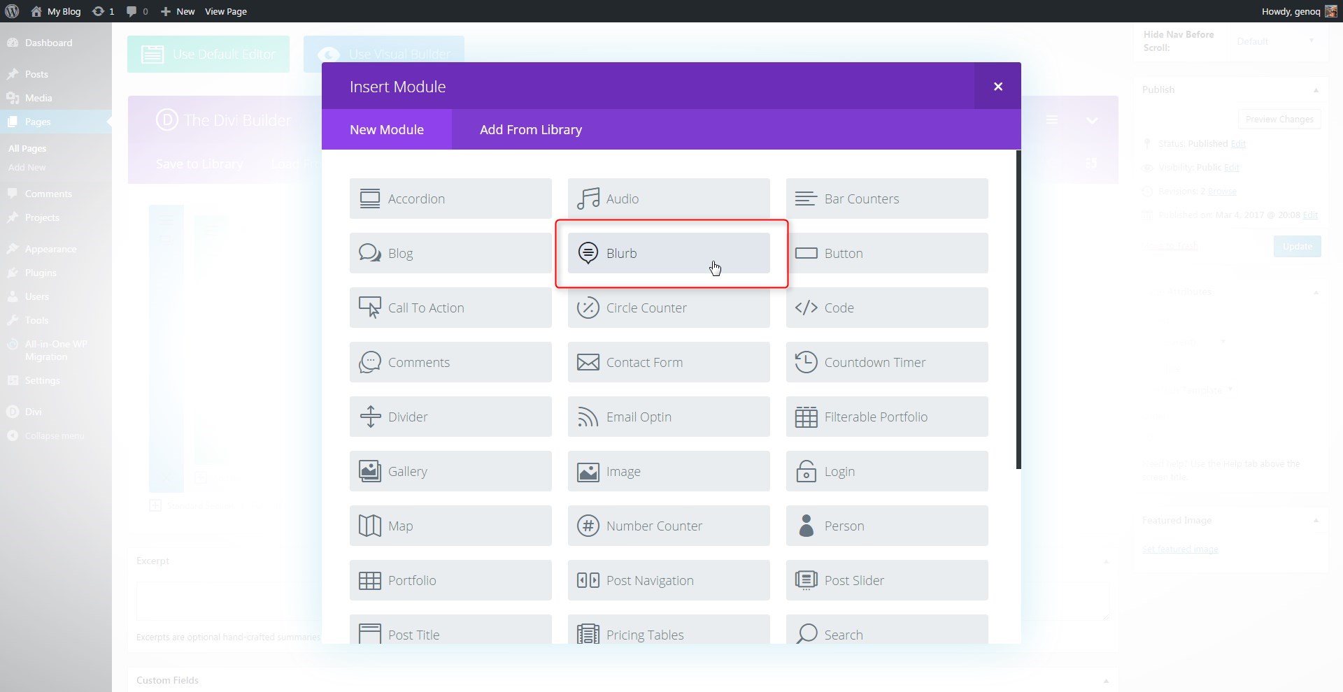
4. Open up the blurb settings and give it a title, url and image. This is designed for images not icons so do not use the icon feature. I recommend image sizes that are at least 600px wide. Because each blurb will stretch across the whole screen on tablets by default.

5. Make sure the image placement is at the Top. I like to turn off any animation for these when using the column box shadow.

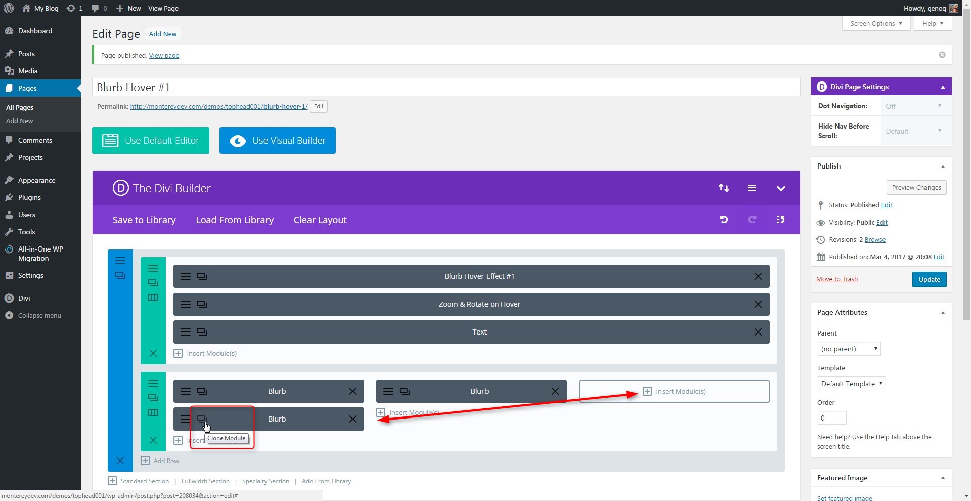
6. Once you have added some text into the Content box of the blurb module, you can select “Save and Exit” and then clone the blurb module twice and then move the extra two over into the next two columns. That way you only have to change the title, image and content on the other two.
Adding The Custom CSS
If you are working with a child theme you can go to Appearance>Editor and open your stylesheet. If not, go to Appearance>Divi Theme Options>Custom CSS (which is located at the bottom of the first tab in Theme Options)
Add this CSS
/*------------------------------------------------*/
/*----------[GQ BLURB ZOOM AND ROTATE]------------*/
/*------------------------------------------------*/

/* zoom on hover over blurb images */

	.mp_r_blurb_zoom .et_pb_main_blurb_image {
		overflow: hidden;}

	.mp_r_blurb_zoom .et_pb_main_blurb_image {
    		margin-bottom: 0px;}

	.mp_r_blurb_zoom .et_pb_blurb_container {
    		padding: 20px 15px 15px;}

	.mp_r_blurb_zoom .et_pb_column {
		max-width: 550px;
		box-shadow: 0px 0px 10px 3px rgba(183, 183, 183, 0.4);
    		-webkit-transition: all .5s ease-out;
    		-moz-transition: all 0.5s ease-out;
    		-ms-transition: all 0.5s ease-out;
    		-o-transition: all 0.5s ease-out;
    		transition: all 0.5s ease-out;}

	.mp_r_blurb_zoom .et_pb_column img{
		vertical-align:top;
    		-webkit-transition: all .3s ease-out;
    		-moz-transition: all 0.3s ease-out;
    		-ms-transition: all 0.3s ease-out;
    		-o-transition: all 0.3s ease-out;
    		transition: all 0.3s ease-out;}

	.mp_r_blurb_zoom .et_pb_column:hover img{
    		-webkit-transform: scale(1.05) rotate(1deg);
    		-ms-transform: scale(1.05) rotate(1deg);
    		transform: scale(1.05) rotate(1deg);}

	.mp_r_blurb_zoom .et_pb_column:hover {
    		box-shadow: 0px 0px 10px 6px rgba(183, 183, 183, 0.7);}

	/* keeps column only as wide as the blurb modules on smaller screens */

	@media only screen and (max-width : 980px) {
		.et_pb_section .mp_r_blurb_zoom {
			max-width: 550px!important;}}
And that’s it. If you used this one one of your projects, please share a link below so we can see how you used it.
Have fun!
Well, that’s all for now. I hope you find this article useful.


Thank you Geno! Gonna try it on my new projet 🙂
Awesome. Let me know how it goes 🙂
Thanks a lot, that is very nice!
I have to adapte the same effect for 5 column with 5 images, but I can’t. Do you can help me?
Thank you very mach advance!
Sorry Lilia. This was designed using Divi’s default columns. It might work if you manually created 5 columns but it would depend on the approach you took making the 5 columns.
Yes, thank you Geno!
Really great article. Thanks for taking the time to explain things in such great detail in a way that is easy to understand.
My pleasure.