This is the sixth in a series on turning your Divi Menu links into buttons and giving them some cool hover effects.
In this tutorial I am going to show you how you can make a Divi Menu Bar With Zoom-In Buttons when you mouse over them. As with my other Divi Menu Button tutorials, I designed them to work with the default header and the centered header.
Let’s Get Started Making The Divi Menu Bar With Zoom-In Buttons
Adding The Custom CSS
If you are working with a child theme you can go to Appearance>Editor and open your stylesheet. If not, go to Appearance>Divi Theme Options>Custom CSS (which is located at the bottom of the first tab in Theme Options)
Add this CSS.
/*------------------------------------------------*/
/*--------------[GQ - MENU BAR]-------------------*/
/*------------------------------------------------*/

	@media only screen and (min-width : 981px) {

		.et_fullwidth_nav #main-header .container {
			padding-right: 0px!important;
			padding-left: 0px!important;}

		#et-top-navigation {
			background: #3173b5;}

		.et_header_style_left #et-top-navigation,
		.et_header_style_split #et-top-navigation {
			padding-top: 0px!important;
			padding-left: 13px!important;}

		#top-menu li {
			padding-right: 15px;}

		#top-menu > li > a {
			padding: 15px 15px!important;
			margin-bottom: 0px;
			margin-top: 0px;}

		#top-menu .menu-item-has-children > a:first-child:after {
			display:none;}

		#top-menu-nav > ul > li > a {
			color: #ffffff;
			-webkit-transform: perspective(1px) translateZ(0);
			transform: perspective(1px) translateZ(0);
			box-shadow: 0 0 1px transparent;
			-webkit-transition-duration: 0.1s;
			transition-duration: 0.1s;
			-webkit-transition-property: box-shadow, transform;
			transition-property: box-shadow, transform;}

		#top-menu-nav > ul > li > a:hover,
		#top-menu-nav > ul > li > a:focus,
		#top-menu-nav > ul > li > a:active {
			background:#214c79;
			color:#ffffff;
			opacity:1;
			z-index: 99999;
			box-shadow: 0 10px 10px -10px rgba(0, 0, 0, 1.0);
			-webkit-transform: translateZ(0) scale(1.1);
			transform: translateZ(0) scale(1.1);}}
Making Adjustments
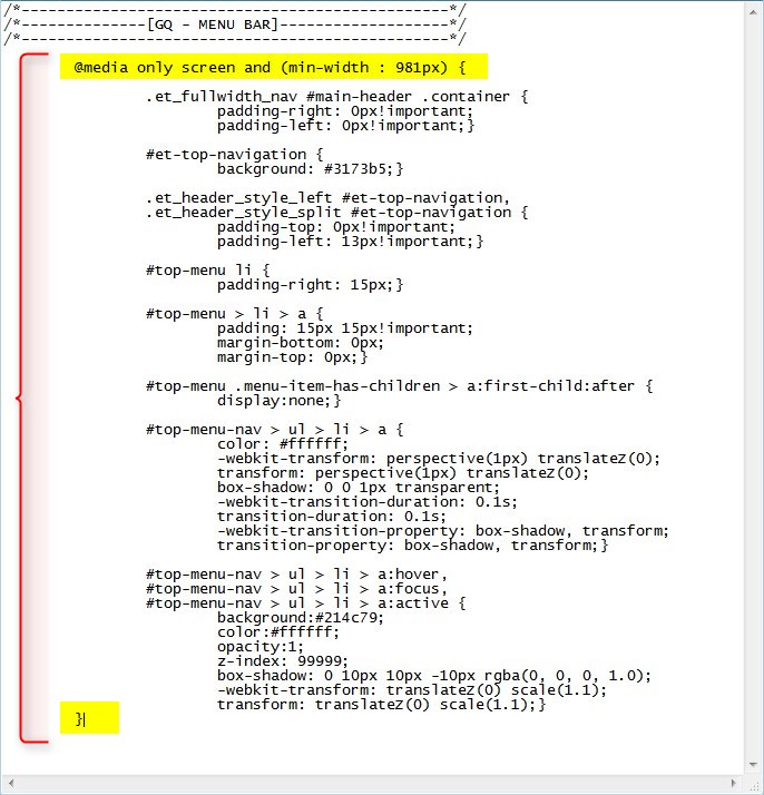
I wrapped this in a media query so that it only applies the CSS on typical desktop screen sizes.
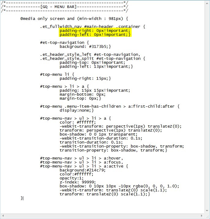
By default the header container has 30px padding on the left and right. I removed that padding but if you want to add it back, just remove this.
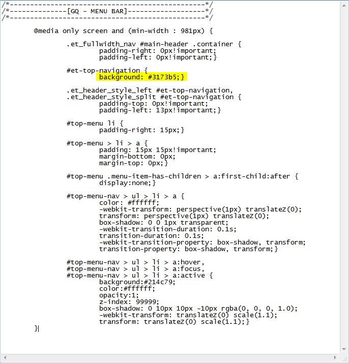
I am applying the background color to the navigation bar only and not the whole header. You can change that background color here.
Now because there are already so many menu padding options available in the Theme Customizer, there is a good chance you may have to adjust the padding. You can change that here.
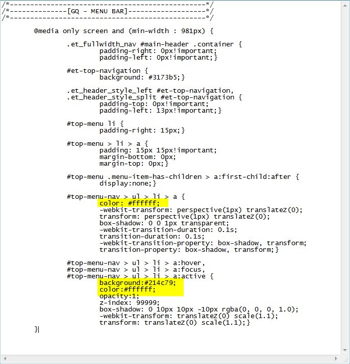
The following rules change the background colors before and after hover and the font color on hover. In my case the font color is white before and after for hover. But I left it there in case you want to change the font color on hover, you won’t have to add it. For example maybe you want the background to be a very light color and the font color to match the bar background color.
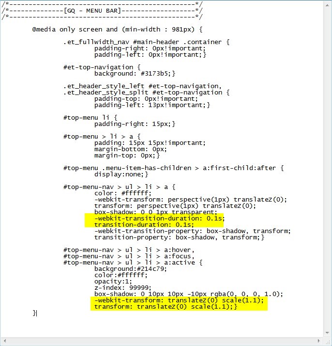
The following rules change the timing and the zoom of the animation.
And that’s it.
If you used this on one of your projects, please share a link below so we can see how you used it.
Have fun!
Well, that’s all for now. I hope you find this article useful.









LOVED THIS! thank you so much. you can look at it working on shadesofyoga.com
Wow that website looks awesome. Those buttons do add a very nice touch to the website. Thanks for sharing Carole 😀
Maybe you forgot to change the hover text color.
Thank you Geno for sharing your great code every now and then. I fiddled with this one on https://www.antcommunications.nl/en/ and I’ll sure will use it on future projects!
Hi Anton, That website looks great and those buttons sure do give it a nice effect. Thanks for sharing.
Hey Geno, nice work! The site I am working on is in production now, so no link to share yet. I added a line to the CSS to keep the current page zoomed. I only have Pages in the menu and no dropdowns so it may need some work in other situations. Cheers!
change:
#top-menu-nav > ul > li > a:hover,
#top-menu-nav > ul > li > a:focus,
#top-menu-nav > ul > li > a:active {
to:
#top-menu-nav > ul > li > a:hover,
#top-menu-nav > ul > li > a:focus,
#top-menu-nav > ul > li > a:active,
#top-menu-nav .menu-item.current-menu-item a {
Sweet. Thanks Karen. I knew I was missing something there.
Awesome tutorial, thanks for sharing.
I tried to modify the code, unfortunately I was not successful.
How is it possible to keep the small arrows in the menu on the right and to integrate the following code?
#top-menu li > a:after {
-webkit-transition: all 0.4s ease-in-out;
-moz-transition: all 0.4s ease-in-out;
transition: all 0.4s ease-in-out;
}
#top-menu li:hover > a:after {
-ms-transform: rotate(360deg);
-webkit-transform: rotate(360deg);
transform: rotate(360deg);
}
Thanks Draven. On my code I actually removed the after pseudo. So you can just remove that line of CSS I have and the drop down arrow comes back. BUt you will also have to mess with the padding and margin to get it where you want it.
Thanks – but what of the search buttom
This tutorial does not include the search icon. If you want to use it you will have to add some custom padding and margin to get it aligned nicely.
Hi Geno, really like the menu effect. I would like to add the affect to a full width menu module. Can you help me with this?
I will be replicating these effects in an upcoming fullwidth menu module series.
Yeah, works great, just screws up the Search bar. Makes it tough to use if you’re not real CSS savvy. I do dig the affect though.
Yeah you have to add some css customization if you want to use the search in the header.
hank you very much! I was already going crazy for not finding how to color the menu and it helped me a lot!
Awesome!!
This would look great on a site I’m setting up but can’t seem to make it work. Put the CSS in a child theme style.css file. Does this still work on the latest version of Divi 3.0.65 ? I must be overlooking something.
Make sure to clear your server cache, browser cache and any plugin cache if you are using any.
How do I make this work with a fixed on scroll menu? The background is working, however I haven’t been able to figure out how to make the color of the link change when hovered on the fixed nav menu.
I love it! Thank you Geno! Will use it soon in one of my projects.
Wow this looks amazing. I just tried this one Thanks Geno