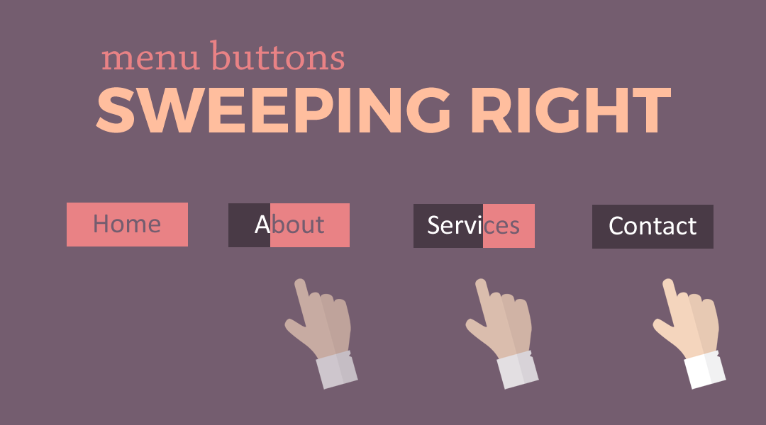
This is the first in a new series I am starting on turning your Divi Menu links into buttons and giving them some cool hover effects.
In this tutorial I am going to show you how you can make Divi Menu buttons with a background that sweeps right when you hover over it.
Let’s Get Started Making The Divi Menu Buttons that Sweep Right
Adding The Custom CSS
If you are working with a child theme you can go to Appearance>Editor and open your stylesheet. If not, go to Appearance>Divi Theme Options>Custom CSS (which is located at the bottom of the first tab in Theme Options)
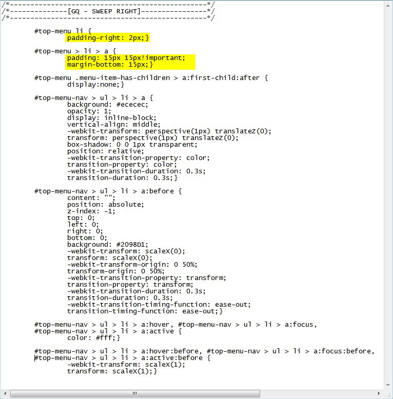
Add this CSS.
/*------------------------------------------------*/
/*--------------[GQ - SWEEP RIGHT]----------------*/
/*------------------------------------------------*/

	#top-menu li {
		padding-right: 2px;}

	#top-menu > li > a {
		padding: 15px 15px!important;
		margin-bottom: 15px;}

	#top-menu .menu-item-has-children > a:first-child:after {
		display:none;}

	#top-menu-nav > ul > li > a {
		background: #ececec;
		opacity: 1;
		-webkit-transform: perspective(1px) translateZ(0);
		transform: perspective(1px) translateZ(0);
		-webkit-transition-property: color;
		transition-property: color;
		-webkit-transition-duration: 0.3s;
		transition-duration: 0.3s;}

	#top-menu-nav > ul > li > a:before {
		content: "";
		position: absolute;
		z-index: -1;
		top: 0;
		left: 0;
		right: 0;
		bottom: 0;
		background: #2098D1;
		-webkit-transform: scaleX(0);
		transform: scaleX(0);
		-webkit-transform-origin: 0 50%;
		transform-origin: 0 50%;
		-webkit-transition-property: transform;
		transition-property: transform;
		-webkit-transition-duration: 0.3s;
		transition-duration: 0.3s;
		-webkit-transition-timing-function: ease-out;
		transition-timing-function: ease-out;}

	#top-menu-nav > ul > li > a:hover,
	#top-menu-nav > ul > li > a:focus,
	#top-menu-nav > ul > li > a:active {
		color: #fff;}

	#top-menu-nav > ul > li > a:hover:before,
	#top-menu-nav > ul > li > a:focus:before,
	#top-menu-nav > ul > li > a:active:before {
		-webkit-transform: scaleX(1);
		transform: scaleX(1);}
Making Adjustments
Now because there are already so many menu padding options available in the Theme Customizer, there is a good chance you may have to adjust the bottom padding of the main buttons. You can change that here.
The following rules change the background colors before and after hover and the font color on hover.

The following rules change the timing of the animation.

And that’s it.
If you used this on one of your projects, please share a link below so we can see how you used it.
Have fun!
Well, that’s all for now. I hope you find this article useful.


hi geno, how do u apply this to a button module?
Hi Achie. Its doable with just a few minor modifications. I will be doing a series on buttons soon so stay tuned.
hi geno how can i apply this into a button module
thanks
I need to do a tutorial on that soon.
I would be keen to see that tutorial. The slider buttons are nice but would be great to apply via a button module and not just as a menu item.
These are great buttons, but how can I apply this to the Divi full-width menu module? I’ve been trying to mess with the selectors but just can’t seem to get it right.
Thanks.
Hah! Of course, right after I posted, I figured it out!
Happens to me all the time 🙂