
This is the second in a new series I am starting on turning your Divi Menu links into buttons and giving them some cool hover effects.
In this tutorial I am going to show you how you can make Divi Menu buttons with a background that slides down when you hover over it.
Let’s Get Started Making The Divi Menu Buttons that Slide Down
Adding The Custom CSS
If you are working with a child theme you can go to Appearance>Editor and open your stylesheet. If not, go to Appearance>Divi Theme Options>Custom CSS (which is located at the bottom of the first tab in Theme Options)
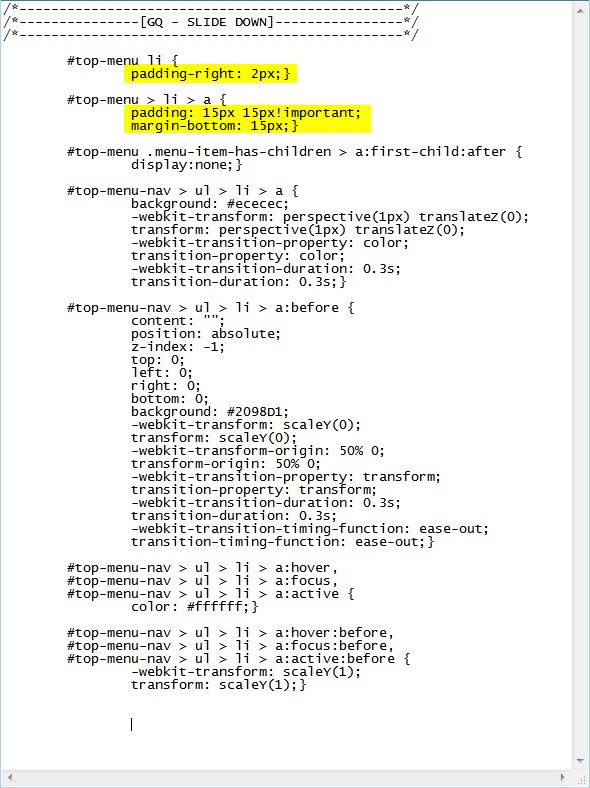
Add this CSS.
/*------------------------------------------------*/
/*---------------[GQ - SLIDE DOWN]----------------*/
/*------------------------------------------------*/

	#top-menu li {
		padding-right: 2px;}

	#top-menu > li > a {
		padding: 15px 15px!important;
		margin-bottom: 15px;}

	#top-menu .menu-item-has-children > a:first-child:after {
		display:none;}

	#top-menu-nav > ul > li > a {
		background: #ececec;
		-webkit-transform: perspective(1px) translateZ(0);
		transform: perspective(1px) translateZ(0);
		-webkit-transition-property: color;
		transition-property: color;
		-webkit-transition-duration: 0.3s;
		transition-duration: 0.3s;}

	#top-menu-nav > ul > li > a:before {
		content: "";
		position: absolute;
		z-index: -1;
		top: 0;
		left: 0;
		right: 0;
		bottom: 0;
		background: #2098D1;
		-webkit-transform: scaleY(0);
		transform: scaleY(0);
		-webkit-transform-origin: 50% 0;
		transform-origin: 50% 0;
		-webkit-transition-property: transform;
		transition-property: transform;
		-webkit-transition-duration: 0.3s;
		transition-duration: 0.3s;
		-webkit-transition-timing-function: ease-out;
		transition-timing-function: ease-out;}

	#top-menu-nav > ul > li > a:hover,
	#top-menu-nav > ul > li > a:focus,
	#top-menu-nav > ul > li > a:active {
		color: #ffffff;}

	#top-menu-nav > ul > li > a:hover:before,
	#top-menu-nav > ul > li > a:focus:before,
	#top-menu-nav > ul > li > a:active:before {
		-webkit-transform: scaleY(1);
		transform: scaleY(1);}
Making Adjustments
Now because there are already so many menu padding options available in the Theme Customizer, there is a good chance you may have to adjust the bottom padding of the main buttons. You can change that here.
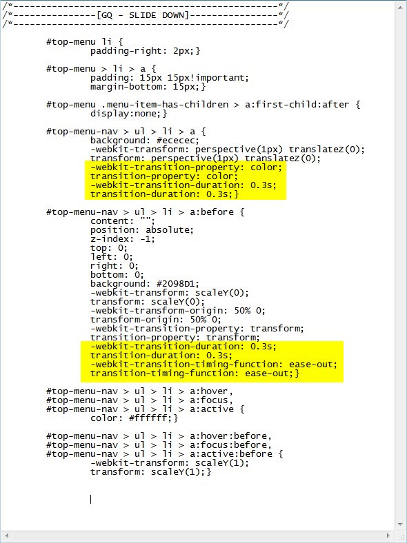
The following rules change the background colors before and after hover and the font color on hover.

The following rules change the timing of the animation.
And that’s it.
If you used this on one of your projects, please share a link below so we can see how you used it.
Have fun!
Well, that’s all for now. I hope you find this article useful.


HI there Geno. First of all I am glad I found this amazing site, it’s been very helpful. quick question if you don’t mind. I am using a a fullwidth menu and wondering how I can apply this to that. Thanks
Just assign the fw menu a custom class and swap out all the default divi menu css with your custom class. Just leave the “a”. That should do it. I plan on doing a series using fullwidth menus pretty soon.
Thanks Geno. I look forward to those videos on that! Again thanks!
can you tell please how to implement this on the sub menu as well?
I will add that to my list 🙂