This is the fifth in a series on turning your Divi Menu links into buttons and giving them some cool hover effects.
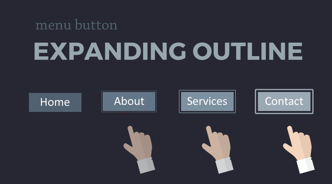
In this tutorial I am going to show you how you can make Divi Menu buttons that have an expanding outline when you mouse over it.
Let’s Get Started Making The Divi Menu Buttons With an Expanding Outline
Adding The Custom CSS
If you are working with a child theme you can go to Appearance>Editor and open your stylesheet. If not, go to Appearance>Divi Theme Options>Custom CSS (which is located at the bottom of the first tab in Theme Options)
Add this CSS.
/*------------------------------------------------*/
/*---------------[GQ - OUTLINE]-------------------*/
/*------------------------------------------------*/

	#top-menu li {
		padding-right: 15px;}

	#top-menu > li > a {
		padding: 15px 15px!important;
		margin-bottom: 15px;}

	#top-menu .menu-item-has-children > a:first-child:after {
		display:none;}

	#top-menu-nav > ul > li > a {
		background: #3173b5;
		color: #ffffff;
		-webkit-transform: perspective(1px) translateZ(0);
		transform: perspective(1px) translateZ(0);
		box-shadow: 0 0 1px transparent;
		position: relative;}

	#top-menu-nav > ul > li > a:before {
		content: '';
		position: absolute;
		border: #3173b5 solid 4px;
		top: 0;
		right: 0;
		bottom: 0;
		left: 0;
		-webkit-transition-duration: 0.3s;
		transition-duration: 0.3s;
		-webkit-transition-property: top, right, bottom, left;
		transition-property: top, right, bottom, left;}

	#top-menu-nav > ul > li > a:hover {
		background: #7230b5;}

	#top-menu-nav > ul > li > a:hover:before,
	#top-menu-nav > ul > li > a:focus:before,
	#top-menu-nav > ul > li > a:active:before {
		border: #7230b5 solid 2px;
		top: -5px;
		right: -5px;
		bottom: -5px;
		left: -5px;}
Making Adjustments
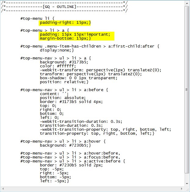
Now because there are already so many menu padding options available in the Theme Customizer, there is a good chance you may have to adjust the bottom padding of the main buttons. You can change that here.
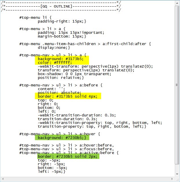
The following rules change the background colors before and after hover and the font color on hover.
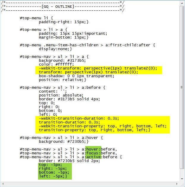
The following rules change the timing of the animation.
And that’s it.
If you used this on one of your projects, please share a link below so we can see how you used it.
Have fun!
Well, that’s all for now. I hope you find this article useful.


Awesome tutorial, thanks for sharing Geno!
Only one question, there is any way to add the “arrow” when is a submenu. Because by adding this code just disappear.
Thanks
This tutorial removes the “arrow” intentionally. You would have to modify the code to bring it back in.
THIS IS GREAT!!!! Is the a way to change the color Of each menu Item (diferent color for each item).
Thanks!
Yes you can target specific menu items. replace these
with this
Create one for each menu item and use your menu item numbers.
GREAT TUTORIAL!!! Thanks!
Is there a way to make same thing but for each menu item in diferent color?
Regards!
See my comment above for Stjepo Hladilo
Many thx for this tutorial : exactly what I was looking for.
What would be the way to keep the hover effect active for the current-menu-item ?
Regards
There is a selector called .current-menu-item used for that current menu item. We just need to experiment with a few different variations of of adding this selector to the existing code. If I come up with it, I will post it on here unless someone beats me to it.