
So for a while now people have wanted to do more with the standard Divi portfolio grid. In fact I have been referring people to the amazing Essential Grid plugin for quite some time now. In fact it is what I have used on many projects including my own Monterey Premier.
But now there is a way to give the native Divi Portfolio Grid some new options without the cost of a premium plugin and without having to have an extra plugin at all.
You can see it in action on Landscapes, A Premium Divi Child Theme.

Click to see live demo
Lets Get Started On The Divi Portfolio Grid
First thing you need to do is create a unique section for the Portfolio Grid
1. Create a new section, open the settings and in the Custom CSS tab, give it the following CSS Class: gq-portfolio-section

2. In the row settings you may want to decrease the custom gutter width. I recommend changing it to 2.

3. Now you are going to insert a Portfolio Module into that section.

4. In General Settings, change the setting to Grid and disable the Categories

5. In Advanced Design Settings, adjust the Hover Overlay Color to rgba(0,0,0,0.5)
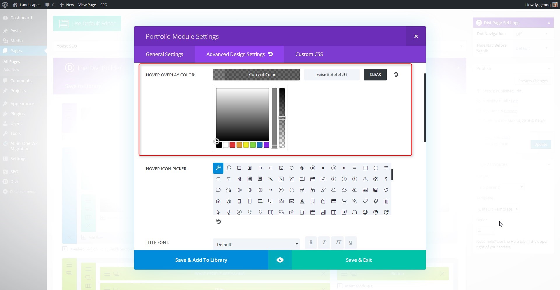
6. Select Save & Exit and Update the page.
The Magic of CSS
Now lets start to dazzle things up a bit with some CSS.
If you are working with a child theme you can go to Appearance>Editor and open your stylesheet. If not, go to Appearance>Divi Theme Options>ePanel>Custom CSS (which is located at the bottom of the ePanel)
Add this CSS.
/*------------------------------------------------*/
/*---------[GQ - CUSTOM PORTFOLIO GRID]-----------*/
/*------------------------------------------------*/
/* Change columns from 4-3 */
@media (min-width: 981px){
.gq-portfolio-section .et_pb_gutters2.et_pb_row .et_pb_column_4_4 .et_pb_grid_item {width: 31.33% !important;}
.gq-portfolio-section .et_pb_column_4_4 .et_pb_grid_item:nth-child(4n+1) {clear: inherit;}
.gq-portfolio-section .et_pb_column_4_4 .et_pb_grid_item:nth-child(4n) {margin-right: 3%!important;}
.gq-portfolio-section .et_pb_column_4_4 .et_pb_grid_item:nth-child(3n) {margin-right: 0%!important;}}
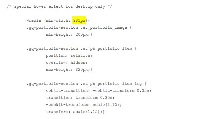
/* special hover effect for desktop only */
@media (min-width: 981px){
.gq-portfolio-section .et_portfolio_image {
min-height: 200px;}
.gq-portfolio-section .et_pb_portfolio_item {
position: relative;
overflow: hidden;
max-height: 320px;}
.gq-portfolio-section .et_pb_portfolio_item img {
webkit-transition: -webkit-transform 0.35s;
transition: transform 0.35s;
-webkit-transform: scale(1.15);
transform: scale(1.15);}
.gq-portfolio-section .et_pb_portfolio_item:hover img {
-webkit-transform: scale(1);
transform: scale(1);}
.gq-portfolio-section .et_pb_portfolio_item h2 {
background-color: #a2c046;
color: #fff;
font-size: 16px;
position:absolute;
text-align:center;
width:100%;
top:100%;
transition:.5s;
webkit-transition:.5s;}
.gq-portfolio-section .et_pb_portfolio_item:hover h2 {
top: 78%;
padding: 15px 0;}
.gq-portfolio-section .et_overlay {z-index: 0;}
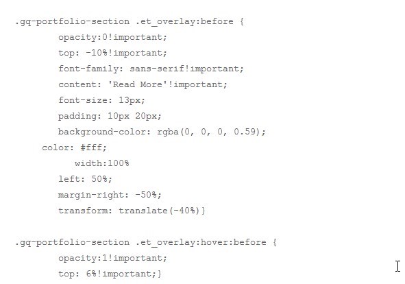
.gq-portfolio-section .et_overlay:before {
opacity:0!important;
top: -10%!important;
font-family: sans-serif!important;
content: 'Read More'!important;
font-size: 13px;
padding: 10px 20px;
background-color: rgba(0, 0, 0, 0.59);
color: #fff;
width:100%
left: 50%;
margin-right: -50%;
transform: translate(-40%)}
.gq-portfolio-section .et_overlay:hover:before {
opacity:1!important;
top: 6%!important;}
}
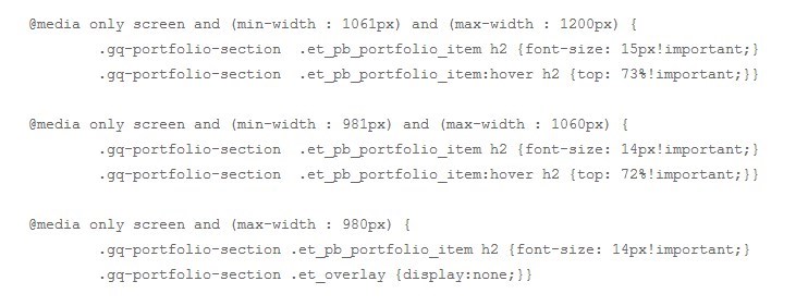
@media only screen and (min-width : 1061px) and (max-width : 1200px) {
.gq-portfolio-section .et_pb_portfolio_item h2 {font-size: 15px!important;}
.gq-portfolio-section .et_pb_portfolio_item:hover h2 {top: 73%!important;}}
@media only screen and (min-width : 981px) and (max-width : 1060px) {
.gq-portfolio-section .et_pb_portfolio_item h2 {font-size: 14px!important;}
.gq-portfolio-section .et_pb_portfolio_item:hover h2 {top: 72%!important;}}
@media only screen and (max-width : 980px) {
.gq-portfolio-section .et_pb_portfolio_item h2 {font-size: 14px!important;}
.gq-portfolio-section .et_overlay {display:none;}}
The first set of code changes the grid from 4 column to three column making the images a little larger.
The next batch of code handles all the hover effects. It has also been designed to work on screens larger that 981px so that it does not ruin the mobile or tablet experience. Since mobile users dont have the option to hover and they can only touch, it pretty much renders the effect useless anyways. But you can always change this code if you want it to work on smaller devices.
You may also adjust the font sizes on a few different screens by adjusting these mobile queries at the end of the custom CSS
And to change the colors looks for these.

This code replaces the icon with the Read More Tab. If you want the icon back just remove this code all together.
And that’s it! Have fun!
Well that’s all for now. I hope you find this article useful.


You get to go to the head of the line for excellence. Thank you.
Muy guapo como siempre, amigo.
Fantastic tutorial – thanks for sharing. Going to give this a try this weekend.
I love this! Any way to display the top of the image rather than the center on the preview?
Is it possible to make this hover effect without a href to the projects page?
Yes I am sure there is a way. Or if you just wanted to add some similar hover effects to just images, check out this cool tutorial: http://divisoup.com/four-more-linkable-image-hover-effects/
Thank you so much for this cool effect. One question, if you don’t mind…. How can I reimplement the title underneath the image for tablets and phones. Right now, there’s nothing when the screen size is reduced. Thank you for considering
You can do that by changing the module settings for your Portfolio Grid. In the General Settings right below Categories is the Show Title option. If that is turned on it should show the title on smaller devices. Hope that helps!
Thank you for replying so quickly. I wish that were the case. I have the Show Title toggled and it doesn’t show up when resizing, just the image.
website: cfrisco.com/attorneys
Thanks for the link to your page, that is helpful. I think that the text color causing this. The title is actually there, but it is white so you cannot see it.
Back in the module settings under General Settings there is a text color setting. If Light is currently selected, then switching it to Dark should resolve this for you. If Dark is already selected then go to the Advanced Design Settings tab and scroll down the the Title Text Color. You can set that to whatever color you’d like to use.
Hope that helps!
You are a badass! Thank you
Excited about this one. I tried it on a standard gallery grid (not portfolio) and it doesn’t work. Would you happen to have a fix for that module?
Sorry Simone, we do not yet have the CSS worked out for that. It is on our list of things to do one day.
Oh nooo! I want this so bad for the grid option. Please make it happen for 2017, pretty please 😉
Geno, this works great and thanks for posting these tips. My only question is how can I stop the featured images that comprise the portfolio grid layout from being cropped in the upload process? We want the images to be square and what’s happening is they are displaying square but the dimensions are not square. Ideas on this?
You might want to check out this tutorial from our friends at Divi Space: https://divi.space/divi-tutorials/how-to-change-the-size-aspect-ratios-of-the-portfolio-grid-images/
Hi Geno
I have followed this tutorial, and one of the other tutorials you have which is similar and nothing is happening. I’m very new to css and perhaps I am copying the code into the wrong place.
I have a child theme and have copied the code from your tutorial into the child theme style.css stylesheet. Then I update the file but there is no change in my page. Do I need to do anything else?
Many thanks
Felicity
Hello Felicity! There are a couple of things that could be happening. I would double check the first part of most of these tutorials which is adding a class to elements on the page. If that is not done correctly, then the CSS in the stylesheet will not have any affect on it.
Thank you so much for providing this tutorial and CSS code! I’ve been trying to model the portfolio grid at this website http://doers.sg/work/ and thanks to you and the additional CSS from Divi Space, I’ve managed to put something together that is close to what I’m trying to achieve: http://javelina.cloudaccess.host/results/
I would love your input, though, on a couple things:
1) The images are distorted/blurry. Do you have any insight as to why that might be? It doesn’t matter if I use square or rectangle images.
2) I’d like to keep the titles static on mobile so that they’re always present, but not readily finding the CSS to do that. Can you point me in the right direction?
Thank you! 🙂
Hello, why in mobile version not work this code?
I used mobile queries to prevent it from being applied in mobile. You would have to add a lot of additional css & mobile queries to get it looking good on small devices.
Hello,
Thanks a lot for your tutorial.
At the second line there is a shift to the second picture => http://www.erkanbatiment.com/activites/
Try changing this part of the code from a percentage to px.
.gq-portfolio-section .et_pb_column_4_4 .et_pb_grid_item:nth-child(4n) { margin-right: 24px!important; }i need your help please i want to make my website menu look like that website http://www.northbrisbanehomeloans.com.au/
i want to create border please help me how can i do that
Take a look at the menu tutorials I have already done. You will find some that are very similar https://quiroz.co/category/menus/
Hello Geno,
I need your help please. I want to make portfolio with this two diferents effects, look like that website http://www.viveunaexperiencia.com. and https://viveunaexperiencia.com/experiencias/gastronomia/
Please help me how can i do that
It would take a bit of custom CSS to apply those hover effects but it is doable. I will add that to my list of things to explore.
Okay! thank you very much. I’ll wait:)
I’ve been struggling with creating a 3 column portfolio grid… and have tried at least 5 different solutions from the ET support forum with no success. I found this article from a search, and I have to say your code (and your easy to follow explanation of each section) got me up and running with my own customizations in less than 15 minutes. I’m going to start at your site first next time I have an issue or customization question. Thanks!! ?
Awww Thanks Heather. I really appreciate success stories like this 🙂
Hey!
I’m using a two lines portfolio grid and I implemented the CSS code above but titles display below the second line. Can you help me ?
Tx.
That would take a bit of time to write the new breaks. Sorry.
Thank you very much for this tutorial, Geno. Appreciate your contribution to the community. I’ve used the code on my own site but I don’t know what happened but the grid was broken for reasons, I don’t know. Must be from an update I did with Divi. Do you have any idea which part of the code I need to update to fix this?
Snapshot: https://pic.ito.ph/images/2018/09/09/3columnissue.th.png
Try changing this part of the code from a percentage to px.
.gq-portfolio-section .et_pb_column_4_4 .et_pb_grid_item:nth-child(4n) { margin-right: 24px!important; }Sorry, I’ve pasted the thumbnail. here’s the full snapshot.
https://pic.ito.ph/image/KtvR
can you please share the mobile query? i really need it.
In this tutorial, I used mobile queries to prevent it from being applied in mobile. You would have to add a lot of additional css & mobile queries to get it looking good on small devices.
Como siempre, gracias very much!
Great tutorial, thank you. I have an issue, and I’m sure it’s an oversight on my part. On my home page everything works well, but I also have portfolios showing on some other project pages. For some reason on the other pages the 3 column CSS doesn’t seem to work. Everything else works just fine, it’s just still showing 4 columns. Any ideas?
Hi Adri Bleier please make sure that portfolio section on all pages have the required class ‘ gq-portfolio-section ‘ also if you can share a link to your website/portfolio page that will help us in debugging and finding the issue 🙂
I love this. For some reason though the title text is appearing under the overlay on the latest version of Divi