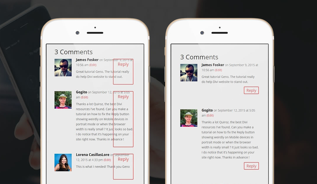
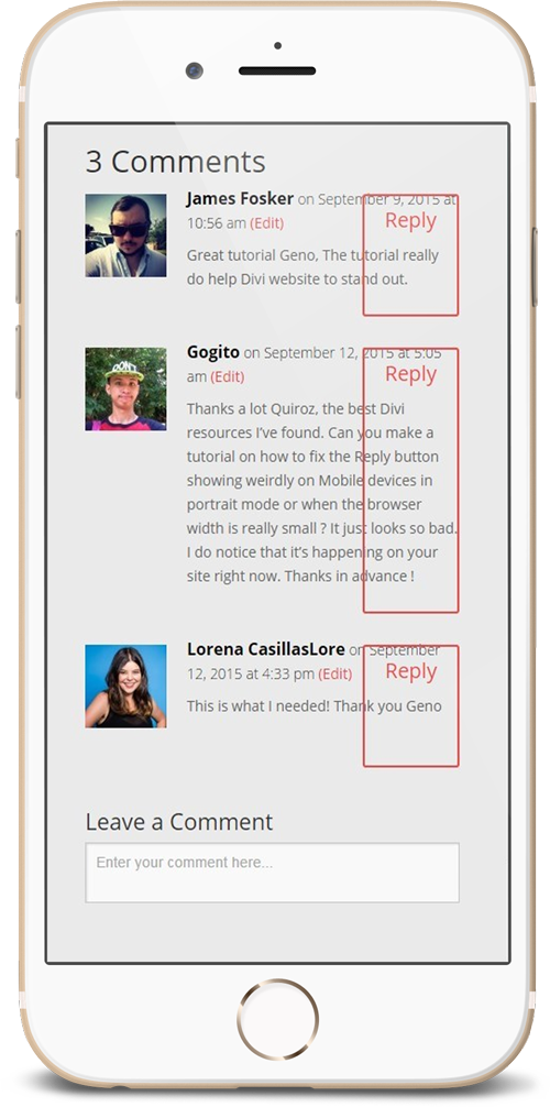
On almost every website I have built on Divi, the default Divi Reply button in the comments area of the post pages always seems to be off in Mobile devices. Like this image below.
So here is how you can fix the Divi reply button on mobile devices using just a little CSS.
If you are working with a child theme you can go to Appearance>Editor and open your stylesheet. If not go to Divi>Theme Options. This will open up the ePanel. Now scroll down until you get to the Custom CSS box on the bottom of this page.
Add this CSS.
/*------------------------------------------------*/
/*---------[COMMENTS REPLY BUTTON FIX]------------*/
/*-------------[ BY GENO QUIROZ ]-----------------*/
/*------------------------------------------------*/

@media only screen and ( max-width: 767px ) {
	.comment {padding-bottom: 60px;}
	.comment_area .comment-reply-link {
    		top: auto;
    		bottom: -45px;
    		padding: 0px 10px;
    		font-size: 18px;}}
What did we just do?
We added 2 Rule Set’s in a media query set to initiate on devices with a screen width smaller that 767px.
The first rule set added a little space (padding) in between each comment.
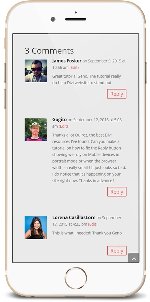
The second rule set targeted the button itself. The Declaration block is telling the browser to bring the button down a bit, remove some of the button padding to make it a little smaller and to decrease the font size just a tad. And now you have should have something like this.
Well that’s all for now. I hope you find this article useful.


Thanks this worked awesome.
Thanks. No more messed up reply buttons on http://popeller.io/index.php/2015/10/09/bitcoin-block-propagation-with-iblt-infographic/
¡Gran consejo y ejemplo! ¡Gracias!
Sería genial contar con una actualización que funionará en Divi 3
😀