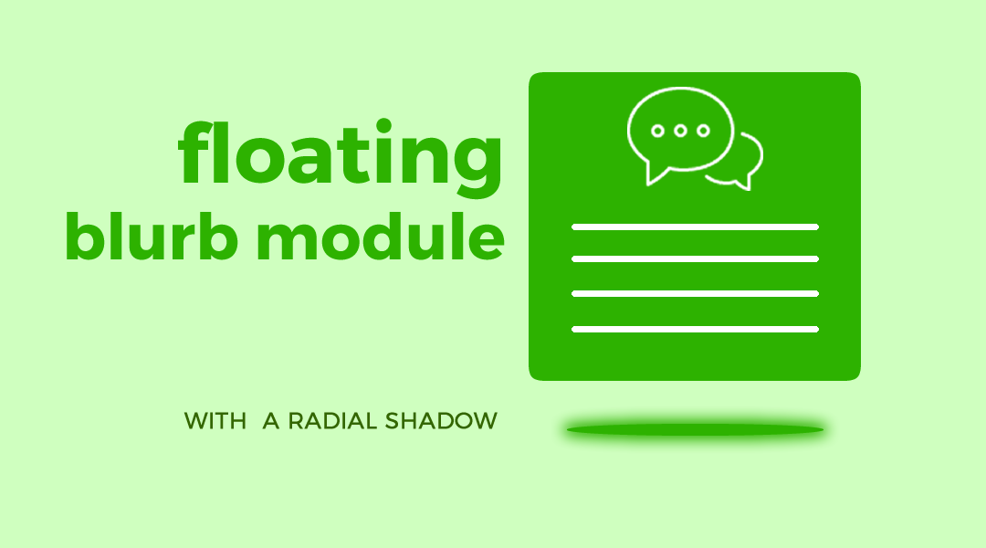
I started a series on adding some spice to the Divi Blurb Module and it it has been a lot of fun.
So in this tutorial I am going to show you how you can make your Blurb float upwards with a cool radial shadow below it when you hover anywhere over the blurb.
Let’s Get Started
Creating the Modules
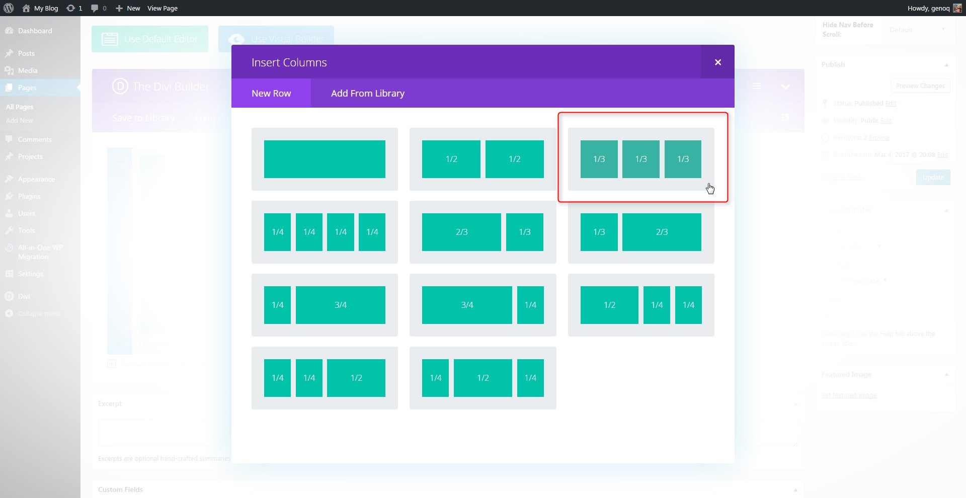
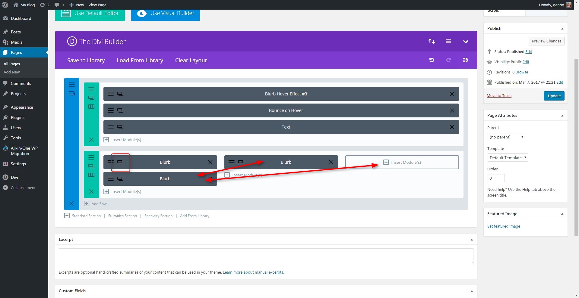
The first thing we are going to do is create a 3 column row. You can use other column options but I think 3 is the perfect layout for this feature.
1. In the section you want to add the modules, create a new 3-column row
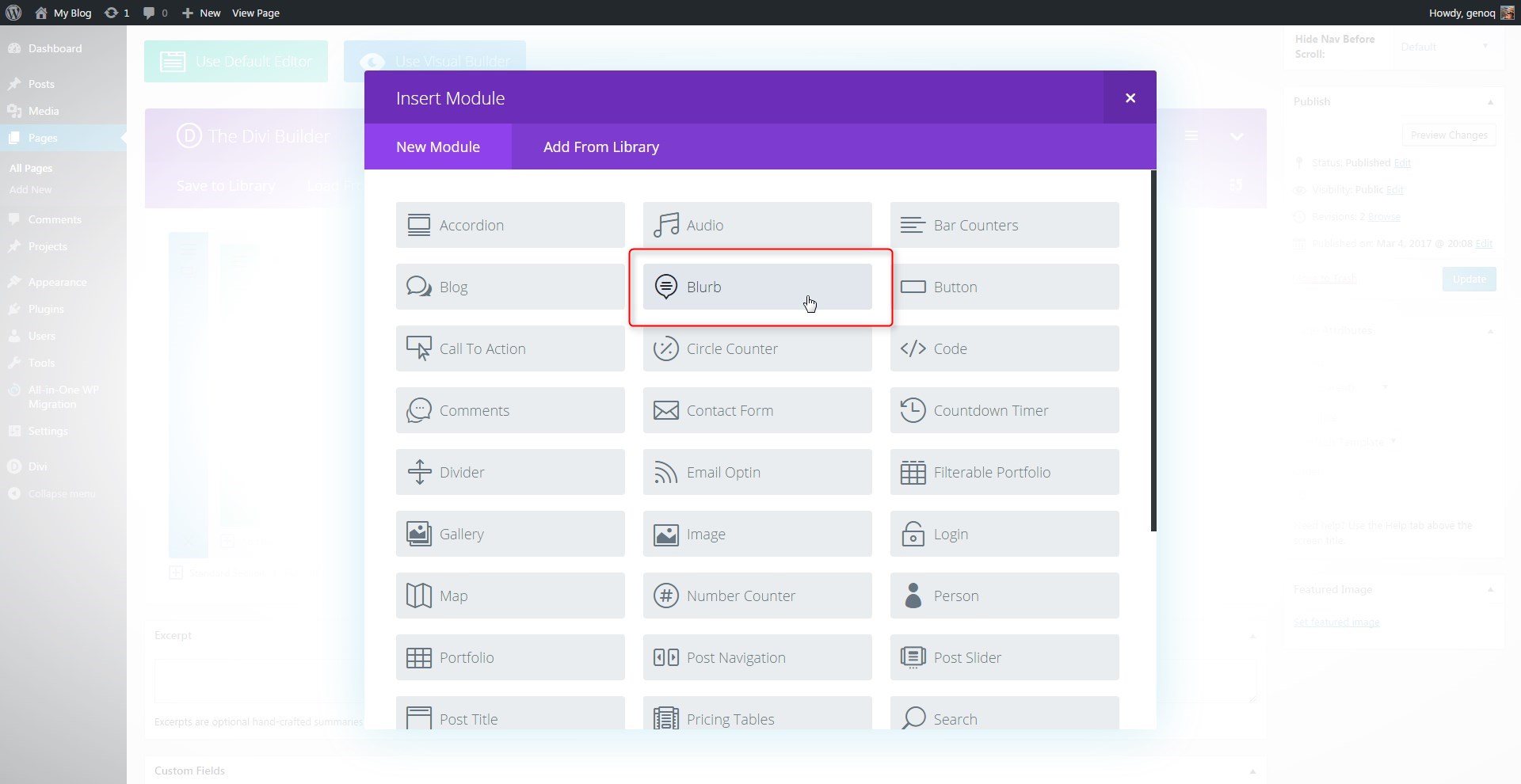
2. Next you will add a blurb module in the first column.
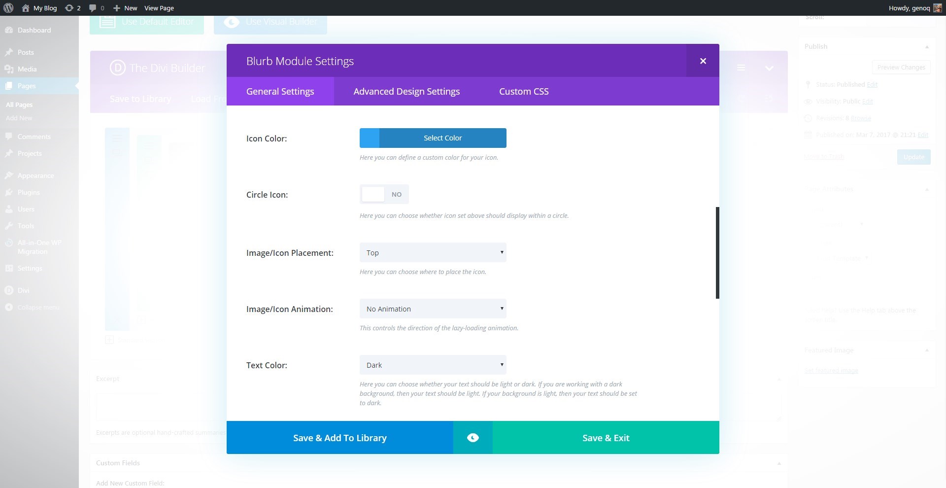
3. Open up the blurb settings and give it a title, url and an Icon. You could use an image if you wanted to but in this tutorial I will stick with the icons.
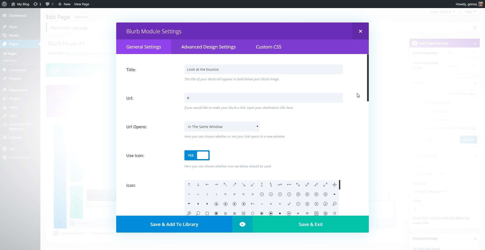
4. Give the icon a color, Image Placement is on the top, turn off animation and add content.
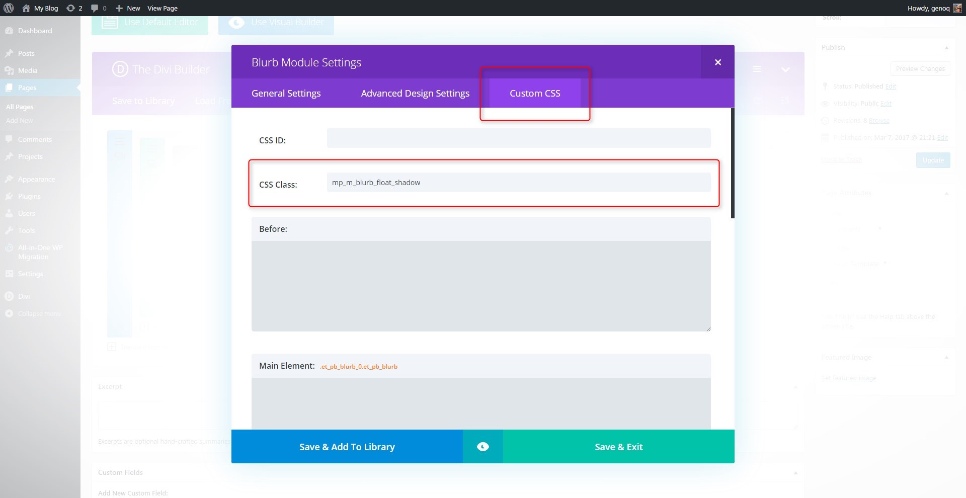
5. Now open up the “Custom CSS” tab and give the blurb module the following class: mp_m_blurb_float_shadow
6. Select “Save and Exit” and then clone the blurb module twice and then move the extra two over into the next two columns. That way you only have to change the title, image and content on the other two.
Adding The Custom CSS
If you are working with a child theme you can go to Appearance>Editor and open your stylesheet. If not, go to Appearance>Divi Theme Options>Custom CSS (which is located at the bottom of the first tab in Theme Options)
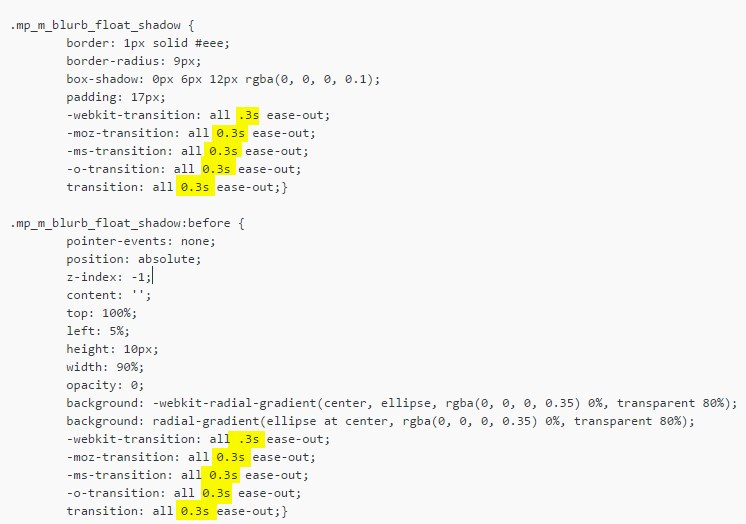
Add this CSS
/*------------------------------------------------*/
/*---------------[GQ BLURB FLOAT]-----------------*/
/*------------------------------------------------*/
.mp_m_blurb_float_shadow {
border: 1px solid #eee;
border-radius: 9px;
box-shadow: 0px 6px 12px rgba(0, 0, 0, 0.1);
padding: 17px;
-webkit-transition: all .3s ease-out;
-moz-transition: all 0.3s ease-out;
-ms-transition: all 0.3s ease-out;
-o-transition: all 0.3s ease-out;
transition: all 0.3s ease-out;}
.mp_m_blurb_float_shadow:before {
pointer-events: none;
position: absolute;
z-index: -1;
content: '';
top: 100%;
left: 5%;
height: 10px;
width: 90%;
opacity: 0;
background: -webkit-radial-gradient(center, ellipse, rgba(0, 0, 0, 0.35) 0%, transparent 80%);
background: radial-gradient(ellipse at center, rgba(0, 0, 0, 0.35) 0%, transparent 80%);
-webkit-transition: all .3s ease-out;
-moz-transition: all 0.3s ease-out;
-ms-transition: all 0.3s ease-out;
-o-transition: all 0.3s ease-out;
transition: all 0.3s ease-out;}
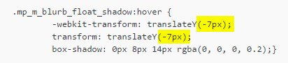
.mp_m_blurb_float_shadow:hover {
-webkit-transform: translateY(-7px);
transform: translateY(-7px);
box-shadow: 0px 8px 14px rgba(0, 0, 0, 0.2);}
.mp_m_blurb_float_shadow:hover:before {
opacity:1;
top: 106%;
height: 15px;}
If you want to speed up the animation process, just decrease the animation speed.
If you want to have the blurb float higher or lower, just adjust the hover transform: translateY
And that’s it.
If you used this one one of your projects, please share a link below so we can see how you used it.
Have fun!
Well, that’s all for now. I hope you find this article useful.


wicked. thanks!
Looks great but does not work on two different sites
Strange. It works on all the sites I have used this on. You might be having a caching issue with your sites (or browser)
As always, thank you Q!
My pleasure Devin
It looks really neat, thank you Geno!
question: can you point me in the direction of some resource to be able to do the growing box on scroll that you have here?
I have been trying to find something like that on google but can’t find the appropriate name for it 🙁
Thanks!
Hi MAddie. A tutorial can be found here http://www.robertmeans.net/div-transitions/
Great!, Thank you!!
My pleasure.
Hey Geno .. love what you do for us .. the Divi users … where u say to drop the CSS above into ur CSS style sheet? Is there anywhere in particular it has to go, or can I just dump it somewhere and let the system work it out? Cheers
.
Thanks 🙂
If you are using a child theme, you can pretty much dump it anywhere on the stylesheet (style.css). I usually add my new css towards the bottom so I can always see what is the most recent. If you are not using a child theme, I recommend adding it to the css box located in – Divi Theme Options > Custom CSS
Thanks for this great tutorial. The only thing is that the blurbs are of different height depending on the content. Is there any way to make all blurbs equal in height?
Thanks!!
The only way to do that is if you choose the row setting to make all columns equal height but that really won’t work with this tutorial. You would have to target the columns instead of the blurb modules. And since the equal columns requires a hidden overflow, it makes it a lot more trickier. I suggest using the same number of words for each blurb.
Hi.. I am a Big Fan of your.. and enjoying of your Tutorials.. I have a request Could you please provide me css or give some tips How we Floating Grid Blog Module.. Like when any users put mouse the grid has gone up and behind some shadow.. Thanks
I will be working on a blog module series soon 🙂
Thanks Mr. Geno, Its Work
Awesome. Thanks for taking the time to comment as well. I appreciate it.
Awesome Geno! How would I eliminate the 2nd shadow that pops up underneath the blurb? I’m trying to get the hover effect without the 2nd shadow underneath. Thanks for another great tutorial!
Hi Michael. The css for the shadow on the bottom is this. You can remove this all together if you do not want it included.
.mp_m_blurb_float_shadow:before { pointer-events: none; position: absolute; z-index: -1; content: ''; top: 100%; left: 5%; height: 10px; width: 90%; opacity: 0; background: -webkit-radial-gradient(center, ellipse, rgba(0, 0, 0, 0.35) 0%, transparent 80%); background: radial-gradient(ellipse at center, rgba(0, 0, 0, 0.35) 0%, transparent 80%); -webkit-transition: all .3s ease-out; -moz-transition: all 0.3s ease-out; -ms-transition: all 0.3s ease-out; -o-transition: all 0.3s ease-out; transition: all 0.3s ease-out;} .mp_m_blurb_float_shadow:hover:before { opacity:1; top: 106%; height: 15px;}How would I eliminate the white that surrounds me blue when I upload an image in the blurb? Maybe some part of the CSS I can edit?
Thanks MC
I am not sure what you are referring to. Do you have a link?