*This tutorial has not been tested in Divi 2.4 or above
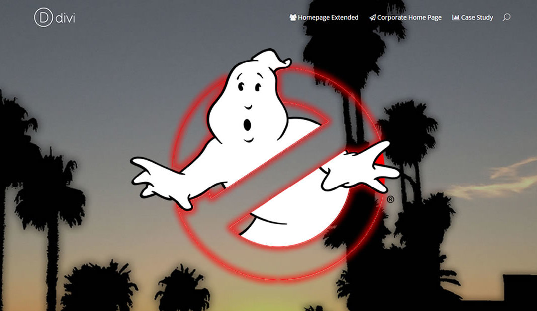
First of all, this is not another post about how ghosts are taking over the internet so if that’s what you are looking for you can leave this post now.
And if you are wondering why you never heard about ghosts taking over the internet, then perhaps you just found your niche blog because I haven’t either.
Okay now that you know why I am a designer and not a comedian let me explain what a ghost landing page is.
It is a term that was given to pages that typically have a huge image taking up the whole screen with text, menus, logos and even call to action buttons that have a transparent feel. No solid background colors covering up the image.
Take this page I did for Nick Lemau for example…
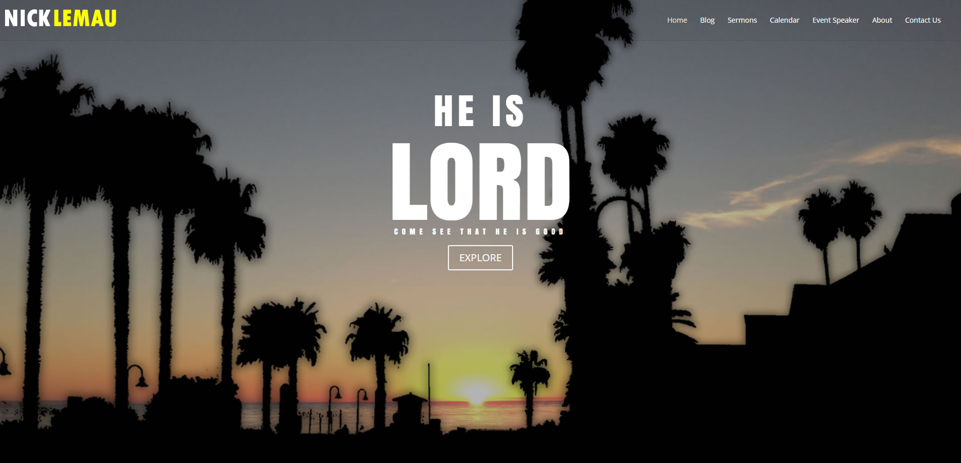
So in this tutorial I want to show you how you can recreate this effect in Divi. And I want to show you how you can have a header menu background start off transparent and fade to a darker transparent color once you begin to scroll down.
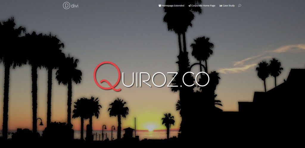
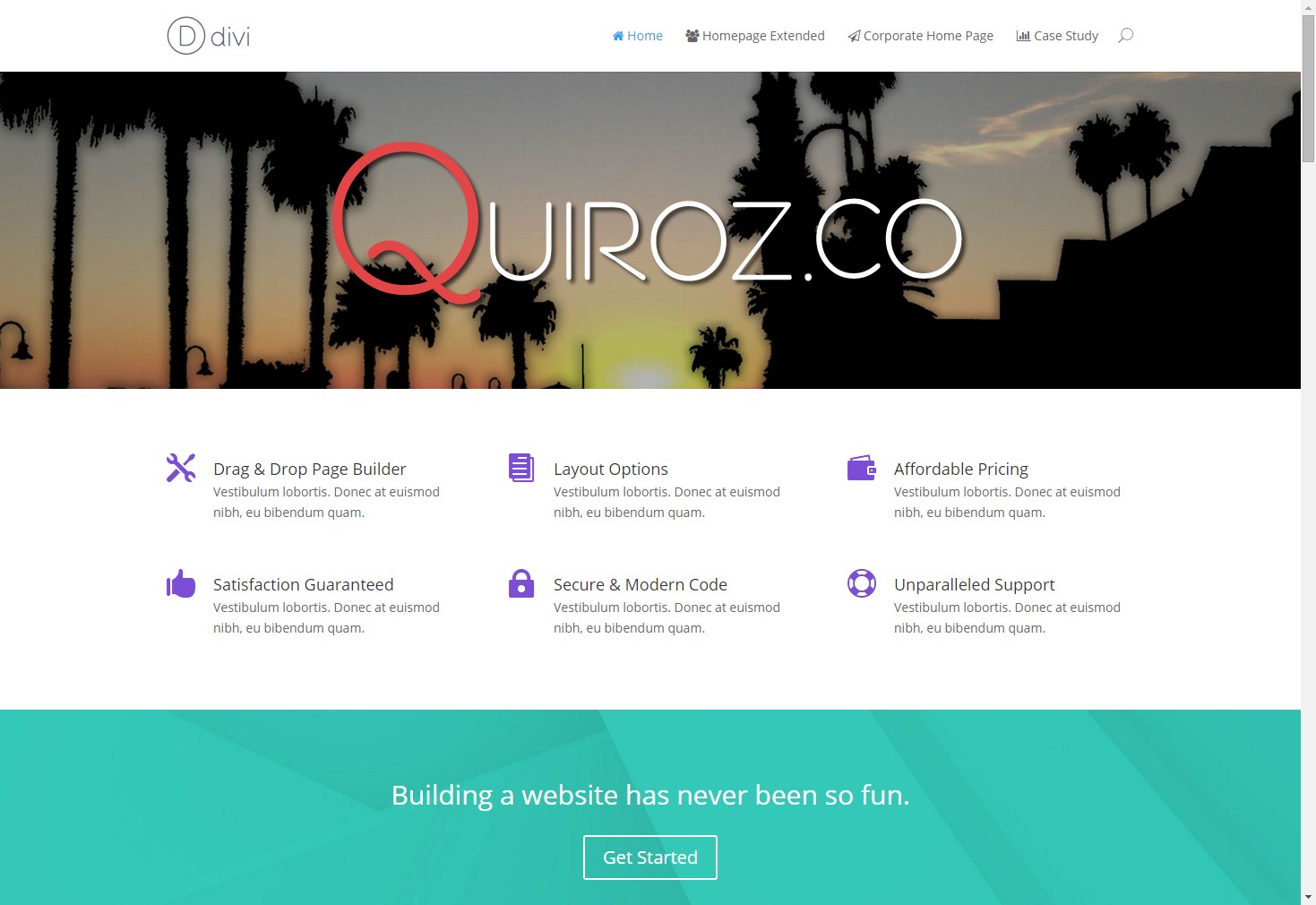
Here is the demo page that we will be re-creating in this tutorial. https://quiroz.co/2014-Demo/
So Let’s begin!
Add The Landing Image To Your Divi Page
1. Open up your home page and create a new Section and insert a Single Column
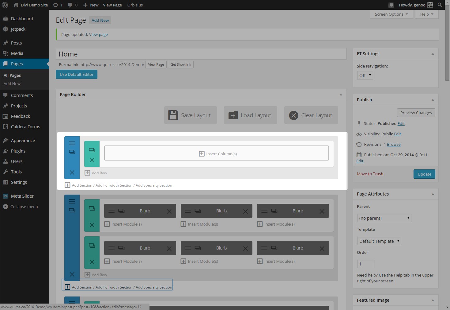
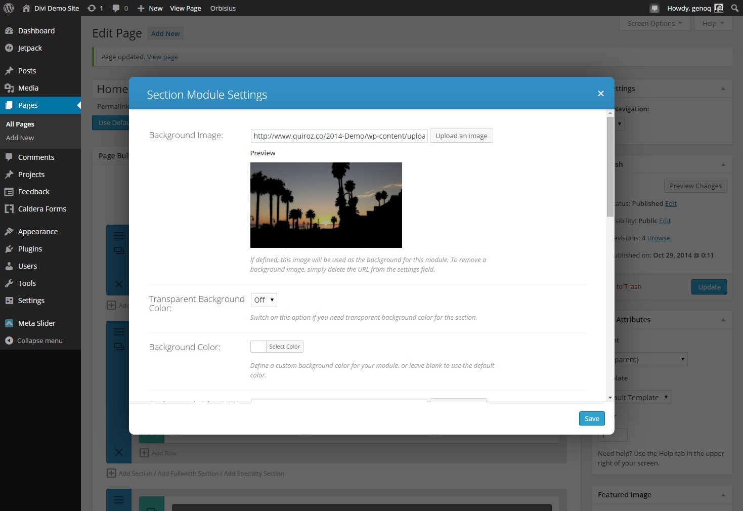
2. Open up the section module settings and choose the background image you want to use. This image should be at least 1920 x 1080 if you want it to take up the whole screen of a large monitor and still have good resolution.
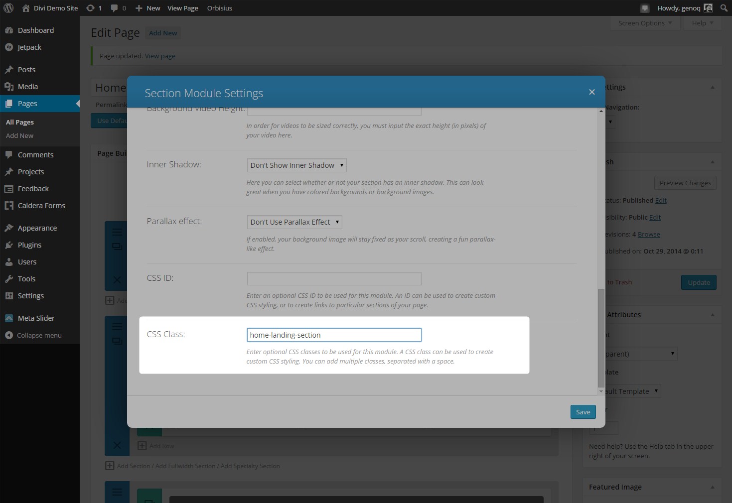
3. While you are still in the settings panel go ahead and give the section a unique CSS ID. I used home-landing-section in my example.
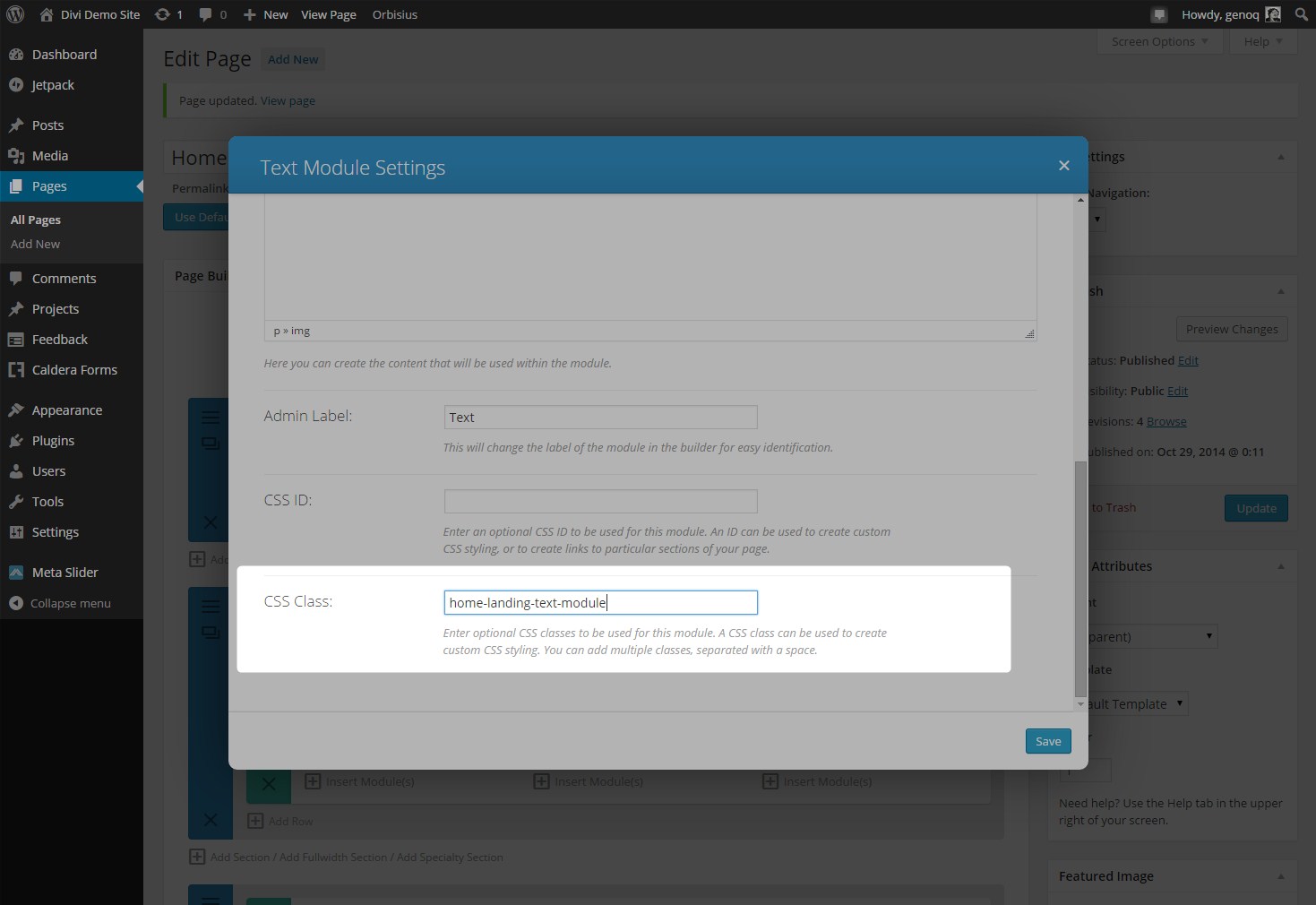
4. Once you have saved your settings you can insert a module. It can be a call to action module, image module or simply a text module. For this example I will use a text module and add an image.
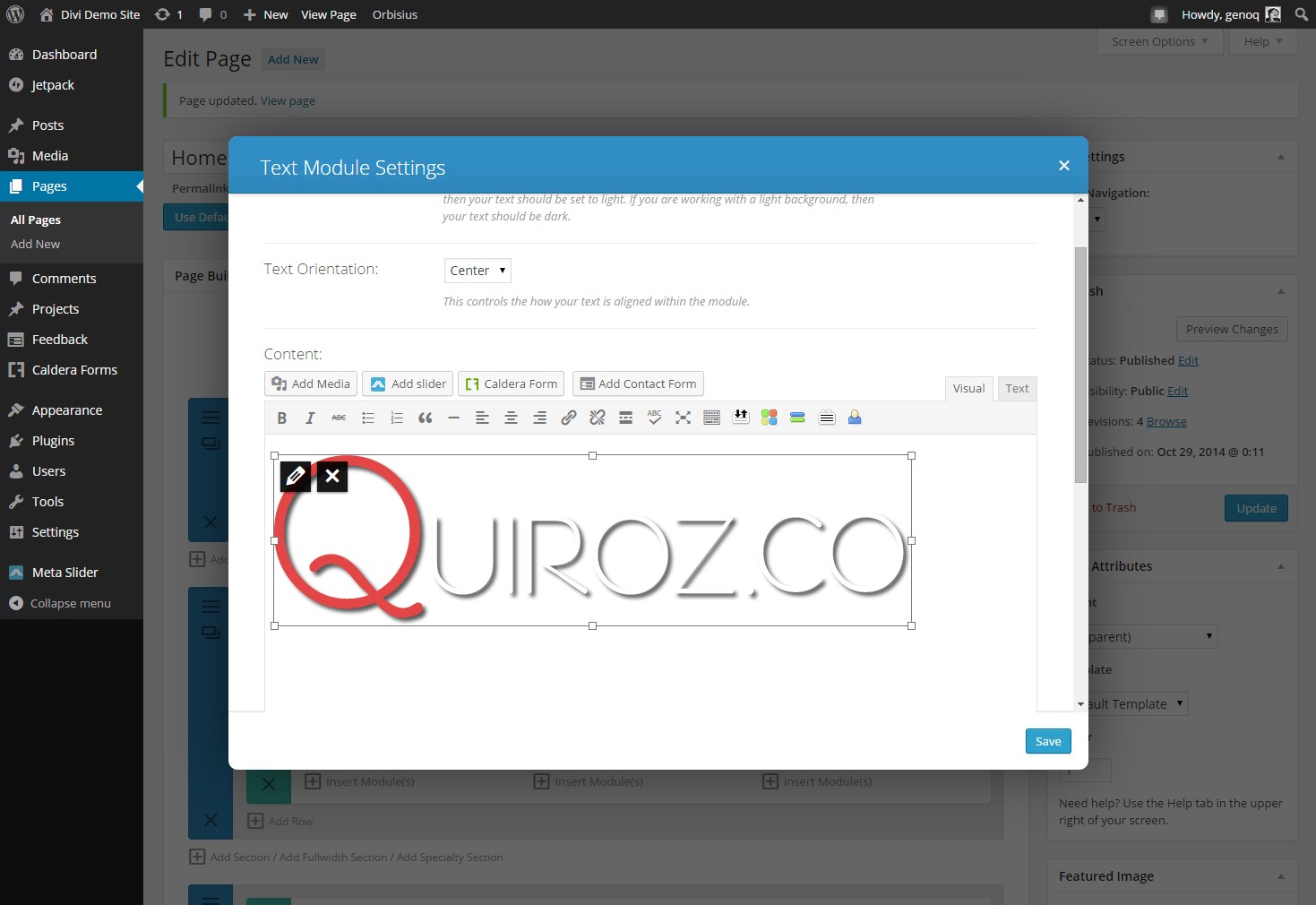
5. Change Text Orientation to Center and go ahead and give it a unique CSS ID. In this example I will use home-landing-text-module.
6. At this point you page might look something like this depending on your existing content and menu settings and before we start adjusting height, placement and the header menu.
Change Menu Transparency and Move Landing Section Up Behind Header
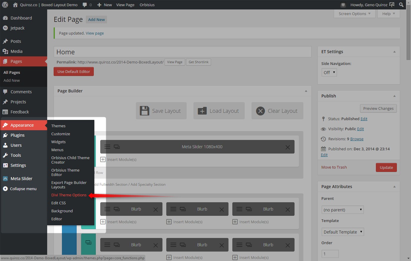
1. Go to your Divi theme ePanel . Go to Appearance>Divi Theme Options
2. Scroll down to the bottom of the page down to the Custom CSS panel where you will copy this CSS and paste it into that ePanel in order to move the image up behind the menu.
.home-landing-section {height:1000px; top:-80px; }
3. Just below that you will add this to change the header background to a transparent color and the second line makes the background a little darker when you scroll down.
/*original state*/
.page #main-header, .post #main-header, .single #main-header {background-color:rgba(31,31,31,1)!important;}
.home #main-header{
background-color: rgba(31,31,31,0.00) !important;
box-shadow: 0 1px 0 rgba(0, 0, 0, 0.0);
-moz-box-shadow: 0 1px 0 rgba(0, 0, 0, 0.0);
-webkit-box-shadow: 0 1px 0 rgba(0, 0, 0, 0.0);}

/*scrolling state*/
#main-header.et-fixed-header {background-color: rgba(31,31,31,0.6) !important;}
The above code is set to make this transition on only the homepage. I assume the other pages wont have this ghost style. If they do just remove line 02 above and remove .home in line 03.
4. Now lets give that menu some colors that stand out and match our theme style.
/*Menu*/
#top-menu a {color: #fff!important;}
#top-menu a:hover {color: #ef4a4a!important;}
#top-menu li.current-menu-ancestor > a {color: #ef4a4a!important;}
#top-menu li.current-menu-item > a {color: #ef4a4a!important;}
#et_search_icon {color:#fff!important;}
#et_search_icon:hover {color: #ef4a4a!important;}
5. This following snippet will make sure your sub-menu matches the color scheme above. Remember you can just replace the color codes with your own colors.
/* Sub-Menu */
#top-menu li li a {color:#ededed!important;}
#top-menu li li a:hover {color:#ef4a4a!important; background:#1e2024!important;}
.nav li ul {background: rgba(30, 31, 34, 0.73)!important;}
.sub-menu {border-color:#ef4a4a!important;}
#et_search_icon {color: #cfcfcf!important;}
6. Now let’s go ahead and move that image I added in the text module down a little bit.
/* Landing Page Text Module Image */
.home-landing-text-module img {padding-top:300px;}
7. Now you will notice there is a large gap between this first landing section and the next section. What you will need to do to remove that gap is give the second section a unique CSS Class and then give it a negative margin of -80px. Your code will look something like this…
.your-new-section-name {margin-top: -80px;}
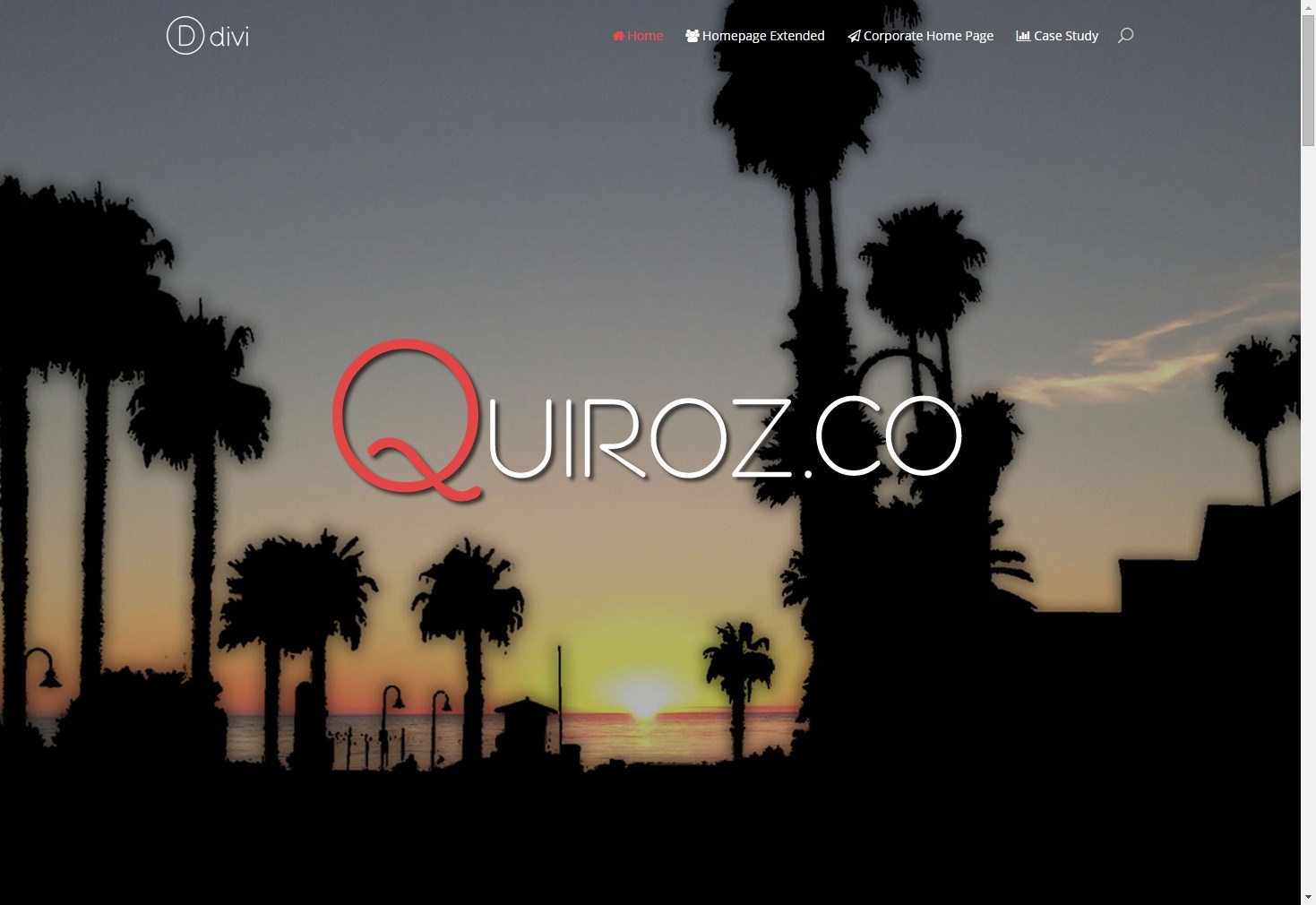
8. Good Job – Now you page should look something like this. Pat yourself on the back
Side Note: You may have to experiment with the mobile/responsive layouts. You can change the height of the landing page section and the padding above the logo by using the above elements within the responsive elements as listed below. You can simply add the modified code in the section listed as .your-custom-class-id {your modified code:xxxxx;} in the examples below.
/*------------------------------------------------*/
/*---------------------[RWD]----------------------*/
/*------------------------------------------------*/

/* LAPTOP (981-1100) */
	@media only screen
	and ( min-width: 981px )
	and ( max-width: 1100px ) {
	.your-custom-class-id {your modified code:xxxxx;}
	}

/* TABLETS (768-980) */
	@media only screen and (max-width : 980px) {
	.your-custom-class-id {your modified code:xxxxx;}
	}

/* MINI TABLETS (480-767) */
	@media only screen and ( max-width: 767px ) {
	.your-custom-class-id {your modified code:xxxxx;}
	}

/* CELL PHONES */
	@media only screen and ( max-width: 479px ) {
	.your-custom-class-id {your modified code:xxxxx;}
	}
Optional 1 – Alternative modification to make sure the header modifications are restricted to the homepage.
Go to where you placed this code from the above tutorial…
#top-menu a {color: #fff!important;}
#top-menu a:hover {color: #dbdbdb!important;}
#top-menu li.current-menu-ancestor > a {color: #dbdbdb!important;}
#top-menu li.current-menu-item > a {color: #dbdbdb!important;}
#et_search_icon {color:#fff!important;}
#et_search_icon:hover {color: #dbdbdb!important;}
And replace it with this…
.home #top-menu a {color: #fff!important;}
.home #top-menu a:hover {color: #dbdbdb!important;}
.home #top-menu li.current-menu-ancestor > a {color: #dbdbdb!important;}
.home #top-menu li.current-menu-item > a {color: #dbdbdb!important;}
.home #et_search_icon {color:#fff!important;}
.home #et_search_icon:hover {color: #dbdbdb!important;}
And now you can remove this one all together
.page #main-header, .post #main-header, .single #main-header {background-color: rgba(31,31,31,1)!important;}
Optional 2 – Remove the Home Page Menu Button on the Home Page Only
Since we are aiming for a minimalist ghost style, then why not remove the home menu button on this homepage only. Heres how you can do that.
1. Using Chrome Dev Tools, right click on the Home page menu item and select Inspect Element.
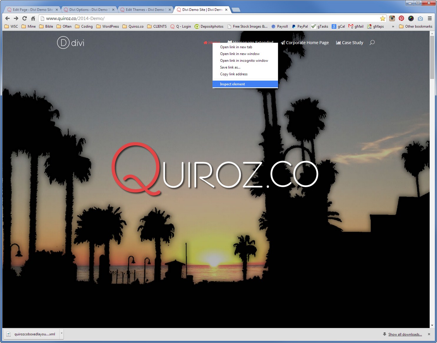
2. You will see in the Elements screen what the menu item id number is. On our page it is menu-item-1370. It is different for each site so look closely at the image attached to see where you will look to find yours.
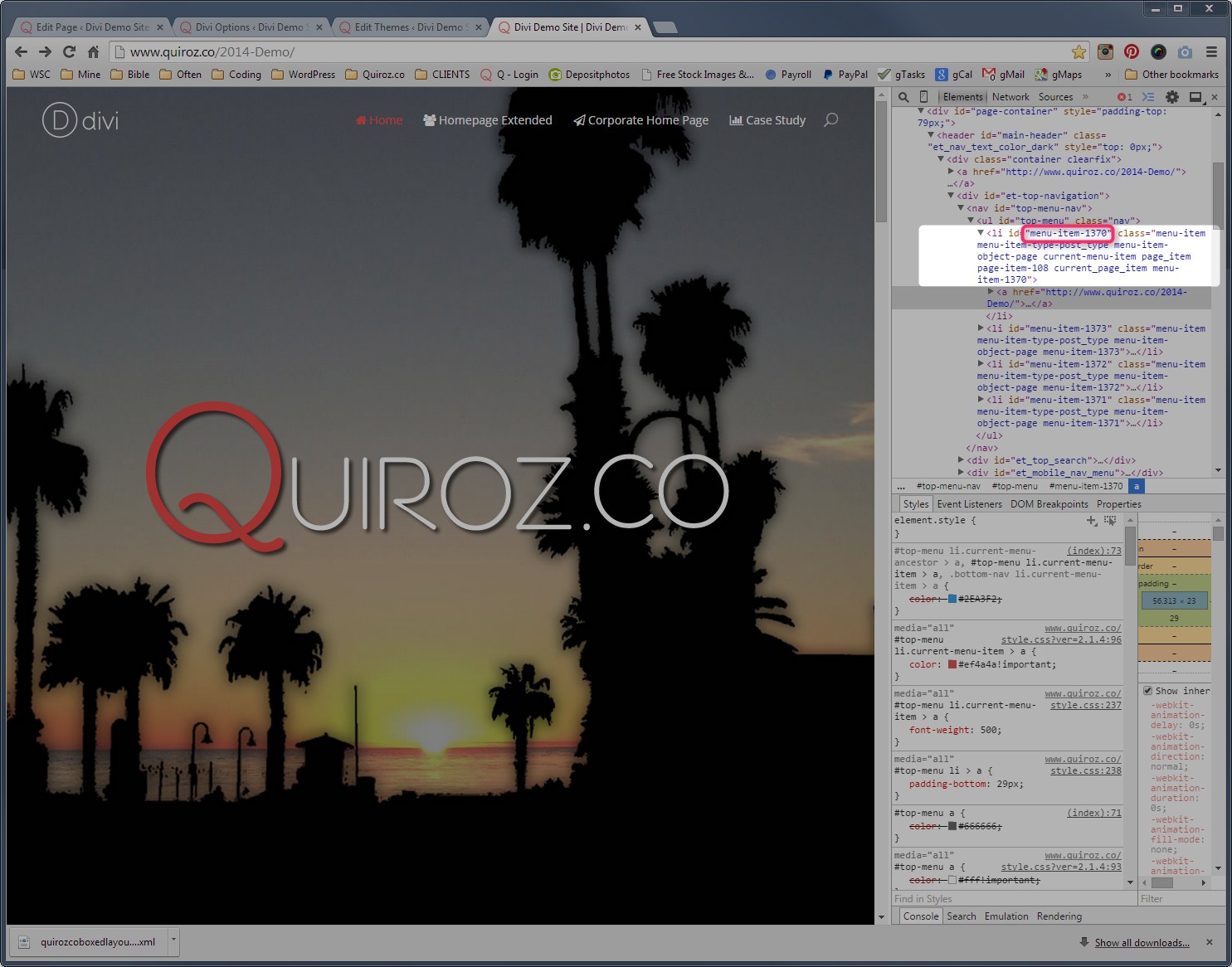
3. Now go back to your ePanel and add this code. Remember to replace the menu id with your own specific menu item id.
/*Remove Home Menu Item On Homepage Only */
.home .menu-item-1370 {display:none!important;}
Optional 3 – Expand Logo and Main Menu All The Way to the Right and Left of the Screen
I recently posted a tutorial on moving the header logo all the way to the left of the screen and moving the header menu all the way to the right of the screen.
It is what I did on the Nick Lemau website and I think it’s perfect for a ghost styled landing page. You can view those instructions here.
Well that’s all for now. I hope you find this article useful.


This post is fantastic! Thank you so much Geno, I need to find the perfect client to use this for, I can’t wait!
Thanks Eileen! Appreciate it very much!
Very cool… thanks Geno.
Anytime 🙂
I’m unable to get such kind of view. please help me out for the same and not able to find a .your-custom-class-id {your modified code:xxxxx;}.
Thanks in advance.
Hi Prabhjas. You will have to give the Section a custom css class. In my example I used home-landing-section as mentioned in #3 above. If you use the same exact name, then you can use .home-landing-section in the custom css. If you are not sure how to do this you can see an example here http://mostawesometech.com/2014/07/23/add-custom-css-module-divi-elegant-themes/
Thanks a lot for your guidance it worked for me. And sorry for a late reply!
This is fantastic. I hope to be able to try this with a site very soon. Thank you for all your demos. It is wonderful to find someone so willing to share with strangers.
is it possible to get this affect on other pages not just the home page?
If you want it to appear on every page just replace this…
.page #main-header, .post #main-header, .single #main-header {background-color:rgba(31,31,31,1)!important;}
.home #main-header{
background-color: rgba(31,31,31,0.00) !important;
box-shadow: 0 1px 0 rgba(0, 0, 0, 0.0);
-moz-box-shadow: 0 1px 0 rgba(0, 0, 0, 0.0);
-webkit-box-shadow: 0 1px 0 rgba(0, 0, 0, 0.0);}
with this…
#main-header{ background-color: rgba(31,31,31,0.00) !important; box-shadow: 0 1px 0 rgba(0, 0, 0, 0.0); -moz-box-shadow: 0 1px 0 rgba(0, 0, 0, 0.0); -webkit-box-shadow: 0 1px 0 rgba(0, 0, 0, 0.0);}This is awesome! is there a way to get it to appear on a non-home page but not appear on all pages (like if I wanted to have a transparent menu just on blog posts)?
YEs each page type has a class. .home, .page, .single, .archive etc… You just have to play around with the css to target the page type
Hello and thanks for this excellent post! I am working on the same issue as Aaron. I have a page called “husdyrpark”. The page is linked to a menu with the same name. How can I create the effect on this page?
Thanks for any help!
If you only want it on a certain page, you can target the page id. For example a page id would look something like this .page-id-27
You would then add that to the beginning of each css rule to only target that specific page.
Hi, I have implemented this effect on my website but I cannot get it to work. The header just changes height and doesnt fill the screen as I would want. The menu has problems at the mobile sizes. I have spent so much time trying to fix this (about 5 hours no joke).
Do you have a service to make it work and how much would it be?
Sure. I just sent you an email 🙂
Hey, this is great – been looking for over a week for a way to get this effect on divi. Only thing is my logo shows up really small – I found a way to make it larger from he nerdnomads site but it leaves a black white line at the top of the screen – could you share a simple way to make the logo larger before shrinking to normal size?
Hi Alex. Glad to hear the tutorial helped. If you still need help with the log, shoot me an email with a link to the site and I will take a look.
Geno,
Thank you SO much for your quick reply. This is exactly what I was looking for. I haven’t tried to implement yet, but I have high hopes.
Thanks again,
-B
Awesome. Let me know if you have any questions. Hope this works out for you 🙂
Hi Geno,
I’m following your steps perfectly, but my image won’t move up behind the menu? I’m getting everything else perfectly. What could be causing this? Thanks!
Nevermind, Geno! I got this fixed. Rookie mistake! 🙂
Glad you got it worked out. Thanks for stopping by and checking out the blog 🙂
What you did?
I have the same problem and can`t find the answer! Otherways, super work Geno! Thank you!
Hi Kadri. The css above moves the section up behind the menu. So double check all your css and the css class for the section to make sure you have everything exactly as instructed.
Great article! Helped me a lot! Thanks
Hi Geno,
Great article! I finally found what I need. I do have a small problem though. When I moved the image up like what you did, there will be a blank white space before the next module. What could be causing this? Thanks!
-D
Hi Dan,
I need to update my tutorial. You also need to give the next section a unique CSS Class and then give it a negative margin of -80px. So something like this…
.your-new-section-name {margin-top: -80px;}You should not have to move up any other sections. Sorry about that.
Oh, that worked! One more problem, I’d applied the code as mentioned in step 3 (removed line 2 and everything), but the menu colours code didn’t change for the entire website, any suggestions on how to fix this? I’m a rookie at CSS…
If you want this to be site-wide remove .home
.home tells it to only change the homepage
Oh oops, a typo. What I meant was I don’t want the colours to apply to the entire site.
Dan, send me an email describing exactly what it is you want to do and a link to your website. Then I can troubleshoot for you. geno@quiroz.co
This is nice Geno! I’m looking forward to trying it.
Awesome Tammy! Let me know how it goes!
Hi Dan, after looking at your site, I can make the following recommendations…
In the custom css this code
#top-menu a {color: #fff!important;}
#top-menu a:hover {color: #dbdbdb!important;}
#top-menu li.current-menu-ancestor > a {color: #dbdbdb!important;}
#top-menu li.current-menu-item > a {color: #dbdbdb!important;}
#et_search_icon {color:#fff!important;}
#et_search_icon:hover {color: #dbdbdb!important;}
Change it to this
.home #top-menu a {color: #fff!important;}
.home #top-menu a:hover {color: #dbdbdb!important;}
.home #top-menu li.current-menu-ancestor > a {color: #dbdbdb!important;}
.home #top-menu li.current-menu-item > a {color: #dbdbdb!important;}
.home #et_search_icon {color:#fff!important;}
.home #et_search_icon:hover {color: #dbdbdb!important;}
And then you can remove this line altogether in your custom CSS
.page #main-header, .post #main-header, .single #main-header {background-color: rgba(31,31,31,1)!important;}
Hi,
Thanks for a great article.I just have one question.Where do i get the {your modified code:xxxxx;} values?
Thanks.
Hi Adam. It depends on what elements you want to change. If you wanted to reduce the height of the main section on a Mini Tablet for example you would use the following…
/* MINI TABLETS (480-767) */
    @media only screen and ( max-width: 767px ) {
    .home-landing-section {height:700px;}
    }
All the elements you might adjust are pretty much used in the above tutorial so you can go through all the css to see what elements you might modify on smaller screen sizes. Usually only the section height and the top padding for the .home-landing-text-module img
This is great.Thanks for all your help.
Geno, love the tut….question though. Can you make it so the image is always “full screen”. Meaning always goes exactly to the bottom of the screen regardless of laptop or desktop size.
As SJ James said in the forum “Could set height as 100% or 100vh” which worked for you. Just posting it again to help others reading this tut 🙂
Hi Geno, perfect post! I have the ghost effect on my website but I’m facing a problem with the menu bar. The problem is that the menu bar does not get smaller as on the site of Nick Le Mau. If I access the site of Nick Le Mau on a mobile device, the ghost bar dissapears and visitors will have a full screen. My navigation bar (primary and secondary) doesn’t get smaller and moreover, on mobile devices it doesn’t float away. Do you maybe have some advice for me here? I would be happy to hear from you. Cheers!
Strange. Are you using any plug-ins like Divi booster, Divi Child or CSS Hero? Anything that might have allowed you to alter your default header settings?
Hi Geno, thanks for your fast reply! I use Divi Child, you think that’s the problem? Any advice what I can change over there?
Check to see if there are any settings in there that are disabling the fixed header. Also check to make sure the fixed header setting is turned on in the ePanel in Divi Theme Options. Although the header is sticking to the top of the page, none of the fixed header css is working. For example by placing this code in your stylesheet, the header should change color when you scroll down but for some reason it does not which tells me the fixed header settings are not turned on or have been modified somewhere else.
#main-header.et-fixed-header {background-color: rgba(31,31,31,0.6) !important;}background-color: rgba(31,31,31,0.6) !important;Hi Geno,
Thank you for your reply! I’ll have a look and see if I can fix it 🙂
Cool. Keep me posted. Great site!
Loved the possibility of doing this but for some reason I am doing everything exactly the same and all I am getting is font color change on my navigation bar, and that is all.
Okay… So I got a few things to work (stupid me had navigation bar fixed). So now the only problem is I still have a white bar as a navigation bar (when in place, once scroll its all good). So I don’t know if this is a problem with the image going behind or problem with transparency. Thanks.
It is most likely that the section below has not move up behind the menu. Be sure to give the very first section a unique css class by going into the section settings. Then be sure the css to move the image up is using that same css name. I use home-landing-section in my example. Double check #3 in my tutorial.
it is definitely that the section is not moving up. I have done and redone everything multiple times the exact way you have it. It will not shift up. I have no clue why it is doing this. Thanks for getting back!
Send me an email with the link and I will try to take a look at it for you if I get a chance.
my dude, wtf am i doing wrong here? went over and over again with this….could it be because im using a slider above the header? anyway http://lexgraphic.com/ kinda gotta give up(for the night) but if you can get back to me fast with a band iad for this…that would be awesome….
otherwise, i’m having a ball with all your other tips and tricks so…good lookin out.
the closest ive gotten to this was fixing the bottom white space, but the slider cannot seem to live behind the f***in header.
There is a conflict with one of the other rules on this page. You used this rule for the section seperators on one of my other tutorials.
#et-main-area {overflow: hidden;}Unfortunately that prevents this code from working.
#main-content {margin-top:-80px;}So you will have to replace both of those with this…
#et-main-area {
  overflow: hidden;
  margin-top: -90px;
}
Unfortunately this triggers the fixed header. To fix that requires changing the custom.js files. For that you will have to reference this article https://www.wpthemefaqs.com/making-the-divi-header-shrink-further-down-the-page/
Hello Geno, amazing stuff here. Fits perfectly with my website : http://www.online-arts.fr/
Is there a way to have this transparency not only on homepage but on full website ?
Thanks a lot
Or maybe just on a selected page with ID ? I dont know… 🙂
By the way your website is beautiful 🙂
Sure replace this
/*original state*/
.page #main-header, .post #main-header, .single #main-header {background-color:rgba(31,31,31,1)!important;}
.home #main-header{
background-color: rgba(31,31,31,0.00) !important;
box-shadow: 0 1px 0 rgba(0, 0, 0, 0.0);
-moz-box-shadow: 0 1px 0 rgba(0, 0, 0, 0.0);
-webkit-box-shadow: 0 1px 0 rgba(0, 0, 0, 0.0);}
with this
/*original state*/ #main-header{ background-color: rgba(31,31,31,0.00) !important; box-shadow: 0 1px 0 rgba(0, 0, 0, 0.0); -moz-box-shadow: 0 1px 0 rgba(0, 0, 0, 0.0); -webkit-box-shadow: 0 1px 0 rgba(0, 0, 0, 0.0);}Ah thanks a lot, I’m very proud of this one I hope design will make it very famous ! 😀
Sadly not working I dont know why… Maybe I missed something ?
Here are the lines I added after reading your post (hope quote are working here ^^) :
[quote]
.home-landing-section {height:1000px; top:-80px; }
/*original state*/
#main-header{
background-color: rgba(31,31,31,0.00) !important;
box-shadow: 0 1px 0 rgba(0, 0, 0, 0.0);
-moz-box-shadow: 0 1px 0 rgba(0, 0, 0, 0.0);
-webkit-box-shadow: 0 1px 0 rgba(0, 0, 0, 0.0);}
/* Landing Page Text Module Image */
.home-landing-text-module img {padding-top:300px;}
.hero {margin-top: -80px;}
[/quote]
AAAAAH no, forgot to add “hero” xD Perfect man, you saved my… life maybe not but website for sure 😀
Awesome. Thanks for keeping us posted 🙂
Why are you throwing around the “importants” in the css so heavily? There’s no need for them 90 % of the time?
Thanks. I only use “importants” when it gets my tweaks to work. I guess it’s because I pull my tutorials from existing projects that are heavily customized already. May not be completely necessary if you dont have a completely customized site but it does the trick and keeps me from having to go in and suggesting it for others who may need it based on their existing customization’s..
Geno, your work is outstanding but also, and most important, your human kindness is more than an example for everyone. Thanks a lot for your help. You made me achieve the possibility to launch my first website, for my wife:
http://www.adriana-gutierrez.com
Wondering if there’s an easy way to show the logo (“AG”) after scrolling down the first section. If is possible, I would avoid a redundancy, showing her name and the abbreviation on the homepage.
Thanks again.
Geno it doesn’t work with my homepage, i edit this but there is a white gap between menu and slider, how to fix this?
You need to give that section a CSS class. for example you can name it home-landing-section. Then just add this piece of code.
.home-landing-section {height:1000px; top:-80px; }This will make sure it only effects this particular section. An alternative is to do this to all sections by using this generic rule.
.et_pb_section.et_section_regular.et_section_transparent {
  margin-top: -80px;
}
Both methods worked for me on your website using dev tools.
https://quiroz.co/2015/wp-content/uploads/2015/03/screenshot_10.jpg
Hi,
You used one ghost image in this example. In case, 4 images needed as scrolling (automatically) as ghost images, what could be the right procedure?
Thanks
You would just create 3 more individual sections with unique CSS Class and set a fixed height and background pic for each section.
Hi Geno.
I looked through your tips and couldn’t find more suitable topic for my question. That’s why I decided to write here. While viewing the examples of Divi sites I have found an interesting effect with variable background. It will be difficult for me to explain in words, here is an example: http://brewlife.com/ (the first section after main navigation with words “Brew life into your …”). Can you explain this effect or write the tutorial about it?
Thank you.
I love that site. I will add that to my list if I ever write up a tutorial, I will send out a newsletter to let everyone know 🙂
Hi Geno,
This tutorial is awesome and I have been trying to create it on one of the websites. However the user wants a slider instead of single ghost image. Though I was able to make that work, the space below he image is not going away even though I added as CSS class “new-section” and put the following code in :
.new-section {margin-top: -80px;}
The website is http://www.couturechasers.com/
Is there anyway you can suggest ?
Found the answer 😀
Geno any tips on making logo larger and work with this tutorial?
Sure. Just use a larger image and adjust the max-width in #logo for its initial state and then in .et_fixed_nav #logo for the shrunken state during scroll down.
Hey Geno, thanks for the tutorial! I was having issues with getting my fullwidth header to move up the screen, the margin-top didn’t seem to work no matter what. Instead I added margin-bottom: -80px to my slider in order to drag everything up underneath the slider.
I used the code:
.home-landing-section {height:1000px; top:-80px; margin-bottom:-80px}
Hope this helps anyone who encounters the same problem!
Thanks for sharing Jake 🙂
I’m close, EXCEPT I cannot get the image to move up into the header area.
Any help is much appreciated! Thanks!
Here is the page:
http://goo.gl/PzoU65
Here is my current code in the Custom CSS box:
.et_fixed_nav #logo {
max-height: 150px;
}
.et_pb_section {
padding-top: 0px;
padding-bottom: 0px;
}
html body .et_pb_slide_image,
html body .et_pb_slide_video,
html body .et_pb_slide_content {
display: block !important;
}
@media only screen and (max-width: 470px) {
.et_pb_slide_image { position: static !important; }
}
@media only screen and (max-width: 767px) {.et_pb_slide_content, .et_pb_more_button, a.et_pb_more_button {display: block !important;}
}
#top-menu li {
font-size: 19px;
}
@media only screen and ( min-width: 981px ) {
/* Vertically center the top navigation */
#et-top-navigation { display:table-cell; vertical-align: middle; float:none !important;}
.container { display:table; }
/* Right align the contents of the top navigation area */
#et-top-navigation { text-align:right; }
#et-top-navigation > * { text-align:left; }
#top-menu-nav, #et_top_search { float:none !important; display:inline-block !important}
#et_top_search { vertical-align: top !important; margin-top:3px }
#car img {
margin-top: 100px;
opacity: 1;
}
#car .et_pb_column:hover + .et_pb_column_1_3 img {
-webkit-animation-name: rocketShake;
-moz-animation-name: rocketShake;
animation-name: rocketShake;
-webkit-animation-duration: 2s;
-moz-animation-duration: 2s;
animation-duration: 2s;
-webkit-transform-origin:50% 50%;
-moz-transform-origin:50% 50%;
transform-origin:50% 50%;
-webkit-animation-iteration-count: 1;
-moz-animation-iteration-count: 1;
animation-iteration-count: 1;
-webkit-animation-timing-function: linear;
-moz-animation-timing-function: linear;
animation-timing-function: linear;
-webkit-animation-fill-mode:forwards;
-moz-animation-fill-mode:forwards;
animation-fill-mode:forwards;
}
@keyframes rocketShake {
0% {
transform: translate(0px, 0px) rotate(2deg);
}
10% {
transform: translate(10px, -0px) rotate(-1deg);
}
20% {
transform: translate(20px, -0px) rotate(1deg);
}
30% {
transform: translate(35px, -0px) rotate(0deg);
}
40% {
transform: translate(55px, -0px) rotate(1deg);
}
50% {
transform: translate(85px, -0px) rotate(-1deg);
}
60% {
transform: translate(115px, -0px) rotate(0deg); opacity: .9;
}
100% {
transform: translate(580px, -0px); opacity: 0;
}
}
@-moz-keyframes rocketShake { /* Firefox */
0% {
-moz-transform: translate(0px, 0px) rotate(2deg);
}
10% {
-moz-transform: translate(10px, -0px) rotate(-1deg);
}
20% {
-moz-transform: translate(20px, -0px) rotate(1deg);
}
30% {
-moz-transform: translate(35px, -0px) rotate(0deg);
}
40% {
-moz-transform: translate(55px, -0px) rotate(1deg);
}
50% {
-moz-transform: translate(85px, -0px) rotate(-1deg);
}
60% {
-moz-transform: translate(115px, -0px) rotate(0deg); opacity: .9;
}
100% {
-moz-transform: translate(580px, -0px); opacity: 0;
}
}
@-webkit-keyframes rocketShake { /* Safari and Chrome */
0% {
-webkit-transform: translate(0px, 0px) rotate(2deg);
}
10% {
-webkit-transform: translate(10px, -0px) rotate(-1deg);
}
20% {
-webkit-transform: translate(20px, -0px) rotate(1deg);
}
30% {
-webkit-transform: translate(35px, -0px) rotate(0deg);
}
40% {
-webkit-transform: translate(55px, -0px) rotate(1deg);
}
50% {
-webkit-transform: translate(85px, -0px) rotate(-1deg);
}
60% {
-webkit-transform: translate(115px, -0px) rotate(0deg); opacity: .9;
}
100% {
-webkit-transform: translate(580px, -0px); opacity: 0;
}
}
/*————————————————*/
/*——[Shadow Diagonal Lines – Quiroz.co]——-*/
/*————————————————*/
#et-main-area { overflow: hidden;} /* Hides all the items that float over the right margin */
.diagonal-shadow::before,
.diagonal-shadow::after {
position: absolute;
content: ”;
pointer-events: none;}
.diagonal-shadow {
z-index: 1;
padding-top: 6em;
background: #2072a7;}
.diagonal-shadow::before,
.diagonal-shadow::after {
top: 0;
left: -25%;
z-index: -1;
width: 150%;
height: 75%;
background: inherit;
-webkit-transform: rotate(-2deg);
transform: rotate(-2deg);
-webkit-transform-origin: 0 0;
transform-origin: 0 0;}
.diagonal-shadow::before {
height: 50%;
background: #ca0d0d;
-webkit-transform: rotate(-3deg);
transform: rotate(-3deg);
-webkit-transform-origin: 3% 0;
transform-origin: 3% 0;}
.home-landing-section {height:1000px; top:-80px;}
.homesection {margin-top: -80px;}
/*original state*/
.page #main-header, .post #main-header, .single #main-header {background-color:rgba(31,31,31,1)!important;}
.home #main-header{
background-color: rgba(31,31,31,0.00) !important;
box-shadow: 0 1px 0 rgba(0, 0, 0, 0.0);
-moz-box-shadow: 0 1px 0 rgba(0, 0, 0, 0.0);
-webkit-box-shadow: 0 1px 0 rgba(0, 0, 0, 0.0);}
/*scrolling state*/
#main-header.et-fixed-header {background-color: rgba(31,31,31,0.6) !important;}
#main-header {
opacity: 0.8;
}
/* Landing Page Text Module Image */
.home-landing-text-module img {padding-top:300px;}
Hi! It’s possible this effect with a slide or revolution slider?
Yes but you will need some additional customization.
Hi Geno,
There seems to be a 78-80 px top-padding from the div id page container that continues to add “white space” for the header tag. Is there a way around this?
Did you remember to give the hero landing section a class and then use css to move that section up to replace the white space? Look at # 3 in the first section of this tut aqnd then look at #2 in the css section of this tut.
Hi Geno, I followed this tutorial to the core litteraly but I’m doing something wrong as it doesnt looks like the one you made, Could you take a look at the site I’m building and tell me what i’m doing wrong? i’ll write the website addres on the website field of this comment
Hi Armando. It seems as if the fixed header is trigger immediately upon the page load when it should be triggered when you begin to scroll down. There is a conflict with some other code on your website.
I applied this and only have one problem- I need my menu color to change when the nav bar turns white… any idea? I need the menu to start white and change to grey.
http://client.carmenvermilliondesigns.com
Add this
.et-fixed-header #top-menu li.current-menu-item > a { color: #ca23c0!important; }Hi Geno, Is this now possible in using the DIvi 2.5 settings or does it still require this process? Thanks.
Ignore the previous message. It’s quite simple in Divi 2.5.
Hi Geno,
Great tutorial, however am trying to apply this to more than just the home page, its working for the home page but not for the other pages. any suggestion?
Try replacing this
/*original state*/
.page #main-header, .post #main-header, .single #main-header {background-color:rgba(31,31,31,1)!important;}
.home #main-header{
background-color: rgba(31,31,31,0.00) !important;
box-shadow: 0 1px 0 rgba(0, 0, 0, 0.0);
-moz-box-shadow: 0 1px 0 rgba(0, 0, 0, 0.0);
-webkit-box-shadow: 0 1px 0 rgba(0, 0, 0, 0.0);}

/*scrolling state*/
#main-header.et-fixed-header {background-color: rgba(31,31,31,0.6) !important;}
with this
/*original state*/ #main-header{ background-color: rgba(31,31,31,0.00) !important; box-shadow: 0 1px 0 rgba(0, 0, 0, 0.0); -moz-box-shadow: 0 1px 0 rgba(0, 0, 0, 0.0); -webkit-box-shadow: 0 1px 0 rgba(0, 0, 0, 0.0);} /*scrolling state*/ #main-header.et-fixed-header {background-color: rgba(31,31,31,0.6) !important;}Hi Geno,
Have a problem with this code. I have a white stripe underneath the page and tryed different options but can removed this. Can you help? http://www.kapperdeboer.nl
Regards Robert
Add this…
.home-landing-section {margin-bottom: -50px;}I’m trying this code with Divi 2.7.8 and find that the transparency of the menu background isn’t happening. Can you take a look and help me out? http://www.simpaticostage.com
It looks like it is missing the margin adjustment. Try adding this CSS…
#home-landing-section { margin-top: -80px !important; }That did it! I had it as a class instead of an ID. Thanks so much for your help Jerry. 🙂