*Updated on 4/10/2017 to include archive, category and search pages.
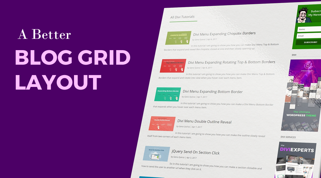
The Divi Blog Module gives you two layout options that are both fantastic. The fullwidth layout allows you to have large images for those who really want to showcase the image. But sometimes the images are too large and so you might opt for the grid option that shrinks the image down.
The grid layout is really modern and popular allowing you to list your blog posts in card like positioning 2-3 per row depending on if you are using a sidebar or not. But some people dont like the fact that it crops the sides of the images and really doesn’t work if you intend the visitor to see the entire image.
Another option is to shrink the image, align it to the left, maintain it’s aspect ratio, and wrap the text around the image. This can easily be done using a little CSS.
In this tutorial we will make your blog pages go from this to this…
Lets Get Started On Your Blog
First thing you need to do is create the blog module.
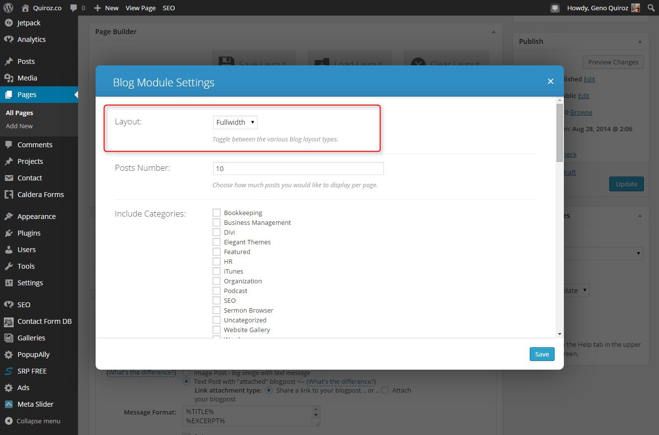
1. On your page go ahead and add the blog module where you intend to have it
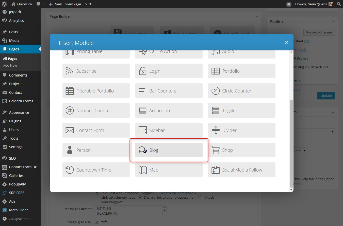
2. Go ahead and use the Fullwidth layout
3. Next you will want to make sure that you have chosen to “Show Excerpt”
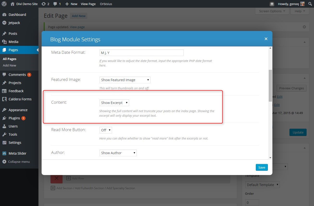
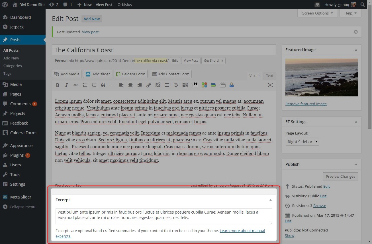
4. Also you will want to make sure you include an Excerpt on the post page as this is what will show up on the page that shows all your posts.
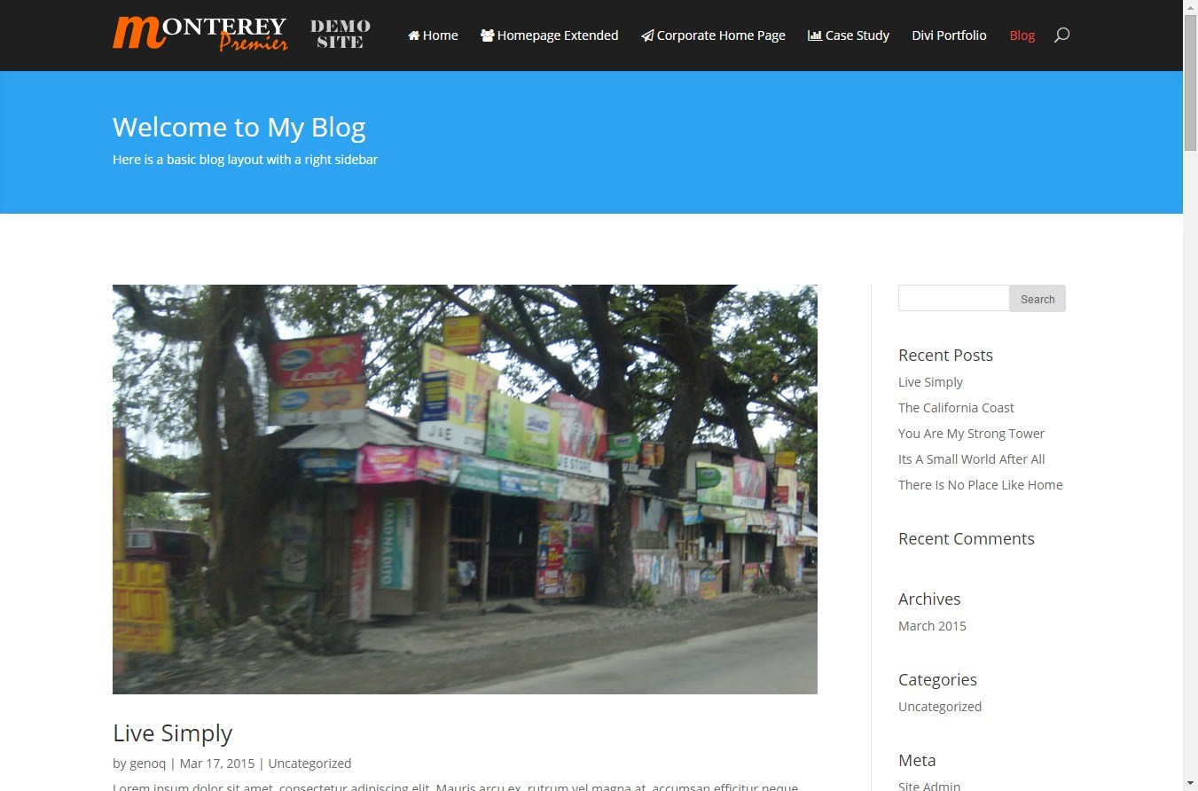
5. Now here is an example of what the page might look like with a sidebar and a fullwidth header as comes with Divi’s pre-loaded Standard Blog Layout.
The Magic of CSS
Now lets start to dazzle things up a bit with some CSS.
If you are working with a child theme you can go to Appearance>Editor and open your stylesheet. If not, go to Appearance>Divi Theme Options>ePanel>Custom CSS (which is located at the bottom of the ePanel)
Add this CSS.
(This code includes the mobile query to keep in friendly on your smaller devices)
/*------------------------------------------------*/
/*--------[GQ - LEFT ALIGN BLOG IMAGE]------------*/
/*------------------------------------------------*/

	.et_pb_posts .et_pb_post a img,
	.archive .et_pb_post a img,
	.search .et_pb_post a img {
    		max-width: 210px!important;
    		float: left;
    		padding-right: 20px;}

	@media only screen and (max-width: 980px) {
		.et_pb_posts .et_pb_post a img,
		.archive .et_pb_post a img,
		.search .et_pb_post a img{
			float:none;
			max-width: 250px!important;}}
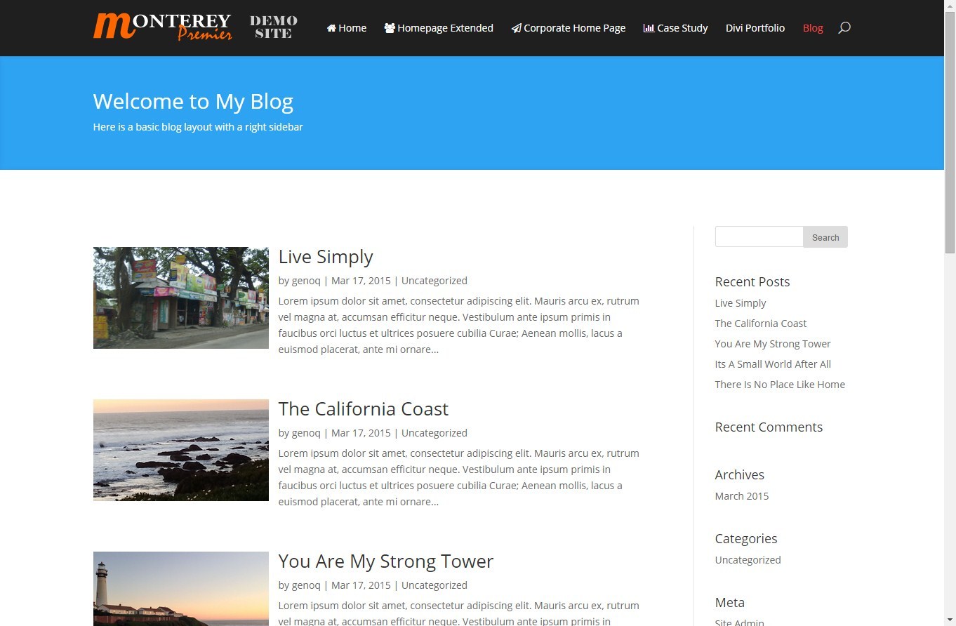
Now your blog should look something like this.
Well that’s all for now. I hope you find this article useful.


Geno, this is cool thanks. I’m going to use this when I post my next blog entry, but I have to resolve an issue first. I had a question about my posts page. On my blog (created in Divi), when I click “read more”, it takes me to my posts page. I’ve set up customizations on my posts page using the page builder, but they won’t take. It’s there when I “Preview changes” but, when I actually visit the url, they are not there. My header, and menu items are missing. No matter what I try it never shows up. Have you ever seen this happen?
Hi Rob. Thanks for visiting and sharing the blog. Unfortunately I have never enabled the page builder on my posts so I’m not sure why you would have that issue. Try posting the question on the Divi Facebook group as there is probably someone in there who might be able to help. https://www.facebook.com/groups/DiviThemeUsers/
I actually have posted the question on the Facebook group twice, but so far no one has had any info that has helped. One person thought it might be an issue with the child theme I’m using, but I switched to the parent theme, and it didn’t make any difference.
Do you know if there is a good tutorial on customizing the posts without using the page builder? Maybe I should just go that route instead. I see some beautiful post pages out there, and I want to be able to make mine look nice before I post any more blog entries.
I havent come across any yet. Here on my blog and on my blog at http://montereypremier.com/monterey-bay/ I did a few tricks to make it look completely different from the rest of the site.
1. Create your main blog page on a regular Divi page using Page builder.
2. Once you have created the header you like, open up your page in dev tools and grab the html being output for the section below the main #top header.
3. Create a single.php file in your child theme.
4. Paste your copied html right below this first bit of code
5. And thats basically how I got this page to look different than the rest of my site on quiroz.co.
Also lots of CSS customization on the sidebar 😉
If that sounds like too much work, you can start with a simple custom header on each post. Check out this tutorial I wrote awhile back. http://www.eileenlonergan.com/adding-a-custom-header-on-your-blog-post-in-divi
Thank you for the tips. I’ll definitely try one of those. I like what you wrote on Eileen’s page. I might try that first. Thanks again!!
Thanks Geno! I used your info from Eileen’s page to add a header, however, there’s no menu functionality, and I’m wondering if there’s a way to get menu buttons to work by doing that. Also, I still can’t customize the sidebar in posts. I realized going through this that there are only a couple of .php files on the child theme I’m using. Do I need to copy the sidebar.php file to the child theme, and add customizations into that to get my sidebar items I want?
Unfortunately that only works for images and not the menu. To modify the look of the sidebar, you will have to use CSS and add it to your ePanel located in Appearance > Divi Theme Options (or your child theme style sheet).
Thank you so much for your help Geno!
Hi Geno
i have looking for this code on all world wide web for many and many times. You are the boss ! Many thanks and regards from Italy.
HI Geno
thanks for the tips! For some reason it didn’t work for me? i posted the CSS into the ePanel and my blog posts still look the same? I am also wanting to create 3 separate blogs (3 different subjects) on the one site But on each blog in the categories section in the sidebar, all of the categories show up from all blogs. I am only wanting to have certain categories show up in the sidebar of each of the 3 blogs? Not sure if i am being clear : ) Do you have any tips? thanks!
Not sure why the code is not working for you. Double check to make sure you copied the whole css snippet. As far as the sidebar question. Just create a custom menu for only the categories you want to use. Then use the menu widget instead of the category widget and select the custom menu you created.
Hey Geno,
Thanks so much for all these great guides!
Anyway, I have a quick question for you:
I’ve used this guide and love the results, however it seems to be causing a problem with grid-style blog layouts.
I have a grid-style blog layout on one page of my site, and the full-width version on another, and the code from this guide is causing the featured images on the grid sections to stick to the left of the boxes (rather than center), messing up the formatting of each section.
Do you have any idea how I could fix this?
Cheers!
Liam
Hi Liam. Unfortunately I am not sure what might be causing this conflict. I use this technique on my Magazine Blog where I run both types of layouts and I don’t have this issue. It might be conflicting with another customization. Are you using CSS Hero? Here is my blog where you can see it works fine for both layouts.
http://montereypremier.com/category/monterey/
http://montereypremier.com/monterey-bay/restaurants/
Would this work, no matter what kind of Blog Post it is? For example, a Video, Audio, Quote, Gallery, or Link (Divi Blog Formats) Blog Posts? I’ve been having trouble getting anything but the first Video Blog Post to work correctly. After that, I have had to make them all Standard Blog Posts or they get a little wonky.
Thanks, Geno!
I’m not sure Deb. I have not tried this on other types of posts.
Hi Geno
Love your suggestions, tips, etc. Unfortunately, while this creates the desired effect on archive pages, it screws up the display of images on the actual post. If you look at this page:
http://www.merrickville-house-tour.ca/tour-stops/houses/old-world-modern-bungalow/
you can see the images at the bottom of the post have the same selector (.et_pb_post a img) so these images are impacted as well. I have disabled your tip because of this so you can’t see it.
Any other way to do this? The only thing I can think of is to modify the php on the archive tempkate tself.
Thanks.
Yeah you would probably have to modify the php
No. I found that if you add the following selectors, it changes only the featured image on the grid.
.archive .et_pb_post a,
.et_pb_posts .et_pb_post a img {
…..
}
it works on both the regular archive page and the Blog module.
Mike, I had the same problem as you with it making ALL the images on the site smaller. Where did you enter the text above to keep the rest the same but the blog menu smaller?
Dont worry. Just added to the start of the supplied text. Thanks anyway for the great tip!
Hi Geno,
I just found your page and your tutorials are amazing! I was hoping to find something like this tutorial for my new website.
I was wondering, do all the images for this blog layout have to be the same size or at least rectangular in shape? It looks like any featured image picture that is more square shaped makes the next post move over a bit to the right. Here is a screen shot of what I mean: http://www.vnutritionandwellness.com/wp-content/uploads/2015/06/blog-images.jpg
Is there any way to get around this?
Thank you so much!
Mary
You can increase the space between posts…
.et_pb_post { margin-bottom: 100px; }Thank you so much Geno! That worked!
Hi Geno
Thanks this worked for me but I can’t seem to move the Read more link to follow on directly after the excerpt, so on my site it would be after the word Nulla…:) http://ninirichi.webstory.co.za/wp/index.php/weddings-2/. I think you’ve probably disabled the Read More function on your example but my client wants to include it. Any suggestions?
thanks. it works!
When I do this it works perfectly on my main blog page, but when you click into an individual blog post, it also moves all the post images to the right and turns them into thumbnails. Is there a way to edit this code so that it works on the main blog page only?
Geno, this works fine but seems to break my galleries on a couple of pages (divi gallery module) . I’ve only found the issue on safari on ipad so far but instead of my gallery looking how it normally does it stacks each image in one column one on top of the other to the left. Any ideas?
Ignore my comment. I updated iOS on both ipads and it fixed the issue!
I swear you have the best and easiest to follow divi tutorials on the net. Thanks so much!!
Hey Gino, do you know if there is any way to just display the featured photo, title and the read more button. I don’t really need the excerpts but Divi doesn’t give me that option. Thanks!
Awesome. Was looking to do this on new Divi site.
Now the only thing I wish I could figure out is how to have the current post fully width and then the balance of posts with image on left.
I assume this would take a little php but I’m not a developer.
Hi Geno, great post (someone in the FB group pointed me at it). While it works great for the static pages I use to display certain categories using the blog module in full width, it also messes with the thumbs in grid mode (used on the home page, where the last three posts per category are posted). Is there any way to limit this code snippet to blog module IN FULL WIDTH, rather than both blog module in full width AND grid mode?
You could assign a unique css class to the module and use that css class in the css code you want it only to affect.
Hey Geno! Great write up. However, when I use the code above, it works perfect on my actual page that I use the blog module for, but nothing seems to change on either the archive pages, nor the category pages. I am using the newest updated Divi and placing the code in the Divi theme options ePanel. Could you help me shed some light on this please. You can see what i mean here: https://theoandharris.com/category/ask-th-video-series/
Hi Geno,
This is fab – thank you! I’ve managed to get it to work for the desktop but is there a way to return the image back to full width on mobile phones? If you have any ideas I would be very grateful. Many thanks Jennifer. See: http://www.jenniferglover.co.uk/studio/sample-page/
Thanks for great article!
How about if I want a side bar with full width page?
is there possibility to get that?
once I tried to add special section to show the widget but it is shrinking to down under the content.
any tips would be appreciated.
Thanks
Hmmm. Something must be causing a conflict. The special section should do the trick.
Hi Geno, I tried this on my website and it doesn’t seem to work. Am I missing something? thanks. Blog is at:
https://www.newmanwebsolutions.com/blog/
Never mind, LOL – I had to clear the cache on my CDN. Great tutorial – thanks!
🙂
Hey Geno. thank you for the post…however, I’m really looking for the blog module layout to be something like this site – http://aholyexperience.com/ .. and Im hoping the current version of Divi has something in it.. Any suggestions will be reallllly a great help.
Thank you!
Elina
Hi Elina! I can see why you like that layout, it is very nice. That can be done in Divi, but I don’t know of a quick and easy method or tutorial to do that exactly.
Here are a couple tutorials that can get you started in the right direction if you are willing to figure it out…
https://quiroz.co/modify-the-divi-blog-fullwidth-layout/
http://divisoup.com/how-to-create-a-large-thumbnail-style-blog-layout/
Hey Jerry!! Thank u soo very much for sharing those tutorials! The 2nd link divisoup helped a lot! Used the example shown from that post, however, two more small help I would need.. after using that method I only see the top most post being effected in terms of font and font size..rest of them dint change.. 2. I dont want the spacing between each posts.. Can that be reduced somehow? I tried but couldnt 🙁 .. pls help.. 🙂 Pls see the blog here – http://ksim.org/blog/
For the gap between posts, find the following section in the CSS you added to the Custom CSS box.
/*Styling for the posts*/
.ds-thumbnail-blog .et_pb_post {
    background-color: #fff;
    min-height: 500px;
    margin-bottom: 0px;
}
You can change that margin-bottom value to reduce the gap. -110px seems to be a good fit, but you can play with your own values.
For the font changes I would double check the posts to see what is different between them. Maybe one is using an excerpt and the others aren’t, or something like that.
Jerry!! You are too good! thanku!! that worked so perfect!! Can I please ask one more question to u pls pls pls :p… is there a way where each posts come like the one in the site I mentioned that I liked…? in this http://www.aholyexperience.com? You see the featured image comes once on the left hand side and next on the right hand side? Anyway that can be done?
Also I’m so sorry I didn’t realise ..the font thing was the excerpt issue.. I had used it only for one post.. 🙂 Now it’s fixed!!
Thank you so much Jerry! You have been a great help for me…
Elina
Hi Elina! I have not tried to do that before, but I think it is possible. I would have to spend some time working out the code to do that and that’s more than I can commit to right now.
If you’d like to hire us to develop that for you, you can get started on this page: https://montereypremier.com/divi-expert/
ohh! Sorry I didn’t realise that… cannot afford to hire at this moment 🙂 but thank you so much Jerry for helping me out till now.. you are kind..
Thank you!
Elina
HI. one of my blog pages is just video. this code is not allowing the video to float left – do you have a suggestion as to how to do it.
The video is grabbed from youtube. I aslo added a featured image but this hasn’t helped – I dont want the featured image on the single post.
Hi Lisa! You can do something similar with a video, but you will need to change up the code to apply to your videos.
Here is a little sample CSS to get you started…
.et_pb_posts .fluid-width-video-wrapper {
    width: 400px;
    float: left;
    position: relative;
    margin-right: 20px; }

@media only screen and (max-width: 980px) {
    .et_pb_posts .fluid-width-video-wrapper {
        float:none;
        max-width: 250px!important; } }
That is a pretty rough draft, so you will probably need to work out some details for it to look the way that you want.
Quick and easy – many thanks for posting.
You are welcome! Thanks for visiting!
Hi Jerry. The thumbnails on my divi BLOG page became deformed after the css change. They are originally landscape pictures and after the css code they became portrait position. How can I fix this? Tks!
Jerry. Nevermind. Found the problem and solved it! tks
Hi Jerry, this worked great, but the words are bleeding over under the photo, rather than wrapping to the right. Any ideas how to solve? I am doing this for a friends site
Thank you!
You can disregard, I went with a different layout. Thank you for the great post!
Really great Geno! I have a question about switching from Genesus to Divi and dealing with 76 blog posts that DON”T have a featured image already selected. I am hoping to try your great styling options but I am hoping I don’t also have to go in and manually add 76 featured images first. Most of the blog posts already have an image or 2 within the text of there blog. Any ideas on a shortcut for this? Thanks sooo much for your time.
There is an option that you can turn on in Divi’s Theme Options. The option is called “Grab the first post image”. If you turn that on it will use the first image as the featured image.
Hi Super Geno ! All is OK and really thanks for that … except in Chrome !! have you this problem ? (I’m french … sorry for my bad english)
Hello! No need to apologize, your English is great! We are not seeing an issue in Chrome. Do you have a link to your page that we can check out?
Thanks Quiroz and Jerry. This code was simple yet elegant and beautiful. I don’t know if you guys will be able to help us make the same design with the archives and categories in upcoming posts. I know we have to edit some php code but it will be helpful. again thanks.
Hello. Thanks for the tutorial but I can’t seem to get it to work. Here is the page I’m trying to get it right on: https://www.soulnavigationadventures.com/blog/
Any ideas?
Hey Rob! It looks like the CSS has not been added to the correct place. Double check that you added the CSS from the tutorial to the Custom CSS box in Divi Theme Options, or to the style.css file in your child theme.
Thanks Jerry, I’ve done that and it worked. The strange thing is that I had already added it to the style.css file of my child theme and it didn’t work. Looks like it’s not reading the child theme style file.
Okay, figured it out… the permissions on my child theme folder and files were wrong. Not sure how that happened but I’ve fixed it and everything’s happy again.
Shouldn’t your !important declarations have a space in front of them?
Spaces can be helpful for our human eyes, but they are not necessary very often in CSS code. 😉
Hi, I’m using Divi 3.0 and there is not ePanel. What section within the custom CSS area do I need to add this to (choices are: before, after, main element, featured image, post meta, or read more)? Do I add this to the Blog Module CSS, row, or something else?
NVM Figured it out…Appreciate your blog post. Gave me a lot of value 🙂
Oops. I see you figured it out on your own. Awesome!
YOu can go to Divi Theme Options and scroll down to the bottom where you will find a “Custom CSS” box where you can enter the code.
Hi ! Jerry, greetings.
I would be grateful if you write an article:
How to configure the display of the blog page as on image: https://cloud.mail.ru/public/FhLw/3c7FHU5ah
Interested page displaying exactly as in the photo unstyled CSS elements.
Thank you very much !
We will keep this in mind when we do another blog tutorial.
Hi Geno. Great article and website!
I know this is an old article now but you say (in red) “This only addresses pages that use the page builder to show blog pages. It does not change the archive pages.”. However, looking at your example site the archive & category pages look just like your styled demo. How have you done this?!
Pleeeeease tell us!
Dave
hey! this is so useful! i loved it, thanks! keep it up!
Thanks Gustavo!
Thanks, Geno! This made my day so much easier. 🙂
Awesome!
You just made my day, thx
Woohoo!!
Hi Gino.
This was very helpful.
What if I don’t want my blogs all in a row?
I want it to look something like mattieJames homepage.
Is that possible?
You could try something like this instead. https://quiroz.co/building-a-magazine-layout-with-divi/
Hi Geno,
Thanks so much for your guidance!! I have a couple questions:
1 – How can I make sure the the excerpt text doesn’t flow over underneath the image? It’s currently always spilling over.
2 – How can I style the pagination and have it show page numbers?
Thanks so much!
Thank you. Your code rocks. I implemented this on my coupon site.
Great tutorial – thanks! Just what I needed. Do you have any suggestions for getting the “read more” button to appear under the excerpt rather than under the image? (I see someone else had this same question, but I don’t see a response)
Try this…
Read More - Read More Link turned into a button on a new line a.more-link { border: 2px solid; border-radius: 3px; display: inline-block; margin-top: 10px; padding: 3px 10px; text-transform: uppercase; float:right; }Hello, Thank you for this post. I just added the CSS to a site I am developing, however, I have an image behind the blog module. I’m still learning. Is there a way to add to the CSS so that the background of the title and body text is white (it comes out transparent on my site). Here’s what I’m working on: http://212.237.18.131/ICCRSWP/ Thanks again for the great instructions!
Looks good on my end. You must have figured this out already?
Hi Geno, I really hope you can help me. I would like to modify the blog module in divi to look like this (https://backlinko.com/blog). I would like to single column blog section with the ability to add/customize a border around each individual post. I was trying to either:
1) Modify fullwidth blog module to now have a border around each post or
2) Modify grid blog module to show as one column.
Thanks!
You can work with either method to achieve a similar result using some custom CSS. It is not something I have handy but if you are interested in some custom dev work, hit us up over at montereypremier.com
Awesome! Most are paid plugins. Thanks for the guide!
You are welcome sir!
A thousand thank yous!! God bless you, sir!!!!
Thanks for this great article. It was very helpful and greatings from Oynabet Giriş Awesome!