My friend and fellow web designer Ranesh Weerasingham encouraged me to address the Divi slider issue which has been a hot topic as of late.
And another fellow friend and web designer Tami Heaton recently encouraged a great discussion/debate on this topic on a couple of Facebook groups recently which had a lot of folks wondering what’s up with Divi.
so here is my 2 cents regarding the Divi Slider Module. In my opinion, it really is a great tool and has the potential to be visually stunning when used correctly. In fact I think it’s an awesome feature if used as intended and I have used it on several of my own projects and on my own site.
The issue some people are having is in the way it handles responsively in mobile devices.
Portions of the background images get cut off as the screen size shrinks and certain text and buttons are removed on smaller devices.
This of course is intentional as the designers intended for the slider to shrink down proportionately for mobile devices
Now if you know a little CSS, you can easily override the default settings so that you can have full control like I did on own website.
But lets say you don’t want to spend a bunch of time playing with CSS. You just need a simple slider solution that is going to be easy to maintain.
That’s where Meta Slider comes in as a great free alternative.
Meta Slider
It is a very easy to use WordPress slider plugin. You can create SEO optimised responsive slideshows with Nivo Slider, Flex Slider, Coin Slider and Responsive Slides.
You can create multiple slides with various dimensions to be placed just about any where on your site.
But enough about the cool things you can do. Let’s just get started using Meta Slider in our Divi theme.
Set Up Meta Slider
- Download the plug-in here
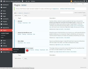
- Upload it to your WordPress site and install it.
- Set up your first slider
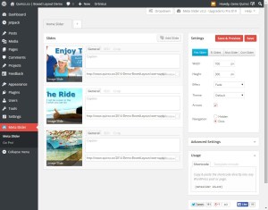
1. Go to the Menu Slider option in your WordPress Admin
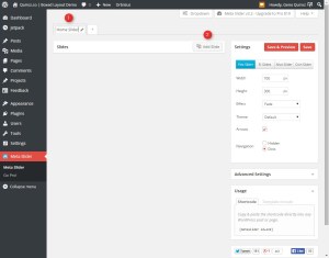
2. Create your first slideshow by selecting the plus (+) sign
3. Give it a unique name and then select the Add Slide Button. since I want the slider to stretch across the screen, I want to be sure to use images that are 1080 wide. You can choose what ever height you want but whatever height you intend to make the slider, make sure your images are the same dimensions. In this case I am going to use 1080×400.
4. Once you have added your pics from the media library you can add a hyperlink where you want people to go when they click on the image. You can also rearrange the slides by dragging the image around. You can also play with the other slide settings like captions and SEO but for now lets just add urls for the hyperlinks.
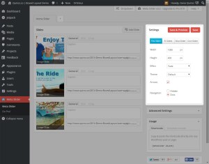
5. I want to use this in a Divi site that is set-up with a Box Layout and I am going to want it to stretch across the entire box so lets change the settings on the right. Lets use the Flex Slider template and change the width and height to 1080 x 400
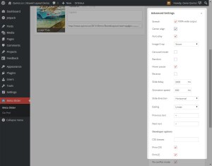
6. Now lets just adjust a few of the advanced settings just below that. I am going to make sure to check off the following: Stretch 100% wide, Center Align, Auto Play & Hover Pause
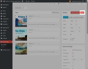
7. Now hit save and you done with this part.
Add The Slider To Your Divi Page
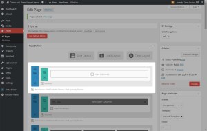
1. Go to the page you want to add this slider and create a new section.
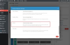
2. Open up the section module settings and give the section a unique CSS ID. I used meta-home-slider-container in my example.
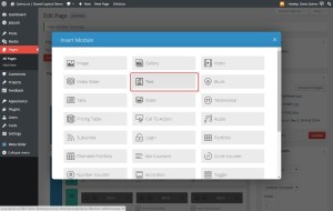
3. Now make it a one-column row and add a text module.
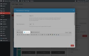
4. Open up the text module and you will find a new button next to the standard Add Media button called Add Slider. Select it.
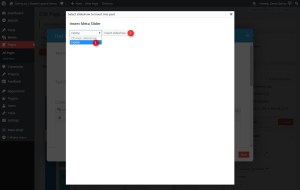
5. You will be given the option to select which slideshow you want to use. In this case we only have one so select it and then select the Insert Slideshow button.
6. Now you can save everything up and update your page.
A Touch of Class To Make It Fullwidth
This last step is just adding a couple of lines of CSS to deal with the padding issues that come pre-designed by default in these Divi sections and modules.
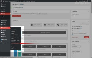
1. Go to your Divi theme ePanel . Go to Appearance>Divi Theme Options
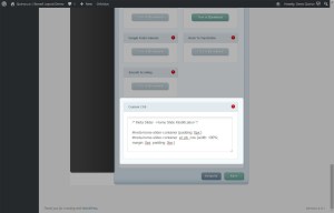
2. Scroll down to the bottom of the page down to the Custom CSS panel where you will copy this CSS and paste it into that ePanel
#meta-home-slider-container {padding: 0px;}
#meta-home-slider-container .et_pb_row {width: 100%; margin: 0px; padding: 0px;}
#meta-home-slider-container .et_pb_text {margin-bottom: 0px;}
3. It should look like this.
Hit save and your all done.
Keep in mind this tutorial was intended for use in the Divi Box Layout template. But once you understand the basic theory, you should be able able to do this in any Divi theme layout.
Well that’s all for now. I hope you find this article useful.










Talk about a post solving a problem! You are the best Geno, thank you so much for this great detail, you are awesome.
Geno,
A great blog with useful information.
Thanks for sharing it.
Gerard Drent,
From the Netherlands
Wow, Geno! This was awesome information and just solved a major issue I was having! Nice job. 🙂
Woohoo. Glad it helped 😀
Geno, This is great! I’ve been wondering about using another slider with Divi and this was exactly what I needed to get it done.
Thanks Scott. Glad it helped!
Read this on Pinterest , awesome, even I can do this 😉
Thank you so much. This was so easy to follow and worked like a charm! Thanks Geno
Awesome. Thanks for checking out the blog. Lovely site by the way 🙂
Hey Geno…great post. I was setting up this on a fullwidth layout and the slider is left aligned and has a gap on the right. See screenshot- http://screencast.com/t/9SR24MIzdG
What dimensions do you recommend for fullwidth?
Hi Tyler. The tutorial was designed for the boxed layout. Havent done this on the default Divi layout yet but you might try a width of 1920. Let me know if that works for you. Its good to see a fellow missionary doing this kind of work as well 🙂
Thanks man. The site is safecom.solutions Your posts have helped me on multiple projects. I appreciate your time to help.
😀
Love it Geno and this is one that I am really really realy going to add to my site – can’t thank you enough for sharing.
🙂
Hi Geno,
Great post. Very helpful. I have a minor issue. In step 3 of “Set Up Meta Slider”, navigation is set to “Dots” which is cool. I was using “Dots” also and all was good. I have since chosen “Hidden” and the Dots are now not visible (which is correct) however now the empty space below the slider image (bottom margin) where the dots were is still visible. It seems the CSS code provided in step 2 of “A Touch of Class To Make It Fullwidth” hasn’t addressed it.
I have found other “solutions” online and tried them however they didn’t work:
https://wordpress.org/support/topic/40px-high-space-under-slider
https://stackoverflow.com/questions/14215654/flexslider-adding-huge-white-space-below-slider
I thought that maybe the Divi Text module could be overriding Meta Slider CSS. I am not super technical hence blog posts like yours are really helpful.
Reaching out as any thoughts would be appreciated.
Thanks for your awesome site 🙂
John
Thats correct John. This tutorial is specific to the slider settings mentioned in the tutorial. If you want to remove the dots, you will have to remove the bottom margin & padding where the dots were. If you want to post the page, I can show you how to do that.
Gino, here is my site (which is still in development):
http://www.lechefroyale.com/
To help explain the situation, on the homepage, I have created three Meta Slider slides and inserted them into Text modules like you have outlined in your blog post.
Slider A
– Slider image slideshow with Dots set to Available
Slider B
– Slider image slideshow with Dots set to Hidden
Slider C
– Slider with 1 static image with Dots set to Hidden
With Slider B and C above, the Dots are set as Hidden, yet they still show a Bottom margin with empty space, like a placeholder where the dots would have been showing.
So how do I remove this empty placeholder space below the Meta Slider, when I set the Dots to hidden?
Appreciate any insights.
John
HI John. That space you are referring to is not related to the slider. It is the default margin for a Text Module as you can see in the image below.

A quick fix would be to remove the text module bottom margin.
.et_pb_text {margin-bottom: 0px;}But this will remove the bottom margin on every text module throughout the site. If you dont want to change the margin on all text modules, then you can give the text module a unique CSS class and then target that specific text module
.your-unique-text-module-name {margin-bottom: 0px;}You can name the second text module the same css class and this code will change both.
It amazes me that a line of code can make all the difference. Works for me 🙂 Really appreciate your generous insights, your unselfish nature and for being so giving with your knowledge and time. Have bookmarked your site. Thanks Gino!
🙂
Hi Geno,
I set this up and it works fine, however, on the page the images are not as sharp as they are in the Preview. I have uploaded them as 1200x444px, so they should not be scaled, but I can see it loading just smaller, and then scaling up to the full width. Have you come across this behavior? Thanks!
I have not. Could you send me a link to your site so that I may take a look. Also, the 1200 width works great for the boxed layout. If you are using a full screen layout, you will have to use a larger image.
Thanks Geno,
I have set you up as a subscriber to see the site. It is in boxed. I just don’t see why it would be scaling it. I have the images in the built in slider moved below to see the difference in quality. I had to go with a third party slider since the client wanted to just create their images in house and not have text, and you cannot make a fullwidth slider link full frame in DIvi(that I could figure out). Cheers.
He Geno,
Just an update, I noticed the images were being served via wp.com via Jetpack’s Photon, I deactivated that and all is well in the world. Cheers.
Awesome. Thanks for the update. I got caught up with some other issues last week and had this on my priority list for next week. Glad you got it worked out!
Hi Geno, I have just used your amazing step-by-step guide and it’s worked brilliantly. Thank you so much.
Woohoo! The pleasure is all mine 🙂
I am so deeply grateful for this post! The Divi slider was making me craaazzzy with responsive issues and no matter how I hacked the css I couldn’t resolve it. This was the perfect solution. I especially appreciate the padding overrides to make it full width so I didn’t have to hunt them all down myself. With just a little tweaking, I’ve made it work for the site I’m building.
I’m wondering if you’ve found any way to have the parallax functionality work with the metaslider? My client wants all the fancy effects, lol, which is why she bought Divi in the first place.
Thanks again!
Awesome Jen. Glad it helped. Unfortunately I do not know of a way to make it parallax. But perhaps you can use the parallax feature in other sections of the page to wow you client 😀
Thanks for the reply, Geno! Yeah, we’re doing some other fancy schmancy stuff elsewhere on the page instead of parallax stuff.
I have one other question. On both my implementation of this solution with meta slider and on your demo page, something is causing a bottom scroll bar and there is maybe 50px worth of white space when I scroll to see the right side. Any thoughts? Is it related to the padding adjustments perhaps? Oddly, it goes away when the browser window drops below about 860px in width. I’m having trouble pinpointing the offending padding, if that is the cause.
Really appreciating your other tuts here too! Thanks again for sharing your knowledge!
It probably needs an additional mobile query for the screen size that you are seeing that on. There are so many screen sizes it’s hard to get them all 🙂
Just find out what screen size it is happening on and add a new query. Here is a list of several although i did not use all of these for the tutorials. I was a tad bit lazy 🙂
/* Laptops & iMacbook */ @media only screen and ( min-width: 1100px ) and ( max-width: 1280px ) {} /* iPads (landscape) */ @media only screen and ( min-width: 981px ) and ( max-width: 1100px ) {} /* iPads (Portrait) */ @media only screen and (max-width : 980px) {} /* Large Smartphones */ @media only screen and ( max-width: 767px ) {} /* iPhone 6+ Landscape */ @media only screen and ( max-width: 736px ) {} /* iPhone5 landscape */ @media only screen and (max-width : 568px) {} /* iPhone 6+ Portrait */ @media only screen and ( max-width: 414px ) {} /* iPhone5 portrait */ @media only screen and (max-width: 320px) {}I implemented your slider as instructed. The slider works good and is responsive, but it has caused the blurbs and lower sections to be misaligned. They are all shifted to the left with no space between the left side and the first blurb. I tried changing the margin for those sections and it looks good at the size I’m using, but isn’t correct at other sizes. Is there a way to get the slider full width and not affect the areas below?
Hi Mike, I am sorry that happened to you. I tried to re-create your issue but could not get the same results. Be sure that the slider is in it’s own section without any other modules and be sure the secttion has it’s own unique css class and it should only target that one section with the slider module in it.
Thanks for the reply. I figured out my problem. Just a dumb mistake on my part! Thanks for the great slider and tutorial. Works much better for the mobile experience!
Awesome!
hey geno great tut tks !! i managed to follow you on every step but i was doing the same for the rev slider ! and i worked but im getting some king of margin on the top and bottom and i have done the css code do you think you can help me ? here’s the link to that page: http://www.dimcode.com/home-cb/
what i want to do is something like you ghost style page but with a video instead of a pic !
I did not see any margin on the top but I did see some margin on the bottom. Here is a quick fix. Just add the margin-bottom part to your existing code…
.your-new-section-name { margin-top: -380px; margin-bottom: -85px; }Wow! You’re a genius! Thanks so much for posting this. I will definitely share your blog with my friends!
You solved my problem with Divi & Layerslider! Now only if I can make the html on the slider responsive.. any ideas? – ShahilShaikh.com
Cool. Thanks for letting me know it worked for you and especially thanks for sharing 🙂 As far as the responsive html on the slider, I am sure you can. Just target the specific html by right clicking and selecting “inspect element” (Chrome or Firefox) over the html to find out what css class is. Then make adjustment within the mobile queries…
@media only screen and ( max-width: 767px ) {} @media only screen and ( max-width: 736px ) {} @media only screen and (max-width : 568px) {} @media only screen and ( max-width: 414px ) {} @media only screen and (max-width: 320px) {}I’m about to try this solution out. I’m currently using the full width section and was wondering if maybe you had circled back around to figure this one out?
I have not had a chance to try this out on a fullwidth project yet. But if you beat me to the punch, please share 🙂
I never went with the full width page and stayed at the boxed layer out. Your solution worked great there.
As everyone is saying, thanks for posting this solution. It saved me
Woohoo. Glad to help 🙂
You Rock! Thank you… You don’t know how long i have been looking for a solution like yours. Thank you! I solute you!
😀
Hi Quiroz,
Do you have any problem with Metaslider on the latest version of Divi 2.4.2? After updating the theme, all my sliders are not full-width anymore, more like box format. Looking forward to your advice! Cheers
Hey Geno this is amazing, having a lot of problems because of the slideshow i with divi this solves a lot to me, just one question, I’m using a wide site not a boxed one, following your example I’m using 1080×400 pixels images but looks a little blurry in some occasions, at some point in the comments you mentioned to use a width of 1920 but what about the height? Thanks man, really appreciated!
Oh, forgot to mention, with your example, when the size is being displayed on smaller device screens, below each image there’s a white space, is this because I took off the navigation dots but the space is reserved? Thank you!!
This tutorial is for the box layout.
Has this been tested on divi 4.2?
I can’t seem to get the slider to go full width on a 4.2 site
This has not been revised for 2.4 yet 🙂
Any idea for Divi 2.4 ?
Hey Geno,
Just an FYI, I just used your slider on the 2.4.6.1 version of Divi. The only change that needs to be made is for them to use it in the full-width code section and it will work like a charm. Once again, you saved my hide. It looks great on my iphone 6 plus, my laptop, my desktop, and my ipad air 1st generation. Here’s a test site that I’m playing with http://ajcarmicheal.com/jessdee/
Thanks again! You rock.
AJ
One more thing. They need to use the shortcode in the code section. Wasn’t sure if I was clear about that.
Thanks again.
AJ
Awesome. Thanks for sharing AJ. I will update the post when I get a chance.
You’re welcome!
Any idea as to when there will be an update for Divi 2.4? Plugin works great, just need it to go full width.
Adrian, if you use the full width code option it will work. That’s what I did.
AJ
To make this work in Divi 2.4 I simply used a Fullwidth Section, set the CSS ID, and then a Fullwidth Code Module with the shortcode of the MetaSlider I want to display. Just remember to check the box under Advanced to Stretch to 100% wide output, or just make your image 1200px wide and then uncheck the Stretch box if using boxed mode.
Thanks for the share Todd
Nice tutorial Geno …as usual. I’m assuming that this process would work with pretty much any slider plugin, am I right?
Yes pretty much.
Great work! Looks great in Divi 2.5. I can’t figure out how to get the main navigation to overlay the image. I have a transparent bg on my main nav and want the slider to appear under. Thoughts?
http://twisted.christopherkwright.com/
So let me ask this. How can we use a slider as a rotating background of a section and use other modules on top of it? (aka other text modules and say a row of blurbs)
Not necessarily in Divi. Revolution Slider gives you some great options and works great with Divi.
Any idea how one would get that into a Divi Section Background and still have the ability to use other modules on top of it?
Not quite. But you might consider using negative margins in the section below dragging the modules up into the slider area. It would require a bit of CSS customization but it could be done that way
Hey Geno, I’m new to this and the walkthrough really helped. I saw you were going to update this post when you had a chance…any luck? I’m on 2.5.9 and the image is not going across the entire page and stuck on the left. I’m also using the child theme to build the site before launching. Thanks so much!
Hi Geno,
I followed each step of your tutorial, but still cannot make a fullwidth. I don’t understand in which part I did wrong 🙂 the slides alway have left-right-above-below padding
Please advise and thanks a bunch!
Try setting all the top, bottom, right & left padding to zero in the section AND row settings.
Hi Geno, Love all your tips and stuff. As a newbie to WordPress and Divi – its really helpful to me!
Just wanted to know what you recommend for fullwidth slider when creating divi sites?
I would like to use something that is more flexible – more options, better on mobile..etc..
Thanks so much!
The Slider Revolution premium plugin is a fan favorite.
Dear Geno,
Thanks so much for this great post. I set up a meta slider with Divi 3 in no time, but unfortunately a second slider on another page does’nt show on my Ipad and Iphone, but it does work on my desktop Mac. I tried everything, but it will not work. Or am I just plain stupid? Any suggestions?
alright, I found out what was wrong: I used a forbidden “umlaut” in an image name. Now the Meta sliders work perfectly on IOS devices.
Thanks again for this really helpful tip using meta slider as an alternative to Divis not so wonderful slider modules.
Glad you got it sorted out.
Sei il migliore….