One of my most popular tutorials has been the Customized Subscribe Module for the Divi 2.3 legacy version. People just wanted the option to have a thinner streamlined look rather than the stacked form that is the standard Subscribe layout.
But some wanted an even more streamlined subscribe/signup module. And how cool would it be to replace the subscribe button as well. Well in this tutorial we will show you how to do it all.
Lets Get Started
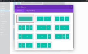
First thing you need to do is create a new “Standard Section” and insert a single row “Column”.
1. Insert Column
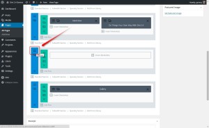
2. Next you will need to make a few adjustments in the Section Settings. Open up the settings.
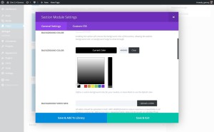
3. Change the Background Color. In my example I use black.
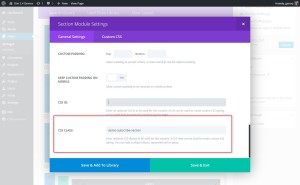
4. This next step is very important and often missed or entered incorrectly. You are going to give the Section the following CSS Class: demo-subscribe-section
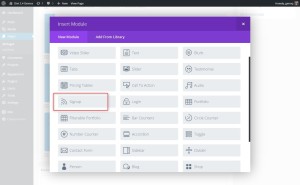
5. Now once you have saved those changes, you can insert the subscribe/signup module.
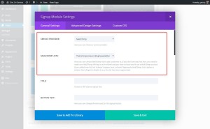
6. You will have to set up your Service Provider and List. In this example I am using Mailchimp and I have already set up my Mailchimp account in the Divi Option ePanel
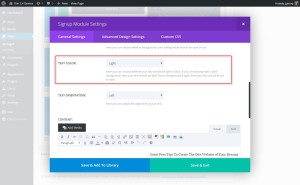
7. Since I am using a dark background like black, I want to make sure my text it “Light”
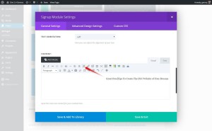
8. Now you can enter the text you want to appear to the left of the form. I like to set the text to right-align so that it bumps up against the form. My CSS is geared to this so I recommend you do the same.
The Magic of CSS
Now lets start to dazzle things up a bit with some CSS.
If you are working with a child theme you can go to Appearance>Editor and open your stylesheet. If not, go to Appearance>Divi Theme Options>ePanel>Custom CSS (which is located at the bottom of the ePanel)
No go ahead and add this CSS.
/*------------------------------------------------*/
/*-------------[Custom Subscribe Demo]------------*/
/*---------------[By Geno Quiroz]-----------------*/
/*------------------------------------------------*/

.demo-subscribe-section {padding: 0px!important;}
.demo-subscribe-section .et_pb_row {padding: 0px!important;}
.demo-subscribe-section .et_pb_newsletter{padding: 0px 0px;}
.demo-subscribe-section .et_pb_newsletter_description {padding: 0 0 0 0; width: 50%; margin: 0;}
.demo-subscribe-section .et_pb_newsletter_description p {padding: 19px 20px 0px 0px;}

.demo-subscribe-section .et_pb_newsletter_form {width: 50%; padding-left: 5px; height:60px;}
.demo-subscribe-section .et_pb_newsletter_form p {display: inline-block; margin-right: 10px; padding: 0px; padding-bottom:10px;}
.demo-subscribe-section .et_pb_newsletter_form p input { padding: 5px 4% !important; width: 160px; border-radius: 0px!important;}

.demo-subscribe-section span.et_pb_newsletter_button_text {display: none;}


.demo-subscribe-section .et_pb_newsletter_button {
    padding: 0 0 0 10px;
    text-align: right;
    border: none;
    background: url(https://montereypremier.com/wp-content/uploads/2016/04/149X51-mail3.png) no-repeat left top;
    width: 135px;
    height: 31px;
    cursor: pointer;
    z-index: 1;
    margin-left: 10px;
    margin-bottom: -20px;
    margin-top: 14px;}


.demo-subscribe-section .et_pb_newsletter_button:hover {background: url(https://montereypremier.com/wp-content/uploads/2016/04/149X51-mail4.png) no-repeat left top;}


.demo-subscribe-section a.et_pb_newsletter_button:after {display:none;}
.demo-subscribe-section .et_pb_newsletter_form p:nth-child(3) {display: none;}
.demo-subscribe-section .et_pb_newsletter_result { padding-top: 19px;}
.demo-subscribe-section h2.et_pb_subscribed {font-size: 17px; padding-top: 3px;}


@media only screen and (max-width: 1141px) {
	.demo-subscribe-section .et_pb_row {
     		width: 100%!important;
    		max-width: 100%!important;}}

@media only screen and (max-width: 1110px) {
    .demo-subscribe-section .et_pb_newsletter_description {width: 35%;}
    .demo-subscribe-section .et_pb_newsletter_description p {padding: 9px 20px 0px 0px;}
    .demo-subscribe-section .et_pb_newsletter_form {width: 65%;}
}

@media only screen and (max-width: 980px) {
    .demo-subscribe-section .et_pb_newsletter_description {width: 100%; text-align:center;}
    .demo-subscribe-section .et_pb_newsletter_description p { text-align: center!important; padding: 9px 0px 0px 0px;}
    .demo-subscribe-section .et_pb_newsletter_form {width: 100%; text-align:center;}
}

@media only screen and (max-width: 570px) {
    	.demo-subscribe-section .et_pb_newsletter_form {height:100px; padding-top:17px;}
    	.demo-subscribe-section .et_pb_newsletter_button {margin-left: 0px;}
	.demo-subscribe-section .et_pb_newsletter_form p input {width: 70vw;}
	.demo-subscribe-section {height: 196px;}
}


@media only screen and (max-width: 550px) {
    .demo-subscribe-section .et_pb_newsletter_form {height:130px;}
}

@media only screen and (max-width: 393px) {
	.demo-subscribe-section {height: 225px;}
}

/*-------------[End Custom Subscribe]-------------*/
/*````````````````````````````````````````````````*/
/*````````````````````````````````````````````````*/
The next step would be to add your own buttons into your media library. If you do not have any, check out all the Free Icon links I have on my resource page. https://quiroz.co/blog/resources/
Once you have upload an image, open it up in WordPress so that you can grab the url. Then replace the url I used on the demo with your very own image url.
Now keep in mind that the length of the text you use and the size of the image you use mess with the padding.
If you keep the text message short and sweet and work with a button image similar to the one above then you will not have to make any modifications. But if you choose to use different sized images for the button, then you may have to adjust the the css for the form height, button background height and width, button margins and form margins in the above sample code.
My Email Field Is Missing?
For some individuals using the code on my last tutorial, their email field went missing. It turns out that for some reason the 3rd nth-child which is the Last Name Field for most users, turns out to be the Email Field for a few people. Although I am not sure what that is the case, we have a solution.
If you used my tutorial to make your subscribe module, then just remove this line of code.
.demo-subscribe-section .et_pb_newsletter_form p:nth-child(3) {display: none;}
And that’s it! Have fun!
By the way. I love providing these tutorials for free but for those of you who use these to your financial gain, might you consider buying this poor guy a coffee? Every penny helps me to continue to provide these Divi tutorials free for all to learn and grow.
Well that’s all for now. I hope you find this article useful.







Dear Geno, Is there a way to change the default icon in the overlay?
Hi Pablo. Are you referring to the icon I used on the image or the default Divi arrow that appears when you hover? I used a variation of this module on my latest child theme. You can check it out here. https://quiroz.co/themes/pacificgrove2/
Thanks a million! What about customizing Bloom?
Not on my list. But they just released an update this week and havent had a chance to see the new options yet.
The only issue I noticed, is if the end user puts in a fake email address, that error message gets cut off. Its about 3-4 sentences. try joe at aol dot com, to see what I mean.
Thanks Ciril. I will have to update this when I get a chance. I did get it working right on my latest child theme which uses a variation of this. https://quiroz.co/themes/pacificgrove2/
Hi Geno – works great (THANK YOU!) except I am getting First Name, Last Name, and Email Address fields out of MailChimp, even though I have removed those fields from my list. I’d like to to only show an email field … any idea how to change the default signup form when using the API? THANKS
Hi Judy. I am not sure I have the right answer for you. The signup form I am using on the demo is using the MailChimp API and it is not showing the last name. As for the first name, the last time I checked it was required by Divi. That may have changed in the latest release(s) but I have not taken a look into it yet.
Thank you for your reply, Geno, and for all the tips and code you share! I think my problem is with MailChimp and I’ve just given up on using your pretty code. But I thank you all the same!
I have the same problem. I tried changing it in MailChimp and generating a different API key, but of no avail.
This is how I changed the css and set the row to full length. The Mailchimp fields are loading back to front, and like, you, I am thinking of deleting this feature.
.subscribe-section .et_pb_newsletter_description {padding:10px 0 0 0; width: 30%; margin:10px 0 0 0;}
.subscribe-section .et_pb_newsletter_description p {padding: 19px 20px 0px 0px;}
.subscribe-section .et_pb_newsletter_form {width: 70%; padding-left: 5px; height:60px;}
Hello Gino,
Thank you. This is what I was looking for but I don’t use Mailchimp, I use Getresponse .
Do you have a trick for those using Getresponse?
Thank you
Im not sure if the Divi Signup module supports Getresponse. If it does, then it should work the same.
I’m using this for a new site and it works great… Thanks Geno!
Awesome!
Geno, you are a legend.
I have only just started a site that really only needed the single line contact form and after heading to my go to site (yours), lo and behold, there it is in all its glory.
Thanks mate and keep up the great work.
🙂
Hi Geno I did as above but both my two fields and the image are not displaying. I did create an account with MailChimp and added the API key in wordpress. I also try your note at the bottom but with no luck.
Hi Geno,
The demo page (2015-DiviDemos/) is empty – No Results Found
Can you show a live example?
Thanks for your time!
Igor
Thanks Igor. The link has been updated. Here is the demo page https://quiroz.co/2014-DiviDemos/
Hi Geno,
For some reason the height of my module is much larger than yours… any idea why?
So, I actually scrapped everything and started over… and was able to get the height the way I wanted. New question, how do I get my icon for submitting the email address to overlap underneath the module likes yours is in the example above? Mine is getting cut off slightly at the bottom instead of overlapping.
Hi Geno, Thanks for this…great as usual. Is there a way to use the email signup module and your twist on it in the secondary menu area of DIVI…at the top of the page where contact details, social icons usually go?
Sounds like a fun task to add to my list for future tuts 🙂
Is there a way to show the image and subscriber form full screen?
Unfortunately I only can find a way to make either the image or the form appearing full scren.
Im sure you can but I have not tried it yet.
The new Divi changes the optin slightly so that the “on hover” action of the icon shows up even if you leave the button text blank (or a space which is required now with the latest Divi) To fix this i just used the advanced design panel and removed the button icon in the settings and it worked. Im sure theres a CSS you can add to remove the :hover icon but this is a workaround
Thanks for the share 🙂
My email didn’t show so I removed that line of code and now the email is under the other two fields. How do I get it to line up?
Link?
Hello,
Is it possible to change In french the message when people sign up?
Thanks for the reply.
Yes I am sure it is one of the php files. Not sure which one though.
Thanks so much for this hack! How does one control what the button does when you hover over it? And the colour of the fields when typing into them? My button just disappears when you hover over it and I can’t figure out how to fix it!
Geno – I have added your code for the super slim signup bar with a few modifications and it looks great. However when I try to use it I get an Internal Server Error. If I plugin the standard signup module on the same page and test it – it works fine. Any hints at what might cause the form to break?
Not sure what might be causing it to break on your site. Sorry.
Same problem over here: if I hide a field, it doesn’t work. :/
We are not sure why that would be. Could you provide a little more detail about your setup? Like, what service provider are you choosing? What field are you hiding? And what is the result that you see?
I am having a similar issue with the Divi Optin though I didn’t use Geno’s code at all. I’m connected to Mail Chimp. It worked for one test registration and now it’s broken.
Hi Mike! I’m sorry, I don’t think we can help you with that since it is not related to our tutorial code. You’ll probably need to reach out to Elegant Themes support.
I’m having the hover issue, but can’t correct it. Now, I’ve used this on another site once before and it still works perfectly. The site that I’m having this hover issue on is my own company site. Being my own site it’s the only site I’m kicking the tires on WordPress 4.4, which I think might be the culprit. I’m gonna axe the use of this for now, however I still wanted to let you know of this since it might be a new issue related to 4.4.
i have found an article related to divi email optin module but the customization of subscription thankyou message didn’t work to me, can u please suggest me any mathod to do so .
Are you able to add more fields to this form?
You are now with 2.6 🙂
Gino hi.
how do I cancel the hover on the icon button or add a hover icon that’s different. at the moment I am getting a colored square when I hover to click.
Hi Lisa. Try adding this.
.demo-subscribe-section .et_pb_newsletter_button:hover { padding: 0 0 0 10px; text-align: right; border: none; background: url(http://montereydev.com/demos/superslimsubscribe/wp-content/uploads/2015/08/mail.png) no-repeat left top; width: 64px; height: 64px; cursor: pointer; z-index: 1; margin-left: 10px; margin-bottom: -37px;}Thanks Geno! LOVE this one. Is there any way for it to just say “name” instead of “first name” in the first field?
Fantastic, is there a way to get the last name field to display?
You can remove this but it will throw off all the custom padding and margins. You would have to reconstruct everything else as well.
.demo-subscribe-section .et_pb_newsletter_form p:nth-child(3) {display: none;}Hi Geno having an issue with the icon I picked not fully showing up. Not sure what to do. Any thoughts?
http://www.modernutilityservices.com/solar-systems
Hi Alyssa! It looks like you have played with it some more to get it to show…but it is sitting up higher than you probably want. I would probably remove the margin-top value and set the margin-bottom at -43px or so.
Hi Jerry, I have this issue as well. When I change the margins it is moving the fields, not the icon. I’m changing them here
margin-bottom: -20px;
margin-top: 14px;}
Also, what size should the icon be to work please? Thank you!
Hi Nicola! The CSS I provided in the previous answer was for that specific website. Any size icon can be used, but there will need to be adjustments to the CSS. The icon in the demo is 64×64. If you have a link we can try to give you some suggestions for the CSS.
Hi Geno, thank you so much for the awesome tutorial. I implemented it here: http://www.trainbestpractice.com/5-key-factors-career-success/. However, like Lisa I’m also getting a colored block on hover. I did try adding the code you suggested, but the issue persists. Any tips on how to resolve this?
It looks like there needs to be an !important tag added to the background line… Try using this CSS…
.demo-subscribe-section .et_pb_newsletter_button:hover { padding: 0 0 0 10px; text-align: right; border: none; background: url(http://www.trainbestpractice.com/wp-content/uploads/2016/08/Flat-Email-Icon-Smallest.png) no-repeat left top !important; width: 80px; height: 80px; cursor: pointer; z-index: 1000; margin-left: 10px; margin-bottom: -37px;}Hi Jerry, that worked perfectly, thank you. It’s really looking awesome but I’m having some trouble on mobile landscape. How can I, like on mobile portrait, make the fields appear underneath each other (centred) with the button underneath?
Also, I’m trying to get it display nicely on iPad and I’m struggling. For example, on iPad portrait the form fields fell outside of the section background, so I added padding, but now that padding is also added to iPad landscape? How can I prevent this?
Also, on iPad landscape the text is on two lines and not aligned with the form fields. How can I fix this? Thank you so much in advance for assisting me with this… I know you certainly don’t have to give support, but it IS much appreciated. 🙂
Hi Noëlle! There are a lot of ways to handle the different screen sizes, you will have to play with it a bit to find the exact solution you are looking for. You can adjust those media query lines to better suit your needs. For example, you can do something like the following…
@media only screen and (max-width: 980px) and (orientation: portrait)  {
    .demo-subscribe-section .et_pb_newsletter_description {width: 100%; text-align:center;}
    .demo-subscribe-section .et_pb_newsletter_description p { text-align: center!important; padding: 9px 9px 18px 9px;}
    .demo-subscribe-section .et_pb_newsletter_form {width: 100%; text-align:center;}
}
@media only screen and (max-width: 980px) and (orientation: landscape)  {
    .demo-subscribe-section .et_pb_newsletter_description {width: 100%; text-align:center;}
    .demo-subscribe-section .et_pb_newsletter_description p { text-align: center!important; padding: 9px 9px 18px 9px;}
    .demo-subscribe-section .et_pb_newsletter_form {width: 100%; text-align:center;}
}
That’s just a quick example, but you can play with it from there.
Hi Geno! This is exactly what I’m looking for 🙂 Thanks a lot! Although I just have one question: my client doesnt want a fancy button just a plain solid black one. I tried removing the background url and replacing it with just #0000 but the text wont show up. How do I fix this? I’m still a noob at coding but I really want to learn.
Hello Bea! You’ll need to modify the CSS from the tutorial to accomplish that. Here is something to get you started in the right direction…
First, you will need to remove, or comment out this section of the code…
.demo-subscribe-section span.et_pb_newsletter_button_text {display: none;}

.demo-subscribe-section .et_pb_newsletter_button {
    padding: 0 0 0 10px;
    text-align: right;
    border: none;
    background: url(https://montereypremier.com/wp-content/uploads/2016/04/149X51-mail3.png) no-repeat left top;
    width: 135px;
    height: 31px;
    cursor: pointer;
    z-index: 1;
    margin-left: 10px;
    margin-bottom: -20px;
    margin-top: 14px;}

.demo-subscribe-section .et_pb_newsletter_button:hover {background: url(https://montereypremier.com/wp-content/uploads/2016/04/149X51-mail4.png) no-repeat left top;}
And then you can use the following code in it’s place…
.demo-subscribe-section span.et_pb_newsletter_button_text { display: initial; }
.demo-subscribe-section .et_pb_newsletter_button {
	margin: 8px 0px 0px 0px;
	padding: 5px 15px 5px 15px;
	border: none;
	background-color: green;
	cursor: pointer;
	z-index: 1; }
.demo-subscribe-section a.et_pb_newsletter_button:hover {
	background-color: red; }
Obviously you will want to change the background color, for the button and the hover (green and red). You can also adjust the padding and margin values to size the button.
Thanks Jerry! That helped a lot 🙂
I’ve used this on my site which is built using Extra with the Divi builder (http://sunflowercreativearts.org) but I’m having a problem with the mobile version. The submit button ends up hovering over the module/section under the subscribe module. Any suggestions on fixing this? Thanks!
Hello! What you’ll need to do is change the height of the section in the CSS. You might have to use different values for the different screen sizes, but here is one example for you…In the tutorial code there is this piece…
@media only screen and (max-width: 550px) {
    .demo-subscribe-section .et_pb_newsletter_form {height:130px;}
}
You can change the height value to 230px and that looks much better for that size screen.
Hey
I am from Denmark and want to translate the fields to danish
How do I do that?
Thanks
Hello Frederik! Since this is using a standard Divi module, I think you can do the translation by the normal methods for WordPress and Divi.
WordPress: https://make.wordpress.org/polyglots/handbook/
Divi: https://www.elegantthemes.com/gallery/divi/documentation/translate/
Anyway this concept can be applied to the divi contact module / form? for a super slim contact form?
Hi Jeremy! It can be done, for sure. Unfortunately we haven’t put together the code to do that.
I followed the instructions and removed the code that was making email boxes disappear, mine is still not there. I can see it in the visual builder, but when I visit without being logged in, it’s not available. Please help.
Hi Kennedy. I am not sure what might be causing that sort of problem. Try disabling all your plugins to see if that does the trick. If not, you can look into our Divi expert services here: https://montereypremier.com/divi-expert/
Hello Geno, am having the same issue as Kennedy. But am using Divi 3.0. could that be the problem?
It might be. I have not tested it using the Visual Builder.
Absolutely loving the double menu’s you have at the top of this web page with the logo in the top one. A tutorial one day Geno? 🙂
Sounds like a fun tutorial. I just might do that 🙂
I can’t seem to get the envelope icon to “pop out” above the rest of the content. Any thoughts? http://theovationtheatre.com/home/
Increase the height to 131px and the top margin should be about -42px and add position:absolute;
.demo-subscribe-section .et_pb_newsletter_button { padding: 0 0 0 10px; text-align: right; border: none; background: url(http://theovationtheatre.com/wp-content/uploads/2017/02/mail.png) no-repeat left top; height: 131px; cursor: pointer; z-index: 1; margin-left: 10px; margin-bottom: -20px; margin-top: -42px; position: absolute; }That was perfect! It bumped my entry boxes up to though… any thoughts? I’m still learning these little nuances and really appreciate the help!
Hi, I have carried out the instructions for this great looking signup. I have a couple of issues which I am not sure how to resolve. The text is not centered vertically as yours is and also the signup boxes / text is not aligned very well. It looks like the boxes have just been placed anywhere, that may be due to my text. Hope you can help as other than this it is exactly what I need. Thank you.
I was just checking the site and it looks pretty lined up to me on a decktop. As I change the screen width on my browser I that there are some screen width that could use adjustment. I recommend testing the various screen widths and adding new media queries & applicable css specifically for those screen widths.
I meant to add my website so you could see how it looks. http://www.parkwyddnjfc.uk/
Thanks Geno, this is terrific! Any way of adding surname as well? Many thanks if someone can help out!
Hi Julie. I dont have a tutorial for that at the moment.
Is this form still working for people in the same way? My form does not seem to be styling
Mine isn’t either. Any idea what could be wrong Geno?
After the latest update to Extra this isn’t working anymore, any idea what’s wrong?
I need to go back and take a look. When i get a chance I will update the tutorial.