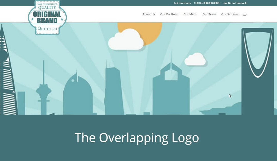
So a few Divi do-it-yourselfers have asked me about the overlapping logo I have used on a few recent projects. Like these two for example…
As you know logos with more height than width can be a little hard to squeeze into the vertically challenged default Divi logo area.
Yet not all logos are going to be horizontal so we have to find nice solutions. There are some great ones out there but I have fallen in love with the overhanging logo as of late.
Like the one I used for this demo here: https://nationalinfantrymuseum.org/
The Basics
As you can see I use the secondary header as well so my logo has to hang over both above the secondary header and below into the main section. But this is actually to my advantage because using the secondary header actually gives me more room for the Logo.
Getting Started
So to get things started a I created a basic home page with a standard primary menu and a secondary header menu
1. As you can see here I have not done any other customization to the header area except change the color of the top header. You can see I still have the default Divi Logo.

2. Now go ahead and add your vertically challenged logo via the epanel in Divi Options.

3. And now your page has the vertically challenged logo in place.

And like you probably have already encountered, you can barely read the little bugger. Well lets get this resolved with a little CSS.
And Now The Magic of CSS.
If you are working with a child theme you can go to Appearance>Editor and open your stylesheet. If not, go to Appearance>Divi Theme Options>ePanel>Custom CSS (which is located at the bottom of the ePanel) 1. Add this CSS.
/* overhanging logo by Geno Quiroz */

#top-header {z-index: 99999;}

#logo {
    max-height: 220%;
    margin-top: -32px;
    z-index: 100000;
}

@media only screen and (max-width : 980px) {
    #logo { margin-top: 0px}}
By changing the z-index on the top header, the logo now floats over the top header as well as into the main area. You will also probably have to adjust the “max-height” and “margin-top” until you get it just where you want it. Each logo is different so plan on playing around with the numbers.
In the customizer you can make the top header and main header fullwidth. You can also remove the fixed header setting so that the header scrolls up with the page instead of shrinking and remaining fixed at the top of the screen.
You can also add a little more CSS to swap out the vertical logo with a smaller one as you scroll down the page. Like this…
I have a tutorial on swapping out the logo here https://quiroz.co/change-the-logo-when-scrolling-down/
Well that’s all for now. I hope you find this article useful.


Man you rock! Seriously! This-is-awesome!
And what about the menu group Directions/Email/Tour? Is it a secondary menu?
You mean for the National Infantry Museum Demo/Gif? If so the answer is yes. I just added some Font Awesome icons and a little CSS. You can expect that to come in a tutorial very soon 🙂
This is better than a black friday deal 🙂 You’r the man.
{applause} Thanks for saving me the engineering research. I owe you a beer/coffee. 😉
Your the man Geno. Thanks for sharing, I appreciate it.
It’s really cool!
Excellent!
Always hunting for fun ways to change up the Divi menu, thanks for this.
is there a way to get this to work with centered inline logo header ?
Thanks for this – the Logos on DIVI came out so small….
I am using a child theme – but the code didn’t work for me in the Editor or updating the stylesheet directly, but worked on the Custom CSS on Divi ePanel. I am very much a newbie – so am sure I have not set something up properly. THANKS AGAIN.
Great tut, thank you!
I have implemented this and it works great in Chrome, FF & IE11 but not in Safari 5.1.7 for Win. The logo doesn’t resize on scroll and appears on the page at the originally designed full size. I have also noticed that the logo doesn’t resize in iOS on iPad4. Running WP 4.3.1, Divi 2.5.8 with a barebones Child theme.
Thanks Todd. I will look into these questions and post what I find.
Should it work the same with a logo centered inline ?
I have not tried it out using the centered inline logo yet. When I do I will post it on here.
Geno Quiroz – Have you found a way to do this with the centered inline logo? I have been trying to get it to work without success.
Not yet 🙂
Any chance you’ve had time to figure out the center-inline way to do this? I’m working on a website right now that it would look really great on. I’ve tried a lot of different patching from various tutorials I’ve found, and I get it close, but not close enough.
Sorry. Not yet 🙂
Provide a link and I might be able to help you out.
This worked for me …
/*Overlappin*/
#top-header {z-index: 99999;}
.centered-inline-logo-wrap {width:225px !important;}
body.et_header_style_split .centered-inline-logo-wrap #logo {
margin-top: 90px;
z-index: 100000;
max-height: 514%;
}
.et-fixed-header .inline-logo-wrap #logo {
max-height: 153px;
}
@media (max-width: 980px) {
.et_header_style_split #logo {
max-height: 225px;
}
}
/*Overlappin*/
@media only screen and (max-width: 980px) {
#logo {
min-height: 100px;
}
}
@media only screen and (min-width: 981px) {
#logo {
min-height: 120px;
}
}
Jonny’s code in this thread worked for my centered inline logo!! Thanks Jonny!
It also worked for me. Thanks!
Great! Really helpfull!
Is there a way to do this just on the home page or am I asking too much?
Thanks again for sharing!
Try this…
/* overhanging logo by Geno Quiroz */ .home #top-header {z-index: 99999;} .home #logo { max-height: 220%; margin-top: -32px; z-index: 100000; } @media only screen and (max-width : 980px) { .home #logo { margin-top: 0px}}This seems great ! I can’t make it work with a centered inline logo, is there something to change in the CSS ?
I have not tried it out using the centered inline logo yet. When I do I will post it on here.
Yes! Please let us know when this works on a centered in-line logo! It’s giving me very inconsistent results each time I refresh the page with the code provided. Thanks!
I’ve tried it with the centred in-line logo and it worked fine, until the other day when it stopped working. Not sure what I did wrong 🙁
I’ve had the same issues trying to do this with the centered in-line logo layout. Still no luck either. Just like Jenny, it worked, and then it stopped working within the hour. So weird!
I can’t make it work this code on my site
Thanks so much, will wait for it !
Hey Geno. This is excellent. Only problem is, on mobile, it’s pulling my logo to center of page. How can I fix this so it works on mobile too?
Each case is different due to menu size or logo size. You most likely have to adjust the mobile queries.
That make’s sense, but where do I do that? Sorry, new to this.
Send me a link to your site.
Awesome thank you. I haven’t set it to my official URL yet so it’s http://4c0.362.myftpupload.com/
Try adding this to the Custom CSS box in the Divi Theme Options ePanel.
@media only screen and (max-width: 1000px){ #logo {margin-top: -100px;}}Excellent, thank you Geno !
I would like to do the same with a vertical navigation setting for a client.
I tried with your settings, it works perfectly with an horizontal navigation, but not with a vertical one.
Any idea if it would be easily possible ?
Thanks and happy Christmas in advance.
Its possible but it just depends on the size of the logo. I would have to see the page in order to give you the proper css
Tx! Only Problem I have is the the logo is over the text on Mobile (Hor. Position) see http://www.verenigdestaten.info/
Got it ..
Can we set a vertical banner on Media scree only? tx…
You can try pushing down the mobile menu. Try adding this to the custom css in the Divi Theme Options ePanel.
ul#mobile_menu {margin-top: 29px;}That is absolutely awesome! That is the perfect solution to something that has been bugging me for ages! (I’m on my first site and not a tech whiz). Thank you so much for sharing. http://www.ethicalsolarsolutions.com.au
Since the death of Safari for Windows is there any way to make this work on the latest Safari for Windows version 5.1.7?
Sorry. I have not tested it on Safari for windows.
What if there is no header.php in my child theme?
I dont know if there is an alternative method. I only know how to add the second logo via modifying the header.php. You can create a header.php for your child theme. Using ftp just take the original header form the original Divi file and drag it into your child theme folder via ftp.
And also, the logo does not appear full size on page before scrolling down… How to make it larger before scroll? Thanks.
Just modify this part here and experiment with the number values
#logo { max-height: 220%!important; margin-top: -32px!important; z-index: 100000!important; }Awesome. Thanks for the tips.
Hi. I tried the Divi Facebook group, but no luck with help. Looking for some help. mcmsite1.info – working on a new site – I like the effect of the overlapping logo AND I like the effect of the navigation being visible when you scroll. With my logo, the transparency is an issue when you scroll and have the navigation visible. I used Geno’s tactics at https://quiroz.co/the-overlapping-divi-logo/ to make the logo overlap and he does give a way to shrink the logo – but it involves modifying the php files – https://quiroz.co/change-the-logo-when-scrolling-down/ – to basically change out the logo when scrolling – I really don’t want to mess with the php files. Does anyone else have a solution/idea they can offer? Later, I tried the altering the php files as you suggested in a child theme – but the main logo didn’t go away and the secondary logo – didin’t find the logo file AND stayed present ALL the time. Must be something different in the current version of DIVI’s header.php file. Any other suggestions?
Hey Gino, started to build my first site using Divi and your blog has been so helpful, thank you a lot for all the tutorials. I’m having an issue with the overlapping logo, as it seems to break another tutorial that i’ve been using, which is how to have a FLY in CTA button in the navigation (https://divi.space/divi-tutorials/how-to-create-fly-in-menu-button/) it seems that once I insert the CSS for the overlapping logo, the CTA button always shows up, and its size seems fixed by the logo size. I wonder if this is due to the Z index CSS ?
Sounds like it.
Awesome mod Geno! Is there any way to center the logo on mobile devices only with this modification? not sure if its been covered yet.
Hey,
first thanks for the great tutorial.
I do have a minor issue though, on my page https://www.nestingnomads.de/
My secondary menu (top right) has two drop down elements – but the dropdown is not visible anymore. What I figured is out it comes back when I delete line #top-header {z-index: 99999;}
But then the logo is cut of on top by the secondary menu bar. Is there a way to solve this?
Thanks in advance,
Chris
That will require a different approach. I dont have a quick fix for that yet. Sorry
Hi,
I am using your code but is not working. I have divi and wordpress updated. Any suggestions? the web is http://www.bezenterapia.com
Looks like its working on my end. This is what I see. http://screencast.com/t/MeyW8b2BW
Just tried this out and it works like a charm! Thanks!
Awesome! Glad it worked for you!
Hey Geno. This is wonderfull. Only issue is, on mobile, it’s pulling my logo to center of page. How can I fix this so it works on mobile too?
Hello Nimah! I’m thinking there might be some conflicting code or CSS causing this issue for you. If you provide the link to your site I can take a look at it for you.
Hello Geno,
Love your stuff and using some of your child themes as well.
I have a question regarding the overhanging logo, is there a way to make it work with an SVG format?
I tried, but it didnt do the overhanging trick, which it did when using a PNG.
Any suggestions please?
Thank you,
That is an interesting challenge… I don’t know of a way to do this currently. The support for SVG format in WordPress is pretty limited for now. Without digging into it too deeply, I think WordPress is scaling the image based on the container size which means it won’t let the SVG image overflow. I’m guessing it would require a modification to WordPress for this to work, perhaps there is a plugin somewhere.
Thank you Jerry. I am always using the SVG SUPPORT plugin, as WP does not support that file format. I prefer the SVG format for logo’s as it shows much sharper. However, I am struggling to get the SVG logo overlapped as well. Would be great if that is possible.
Hi Jerry, now I am flabbergasted. I successfully implemented the overhanging logo in one site. When I tried to apply the same at another site (http://photosbyfrans.com) it doesn’t work. Can you please have a look and advise me where I went wrong? Thank you!
HA! A walk in the wind and coffee solved it.
Awesome! A little space goes a long way! 😉
I know this is old, but hopefully somebody can make use of this. I figured it out. Use this CSS instead of #logo to get it to work for SVG:
.logo_container {
height: 120%!important;
margin-top: 10px;
z-index: 100000;
}
Actually, the z-index makes it so that the menu items are not accessible. You need to take out the z-index line.
Is there a way to do the image overlap on a section, where the image overlaps both the top and bottom of the section. (like this page: http://byregina.com/) Thanks!
That is definitely possible. How to do it is too long to describe here, but below are a couple links that can get you started in learning the concepts on how to do that.
https://quiroz.co/how-to-float-an-image-in-between-sections/
http://www.elegantthemes.com/blog/divi-resources/creative-ways-to-use-divis-built-in-margin-and-gutter-controls
Hello (again) Jerry, I did it again. Phew, pulling my hair out, if I had any left.
A brand new site and a brand new installation. http://castle.ftck.net
And I am not getting the PNG logo overlapping. What am I missing please?
Thank you so much,
I think you have some CSS code that is conflicting in the Divi -> Options -> Custom CSS box at the bottom. There is a max-height: 100% that is overriding your other changes.
That is empty Jerry. Only setting I did was in the customizer, setting the max logo height from its default at 54 to 100.
Looks like you got it working now. Happy coding! 😉
Yes, I set the max logo height back to default. Never thought that this will matter. Never stop learning. Thanks Jerry.
🙂
Hey Geno,
Shrinking down to 980px and smaller, my logo is growing, making it too big on mobile. On your demo, your own site, I see it moves a little at 980px, but goes right back to original size.
I used your code…
#top-header {z-index: 99999;}
#logo {
max-height: 130%;
margin-top: +0px;
z-index: 100000;
}
@media only screen and (max-width : 980px) {
#logo { margin-top: 0px}}
and added this to get the growing logo to stop, so it does the same thing your site does:
@media only screen and (max-width: 980px){
#logo {
max-height: 70%;
margin-top: -20px;
padding: 0px;
z-index:100000;}
}
But there’s still that little bump. Just something we have to live with? And is there a simpler way to add my code to yours to fix the issue? Site is here
Thanks man!
Hi Randall! I think I understand what you are referring to… The logo changing as you resize the screen is something that happens on standard Divi sites. So I think you will see that happen, even if the the logo is exactly the same size before and after 980px. I just check out your site though, it looks great on my desktop and mobile.
I had to hack for Safari.
This is what I added under the logo code and separate from Geno’s.
@media screen and (-webkit-min-device-pixel-ratio:0) {#logo {max-height: 190px !important;}}
Thank you for sharing your solution!
There was another hack I had to use for 1280×1024 screens otherwise the logo was huge, it was fine if it was 1280×768:
@media screen and (max-width:1280px)and (max-height:1024px) {
#logo {
max-height: 230% !important;
margin-top: 0px;
z-index: 100000;
}
}
:
Thanks alot for this!
But I really want to use it for centered inline logo… Did you by any chance found the time to figure this out?
Sorry, we have not worked out a way to do this yet.
Hi Jerry, is it impossible to do it with the centered inline logo? I have a developer trying to help me with it, but I don’t want to spend too much time or money trying to make it happen if it isn’t possible.
I may need to switch to a different theme for the project I’m working on, or convince the client that we should left align the logo! The site is testsite.legupcreative.com. I would really appreciate your expert advice!
🙂
thanks!
Hi Julie. It is possible but it will take a different approach. This tutorial is not written for the centered inline logo.
Thanks! Luckily, my client likes the way it looks on the left!
One more question. Can you tell me why the logo isn’t getting much smaller as I scroll? I see that it does it on your demo page: http://montereydev.com/demos/overhanginglogo/ – but mine is staying almost the same size and my client wants it to fit within the menu when we scroll so it doesn’t cover up content.
I’ve played around with just about everything, but still can’t figure it out!
Thanks!
Hi Geno, i’m interested to know how its possible to a centered inline logo. Did you try ?
Not yet.
I love this solution. It has given me the results that my client was looking for on desktop. Just one little issue is that on mobile the logo appears as if it’s floating. It’s pushed down the screen enough that it’s visually impacting the header. Do you have a tip to move it up the screen only on mobile? fitchicbootcamp.com/checkitout will get you around the Coming Soon page.
Hello Andi! Great job on this site! To adjust the logo on mobile you can modify the margin-top value in this line of code from the tutorial…
@media only screen and (max-width : 980px) { #logo { margin-top: 0px}I would start by making that -10px instead of 0px, and then adjust based on how you want it to look.
Ah, jeez… Why didn’t I see that before. Thanks for taking the time to answer my question even though the answer was right in front of me. -17px was the magic number!
That’s what we’re here for! 😉
Hi Geno,
Love your tutrorial as always.
I try to use your codes into my website : http://www.mbw212ci.com.
I use Primary Menu instead. How can I raise the primary menu position higher?
I need to make the full header image fill the screen, there’s a gap when using the secondary menu that I don;t want to appear.
/* overhanging logo by Geno Quiroz */
#top-header {z-index: -99999;}
#logo {
max-height: 100%;
margin-top: 0px;
z-index: 100000;
}
@media only screen and (max-width : 980px) {
#logo { margin-top: 0px}}
Any suggestion?
You can try adding this CSS to move the menu up…
#top-menu-nav {
    margin-top: -50px;
}
You might need to adjust the logo size after adding that code. And you will probably need to do some adjustments for mobile devices also. But that should get you going.
Please help… I cant seem to get it right on my site. http://www.thesportstrust.co.za
Hi Stephanie! I took a quick look at the site, there is a lot of CSS stuff going on there. I can see why it would be difficult to get this working. I’m sorry, but this is a bigger project than we can handle in comments.
Thanks again for posting this, Geno. Very useful today. 🙂
Hi, Thank you for all usefull turorials, and I have used this one before, but today in Divi 3 I am not getting it to work? Is that correct? Not working in 3? Or do I need to have a closer look to what I have done wrong. 🙂 Thanks
Hmmm… You probably should take a closer look at the tutorial steps. It has still been working with Divi 3 for us.
Hi, yes, something I did. Now testing on a different site and working fine. 🙂 Thank you so much for your support.
Excellent tutorial – thanks so much. Just wondering – is there a way to target a reduction in scale of the logo on mobile only, outside of reducing the size of the original logo itself?
Many thanks 😉
Glad you like the tutorial! You can reduce the logo size on mobile by modifying the tutorial code a little bit.
Take the following piece of code and modify it…
@media only screen and (max-width : 980px) {
    #logo { margin-top: 0px}}
Here is what you’ll want to replace it with…
    @media only screen and (max-width : 980px) {
        #logo {
            height: 110%;
            margin-top: 0px } }
The “height: 110%;” is what changes the logo size, you can adjust that to get the look you want.
Perfect – works like a charm! Thanks for the quick reply and help. Kind regards 😉
Thank you so much for this! It works!
You’re welcome! Thanks for visiting!
Great tutorial! Thank you.
On my homepage, it looks and functions perfectly. On another, it looks great but is causing an issue with the menu button (under 1000px screens). It’s like the z-index prevents the button from being pressed. Is that possible?
There’s also a “fullwidth menu module” that falls underneath the header and causes a strange gap between header on the top of the screen (again under 1000px screens).
I’m also using the Primary Menu, Divi 3.0.17, and a bare bones child theme primarily modifying the footer.
Any direction or advice would be awesome! Would love to keep it – really adds to the divi layout options.
http://test.opendoorfamily.ca (perfectly functioning page)
http://test.opendoorfamily.ca/about-2 (problem page)
Hi Bradley! There is something more than just CSS going on here. Looking at the page source for the page that is not working, there are no menu items for the mobile menu on the page.
Thanks for looking into it. Just getting back to the project, and have a support ticket in with ET. There’s a js error – just not sure the cause. All plugins have been deactivated and still nothing.
Anyway thanks for the beautiful logo mod!
Thanks for the update!
Thank you, you are a rockstar!!!!!
Hi! Thank you for the tutorials.
I’m working on a Extra Theme, but unfortunately looks it doesn’t work the css. I want to ask if you have any solution to overlap the logo on Extra Theme.
Thanks again.
Unfortunately I do not at this time.
Great Tutorial!!! I use the Divi theme on several sites and I have issues displaying some logos correctly. I really appreciate you sharing this post!
Thanks Geno! Using this now.
Any idea what you would have to modify in the CSS to get this to work with the Centered Inline Logo header format? the element still shows as img#logo in the inspector, but the effect stops working when the logo is entered.
No I have not tried this with the centered logo. When I do it will be a completely different tutorial.
I’m in the same predicament, a tut for the Centred inline Logo would be great! 🙂
Any idea how to change the size of the logo on tablet / ipad? Logo does not scale down.
You can add some media queries specifically for the tablet / ipad. HEre are a couple of media queries you could use. Then just include the css for the logo between the brackets in the media queries below. Something like this .logo {max-width: 200px;}
/* Laptops & iMacbook */ @media only screen and ( min-width: 1100px ) and ( max-width: 1280px ) {} /* iPads (landscape) */ @media only screen and ( min-width: 981px ) and ( max-width: 1100px ) {}Works like charm but struggling with size of the logo on portrait view of ipad Air. It’s very large! Trying to reduce it on mobile worked perfectly but not changing on tablet/ipad view. – still working on site http://www.dekaapwildbedryf.co.za/dekaap/
That is because your menu is too long/wide and creating a second line when the screen size gets to 1163px wide. When the menu creates a second rollover line it increases the menu height. And since the logo size is based on a percentage of the menu height, it also doubles in size. The solution is reducing the menu width. You can make the menu container fullwidth at 1163 and that should do it for you. Just add this.
/* iPads (landscape) */ @media only screen and ( min-width: 981px ) and ( max-width: 1165px ) { #main-header .container { width: 100%; max-width: 98%;}}Hi, since adding this wonderful feature my logo no longer shrinks when I scroll? Any ideas why this may happen? thanks.
It is because your menu is too long. It is forcing your search icon into a second row increasing the height of the menu header. And since the logo is set to be a percentage of the main header it stays big. The navigation padding within the main header is being reduced but the main header itself is not. Try reducing the amount of items you have in the top header. See screenshot https://www.screencast.com/t/DLLmJ8CG73s
Hey Geno…
Thank you for great tutorials, I’m a big fan of your blogs. Having trouble with the logo overlap, trying to do a few things, maybe that’s the issue.
Using the logo Swap Plugin to change the logo when the user scrolls. But it looks like the overlap isn’t overlapping. Any suggestions as to how to get the logo to overlap.
I could remove that plugin…
Thank you in advance for any help.
Yeah if you are using the Logo Swap plugin there there is a good chance it might conflict with this css since they both are modifying the same class
It works on homepage for center inline but my other pages it gets cut off by secondary menu.
I have not tried this with a centered inline header. That would require a different set of custom css I am sure.
I can’t seem to get it to work, any help appreciated http://www.theitalianontour.com
The Logo height in the customizer is overriding the custom css. Try adding an important tag to the logo max height. Replace the Logo css with this.
#logo { max-height: 200%!important; margin-top: -3px; z-index: 100000; }I tried that but it still doesn’t work 🙁
The Logo settings in the customer are overriding it. Try resetting the the Logo Size Settings in the customer and add the css to the new css panel in the Customizer.
I can not do it!!!!!!!! http://www.mebel-ml.ru/ Please help!!!!!!!!!!!!!!!
Unfortunately this does not work with the centered inline logo.
Thats Awesome! Thank you!
Your Welcome 😀
Hi, I have the same issue than shezzza on December 7, 2015 at 2:19 am. Works fine, but doesn’t work when implemented in the CSS file of my child theme. To date, all code implementation worked well in the child theme CSS. Does anyone think there could be an folder hierarchy problem for the logo image ? It would be a content issue, not a styling issue…
So this works great for a home page that you want to have the overlapping logo but once you get the posts, it actually overlaps the H1 header. Any suggestions for this problem?
You can add more padding above the header on single post pages or single out the logo css on post pages so that it does not overlap. Probably add more padding to the top of the single post pages (and archive pages) for better consistency.
for some reason mine is becomes large as i scroll down and is smallest when the scroll is at the top of the screen. I also have a shadow at the bottom of my secondary menu showing the sepearetion between both menus. Please Help
Do you have a link?
Hi there, thank you for this great tutorial. Quick question. I am trying to combine this with your Floating Menu customization. But after I add the code for the menu, the logo does not resize anymore. Any help?
Do you have a link?
The tips you provide in this site have helped me on how to create great post that readers will love. Thanks for all of your time, work and for sharing it.
For centered logo.. this worked for me (reworked Jonny’s response from 2017.. had to fiddle with it a lot):
/*Overlapping*/
.centered-inline-logo-wrap {width:auto !important;}
@media only screen and (max-width: 980px) {
#logo {
min-height: 120px; /* this so that it looks ‘decent’ on mobile) */
}
}
@media only screen and (min-width: 981px) {
#logo {
min-height: 250%; /* Give it a decent size */
float: left; /* To make it float, so that the menu around it doesn’t get too big vertically.. */
}
}
I have been a fun on quiroz.co’s creative website resources. I gained so much website coding skills from short tutorial on this platform. I have been able to implement the learned skills on this https://www.akus.co.ke/
And many more..
I’m forever grateful
Thanks for sharing these amazing tips.
Hide logo on scroll for mobile anyone?