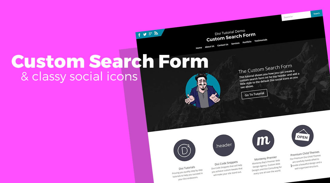
The Divi search feature in the header is pretty cool. I love the way it scrolls down when you select the search icon.
But while working on a Travel/Destination Blog website, the client wanted the search engine more visible. So we came up with this nifty trick to add it to the top header.
Hope you find it useful on some of your projects.
Getting Started
So to get things started a I created a basic home page with a standard primary menu and a secondary header menu
1. As you can see here I have not done any other customization to the header area except change the color of the top header and make it fullwidth in the Customizer settings.

2. Now we are going to add a bit of code in the header.php. You should be working with a child theme so that the changes are not overridden on the next Divi update.
Go to Appearance > Editor> Theme Header

3. Scroll down until you find this line of code
</div>

<!-- #et-secondary-menu -->
4. Add this code just underneath it
<div class="search-form">

<form role="search" method="get" id="mysearchform" action="<?php echo esc_url( home_url( '/' ) ); ?>">
<input type="text" value="<?php echo get_search_query(); ?>" name="s" id="s" placeholder="Search for:" />
<input type="submit" id="searchsubmit" value="Search" />
</form>

</div>

<!-- .search-form -->
5. It should look like this (without the yellow highlight)

6. And the page should have a standard search form now sitting over on the left like this.

And Now The Magic of CSS.
If you are working with a child theme you can go to Appearance>Editor and open your stylesheet. If not, go to Appearance>Divi Theme Options>ePanel>Custom CSS (which is located at the bottom of the ePanel)
7. Add this CSS.
/*------------------------------------------------*/
/*-------[CUSTOM SEARCH FORM AND SM ICONS]--------*/
/*-------------[BY GENO QUIROZ]-------------------*/
/*------------------------------------------------*/

/* top padding*/
	#top-header .container {padding-top: 20px;}

/* social icons */
	#top-header .et-social-icon a {font-size: 23px; padding-bottom: 11px;}
	#et-secondary-menu {
    		float: left;
    		position: absolute;
    		padding-top: 12px;
    		margin-top: -20px;
    		margin-left: -30px;}
	#et-secondary-menu:after {
    		content: '';
    		position: absolute;
    		top: 0;
    		border-bottom: 46px solid rgba(255,255,255,0);
    		right: -32px;}

/* search menu */
	.search-form {float: right; }
	form#mysearchform {
    		margin-top: -20px;
    		margin-right: -30px;}
	input#s {
    		border: 0px;
    		padding: 15px;
    		margin-right: -3px;}
	input#searchsubmit {
    		border: 0;
    		padding: 15px 19px;
		color:#fff;}
/* colors */
	/* changes the social icon background colors */	#et-secondary-menu {background: #008aa5;}
	/* changes the social icon angled edge color */ #et-secondary-menu:after {border-left: 32px solid #008aa5;}
	/* changes the search form input background color */ input#s {background-color: #fff;}
	/* changes the search form button and font colors */ input#searchsubmit {background-color: #008aa5;	color:#fff;}
	/* changes the search form button color on hover */ input#searchsubmit:hover {background-color: #00586a;}
8. And this should be the result.

As you can see in the custom CSS I created a separate set of rules on the bottom just for the colors.
This makes it easier for you to find and change all colors in these elements to match your color scheme. It’s something I started doing on all my child themes as well.
Well that’s all for now. I hope you find this article useful.


Very nice!
Thanks a million Geno, it looks amazing!
Thanks Geno! Great tip.
But from a usability point of view a search box should be in the top left hand corner.
Regards,
Igor
Thanks Igor. By default it is on the left so its easy enough to leave it there. I tend to look in the upper right hand corner first for a search box if its not smack dab in the middle like on Amazon or Fiverr. So as an internet power user, I tend to think that’s where the search form should be and thats where I would continue to recommend it to my clients. Unless you are an eCommerce site. In that case I thinks thats where your account login and shopping cart should be.
Thanks – this is great. I’d like it better with the search box on the top right, as well as the secondary menu items. With your code it sent my menu items to the top left. Any suggestions?
Thanks!
Yes its possible but it would take a completely different set of css.
Nice!
Thanks
Nice! How do you make the secondary menu fixed?
I just enabled the “Fixed Header” option in Divi Theme Options ePanel
Any tips on enhancing the mobile view? e.g. keeping the social media icons, and centering the search form?
I think once the screen shrinks to the point there the menu changes, it be awesome to have the search form and social icons stacked and centered from that point on down to mobile.
It can be done but I havent tried that yet. If I get some time I will play around with it.
Any way to get the search field to have the same (flip flopped version of ) of that diagonal effect that the social field has? That way there would be symmetry on the top of the web page.
Thoughts?
Yes. You can add a pseudo element before the search form in a similar way it was used after the social icons. Then just adjust the colors so that the top half is transparent and the bottom half is white. You may have to do a little adjusting.
Updated to give an angled edge to the search menu as well
/*------------------------------------------------*/ /*-------[CUSTOM SEARCH FORM AND SM ICONS]--------*/ /*-------------[BY GENO QUIROZ]-------------------*/ /*------------------------------------------------*/ /* top padding*/ #top-header .container {padding-top: 20px;} /* social icons */ #top-header .et-social-icon a {font-size: 23px; padding-bottom: 11px;} #et-secondary-menu { float: left; position: absolute; padding-top: 12px; margin-top: -20px; margin-left: -30px; padding-left:20px;} #et-secondary-menu:after { content: ''; position: absolute; top: 0; border-bottom: 46px solid rgba(255,255,255,0); right: -32px;} /* search menu */ .search-form {float: right; } .search-form:before { bottom: 0; width: 100px; height: 100px; position: absolute; content: ''; pointer-events: none; background-image: -webkit-linear-gradient(bottom left, transparent 50%, #30333a 50%); background-image: linear-gradient(231deg, #fefefe 50%, transparent 50%); margin-left: -90px;} form#mysearchform { margin-top: -20px; margin-right: -30px;} input#s { border: 0px; padding: 15px; margin-right: -3px; width: 132px;} input#searchsubmit { border: 0; padding: 15px 19px; color:#fff;} /* colors */ /* changes the social icon background colors */ #et-secondary-menu {background: #008aa5;} /* changes the social icon angled edge color */ #et-secondary-menu:after {border-left: 32px solid #008aa5;} /* changes the search form input background color */ input#s {background-color: #fff;} /* changes the search form button and font colors */ input#searchsubmit {background-color: #008aa5; color:#fff;} /* changes the search form button color on hover */ input#searchsubmit:hover {background-color: #00586a;}Hmmm…must not work in Extra then. I assumed they would be the same. I have fixed enabled, and it works on the Primary nav, but not secondary nav – http://df5.e11.myftpupload.com/ (site in dev). Thanks Geno!
Thanks for the update. I did not klnow you were using this in Extra. Glad to know it worked in Extra as well 🙂
No, the secondary nav is NOT fixed when this option is selected in ePanel. And the solution given by ET in the support forums is a few CSS mods, which kind of screws up various parts of the site. 🙁
I’ll stay tuned for those tuts! Thanks!
I did not know you were trying to use this in Extra. I have not tested it in Extra. I will be adding Extra tuts this year though 🙂
Sweet, that would be awesome!
Hey Geno, great tutorial, congratulations. What if I wanted to use this search form in the main navigation bar? (Instead of the Divi’s default search form), would that be possible?
It can be done. I will post it here if I can get around to it 🙂
Great Post Geno! I have only “Contact” on the right side of the Secondary Menu – What if I just want that sleek angled different color effect on that side of the “Contact” button only – no search bar code or anything. Basically, I want to break the standard straight line menu background with a nice break in color on that particular “Contact” menu button. I hope I am clear and make sense – wish I could post a picture 🙂 – Share if you understand my request! 🙂
Hi Geno, I seem to have a problem with this, not sure if it’s because i’ve got Woocommerce integrated too but everything seems to be over to the left – http://fumtools.co.uk – any suggestions? my CSS knowledge is very limited
Hi Geno. Great input! Thanks. Just one question, is there a way to change the search button for a magnifier icon? Thanks again!
Add and change the following css in the .mobile_menu_bar:before
.mobile_menu_bar:before { padding: 6px 5px 5px 6px; top: 6px; font-size: 25px; content: "\55";}Would this work in the primary menu?
I mean, is it possible to add the search box into the main menu – just by swapping out the secondary for primary in your code.
I’m a bit frightened to just jump in and give it a go but I have a client who wants the search box in his main menu…
I have not tried that yet. It would take some experimentation. I will try to play around with that when I get some time. If you find a solution before me please share 🙂
(by the way, I love your work man – top notch)
Thanks much – just what I needed for my current project.
Wonderful! Thanks for visiting!
Hi,
Thank you for this very good trick.
I’ve done something a little bit different but it only works when I resize my browser windows to make it smaller.
Any idea why it doesn’t display in full size window ?
Thank a lot for your time.
I understand if you don’t have time to answer and I apologize for my english. I’m French.
Thanks again
Hi Matt! That is a nice looking site, and the search option that you have done is a great effect. Looks like you worked it all out.
Hi Geno, how are you?
I have 2 doubts:
How can I change the texts? I need translate to portuguese.
How can I change “Search” to an icon?
Thanks a lot
Cheers
Hi Pedro! For the translation, there are two things to change in the code included in Step 4. On line 4 you will find this placeholder=”Search for:”, and on line 5 you will find this value=”Search”.
To use an icon will require more instruction than I can give here, but you can get started working out how to do that with the following tutorial: https://quiroz.co/expanding-icon-font-library-divi-font-awesome/
Hi Jerry, thanks a lot friend!! Now are perfect =)
For search icon I used a text icon from fsymbols.com, works perfec. If you wanna check the result, see the link of the site http://www.bemvestidos.com.br/home1/
Thanks a lot!
Cheers
That looks great! Well done!
Hi guys, how are you?
I need another help. My client (www.bemvestidos.com.br/home1) ask me to put a woocommerce product search in this search box. So, I instaled Yith Ajax Search plugin to do it, but, I need set it in this search box. I tryed so many things without sucess.
In plugin documentation, they ask to put this code in PHP:
So, I changed value=”” to value=””
But it brockes the search box and don’t worked too.
How can I do it?
Thanks a LOT guys!
Cheers!
Hi Pedro! I’m sorry, we do not have a solution for you. You might need to reach out to WooCommerce, or Yith for help with that.
No problem friend! Thanks a lot anyhow!!
How can I centralize this search bar in mobile?
Here is one way to do that… You can try it and see if it works for you…
@media screen and (max-width: 568px) { .search-form {float: none; } form#mysearchform { margin-right: 0px; } input#s { width: 75%; } input#searchsubmit { float: right; width: 25%; padding: 15px 1%; } }Hi Jerry! Thanks a lot!!
I just need change the submit button padding, 15px to 5px.
Thanks a LOT friend!!
Cheers
Oh, Geno! You are brilliant. I’ve been looking for a solution for “Search” for days, and there you were!
I have Contact Us, Live Chat, etc in secondary menu. Is there a way to move them to the right, I would like to move them far enough right to clear logo which rests on the left. Any way to make the words “Search for” a different color? I’ve been noodling around with your beautiful work. I am not up to the task.
Either way, thank you so much more this beautiful solution.
Kay
Hi Geno,
I figured it out and got the menu set exactly as I want thanks to your easy to use CSS. Is it possible to change typeface and color of typeface? Thank you again.
Kay
So is your top menu on this site a primary or secondary menu? I want THAT kind of search icon/box in my secondary. I was able to follow your directions however I don’t see any way to customize it to look like just an icon and have the animated box appear as it does on your site. THAT is what I’m after in my secondary menu! Any idea if that’s possible and how? thanks!
Never mind…I found some CSS on the ET forums to do this as follows:
#et_top_search{
bottom:115px;
z-index:100002!important;
left:30px;
}
Can see on this dev site: http://ucucc.hoffmangraphics.com and eventually when it goes live (in 2 weeks) at https://universityucc.org
Very nice. I never thought about just moving the icon up there and leaving the actual search field where it normally appears. Nice share thanks 🙂
Hi Sheila,
I saw your website it looks really great. Can you please guide me how you made a section under the primary menu in https://universityucc.org/#nh_tabs|4 i.e. a section with tabs as I want this clickable functionality for my new website.
Thanks alot in advance.
I have not tried that yet. Sounds interesting.
Thanks ! That was super cool. Apart it i want to place it in the primary menu as a central search bar. Is there any way to do it ?
My pleasure. It could be added via php or you can inject your own page builder section into the header using a plugin or by modifying the header.php.
It didnt work
Did you try clearing your cache? Make sure you have cleared you browser cache, plugin cache, and hosting cache.
Thanks for sharing you knowledge. You have great tutorials.
Thanks James 🙂
Working for me, thanks for this. 😀
My pleasure. Thanks for leaving feedback 🙂
actually the solution is quite simple, just use display: flex; Here is mine:
#top-header .container {
padding-top: 16px;
display: flex;
justify-content: flex-end;
}
#top-header .et-social-icon a {
font-size: 12px;
padding-bottom: 10px;
}
#et-secondary-menu {
padding-top: 12px;
margin-top: -20px;
margin-left: -30px;
}
#et-secondary-menu:after {
content: ”;
top: 0;
border-bottom: 46px solid rgba(255,255,255,0);
right: -32px;
}
form#mysearchform {
margin-top: -16px;
margin-right: -30px;
padding-left: 10px;
}
input#s {
border: 0px;
padding: 8px;
margin-right: -3px;
background-color: #efedf4;
}
input#searchsubmit {
border: 0px;
padding: 8px 15px;
color: #fff;
background-color: #6b6565;
font-size: 12px;
font-family: sans-serif;
}
input#searchsubmit:hover {
background-color: #01c9a8;
color: #3d3d3d;
}