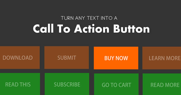
Having a Call To Action button is essential for any website. The whole idea of having a website is to engage the visitor so that they either purchase, contact you, sign up for something or read something. And what better way than a large visible call to action.
Not only does Divi have a great CTA module, but it has built it’s CTA buttons in several of it’s modules as well such as the slider module, pricing module and subscribe modules.
But lets just say you wanted to create your own CTA in a small space that does not have room for one of these modules. Lets say for example I wanted to insert a CTA right here so that I can get you over to my other blog Your Monterey Bay. Like this button for example.
All I did was hyperlink my text, add a class in the html text editor and then use css to give it some style.
Here is how you do it.
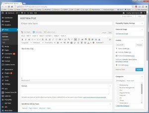
1. Type in the text that you want to turn into the CTA anywhere on your page or in a module.
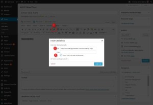
2. Using the standard hyperlink button, give your text a hyperlink
3. Switch to html text editor
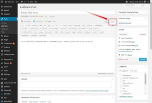
4. Give the hyperlink a class by inserting the following markup before the url href. You can use any class name you want or you can just copy mine exactly to keep it easy.
class="blog-cta"
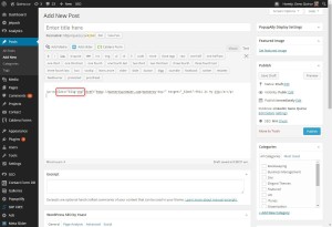
And this is where it should go in case you need a visual. Once you have made this change in the text editor, you can switch back to the visual editor anytime to continue working on your post/page.
The Magic of CSS
Now lets start to dazzle things up a bit with some CSS.
If you are working with a child theme you can go to Appearance>Editor and open your stylesheet. If not, go to Appearance>Divi Theme Options>ePanel>Custom CSS (which is located at the bottom of the ePanel)
Add this CSS.
a.blog-cta {
  line-height: 85px;
  font-size: 25px;
  color: #fff;
  background-color: #fd5a21;
  border: 2px solid #fd5a21;
  border-radius: 5px;
  padding: 15px 35px;
  -moz-transition: all 0.7s;
  -webkit-transition: all 0.7s;
  transition: all 0.7s;}

a.blog-cta:hover {
  background-color: #fff;
  color: #fd5a21;}
Now let me explain what is in these rule sets so that you can make your own custom adjustments.
Properties For The First Rule Set
- Line-height: this is going to make room for the button in your line. If you do not have any standard text above and below the button or you find you have too much space, you can decrease this value.
- Font-size: Sets the size of the font in the button
- Color: The color of the font in the button
- Background-color: The background color of the button
- Border: Border thickness, solid line (you can also use dotted, dashed, etc), color
- Border-radius: Gives it the rounded corners. You can increase the curves by increasing the number. Remove it all together to keep it square.
- Padding: Gives padding around the text making the button larger.
- Transition properties: Slows down the hover rule set so that it eases into the color changes instead of instantly changing.
Properties For The Second Rule Set
- Background-color: The background color of the button when hovering over it
- Color: The color of the font in the button when hovering over it
Check out my magazine blog for ways I used this technique throughout the site. http://www.montereybayfun.com/
Well that’s all for now. I hope you find this article useful.






As ever Geno – well presented tutorial with a great end product.
“All I did was hyperlink my text, add a class in the html text editor and then use css to give it some style.”
Thanks for sharing.
Thanks Keith. Thanks for spreading the word.
Thanks Geno , I’ll be up all night playing with this . You make life easier for the rest of us, such a useful article.
🙂
Who explains things like this? Geno, you are a rockstar!
🙂
Thanks so much for this Geno, I was struggling with the CTA buttons to get a nice look, but this is such a simple solution that even I can understand it!
Awesome!!! Thanks!
Gino. I’m enjoying your blog. Great tips and helps. As a former pastor, having built a number of church websites, I especially enjoyed seeing the innovative ideas you incorporated into the Calvary Chapel site. Do you know of a good Divi example of a Dentist or medical office site?
Hi Tim. Thanks for sharing. I have medical case management website I will be starting in a few weeks. At the moment I am not aware of any in particular.
Hi Geno, awesome post! I implemented it right away on my website. However, I have one question. Can I add a CSS in order to have a responsive button at mobile devices? My button is currently broken 😛
Yes this works on mobile devices as well.
Geno, thanks for sharing such a simple but yet useful technique. Love the tutorials!
Anytime Denver. Thanks!!
If you change the font size of the text on the button, often the ‘>’ doesn’t look proportional, and so you can play with the font size in this little piece of code, and make the ‘>’ larger or smaller. [CSS]a.blog-cta:after { font-size: 25px; }[/CSS]
oops , that should be a double colon above a.blog-CTA::after { font-size: 25px;}, change 25px to suit your needs
Great share. Thanks susan
Great tutorial. This might be a really easy answer but how do you make the hover shift left? Like on your reply button, it stays fixed on the right and only shifts left.
To make it clean like the ET Buttons we would have to add several property values to the hover rule. Unfortunately its not something I have done as of yet so I don’t have an easy solution at the moment. Shoot me an email if this is something you absolutely need done and I can take a look and put together a quote.
Thank you very much. Really cool view.
🙂
Thank you very much, Geno. This tutorial is really saving me. If it’s not asking too much, is there any way to set the width of the button? They change according to the size of the text and it isn’t looking good. Thanks you again.
Sure. Just add this and change the number to the desired width
li.get-started {width: 500px;}It is not working, I must be doing something wrong. I haven’t done any modification to your code, except for the colors. And thanks again!
Sorry. Not sure it why it would not be working for you. 🙁
Hi Geno, In this tutorial your first screenshot where you typed “This is My CTA” shows Font Sizes and Font Family buttons. Where can I get these to add to my Divi? Hope I made sense. If I did it’s the first time today 🙂 Thank you, Sue
Thanks for visiting the blog Sue. Its a plugin that adds more options to the text editor. https://wordpress.org/plugins/tinymce-advanced/
Yea! Thank you, Geno!
Hi Geno, thanks for this really useful tutorial. May I ask how you created the separator/headlines in the demo page – for example the Red “Activities” link/separator in http://montereypremier.com/monterey-bay/ ? Is it the same technique but with a horizontal line added?
Hi Alan. For the text its similar. The line is a bottom border for the entire row.
Thanks, why didn’t I think of that – simple solution 🙂
Geno thanks for this wonderful resource. I managed to create my own CTA and I put it on the full header slider, however, when viewed on the phone the buttons do not appear. Actually, any text that is left indented (or right) does not appear on phone. Why is that happening and do you know the ways to fix it?
Thanks!
All the sliders hide the description and images on smaller browsers by default. To override their settings just add this.
@media only screen and (max-width: 479px){ .et_pb_slide_content, .et_pb_more_button {display: inline!important;}}FYI – Appears to work fine with Divi 2.4
Hey! Great info!
I’m currently trying to create 3 different buttons (back, forward and download), exactly the same style as the regular divi ones but have the symbol change places on each.
Just wondering If you’d know a quick fix?
Thanks. What you are asking is doable using this technique. I would recommend using Font Awesome Icon Fonts so that you can add the symbol to the text. The symbol would be there whether you hover or not. You can learn more about using Font Awesome here http://fortawesome.github.io/Font-Awesome/get-started/
Hello Geno,
I am not sure the link to your site is still good.
http://montereypremier.com/monterey-bay/….
Thanks Catherine. I did recently migrate the site to it’s very own URL and still have some updating to do on my links. Thanks for the heads up. Here is the new site http://www.montereybayfun.com/ Let me know what you think 🙂
Thank you so much saved my day!
awesome job mate thx a lot 🙂
Works fine on Divi 2.5.3
Hi Geno,
Thanks to Susan I have found you. You both are great! I have one quick question…the button I’ve made stacks on top of the other one that comes with the Divi theme already…is it possible to have them sit side-by-side each other?
Hi Matthew. did you ever get the answer to your question? I’m also looking! If you don’t mind sharing…..thanks in advance.
Hi Geno, great tutorial and I’m looking forward to trying it out. However, I went to the linked site to see how your buttons look (http://www.montereybayfun.com/), and I don’t see any buttons at all? Did you do the navigation header with this technique, or maybe I’m not looking in the right place? It also doesn’t look like a Divi site, and if it is, you did a wonderful job customizing it! Also, how will these buttons react on mobile devices? Do we need to style them with media queries?
Thanks again for all the great work you do!
Hi Tony. Thanks for checking out the blog. I use this method on almost every site I build in some way or another. I use it on the front page of montereypremier.com and montereybayfun.com (yes it is Divi 🙂 ). On MontereyBayFun.com I use it for the “MORE” link on the bottom of each section on the homepage.
On MontereyPremier.com I use it for the orange buttons that are “Read More” links and I even used it on the circle button on the bottom of each page (with several modifications of course)
I also use it on my homepage of this blog https://quiroz.co/ down towards the bottom where it says “Visit This Site”
Hey, thanks for answering my question. Real great help…
Hey Geno… Thanks for this. Regarding this:
Give the hyperlink a class by inserting the following markup before the url href.
Just wondering why I can’t just enter the class in the CLASS ID field in the module?
I tried it – it doesn’t work – but just wondering why. I thought that was what that field was for.
Thanks,,,
I am sure it could be done. You might have to take a different approach with the CSS I presume.
Oh and… Is this the proper way to do the class in CSS? My class name = hf-link
/* (#08) —- Styling for Homefree text links (hf-link) — */
a.hf-link:link {
color: pink;
}
/* visited link */
a.hf-link:visited {
color: yellow;
}
/* mouse over link */
a.hf-link:hover {
font-weight: bold;
color: green;
}
Looks good
Dear Geno, thank you for another great tip.
Would it be ok for me to ask for help, though?
I tried putting two CTAs in the same module (different classes, of course) and in the second one I’m not able to make hover color to work…
I’m sure I’m doing something wrong, here… 😛
(here: the CTAs “Esperiencia” and “Testemunhos” – http://www.logikk.pt/sobre-mim/).
TY,
joao
You have too many digits on the hover color 😉
This is what you have on there. Try removing that seventh digit (2)
a.blog-cta2:hover { background-color: #f424242; color: #ffffff; }Please, Geno, ignore my previous comment, I was definitly doing something wrong!!! (color code was wrong, it was #f424242 instead of #424242 – that little “f” was the evil detail… 🙂
TY anyway,
joao
Hi there, I have followed the instructions, however my button style does not appear on my page: http://www.okanaganwebdesign-draft-site-1.ca/
I have added the following link to my text module:
See Menu
And then added the following CSS to my stylesheet via the DIVI ePanel:
}
a.blog-cta: {
line-height: 85px;
font-size: 25px;
color: #2ea3f2;
background-color: #fd5a21;
border: 2px solid #2ea3f2;
border-radius: 5px;
padding: 15px 35px;
-moz-transition: all 0.7s;
-webkit-transition: all 0.7s;
transition: all 0.7s;}
a.blog-cta: hover {
background-color: #fff;
color: #2ea3f2;}
Not sure what I may be missing.
Thank you in advance,
James.
Awesome! Can you tell me what I need to add to control the height? I need a slimmer one. Thanks Geno!
Thanks, Geno.
Hi Geno, thanks for all the great tutorials! I really like the way you have the navigation menu styled in your Monterey Bay site, with the blue hover and current page color behind the links, vertically covering the menu bar. Have you ever done a tutorial on this for Divi? If not, it would be a good one to do, as the stock Divi navigation menu styling leaves a lot to be desired. Thanks!
I just might have to do that.
YES!
Hey Geno! I love your tutorials. I wanted to do exactly what you explained, except I wanted it to act like all the other buttons on the site, so I just gave it the class name of ‘et_pb_button’ and it worked like a charm…no css to add or modify!
We’re glad to be of service! Thanks for visiting!
Hi Geno; curious – is there a way to add a shadow to the button (seems to be supported across the latest DIVI version). Thanks – great tutorial!
Sure. Just add this snippet and adjust the numbers for shadow vertical position, horizontal position, blur and the the rgba is for the rgba color 3 digit code and the last one is for the opacity of the shadow.
a.blog-cta {
	box-shadow: 5px 8px 16px rgba(0, 0, 0, 0.4);}