The best thing about learning CSS while working with a great tool like Divi, is that you can come up with original looking modules pretty quickly.
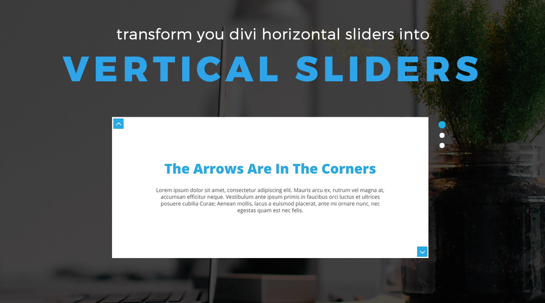
In this tutorial I will show you how we use a little custom CSS to give the appearance that our Divi Horizontal Slider is actually a Vertical Slider. And all we are doing is moving a few elements around.
Let’s Get Started Setting up the Divi Slider Module.
Adding the slider module and class
1. Create a row and give it 1, 2, or 3 columns (I don’t recommend using the slider in anything less than 1/3).

2. Add a Divi Slider Module to one of the columns.
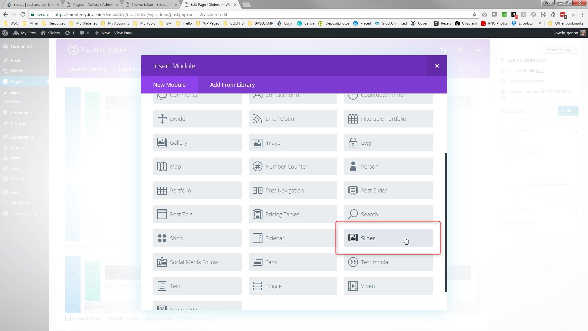
3. Go ahead and add your slides and any design customization you want to make to them. In this tutorial I will show you how to change some of the colors and font using CSS instead of having to go into the settings.

4. In the Advanced Tab: assign the module the following CSS Class: gq_m_vertical_slider

5. Save your page and move on to the magic of adding a little CSS.
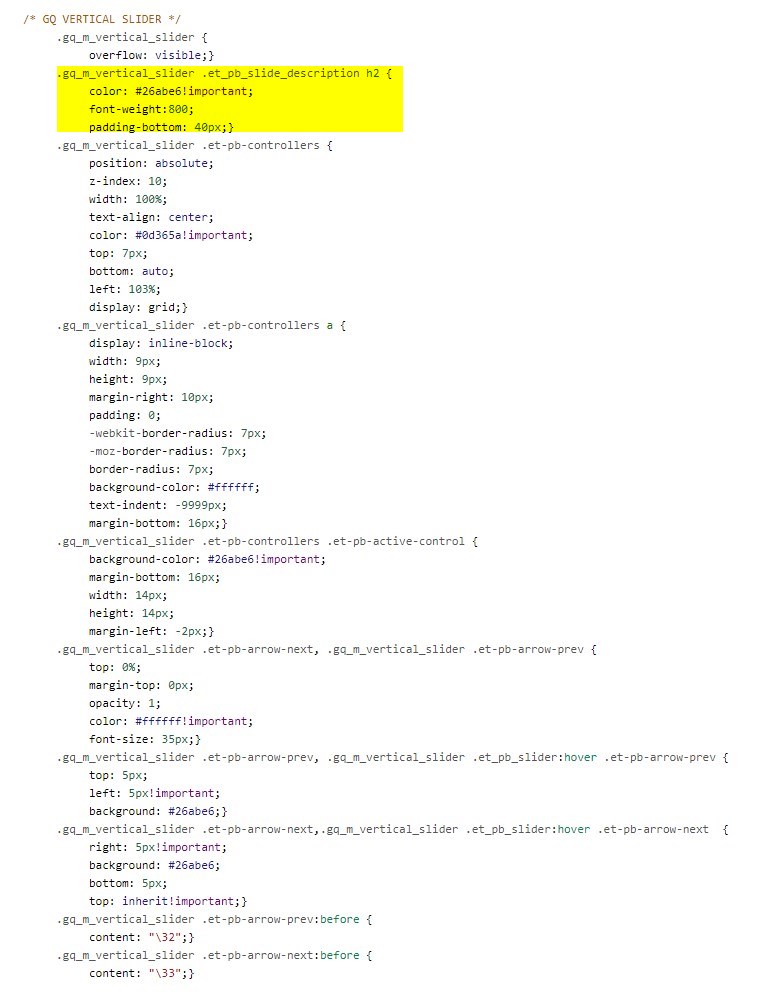
Adding The Custom CSS
If you are working with a child theme you can go to Appearance>Editor and open your stylesheet. If not, go to Appearance>Divi Theme Options>Custom CSS (which is located at the bottom of the first tab in Theme Options)
Add this CSS.
/* GQ VERTICAL SLIDER */
#et-main-area {
overflow: hidden;}
.gq_m_vertical_slider {
overflow: visible;}
.gq_m_vertical_slider .et_pb_slide_description h2 {
color: #26abe6!important;
font-weight:800;
padding-bottom: 40px;}
.gq_m_vertical_slider .et-pb-controllers {
position: absolute;
z-index: 10;
width: 100%;
text-align: center;
color: #0d365a!important;
top: 7px;
bottom: auto;
left: 103%;
display: grid;}
.gq_m_vertical_slider .et-pb-controllers a {
display: inline-block;
width: 9px;
height: 9px;
margin-right: 10px;
padding: 0;
-webkit-border-radius: 7px;
-moz-border-radius: 7px;
border-radius: 7px;
background-color: #ffffff;
text-indent: -9999px;
margin-bottom: 16px;}
.gq_m_vertical_slider .et-pb-controllers .et-pb-active-control {
background-color: #26abe6!important;
margin-bottom: 16px;
width: 14px;
height: 14px;
margin-left: -2px;}
.gq_m_vertical_slider .et-pb-arrow-next, .gq_m_vertical_slider .et-pb-arrow-prev {
top: 0%;
margin-top: 0px;
opacity: 1;
color: #ffffff!important;
font-size: 35px;}
.gq_m_vertical_slider .et-pb-arrow-prev, .gq_m_vertical_slider .et_pb_slider:hover .et-pb-arrow-prev {
top: 5px;
left: 5px!important;
background: #26abe6;}
.gq_m_vertical_slider .et-pb-arrow-next,.gq_m_vertical_slider .et_pb_slider:hover .et-pb-arrow-next {
right: 5px!important;
background: #26abe6;
bottom: 5px;
top: inherit!important;}
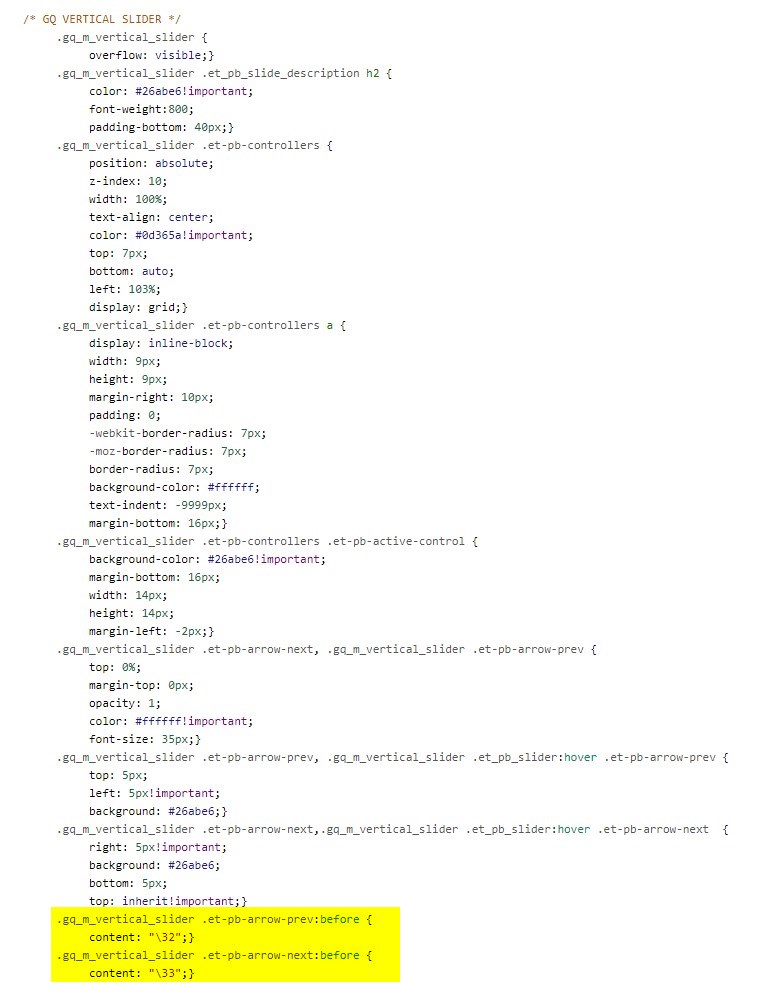
.gq_m_vertical_slider .et-pb-arrow-prev:before {
content: "\32";}
.gq_m_vertical_slider .et-pb-arrow-next:before {
content: "\33";}
Making Adjustments
As with all my tutorials, my goal is not to teach you how to use Divi Settings as much as it is to teach you how to customize your website learning a little CSS along the way. So with that being said, here are a few CSS tips to help you learn a little more about CSS.
To change the header text color, font-size, font-weight and bottom padding, you can do so here:
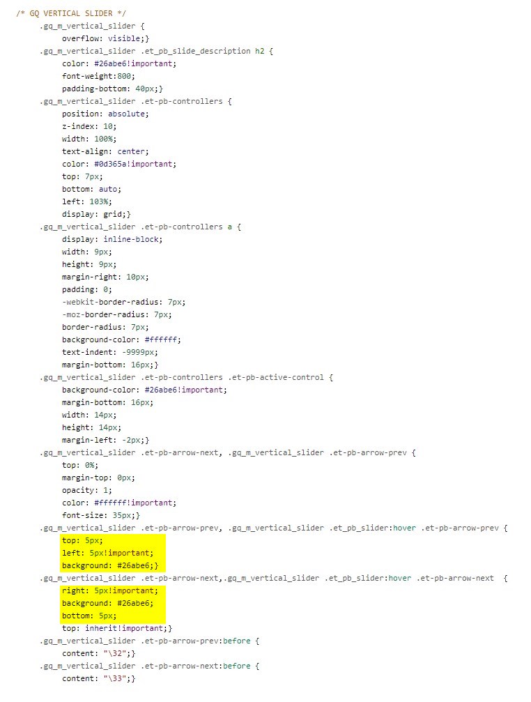
To change the location and colors of the controllers for each slide, you can do so here:

To change the color and size of the active controller, you can do so here:

To change the color and font-size of the arrow icons, you can do so here:

To change the background color and location of the arrow buttons, you can do so here:
And this is the part that changes the arrow icons to point up and down instead of left and right:
And that’s it.
If you used this on one of your projects, please share a link below so we can see how you used it.
Have fun!
Well, that’s all for now. I hope you find this article useful.


Thumbs up Geno its very helpful. Thank you
Geno, this is very impressive and I can definitely see myself using this for my own website or for a future project. Keep em coming!
One question: any ideas of how to keep the background at 100% opacity when in transition?