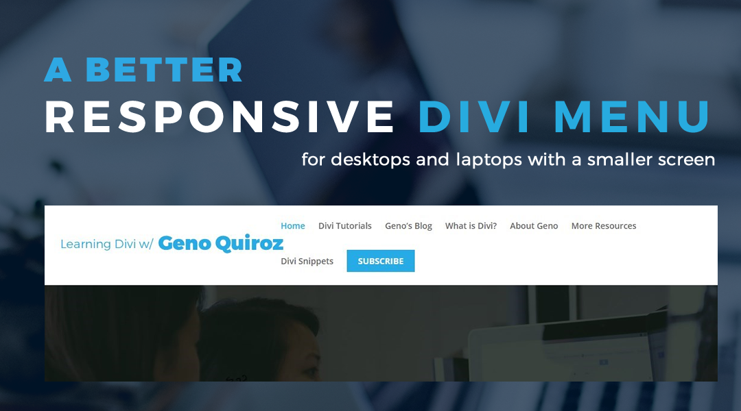
Have you ever been annoyed with the Divi menu carrying over into a second line on smaller desktop & laptop screens? Well so do I, and that is why I have a little CSS I keep handy for just about every website I build with Divi.

The reason it does this is because the logo’s size is determined by a percentage of the rows height. So when the screen is not wide enough to fit the entire menu, it drops into a second line doubling the height of the row.
Awhile back I provided a way to initiate Divi’s mobile menu button on bigger screens. In this snippet, I will show you how to reduce the font size, reduce the right padding, and increase the width of the container at various breakpoints.
Adding The Custom CSS
If you are working with a child theme you can go to Appearance>Editor and open your stylesheet. If not, go to Appearance>Divi Theme Options>Custom CSS (which is located at the bottom of the first tab in Theme Options).
If you need a free basic child theme, check out my post: 5 Easy Steps To Create a Child Theme.
Add this CSS.
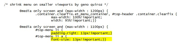
	/* shrink menu on smaller viewports by geno quiroz */

		@media only screen and (max-width : 1200px) {
			.container.clearfix.et_menu_container, #top-header .container.clearfix {
				max-width: 100%!important;
				width: 95%!important;}}

		@media only screen and (max-width : 1100px) {
			#top-menu li {
				padding-right: 13px!important;}
			#top-menu li a {
				font-size: 13px!important;}}
Making Adjustments
As with all my tutorials, my goal is not to teach you how to use Divi Settings as much as it is to teach you how to customize your website learning a little CSS along the way. So with that being said, here are a few CSS tips to help you learn a little more about CSS.
This snippet consists of two screen size breakpoints. The first one applies to a screen width that is smaller than 1200px and the second one applies to a screen width smaller than 1100px. As an FYI, the menu changes to a mobile menu at 980px wide by default. You can adjust the breakpoints here:

On the first breakpoint, we are telling Divi to change the max-width and width of the menu container. By default the max-width is 1080px and the width is 80%. On smaller screens, that is valuable real estate. So I open that up a bit. To adjust the width, you can do so here:

For some, that first breakpoint may be all that you need. But in most cases, you might need to add one more. So for the second breakpoint, what I do is shrink the font size a little and remove some of each menu item’s right padding. To adjust the font size and padding for the second breakpoint, you can do so here:
And that’s it.
If you used this on one of your projects, let me know in the comments below.
Have fun!


Thank you!!!
You are welcome Dennis!
Thanks Geno .. a UI must-have. I’m definitely going to use this nugget over and over! #divirocks
Thanks Keith 🙂
This is awesome. I approached it a different way and reduced the size of the logo. But I like this approach much better.
Glad you like it Tanis.
Genius!… just applied on a site that was in need, indeed !
Love Ya Man!
Awesome. Much love back at ya Michael!
This is awesome – thanks Geno! I have always just used the basic @media to shrink menu to mobile at specific breakpoint but will try this in the future for sure.
Love your work!
Cool. Thanks!
You are a good boy…as your mother would say! Thanks
LOL. Thanks Joseph.
Super! Many thanks! Noticed this yesterday and today my client called that there’s some problem in his menu. Me: No problem, I’ll fix it in a minute 🙂
Perfect timing. Thanks for taking the time to comment Antti.
Well Geno, you are truly a star of the Divi firmament! Here’s a typical problem. Client wants an extra top-level button, and can’t understand why not, as on their wide-screen seems masses of space. Had this with https://www.hadassahaustralia.org/. Now you’ve supplied the workaround. Works a dream, just adjusted the set screen widths to cope with the exact point the double-line navigation clicked in.
Thank you,
Robin.
Awesome. Thanks for sharing Robin 🙂
Nice tip Geno, and yes I have been annoyed by this issue many times! 🙂 Thank you!
Thanks John.
Nice job Geno, caught it through your newsletter……love your blog and tut work to this day, among the best out there for detail and real world usage. Thanks for the read man!
Thanks bro. Its been awhile. Its good to see your comment. Have a great day Dehn.
Thank you!!!
You are welcome 🙂
Thanks brother
You are welcome Kcee.
Excelente trick Geno!!! saludos desde Madrid bro.
Lucky Louis
No hay problema. Muchas gracias hermano!
Thank you so much for sharing! This is awesome! Really appreciate it!
I just freakin LOVE how all your CSS snippets just work! Thanks Geno, not come across this issue before but it solved a headache really fast;)
Wahoo. Thanks Amy.
You’re the best Geno ! Thanks
Salute! thank you so much for this… I was enjoyed with my menu and was thinking my solution is to move a few menu items to secondary menu. But your solutions works like a charm….
Sweet!
Hi Geno, I have a question to submit.
I created 2 different menus, one for the mobile version and one for the desktop version. I would like the mobile version to be visible up to 1100px (landscape). Could you please indicate the css to insert?
Thank you so much!
You could try this. replace the class name with the actual classes.
@media only screen and (max-width : 1101px) { .menu-one {display:block;} .menu-two {display:none;} } @media only screen and (min-width : 1100px) { .menu-one {display:none!important;} .menu-two {display:block!important;} }This is great. Thanks for sharing. Being such a common problem with the theme, I wonder why they haven’t fixed this. I’m pretty new to WordPress. I have a quick question. If you’re using a child theme with Divi, do you always need to put ANY CSS in the Appearance > Edit area? Can anything go in the Divi settings CSS area?
Hi Russ. Thank you. I agree. You do not have to add the CSS to the child theme stylesheet in the Editor. You can add it to the Divi Theme Options CSS box or in the customizer CSS box.
Wow this is awesome man!! Thanks a bunch. You absolutely ROCK!!
That works great, Thanks Geno.
I was looking up for some new style for the menu bar and end up trying this one and loved it
Thank you!!!!! I looked around for a fix for this for over 2 hrs. This is exactly what I was looking for!
My pleasure 🙂
Hi Geno,
Doesnt work for me. Can you help?
Probably still need to do a hard refresh to clear your browser…
Windows
Firefox: CTRL F5
Chrome: Shift F5
MacOS:
Chrome: Shift Command R
Firefox: Shift Command R
Safari: Option Command E
Also be sure to clear any plugin or server cache that may be running behind the scenes
Thanks a lot. It did help me!