*This tutorial is now outdated but please take a look at the updated tutorial hewre: https://quiroz.co/divi-portfolio-grid-hover-animations-larger-images/
The remainder of this tutorial is for educational/archive purposes only.
One of the great features in Divi is the portfolio grid options. By default it has a great look and feel.
The Divi portfolio grid highlights your projects in a four column-wide display with a great hover effect. Out of the box it looks something like this.
But I felt the four columns made things a little cramped as i really wanted to highlight the featured image of each project a little more.
So I decided to give it a darker background and make the grid 3 columns instead of 4. That way I can make the images a little larger.
I also wanted to change the hover effect a little to match the color scheme of my site which was dark grey and orange.
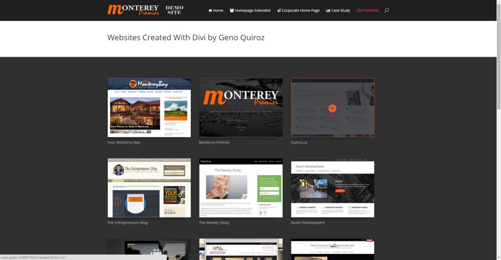
Basically I wanted it to look something like this…
Or see the live demo here https://quiroz.co/2014-Demo/portfolio/
So lets do this.
Create the Portfolio Page in Divi
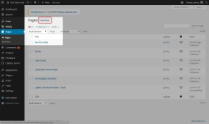
1. Go to your Dashboard and add a new page
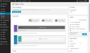
2. Then as you can see I start off with a basic layout using Page Builder. For this tut I simply used a fullwidth header and then a section with a single column below it.
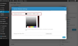
3. Now lets open up those “Section Module Settings” and give it a nice dark background so that our portfolio images will pop off the page a little better. I used #303030 but you can use whatever color works best for your website.
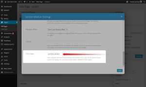
4. Now this next step is important if you don’t want your changes to mess with anything else on your site. I am going to give this section a unique CSS Class.
5. So open up your “Section Module Settings” and give it the CSS Class – portfolio-section
6. Next I add a standard portfolio module.
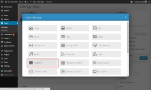
7. These are the settings I am going to use. Keep in mind my objective was to highlight the image so I am turning off some of the extra meta data.
- Layout: Grid
- Posts Number: 16 (or whatever you want)
- Include Categories: Check them all (or whatever you want)
- Title: Show
- Categories: Don’t show
- Pagination: Don’t show
- Text Color: Light
- Admin Label: Portfolio
- CSS ID: Blank
- CSS Class: Blank
Great. Now it should look something like this
The Magic of CSS
Now lets start to dazzle things up a bit with some CSS
Changing it from 4 to 3 columns
If you are working with a child theme you can go to Appearance>Editor and open your stylesheet. If not, go to Appearance>Divi Theme Options>ePanel>Custom CSS (which is located at the bottom of the ePanel)
/* Change columns from 4-3 */

.et_pb_column_4_4 .et_pb_portfolio_grid .project {
  clear: none !important;
  margin: 0 60px 42px 0 !important;
  width: 27% !important;}
Modifying the Images and Meta
This snippet of CSS will do the following…
Stretch out the images a bit, adjust the text color and font size, give the image a slight shadow and give the image slightly rounded corners and a thin dark grey border.
/* Gallery Items */

	.portfolio-section img {max-width: 110%;}
	.portfolio-section h2 a {font-size:14px; color: #b2b2b2;}
	.portfolio-section .post-meta {font-size:12px; margin-top:-13px; color:#cecece!important;}
	.portfolio-section .et_portfolio_image {
		border: 1px solid #28323a;
		-moz-box-shadow: 0 5px 10px rgba(0,0,0,.3);
		-webkit-box-shadow: 0 5px 10px rgba(0,0,0,.3);
		box-shadow: 0 5px 10px rgba(0,0,0,.3);}
	.portfolio-section .et_portfolio_image, .et_portfolio_image img {border-radius: 1px 1px #fc5a20;}
Now About That Cool Hover Effect called the Overlay
This snippet of CSS will do the following…
Stretch out the overlay to fit the image, change the transparent color from white to dark grey, give it an orange border to match my sites colors, and give it a cool slow transition.
/* Overlay */
        .portfolio-section .et_overlay {width: 110%; background: rgba(30, 32, 36, 0.8); border-radius: 1px 1px; BORDER-COLOR: #fc5a20; }

	.portfolio-section .et_overlay:before {
		margin: -14px 0 0 -18px;
		-moz-transition: all 0.6s;
		-webkit-transition: all 0.6s;
		transition: all 0.6s;
		color:#fc5a20!important;}
Keeping It Mobile Friendly
This last bit will help it play nicely with your mobile devices.
/* --------- iPads (Portrait) ---------- */
	@media only screen and (max-width: 980px) {
	.laptops {margin-top: -190px;}
	.et_pb_column_4_4 .et_pb_portfolio_grid .project {clear: none !important; margin: 0 40px 42px 0 !important;width: 27% !important;}}

/* ------- iPhone5 (landscape) --------- */
	@media only screen and (max-width: 767px) {
	.laptops {margin-top: -150px;}
	.et_pb_column_4_4 .et_pb_portfolio_grid .project { margin: 0 40px 42px 0 !important; width: 100% !important;}
	.portfolio-section .et_overlay {width: 101%;}}

/* ------- iPhone5 (portrait) ---------- */
	@media only screen and (max-width: 479px){
		.laptops {margin-top: -120px;}
		.portfolio-section img {max-width: 100%;}}
And now you should have something like this.
You can check it out live in action on the demo page here https://quiroz.co/2014-Demo/portfolio/
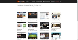
Or if you want more inspiration, you can see how I used it on my portfolio page at Monterey Premier.
Well that’s all for now. I hope you find this article useful.









Thank you, Geno!!! Great tutorial! Crystal clear…so easy to follow!
Thank you Melanie. I appreciate you checking it out. Hope it helps on one of your projects 🙂
Fabulously detailed tutorial and the end result looks amazing – a huge improvement on the original layout.
Keep em coming Geno… keep em coming.
Thanks Keith!
Geno
This is great, just what I was looking for. Did you have to resize your featured images on the portfolio posts? I took screenshots of different sizes and used those for featured images and now the portfolio gallery shows each as a different size, so it messes up the look of the gallery. I tweaked the CSS to limit the height, but that just seems to squeeze the images. Any ideas? Is there something I missed?
Thanks
To keep things simple, I consistently use a 1800 x 940 template for my featured image by default. It keeps all my pages consistent and it displays nicely on Facebook. So what I do is open up an existing png file already set to those dimensions, then I just past my screenshot into that fileand line it up where most of the content is in the middle because the sides get cut off on the portfolio page. I do basically the same thing for my posts. Keeps everything nice and neet. Then I display other images with the various in the content of the post/page/project as needed.
Thanks, I’ll give that a shot. Seeing as I only have 6 items, it will probably be easier than changing code.
Help!
I’m trying to style the Divi Filterable Portfolio Grid using your code, but no luck so far. The problem is that when I apply your code to create three columns, I end up with only two columns.
Below is a link to an example. At the top of your page, I used your code to create a non-filterable grid, and it works great. Below is the same code applied to the filterable grid. You can see for yourself what happens … two columns with a big space between them:
http://new-miracle.mystagingwebsite.com/portfolio-grid-test/
Sorry for the late response but I was able to help Lang with the following snippet.
.et_pb_column_4_4 .et_pb_filterable_portfolio_grid .et_pb_portfolio_item { width: 330px !important; margin-right: 30px !important; position: initial !important; }It works … you are incredible! The out-of-the-box filterable portfolio is so sparse-looking with small thumbs and way too much empty space. It’s so good to now have a nice-looking alternative.
Awesome!
Hi! Question – (1) is there a way to have either the click or hover be a bubble with the text instead of directing them to another page? (2) or can we at least when clicked, have a new page/tab opened up? I see you redirected them (open website or back to portolfio.
Great tutorial! How do I implement this for the filterable portfolio?
Thanks for swinging by. Here is the snippet for the filterable portfolio.
.et_pb_column_4_4 .et_pb_filterable_portfolio_grid .et_pb_portfolio_item {
width: 330px !important;
margin-right: 30px !important;
position: initial !important;
}
Geno:
I’m facing a bit of a challenge with regard to styling the Fullwidth Portfolio Grid. I want to use thumbnails that are of a different aspect ratio … slightly wider than default … so as to accommodate for print titles embedded in the thumbs (which are derived from 16:9 videos).
I know how to change the sizings for thumbs, by tweaking php in “post_thumbnails_divi.php” found in the “panel” folder. So I’ve already done that and regenerated new thumbs. See my example here (scroll down a bit to see the portfolio):
http://new-miracle.mystagingwebsite.com
My question is how best to collapse the thumbnail display to around 94% of the default height? I’ve already applied the following CSS tweak which indeed collapses the thumbs appropriately, but I end up with green bars below each row:
.et_pb_fullwidth_portfolio_grid .et_pb_portfolio_image {
height: 94% !important;
}
So how do I get rid of those green bars, which are around 18px tall?
Or maybe I’m going about this all wrong? But it seems that it’s a two-step process. First regenerate thumbs that have a wider aspect ratio, and then tweak the grid to accommodate?
Note that if I don’t collapse to 94% height, some of the titles (in the thumbs) get whopped off on the right side.
Lang
I see that you also sent me an email. I will go ahead and respond to the email for this one.
Hi Geno –
Really like this post. I’m adding this to my site. I’d like to have the same layout in the Gallery module but I can’t figure out how to do that. Can you help?
Steve
Hi,
can someone please teach me how to change the font size of the project’s titles and categories displayed on the portfolio thumbnails?
The code you need to change is in this tutorial. If you give the section module the CSS Class “portfolio-section” then you can add and modify this…
.portfolio-section h2 a {font-size:14px; color: #b2b2b2;} .portfolio-section .post-meta {font-size:12px; margin-top:-13px; color:#cecece!important;}Hi,
Thank you for sharing your experience on the changing of the divi portfolio feature image I have paste your code in the epanel and in the large screen it do change to three column but it is not responsive as your example.And I have another question is that my feature image have a portrait layout whose aspect ratio is 2:3 so the feature image is cut by default.Can you help me with this problem?Thanks very much.
Make sure you add this section of css as well. It is the css for the mobile versions.
/* --------- iPads (Portrait) ---------- */
    @media only screen and (max-width: 980px) {
    .laptops {margin-top: -190px;}
    .et_pb_column_4_4 .et_pb_portfolio_grid .project {clear: none !important; margin: 0 40px 42px 0 !important;width: 27% !important;}}

/* ------- iPhone5 (landscape) --------- */
    @media only screen and (max-width: 767px) {
    .laptops {margin-top: -150px;}
    .et_pb_column_4_4 .et_pb_portfolio_grid .project { margin: 0 40px 42px 0 !important; width: 100% !important;}
    .portfolio-section .et_overlay {width: 101%;}}

/* ------- iPhone5 (portrait) ---------- */
    @media only screen and (max-width: 479px){
        .laptops {margin-top: -120px;}
        .portfolio-section img {max-width: 100%;}}
In regards to the second question, unfortunately I don’t have a solution for that yet.
I solved the 2:3 problem by going to Divi/epanel/post_thumbnails_divi.php and changing thumb sizes as follows (the first and third size categories are the ones I changed to conform to 3 wide by 2 tall):
$et_theme_image_sizes = array(
‘400×267’ => ‘et-pb-post-main-image’,
‘1080×675’ => ‘et-pb-post-main-image-fullwidth’,
‘400×267’ => ‘et-pb-portfolio-image’,
‘1080×9999’ => ‘et-pb-portfolio-image-single’,
);
After doing that, I rebuilt thumbnails using “Regenerate Thumbnails” plugin by Viper007Bond.
Perhaps this will work for you.
Nice share 🙂
Hi Geno! I urgently need to set my grid filterable portfolio to show five or six columns, because I am using that feature to build a Medical Directory and I need to show more information at the first viewing. Would you help me? Thank you in advance!
Hi Maria. Unfortunately I have not done anything like that yet so it cold take some time to figure something out. If you are interested hiring me for a custom project, shoot me an email at geno@quiroz.co and I can send you a quote.
Hi, can you help me with adding space between project images in fullwidth portfolio?
This sort of works although I’ll bet Geno can give you a better solution:
.et_pb_fullwidth_portfolio .et_pb_portfolio_image {
height: 90%;
width: 90%;
}
Adjust the height and width percentages to your liking. The problem is that there is no margine on the left!
Hi Geno! First, thank you for your code. Very impressive! Is there a way of using the Divi Portfolio Grid so that when someone clicks on a picture it justs blows up the picture and not go into the second screen of Portfolio? I know this sounds funny but I’m just trying to use it as a single picture grid all by itself. Thank you in advance!
I would recommend using the Image Gallery Grid instead. It will do what you are looking for. I do something similar in a custom child theme I created that will be going up for sale on ElegantMarketplace.com next week when they launch. This page highlights some of the features you can expect when we launch. The actual Demo site will be available to view then as well. http://montereypremier.com/carpe-diem/
I look forward to your available Child Themes. If I purchase one can I use it on unlimited clients? Also, somewhere I thought you did a write up on another topic: If I place something in a Divi text module, how do I make that text module full screen using CSS?
Thanks Steve. Yes you will be able to use them on unlimited sites. You just cant sell the child theme itself as your own products but you can install your copy on your clients sites.
Wondering if when an image is clicked on a Project page if it can open up in its own tab, not the same tab?
Hi Melanie. I have not tried this yet but I was told you can add this to the bottom of the footer.php file in your child theme. Unfortunately I have not tried this yet and cannot verify but if you are comfortable messing with your footer.php file it might be worth a try.
<script type="text/javascript"> jQuery('.et_pb_portfolio_image a').attr('target','_blank'); </script>great tutorial.
anyway can we make it 6 columns in 1 row?
since i wan to make it viewed as menu
thanks
I have not tried it yet but I would start with adjusting the margins and width in the CSS above and see what you come up with.
I am trying to figure out how to adjust the height of an image in the filterable portfolio grid, as I manage a book press and need the height of book covers. Is this possible? If you want to look, you can at willowspringsbooks.org at Catalog. I am just in the building stages. You’re awesome. I’ve used some of your other great codes.
I have not done anything like that but if I get some time I will play around with it.
Thank you. Somehow one of the thumbnails loaded full, but I’m not sure why.
Strange.
Just discovered you what a great resource. Thanks. For some reason when I add your CSS code to go from 4 to 3 columns the images are now flush left instead of centered in the page. Any ideas?
Thanks Thomas. Unfortunately I am not sure why you are having this issue. But feel free to post a link to your site.
Is there a way to order filterable portfolio projects by TITLE, instead of by DATE? I need a filterable portfolio in alphabetical order. Thank´s a lot!!!
Hi Maria. Sorry but I have not figured that one out yet 🙂
I needed to be able to do something similar. Building on top of the One-Click Child Theme plug-in I created a child theme for my site and then added the following to the functions.php of the child theme:
function et_divi_get_projects( $args = array() ) {

        $default_args = array(
                'post_type' => 'project',
                'orderby' => 'title',
                'order' => 'ASC',
        );

        $args = wp_parse_args( $args, $default_args );

        return new WP_Query( $args );

}
This is basically changing the ordering of the list of projects returned when making the WP_Query call which Divi is making for the filtered portfolio (this might also change things for other portfolio components as well not just the filtered one, but I’d have to dig into the source some more).
You can read more about the options for the WP_Query (I’m new to WordPress) and can actually do quite a bit of filtering using it. Here’s more about the Order and OrderBy parameters which I’m making use of above. ‘orderby’ => ‘rand’ was somewhat amusing. 🙂
[1] https://wordpress.org/plugins/one-click-child-theme/
Nice share Ben!
Very good! Worked perfectly. The order of projects is important for the portfolio visitor.
Thanks for sharing.
greetings.
Awesome! Glad that it works for you. Thanks for visiting!
please in my case not working
What kind of issue are you seeing on this?
please ty to look http://hopemg.net/artistes/
it starts well sorting but in the end it’s not that
I’m not seeing an issue with the sorting on the artist page. It starts with Doba and ends with Yvich. It looks right to me. Are you seeing something different?
The way I ended up doing this was by using the Post Types Order plugin.
https://wordpress.org/plugins/post-types-order/
+1 for Post Types Order plugin. Great solution.
worked great for me too! Exactly what i was looking for and extremely easy to use
Hey Geno! I was wondering if you could tell me how to center the text of the titles underneath the images? Thank you in advance for your help!
Hi !
I’m trying to change the size of thumbnail in the full width portfolio page.
by Default there is 4 by line and I just want 3 per line, and want to change the square size to
rectangle size but keep the masonry effect…
Hey Geno,
Great tutorial as always. I have a quick question. The 4 to 3 worked like a charm. I have a print cover portfolio that I’d like to change from 3 to 2 so that the print cover will be larger. In essence, I only want 2 on a row for this portfolio page. Where would I tweak it to do a new custom CSS Class? http://blackravensdesigns.com/print-covers-portfolio/
Thanks AJ
Thanks AJ. I will look into this one as soon as I get a chance.
Hey Geno,
Is it possible to do something similar, but for the Full Width portfolio. For example, I have 9 total images in my portfolio grid currently appearing as two rows of 5 and 4 – but I want this to be in a 3×3 format, and keeping each image square.
Many thanks!
I am sure it is Chris. I added this to my list and I will see if I can put something together when I get some time. Thanks for stopping by 😀
Thanks Geno – really appreciate your help.
I’m currently using the code you have in this tutorial. However, I’ve noticed that in your demo page when the browser window is resized the portfolio 3-wide grid scales down, down, down then goes to 1 row images. My site scales from 3 images, to 2 images, to 1 image with a large margin on the right. Just wondered if you had any experience on this, or if it is immediately clear where I am making an error.
Many thanks again Geno.
Also, I’ve used your ‘triangles between sections’ and have the triangles centered – but this portfolio module does not seem to be exactly centered.
Feel free to contact me through email if you like 😀
Hello Geno,
I have two questions about filterable portfolios.
1. I would like to make the thumbnail images on filterable portfolio display with their original dimensions. The feature images on my projects are all square and I would like them to show as squares on the portfolio. Can you help?
2. I would also like the projects in my portfolio to display alphabetically not by post dates. There appears to be no means of changing this within the portfolio settings. Can this be amended through CSS?
Many thanks,
Craig
1. Yes this can be done with CSS. You just have to target the image, container and the overlay. But with a little time you can get this done.
2. This would probably require modifying a php or js file. But you can do some cool similar stuff using Essential Grid. I used it here on my portfolio page https://montereypremier.com/portfolio/. It gave me the option to have them tiled full width without any padding but I opted for a little padding. Its a great tool. Here is a link.
Do you have a way to do something like this:
http://www.llt-group.com/about.html
Not in native Divi. But you can do some cool similar stuff using Essential Grid.
I used it here on my portfolio page https://montereypremier.com/portfolio/. It gave me the option to have them tiled full width without any padding but I opted for a little padding. Its a great tool. Here is a link.
Thanks! I will try!
Hey Geno! Great tutorials and snippets. Thanks for all of the hard work.
Question: Using the filterable portfolio module, how can you place the title over the image on hover vs underneath the image?
Like this, but titles only: http://essential.themepunch.com/even-grid-washington/
Thoughts!
Hello,
Great tutorial, as always!
I was wondering how you’re able to show (on your portfolio page) the excerpt when you hover over a project? Thanks in advance!
Unfortunately I have not figured out how to show the excerpt on hover yet. For that effect I used the Essential Grid Plugin. You can see an example of it in use here on my portfolio… https://montereypremier.com/portfolio/
I absolutely love Essential Grid, far superior to Divi’s built-in options … but how did you get the excerpt to show up? I assume you made a new skin, which I’ve learned how to do. But I missed any option for display of an excerpt, which would be terrific for me.
dumb me .. totally trivial to do by choosing the right skin
Thanks for turning me on to Essential Grid Lang 🙂 I love it!
Great tutorial, is there a way to arrange tabs/project category not alphabetically?
Thank you in advance
Not sure on that one.
Geno :
As I can focus filter rod portfolio ? You have it anywhere you targeted . Thanks and keep it up! 🙂
Just a quick comment/question here. I understand the CSS markup, but by adding the padding to the left of each thumbnail creates a “dead” space to the right of section. This doesn’t allow it to be flush, visually. Is there a workaround for this? Or is this a nature of the beast that is CSS manipulation?
How could we use the portfolio/project feature but show a little more information beneath each thumbnail like a title and a blurb. I know we can do a tile, already? I’m certain they didn’t do that here http://www.coresite.com/resources/resource-library but it would be nice if I could do it. On this test page for a new site I’m working on http://www.serverfarmllc.com/. I would like the title and short blurb beneath each of the project thumbnails. The reason I want to do it this way, if possible, is because then I can use the portfolio feature as a resource library and still show specific thumbnail covers where I want them.
I just figured this one out. I used the concept on my latest child theme here. https://quiroz.co/themes/thejourney/church-staff/ I changed the Project post type to Staff post type and tweaked the php in the child theme so that the excerpt will display beneath the title. Tutorial to come out soon.
I’m wondering if there is a way to edit the size of the project image when it is opened? Mine appears huge/blurry and I’d much rather have it be small around 200×200 px or 250x250px size. I’d really appreciate any help!
If you share the link I can take a look 🙂
I am exactly looking for the same as you. but I never figure out how, even the support at eleganthemes said they can’t help……
I just figured this one out. I used the concept on my latest child theme here. https://quiroz.co/themes/thejourney/church-staff/ I changed the Project post type to Staff post type and tweaked the php in the child theme so that the excerpt will display beneath the title. Tutorial to come out soon.
Do you use the 1800×940 template for you blog post featured image also? Or do you use a different size?
I use 1200×600 for my blog headers. Seems to be a pretty good fit for the blog single post, blog module thumbnails and Facebook.
Did you find a way to change the full-wdith portfolio grid from 4 to 3 per row?
Hi Susan. I actually fell in love with Essential Grid for this purpose and sort of lost interest in this one. I now use Essential grid for any non-divi’ish portfolio grids. It a ton of cool easy to use templates and options. Take a look at how I used it on my portfolio page. https://montereypremier.com/portfolio/
Thanks Geno. I just purchased the Essential Grid plugin. I’m hoping to figure out the best settings for a masonry effect with images of different proportions. Enjoying your site!
thanks for sharing this 🙂 I was struggling a bit
Was wondering if you had any clarification on this issue of left over spacing on the column adjustment
Thanks for sharing this Geno. Do you know if it possible to do the same but with Fullwidth Portfolio Grid? I like to show the info of the project on hover like the FullWidth Portfolio does. Or i need a plugin for that?
I use Grid Essential. Worth every penny.
hi, nice blog! Do you know how can I order by date (from older to newer) portfolio view in divi? thanks!
Did you ever find a solution? I am trying to do the same thing.
Hi. Did you ever find a solution?
Hey Geno,
How did you do the nice, fly-in hover overlay on your website?
If you are referring to MontereyPremier.com, I am now using Grid Essential. A great plugin.
How do I change divi full width portfolio to show a maximum of 4 images per row – when on a large screen it shows 5 so will display 8 and two empty spaces on a larger monitor. Thanks!
I had the same problem with the fullwidth. I have not been to fond of that issue. For fullwidth portfolio grids I still use Essential Grid until I find the time to figure out how to resolve this in Divi.
I’ll have to check that out, the only work around I found was at Divi forums below however every time you update divi you have to edit the code because >= defaults to 5 columns and is overwritten since editing the core
Instead of the css code please use FTP and open the \divi\includes\builder\scripts\frontend-builder-scripts.js file and replace this code
if ( portfolio_items_width >= 1600 ) {
columns = 4;
} else if ( portfolio_items_width >= 1024 ) {
columns = 4;
} else if ( portfolio_items_width >= 768 ) {
columns = 3;
} else if ( portfolio_items_width >= 480 ) {
columns = 2;
} else {
columns = 1;
}
Why does divi porfolio resize the images? i need to show full images on the portfolio view but divi porfolio only shows a part of the image.
Divi does that to try and keep the grid uniform. People use all kinds of various image dimensions but the intention of the grid is to be uniform. If you want to keep the various images I suggest using a plugin like Essential Grid. I used it here to keep the image sizes. http://youthnowcenter.org/gallery/
Hello Geno, how do I center the filterable menu
Here is some CSS to get you started on that, you will need to adjust it for your needs.
.et_pb_filterable_portfolio .et_pb_portfolio_filters {
  clear: none;
  margin: auto;
  width: 300px;
  padding-bottom: 25px;
}
.et_pb_filterable_portfolio .et_pb_portfolio_filters li {
    width: 100px;
}
Quick note: For this to work, pay attention to the “width: 100px” and “width: 300px” lines. The first section of CSS applies to the whole menu bar. The second section applies to the individual categories. The total width of all categories should add up to the width of the whole bar. In this case, I had two categories plus ‘All’, so that is 3 options, 100px each, for total width of 300px. You will need to adjust this according to the width for each category that you want, and for the total number of categories that you have.
Would this look good on mobile as well.
It could look good on mobile. It depends on the size you set for the categories, and the number of categories you have. You will have to try a few different settings to see if you like it. You may need to add in a section of CSS specific to mobile.
Very helpful post and comments. I never did css changes before, I was able to change the columns easily from 4 to 3 in divi. Big thanks to all. Any ideas how to make a 3 x 3 thumbnail grid and make it a widget so I could put it in a footer? Saw one in Javo Directory demo site and I would like that as an option http://screenshot.net/glgj7u1.jpg
Thank you
Hi Dennis! Glad you were able to use this tutorial! I don’t have an answer for the widget that you want, aside from creating the image yourself in an image editor.
Thank you for your response Jerry.
This doesn’t seem to work in Divi 2.7. Unless I’m doing something wrong. Anyone tried?
Hi Andrew! It does still work, I just tested it in 2.7.10. We’ll have to test it again after 3.0 is released tomorrow though. 😉
Hello ! I don’t know if I’m in the right place for my question, so forgive me if i’m not!
I would use the Portfolio module design to make a kind of menu where each image points to one of my pages.
But the Portfolio Module uses the Projects page, and I would do the same thing with simple pages.
Can you help me ?
Thank you very much !
NB: I do not speak English very well, so I hope my message is clear!
Hi Adrien! I’ve seen that kind of thing done with the gallery module. You might want to give that a shot. Here is a link for that tutorial: https://divisoup.com/how-to-add-links-to-the-divi-gallery-module-and-show-captions-on-hover/
Is the mobile option not working for this now? It isn’t lining up on iPad using the CSS. Thanks 🙂
This should still be working. If you give us a link to your site we can try to find out what is going on for you.
Hey Jerry, i dropped in your code and added “text-align: center” in an attempt to get the highlighted portions of hover as well as active state to be centered. which works on the “ALL” filter but seems to slide from filter to filter.
is there a way to make it so the filters are centered on the page, the hover highlights and the active state highlights are centered on the individual filter texts, and customize the color of the hover state?
Thanks for the code, worked a charm!
Awesome. Thanks for taking the time to leave the cool feedback 🙂
Thanks for the helpful tutorial to change the grid.
Although I seem to have a problem. The grid is off when my titles vary in lines (when they take up more than one line).
Please for image visit: https://imgur.com/a/4Szrl
How do I solve this?
I dont think it has to do with the titles. I think there needs to be some addition customization so the the css that is being applied tot he “last child” is being applied to the third one and not the fourth one.
I just centered my portfolio filters in Divi and it is great. This is so inspiring and makes me want to go learn CSS more deeply, so I can know what I am doing, like you! Thank you for sharing your knowledge with us all.
Thanks for sharing that encouraging feedback. I could easily do a lot of things in the settings that I do with the CSS. But I too loved learning CSS so I try to make all my tutorials CSS based. Its how I develop all my clients websites anyways. Its much faster and I feel like I have more precise control over everything this way.
How would you go the other way? I’d like six across…..
There are a lot of changes made to the grid column padding & margins. Probably require a whole different tutorial for that one.
I made it, creating a custom filterable portfolio for my child theme and inserted in ‘$default_query_args = array’:
‘orderby’ => ‘rand’,
‘order’ => ‘DESC’,
demo link broken, can you fix it?
Here is an updated version of the 3 column portfolio grid with additional customizations: https://quiroz.co/divi-portfolio-grid-hover-animations-larger-images/
Hi Geno
The grid always align at left, then with three columns is is more remarkable. How can I align it in center of screen? I have tried adding padding and positioning the section and module to the center, but it is not enough. Can you help me?
Try looking at the css on this tutorial. It has been updated for the latest version of Divi and shows you how to center align the images. https://quiroz.co/divi-portfolio-grid-hover-animations-larger-images/