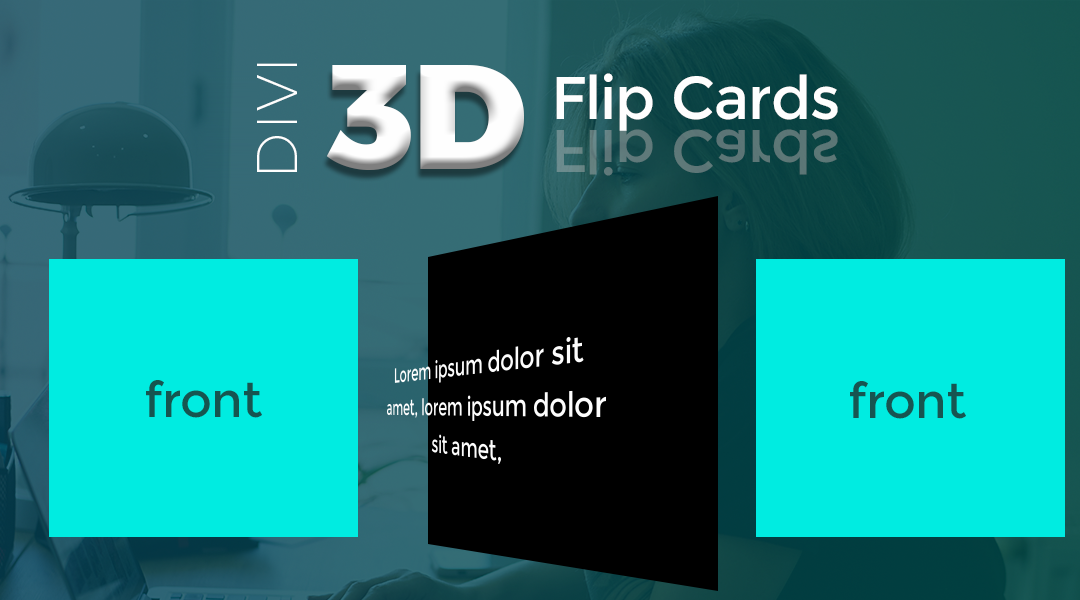
Create a popular 3D Flip Card effect without any plugins.
I just created a tutorial on how to to use a little custom CSS to create Divi Flip Cards out of ordinary Divi Text Modules which you can see here.
I wanted to create a solution that allowed me to use as few module settings as possible. This way I can just create the sections on new builds, slap in the CSS, and I can then customize everything easily in one place when using this on various projects. If you prefer to do everything using the Visual Editor and within the section, row, column, and module settings, you can check out this tutorial over at Elegant Themes.
In the process of looking at different examples on Free Frontend, I came across a few interesting effects that caught my eye. In particular, a few examples had a 3D effect that made the text pop off the background in a way I had never seen before.
In this tutorial, I will show you how to use a little custom CSS to create 3D Divi Flip Cards out of ordinary Divi Text Modules.
Let’s Get Started Setting up the standard Divi Section & Classes.
Adding the sections, rows, and columns.
1. Once you have created a section, open up the section settings and in the advance tab, add this to CSS Class: mp_s_flip_cards_3d

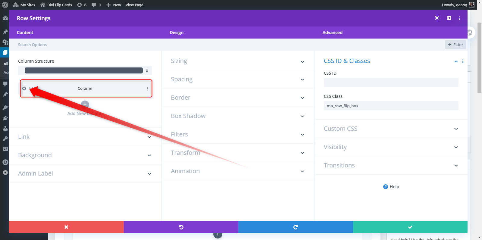
2. Create a single column row, open up the row settings, and add this class: mp_row_flip_box

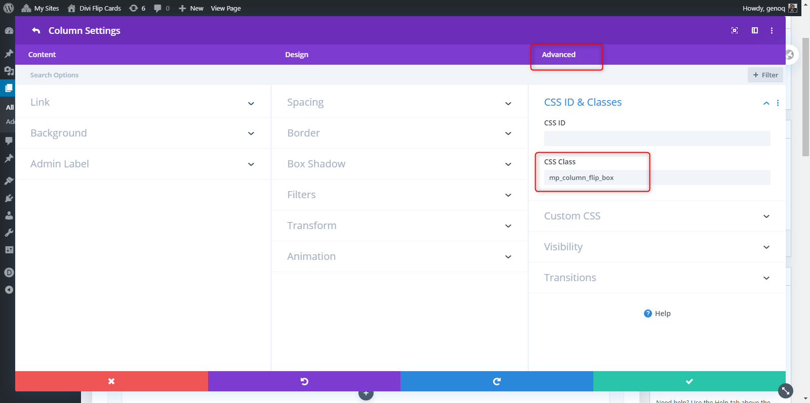
3. While still in the row settings, open up the column settings and add this class: mp_column_flip_box

Adding the modules that we will be using for the flip cards.
In this tutorial I will be using two text modules for the front and back. You can use this concept for most modules but the CSS in this tutorial utilizes a class specific to the text module (.et_pb_text_inner) in some parts.
4. Once you have added the text module, open the settings, go to the advanced tab and add this class: mp_m_fc_front_text
5. Now you can add the content that you want to show on the front of the card. In this case I am only going to have an H3 header and background image. You could also style it at this point using the module settings but for this tutorial, I will be styling it up via CSS.

6. Now add another text module in this row just beneath the first one. This will be the back of the card. Once you create, open the settings, go to advanced, and add the following class: mp_m_fc_back_text

7. As you can see from the image above, I added a little more content and a a hyperlinked text that we will later turn into a button. You can also add a url to the entire module if you do not want to have a button. I also used the same background image I used in the first text module. Now you can duplicate the rows until you have four stacked on top of each other. It should look something like this. For this tutorial, I am using only three row (for three columns)

8. Now your page probably looks something like this but do not worry, next is where the magic is going to happen 😉

9. Save your page and move on to the magic of adding a little CSS.
Adding The Custom CSS
If you are working with a child theme you can go to Appearance>Editor and open your stylesheet. If not, go to Appearance>Divi Theme Options>Custom CSS (which is located at the bottom of the first tab in Theme Options)
Add this CSS.
/*=================================*/
/*=================================*/
/* DIVI 3D FLIP CARDS BY GENO QUIROZ */
/* section */
.mp_s_flip_cards_3d {
display:flex!important;
margin-bottom: 0px!important;
max-width: 1200px;
width:100%;
left: 50%;
margin-right: -50%;
transform: translate(-50%);}
/* row */
.mp_s_flip_cards_3d .mp_row_flip_box {
background-color: transparent;
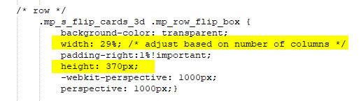
width: 29%; /* adjust based on number of columns */
padding-right:1%!important;
height: 370px;
-webkit-perspective: 1000px;
perspective: 1000px;}
/* column */
.mp_s_flip_cards_3d .mp_column_flip_box {
position: relative;
width:100%;
height: 100%;
-webkit-transition: all 1.2s cubic-bezier(.5,1,.5,1);
transition: all 1.2s cubic-bezier(.5,1.3,.5,1.3);
-webkit-transform-style: preserve-3d;
transform-style: preserve-3d;}
.mp_s_flip_cards_3d .mp_row_flip_box:hover .mp_column_flip_box {
-webkit-transform: rotateY(180deg);
transform: rotateY(180deg);}
/* text modules */
.mp_s_flip_cards_3d .mp_m_fc_front_text,
.mp_s_flip_cards_3d .mp_m_fc_back_text {
position: absolute!important;
width:100%;
height: 100%;
vertical-align: middle;
text-align: center;
border-radius: 0px;
box-shadow: 0px 12px 18px -6px rgba(0, 0, 0, .2);
color: white;
display: flex;
justify-content: center;
align-content: center;
flex: 0 0 100%;
transform-style: preserve-3d;
-webkit-transform-style: preserve-3d;
-moz-transform-style: unset;
backface-visibility: hidden;
-moz-backface-visibility: hidden;
-webkit-backface-visibility: hidden;
-o-backface-visibility: hidden;}
/* text module background image overlay */
.mp_s_flip_cards_3d .mp_m_fc_front_text {
background-blend-mode: overlay;
background-color: rgba(0,0,0,0.5);}
.mp_s_flip_cards_3d .mp_m_fc_back_text {
background-blend-mode: overlay;
background-color: rgba(0,0,0,0.8);}
/* text positioning and styling */
.mp_s_flip_cards_3d .mp_m_fc_front_text .et_pb_text_inner,
.mp_s_flip_cards_3d .mp_m_fc_back_text .et_pb_text_inner {
top: 0%!important;
left: 0%!important;
width: 80%!important;
display: flex;
justify-content: center;
align-items: center;
flex-direction: column;
-moz-transform: translateZ(50px)!important;
-webkit-transform: translateZ(50px)!important;
transform: translateZ(50px)!important;
text-shadow: 0px 0px 2px black;}
.mp_s_flip_cards_3d .mp_m_fc_front_text .et_pb_text_inner h3 {
color: #fff!important;
font-size: 30px!important;
line-height: 34px!important;
font-weight: 900!important;}
.mp_s_flip_cards_3d .mp_m_fc_back_text .et_pb_text_inner {
color: #fff!important;
font-size: 15px!important;
font-weight: 600!important;}
.mp_s_flip_cards_3d .mp_m_fc_back_text .et_pb_text_inner h3 {
color: #fff!important;
font-size: 20px!important;
font-weight: 900!important;}
.mp_s_flip_cards_3d .mp_m_fc_back_text .et_pb_text_inner a {
color: #fff;
padding: 5px 15px;
background: #00b9ff;
border-radius: 3px;}
.mp_s_flip_cards_3d .mp_m_fc_back_text {
-webkit-transform: rotateY(180deg);
transform: rotateY(180deg);}
/* mobile */
@media only screen and (max-width : 980px) {
.mp_s_flip_cards_3d {
display: block!important;
width: 80%!important;}
.mp_s_flip_cards_3d .mp_row_flip_box {
width: 100%;}}
Making Adjustments To The CSS
As with all my tutorials, my goal is not to teach you how to use Divi Settings as much as it is to teach you how to customize your website learning a little CSS along the way. So with that being said, here are a few CSS tips to help you learn a little more about CSS.
The first bit of CSS converts the section to display flex which is how we are able to turn the rows, into columns. Here you can adjust the max-width of the section otherwise it will be fullwidth. The code in the green is what centers the div on the page.

The next bit is the row css. Here is where you will set the fixed height and width of each card.
The next bit is for the columns. There is not much you want to change here other the the timing if you want to speed it up or slow it down.

Now for setting up and styling the text modules. You can change the text alignment, border radius, box shadow, and gradient overlays over the images and behind the text. I used a darker gradient on the back cards so the text pops a little more.
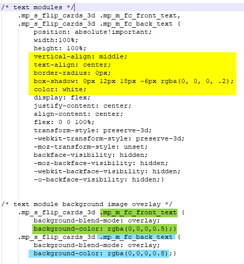
The next several lines are standard styling. Again you can control most of this in the text module builder settings or style it up here. If you use different header levels, be sure to update the htag in this section for the CSS to be applied. The highlighted piece is how we achieve that 3D effect with the content.

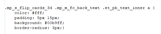
And now for that button on the back side of the card. Here you can change the text color, background color, padding, and border radius.
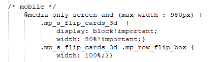
And lastly, for mobile devices.
And that’s it.
If you used this on one of your projects, please share a link below so we can see how you used it.
Have fun!
Well, that’s all for now. I hope you find this article useful.


Wow Geno, you’re on fire, yesterday Flip Cards, today 3D Flip Cards!
Very cool effect and perfect for an upcoming project.
Thank you very much for your efforts and for sharing so generously.
You are welcome!
That’s a very cool mod, thank you!
Hi Gino,
just to say thanks for this awesome tutorial! I have used this for my SEO agency page, and it looks great on all devices. The instructions where very accurate and I had no problem getting this done.
It would be great if you took a look, and keep up the awesome tutorials!
All the best
Dave
Thanks Dave. Nice work on your website. Looks great!
You are the best & your tutorial is amazing… Much thanks 🙂
Thanks for this helpful post.
thanks for this awesome tutorial
Thank you for helping us Geno!
With your help it was much easier to create new design elements!
Stay healthy and continue the good work.
Best regards
Thank you so much for taking the trouble to put this together, Geno. I just used it on a new client website, and she is so impressed with the 3D effect. I’m especially grateful that you explain the CSS so clearly so I could easily make changes to the overlay transparency.
I’ll be looking further on your site for other awesome tutorials, and I subscribed so I don’t miss new ones.
One small thing – the demo page doesn’t work as it’s linking to MontereyDev which seems to be down, but it looked so awesome from the images here I decided to give it a try anyway ?