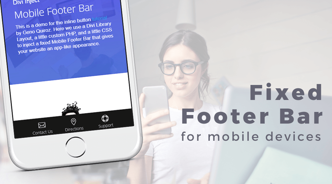
I have been injecting Divi library sections into pages for a couple of years now and one of those sections is a fixed footer bar for mobile devices. This is great if you want to have a clear call to action for mobile viewers. It also gives your website the look and feel of an actual app.
In this tutorial, I will show you how to use a Divi Library Layout, a little custom CSS, and a little PHP, to inject a fixed Mobile Footer Bar that gives your website an app-like appearance.
To do this you will need a basic child theme with a functions.php file.
UPDATE: If you are using a child theme that with an older version of Divi’s header.php and footer.php, before they added the hooks, then you will need to update those files.
Let’s Get Started Setting up the standard Divi Section.
Adding the row and custom class
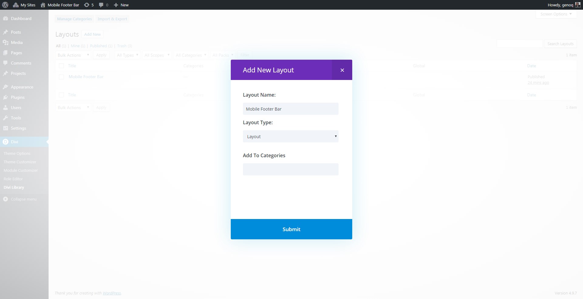
1. Go to your Divi Library and add a new layout.

2. Give it a name and choose Layout as the the Layout Type.
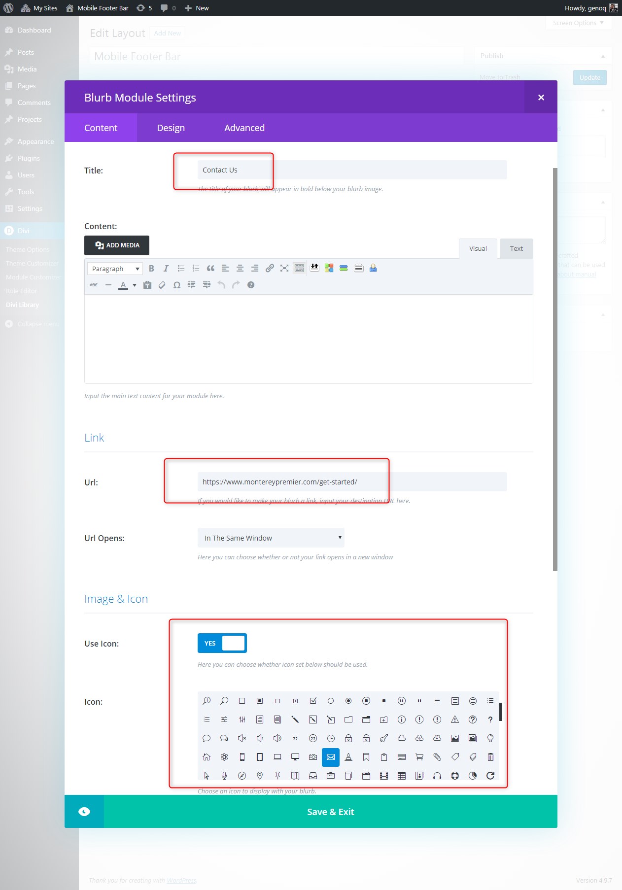
3. Insert your columns. You can choose any amount but I find that three is ideal.

4. Now using the blurb module, add your text, url and icons for all three columns.
5. To assign a custom class to the entire section, open up the section settings and in the “Advanced Tab > CSS Class” add this class: gq_m_mobile_footer_bar

Adding The PHP
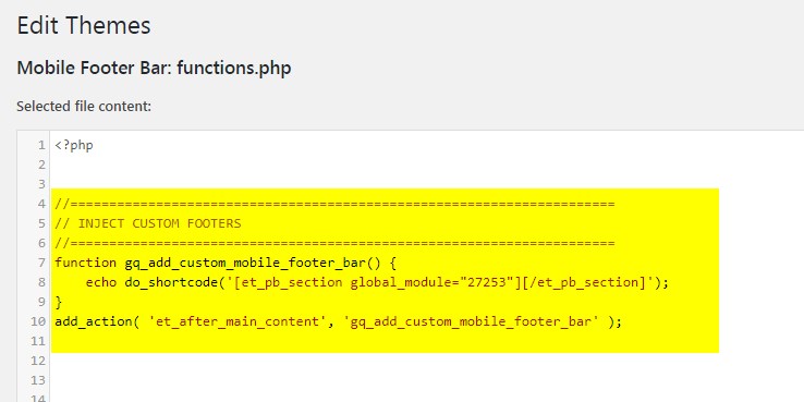
6. Go to Appearance>Editor and open your functions.php file and you are going to insert this snippet.
Unfortunately my Syntax plugin does not know how to read the shortcode without messing up this page so you will have to write the code yourself or grab the snippet from this txt file.
Inserting the Divi Library Section into the PHP snippet
Now we are going to grab the layout shortcode and insert it into the PHP snippet above.
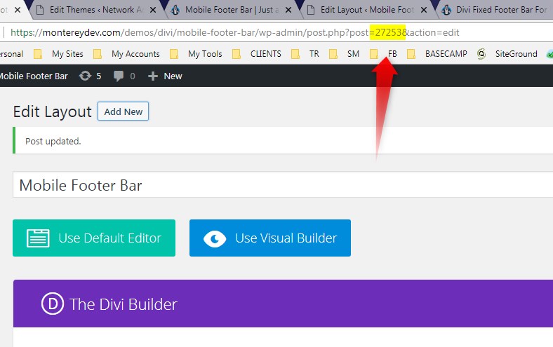
7. Go to your Divi Library and open up the layout you just created. Once you have the layout open, check out the URL and you will see a sequence of characters and numbers. You are going to want to grab the numbers as we will need that for the next steps. For example in my case, the number sequence that I want to grab is 27253. This is the URL in my example: https://montereydev.com/demos/divi/mobile-footer-bar/wp-admin/post.php?post=27253&action=edit
8. Go back to Appearance> Editor and open the functions.php where you added the snippet above and in this shortcode, replace the number with your own.

Adding The Custom CSS
Since you are working with a child theme you can go to Appearance>Editor and open your stylesheet. Otherwise go to Appearance>Divi Theme Options>Custom CSS (which is located at the bottom of the first tab in Theme Options)
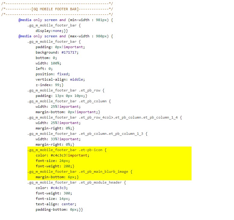
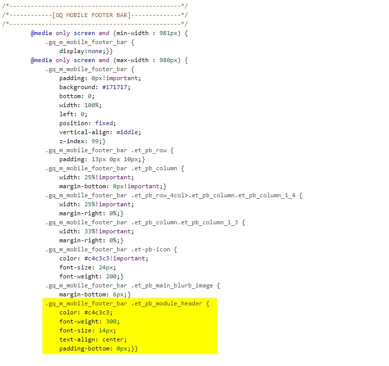
Add this CSS.
/*------------------------------------------------*/
/*------------[GQ MOBILE FOOTER BAR]--------------*/
/*------------------------------------------------*/
		@media only screen and (min-width : 981px) {
			.gq_m_mobile_footer_bar {
				display:none;}}
		@media only screen and (max-width : 980px) {
			.gq_m_mobile_footer_bar {
				padding: 0px!important;
				background: #171717;
				bottom: 0;
				width: 100%;
				left: 0;
				position: fixed;
				vertical-align: middle;
				z-index: 99;}
			.gq_m_mobile_footer_bar .et_pb_row {
				padding: 13px 0px 10px;}
			.gq_m_mobile_footer_bar .et_pb_column {
				width: 25%!important;
				margin-bottom: 0px!important;}
			.gq_m_mobile_footer_bar .et_pb_row_4col>.et_pb_column.et_pb_column_1_4 {
				width: 25%!important;
				margin-right: 0%;}
			.gq_m_mobile_footer_bar .et_pb_column.et_pb_column_1_3 {
				width: 33%!important;
				margin-right: 0%;}
			.gq_m_mobile_footer_bar .et-pb-icon {
				color: #c4c3c3!important;
				font-size: 24px;
				font-weight: 200;}
			.gq_m_mobile_footer_bar .et_pb_main_blurb_image {
				margin-bottom: 6px;}
			.gq_m_mobile_footer_bar .et_pb_module_header {
				color: #c4c3c3;
				font-weight: 300;
				font-size: 14px;
				text-align: center;
				padding-bottom: 0px;}}
Making Adjustments To The CSS
As with all my tutorials, my goal is not to teach you how to use Divi Settings as much as it is to teach you how to customize your website learning a little CSS along the way. So with that being said, here are a few CSS tips to help you learn a little more about CSS.
This snippet hides the footer on screen sizes larger than 981px.

This snippet assigns the background color, padding and position.

By default, the columns become fullwidth on mobile devices. This little snippet assures that the three column and four column rows do not default to fullwidth.

This next piece modifies the icon color, size and weight.
And finally, this last piece assigns the color, weight and size style to the header text.
And that’s it.
If you used this on one of your projects, please share a link below so we can see how you used it.
Have fun!
Well, that’s all for now. I hope you find this article useful.


Love this Geno! Nice tut 🙂
Thanks JD
Great job Geno. Great tutorial and WOW I never realised there were hooks put in by ET. I’ve been copying footer.php into my children and then adding the do_shortcode. I’m surprised I don;t see this being used more often in tutorials etc. Much better to just use the hook I think – thank you Geno.
Thanks Clark. We have been using this method for some time now and I need to go back and update all my “inject” tutorials. This prevents us from having to use template files that get outdated with updates such as the header and footer PHP files.
Hey Geno, great tutorial, I’ve loaded it up to one site and it looks superb. However I’ve tried to place it on another site using the eact same method and it’s not displaying. Followed the exact same steps but no good – any ideas where I should start looking?
Try making sure you have cleared all your cache. Always make sure you have cleared your browser cache, any plugin cache, and then your hosting cache.
Update: If you are using a child theme that with an older version of Divi’s header.php and footer.php, before they added the hooks, then you will need to update those files.
Hey Geno, Super cool feature I am implementing it on a page right now… But it seems like it is only the Icon that is click able, but not the text…. Is there a way to make the text clickable also….
Hi Martin. If you are using the blurb then the text should be clickable. It is working fine on the demo and I did not have to do anything different other than add the url to the blub module.
Love this… Thanks!
I also had no idea these hooks were available. I’ve been caught out with amended header and footer template files in a child theme with the constant Divi updates.
Excellent work.
Thanks. I just started using them and need to start doing some new tutorials with them.
great job Geno… how if i want to set different page with different fix footer bar
You can either add the second shortcode right after the first one and use css to hide and display either one on the specific page. Or just add the section to the actual page and set it to display only on mobile using the Divi Builder settings.
Nice Geno – yep you guessed it a but (sorry) So add the lib section to a standalone page all looks fine. So i know the css is doing what it should. Trying getting to show on a page just using the echo shortcode no go – chnaged the z-index 9999 just to see it it was that nope. For this little project used a standard Divi Template – Fresh WP – No Plugins – stumped which is not normally the case.
url would have had been good https://movemywebsite.co.uk/build/testing/
I’m back – don’t worry the child theme was missing the action hook. So anybody stuck with the same issue check your child theme footer for do_action (‘et_after_main_content’) should be around line 7 of the footer.php. Geno thanks again for the tip, much appreciated.
Thanks for letting me know how it was resolved. Great tip for others. Cheers, mate!
Hey Geno. First off, you are a champion man, seriously. Your website has just good info for us Divi lovers. Secondly, I implemented this last night on my site with one or two minor changes. Please feel free to have a look – http://www.thedesignerscode.co.za So basically what I changed, was I wanted a click to dial (tel: href) and a mailto, these two things cannot be done by using the URL in the blurb. So basically I added these to the text field, and used some javascript to link the blurb clickable event to the paragraph text a boom 🙂 Needed to alter the CSS ever so slightly to centre the paragraph text as I am no longer using the title field. I hope this does your hard work some justice. Thanks again man, and big ups 🙂
Sweet. Thanks for sharing the tip.
Thanks for sharing this great tutorial!
I really appreciate what you do.
Do you know a “material design” effect that could be apply on the icon when we click on it ?
It would be awesome 😀
Sure. Can you give me an example of what effect you would like to see?
Hello Geno, I am wondering what I am doing wrong. I only want 2 icons centered, but right now when I am doing the two icons it displays to the left. Any ideas?
Yes this CSS is only for 4 columns and 3 columns. You will have to add this CSS
@media only screen and (max-width : 980px) { .gq_m_mobile_footer_bar .et_pb_column.et_pb_column_1_2 { width: 50%!important; margin-right: 0%;}}Excelsior! This will take my proyects to a higher level in mobile. Thanks so much.
Can I custom the style in the divi library editor, instead of CSS file?
Yes you can. Just remove these pieces of css between the /* and */
/*------------------------------------------------*/ /*------------[GQ MOBILE FOOTER BAR]--------------*/ /*------------------------------------------------*/ @media only screen and (min-width : 981px) { .gq_m_mobile_footer_bar { display:none;}} @media only screen and (max-width : 980px) { .gq_m_mobile_footer_bar { padding: 0px!important; /*background: #171717;*/ bottom: 0; width: 100%; left: 0; position: fixed; vertical-align: middle; z-index: 99;} .gq_m_mobile_footer_bar .et_pb_row { padding: 13px 0px 10px;} .gq_m_mobile_footer_bar .et_pb_column { width: 25%!important; margin-bottom: 0px!important;} .gq_m_mobile_footer_bar .et_pb_row_4col>.et_pb_column.et_pb_column_1_4 { width: 25%!important; margin-right: 0%;} .gq_m_mobile_footer_bar .et_pb_column.et_pb_column_1_3 { width: 33%!important; margin-right: 0%;} .gq_m_mobile_footer_bar .et-pb-icon { /*color: #c4c3c3!important;*/ /*font-size: 24px;*/ /*font-weight: 200;*/} .gq_m_mobile_footer_bar .et_pb_main_blurb_image { margin-bottom: 6px;} .gq_m_mobile_footer_bar .et_pb_module_header { /*color: #c4c3c3;*/ /*font-weight: 300;*/ /*font-size: 14px;*/ /*text-align: center;*/ padding-bottom: 0px;}}This is exactly what i needed to do a whatsapp button, a Call button, and a slider menu button, sadly all works perfect if i add the section manually editing the page, but adding the inject code in functions.php of my child theme doesn’t do anything, also tried doing a ‘Section’ and make it global, instead choosing ‘Layout’ since code is :”et_pb_section global_module” but it doesnt work either, i did check the number of module and is ok. Should i add the code elsewhere?. i have wordpress 5.0.2 and Divi 3.19 (latest version of both).
Anyway this tutorial is very good, gratz to those who could apply it
Update: If you are using a child theme that with an older version of Divi’s header.php and footer.php, before they added the hooks, then you will need to update those files.
I’m having the same issue as guille – adding it via functions.php isn’t working, nothing is showing at all. Is it possible the current tutorial won’t work with the 5.02 update?
If you are using a child theme that with an older version of Divi’s header.php and footer.php, before they added the hooks, then you will need to update those files. Also be sure to do a hard refresh to clear your browser…
Windows
Firefox: CTRL F5
Chrome: Shift F5
MacOS:
Chrome: Shift Command R
Firefox: Shift Command R
Safari: Option Command E
Also be sure to clear any plugin or server cache that may be running behind the scenes
Awesome Geno – that worked – thank you!
🙂