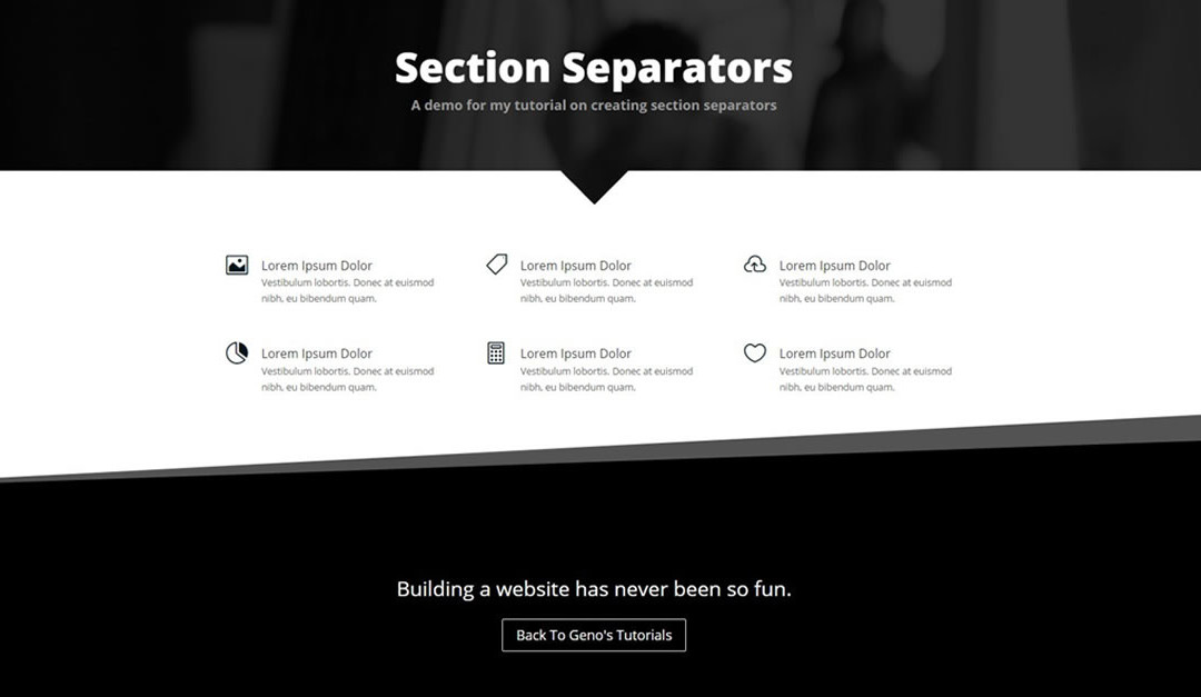
This is #1 in a series of cool sectional dividers inspired by the techniques used on tympanus.net. I even went in and implemented a few on my own website just for fun and to get in some practice http://montereypremier.com/portfolio/
There were just a few things I had to adjust that are unique to Divi and I missed it the first time around. Since so many others were having the same issue, I thought I would attempt to make a novice-friendly step by step tutorial for creating diagonal lines between sections in Divi.
Lets Get Started
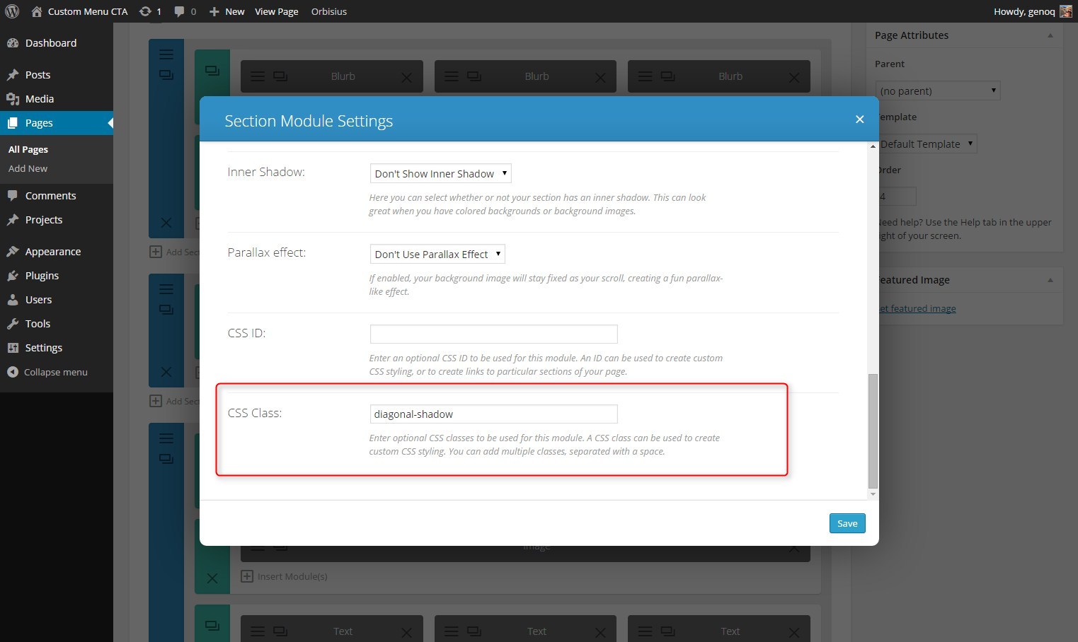
First thing you need to do is assign a unique CSS Class to the section you would like the shadowed diagonal line to be on top of.
1. Open the section settings
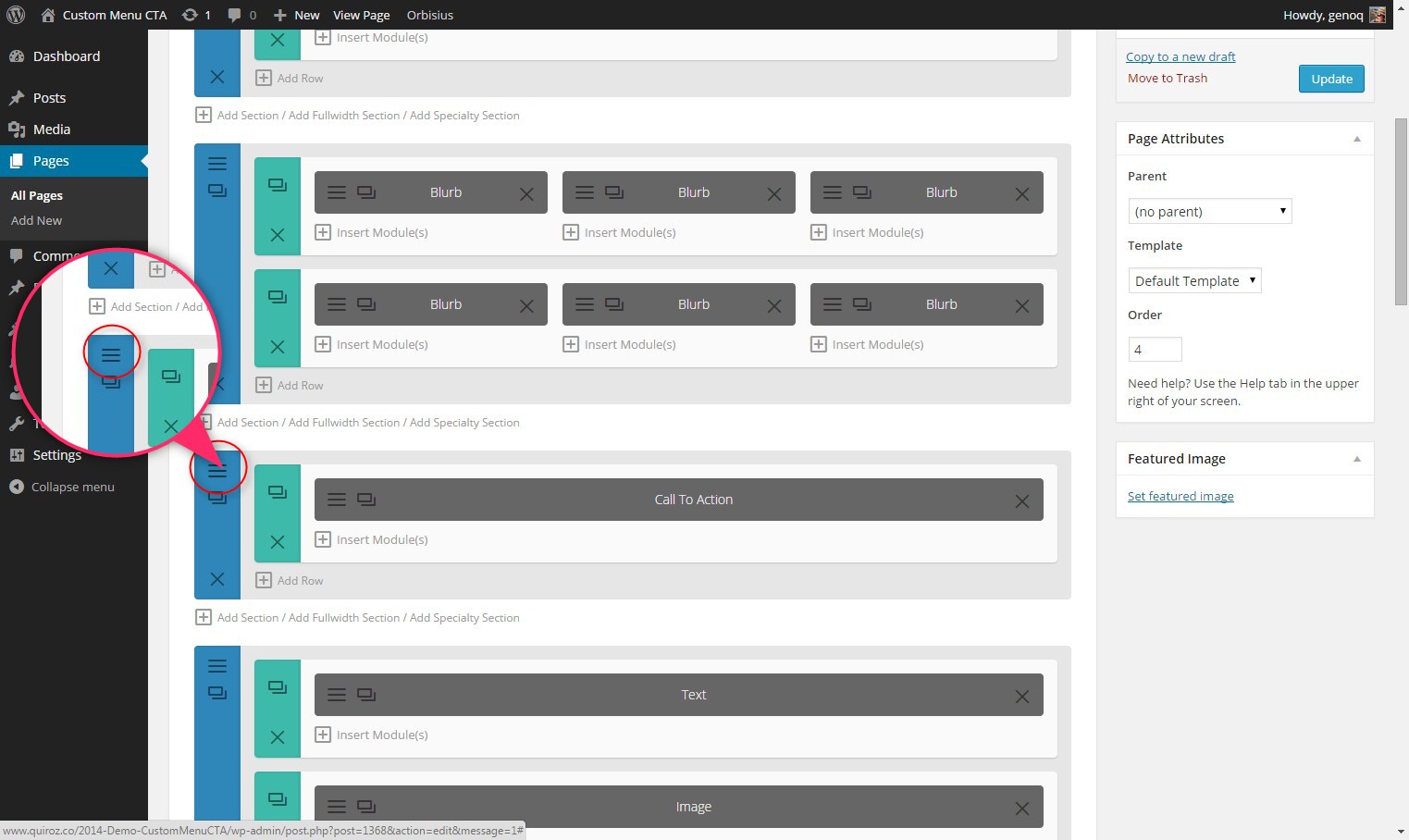
2. Give it the following CSS Class: diagonal-shadow
The Magic of CSS
Now lets start to dazzle things up a bit with some CSS.
If you are working with a child theme you can go to Appearance>Editor and open your stylesheet. If not, go to Appearance>Divi Theme Options>ePanel>Custom CSS (which is located at the bottom of the ePanel)
Add this CSS.
/*------------------------------------------------*/
/*------[Shadow Diagonal Lines - Quiroz.co]-------*/
/*------------------------------------------------*/
#et-main-area { overflow: hidden;} /* Hides all the items that float over the right margin */
.diagonal-shadow::before,
.diagonal-shadow::after {
position: absolute;
content: '';
pointer-events: none;}
.diagonal-shadow {
z-index: 1;
padding-top: 6em;
background: #2072a7;}
.diagonal-shadow::before,
.diagonal-shadow::after {
top: 0;
left: -25%;
z-index: -1;
width: 150%;
height: 75%;
background: inherit;
-webkit-transform: rotate(-2deg);
transform: rotate(-2deg);
-webkit-transform-origin: 0 0;
transform-origin: 0 0;}
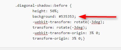
.diagonal-shadow::before {
height: 50%;
background: #535353;
-webkit-transform: rotate(-3deg);
transform: rotate(-3deg);
-webkit-transform-origin: 3% 0;
transform-origin: 3% 0;}
On some occasions this trick might pull the border up a little too close to the content in the section above it. To remedy this, just add a divider to the last row of the section above it and set its height at about 50.
To change the shadow color just change this piece right here.
I also hope to cover some of the other section separators in the near future so make sure you are signed up with the newsletter to know when the next article is posted.
I love providing these tutorials for free but for those of you who use these to your financial gain, might you consider buying this poor guy a coffee? 😉
Well that’s all for now. I hope you find this article useful.


Thanks yet again, Geno. You’re the best! Any chance you could touch on the SVG sections? I’m looking to recreate the curved line from the tympanus.net link. I haven’t been able to try it out yet as I’m currently busy packing to move.
Thanks Scott. I do intend to cover SVG as that seems to be a hot topic. But I will probably cover a few more pseudo elements using css first. But you can be sure I will cover SVG on here too 🙂
Thanks so much for the tutorial for the diagonal lines! (and the transparent triangles too) I also checked/downloaded the source code for the tympanus.net sample separators page and I too am interested in the SVG sections (especially the cloud ones) as I don’t know a lot about SVG myself. My friend would like the clouds separator there, but I’m also checking out other separator types too. 🙂
Hey Guys, I figured out a sort of hack that allows us to use SVG separators with Divi. You can read all about it here (scroll half way down):
http://diviguide.com/section-dividers/
Basically, WordPress only allows SVG’s to be embedded inline. Fortunately, Divi 2.4 allows us to easily create separate sections with no padding in between.
In order for the dividers to work properly on mobile you must ensure that you check “keep custom padding on mobile.” Hope this is helpful
Nice. Thanks for the share Mike and keep up the great work!!!
Amazing, thanks Geno:) much appreciated.
Hey Geno. I love the cartoon look and feel in a circle that you use – your branding, so to speak. I’ve been looking at doing something similar. So I popped a few $ over to your Paypal just because… Cheers!
Got it. Thanks Rick. I really appreciate it. Cheers 😀
i’ll donate more as soon as my cash flow is a little better than it’s current status 😉 Thank you Geno.
Thanks Adam. That is very generous of you. 😀
Hi Geno, looks great but for some reasons when I add this code, all the top site pictures I moved with CSS heroes are now again back to original places, you will maybe realise easier with this screen shot : http://prntscr.com/6txyzy
And without your code : http://bordeaux-creation-site-web.fr/site-web-bordeaux/
If you dont easely know why I’ll try to work on it, as I wanted to add those diagonals since a long time 🙂
I think its conflicting with some other css you are using in that top section but I am unable to determine what it is. To verify try using it in other sections on your site that do not have any customization and if you can get it to work, then you can pinpoint that the issue is related to that one section. It will help narrow the search for you if thats the case.
Ok that’s what I’ll do because I really need those diagonals 😛
Thank you Geno 😉
🙂
all i got was a horizontal white bar, not diagonal at all :/
chrishandesigns.net
It usually conflicts with the parallax. Try turning off the parallax on this page and change the background color of the section. I managed to make it work using these techniques.
Just sent you an email 🙂
you’re awesome!
how would i flip it? so it’d be going diagonally from right to left instead of left to right
Sorry it took so long to get around to it. 🙂
https://quiroz.co/a-diagonal-border-that-starts-from-the-left/
Hey Geno! I bought you a cup of Java. You have a knack for explaining things – kudos.
Question about the CSS for the diagonal separators. The first line #et-main-area { overflow: hidden;} apparently conflicts with something and interferes with your Ghost technique. I causes a white gap at the top in the menu area. I’ve checked a couple of things but haven’t had time to really dig in yet. Just wondered if you’ve experienced this?
Thanks Chuck. Yes I did have that problem as well on another project I am working on. first thing i had to do was modify the code a bit.
/* Hides all the items that float over the right margin */
	#et-main-area { overflow: hidden; margin-top:-90px}
But then the problem was that it triggers the et-fixed-menu right away. So to change that I had to go in the custom.js file and make a modification to a line of code and make the offset for the way point to -90. Check out this article to help you find the right bit of code in the custom.js file. Its a bit tricky but worth learning. http://www.wpthemefaqs.com/making-the-divi-header-shrink-further-down-the-page/
Thanks so much for this. Question: How do you get the phone on the left side. I know it is a tranparent image…but. http://montereypremier.com/
Thanks,
Lynn
Mostly margin and z-index tweaks but that one was a little tricky. Because I wanted to keep the image large I also had to float is out beyond the left margin as the screen size gets smaller. I have it on my tutorial to do list 🙂
Hi Geno, doesn;t work on my cake site…jeez!!!!
Hi Barnabus. Try following the tutorial exactly as it is without any variations. Or try it on a new page without any of your other customization being used. That way you can pinpoint what it is exactly that’s conflicting or what you might be missing.
Ok…but what could be wrong? I followed through even using the same class and the only js snippets I have are for the menu link placed in epanel integration. Well. troubleshooting mode activated. Thanks for your prompt response.Its well.
Cheers
There could be several things. Incorrect css class or css id’s, syntax errors, missing syntax, missing rules, conflicting css and more.
Deactivate all your plugins and check again. Maybe there is a conflict.
So I’m trying out your diagonal lines/section float tuts and something isn’t quite right…It was, then poof…
If you have a minute to look at it, I’d appreciate it
Second section, the red diagonal…
http://gilfordfarmersmarket.org/home/
And….It’s fixed.
That is a cool CSS trick Geno, it worked like a charm on my site – I can see you are a man who likes to provide value!
Thanks Geno! This is really cool of you to provide these tutorials!
Would it be possible to get the code for the line going the other way? That would be fantastic!
Looking for the same info! I’m sure it’s fairly basic, but I’m a novice…
Sorry it took so long to get around to it 🙂
https://quiroz.co/a-diagonal-border-that-starts-from-the-left/
Geno,
Do you you know how to “flip” this diagonal line horizontally? I’d like to stagger the diagonal effects with each section.
Also, any idea on how to make just a straight horizonal line with the color shadow? I’d like to use that on the bottom section of my page to bring it all back together…..
Thanks in advance!
Here you go https://quiroz.co/a-diagonal-border-that-starts-from-the-left/
So in other words, I want my section “diagonal dividers” to look like this….
/ —– first section would be like the example you gave above
\ —– second section would be the same but just flipped horizontally
__ —– last section would be completely horizontal but with the “accent” stripe still on top.
Hope the visual made it make more sense 🙂
Hey Geno,
thank you so much for this code. As beginner in Webdesign i appreciate that you provide this awesome tutorials. could you maybe explain how to get the diagonal line on the left?
best of luck to your crew and business
Thanks. I will have to come up with a tutorial for showing it on the left. Its a little tricky.
Hi, great tutorial – fixed a problem I’ve been having trying to work this out! I could really do with knowing how to get the diagonal to go the other way as well. Would really appreciate if you could let us know. Thx in advance – few cups of java would be heading your way!
Here you go 🙂
https://quiroz.co/a-diagonal-border-that-starts-from-the-left/
Can you please help me! I follow your tutorial but for some reason it is just not working. Nothing is happening
Did you give the module the correct CSS Class?
diagonal-shadow
I’m trying to and it’s not working. 🙁
Could you help me?
Send me your link Patricia
Hi, Is any option to do this diagonal lines after the section?
Hi there,
Firtsable, thanks a lot for your post.
can you show me how i can change the diagonal line that i can use it as header? if i move the section as first section than no diagonal line is seeing, this means the diagonal line should be on the bottom not on the top, is this tricky?
Hi Nicole. That is a bit tricky but doable. Email me an image mock up of what you are trying to achieve and I will see what I can do.
I am also after this code. Is there another tutorial somewhere?
Hi Andrew! You can check out this tutorial which uses a triangle divider with background image: https://quiroz.co/how-to-create-transparent-triangles-between-sections-in-divi/
Thank you for this brilliant tutorial again, I’d like to get this effect on my main-footer instead of a section but I just can’t get it to work as easy on my footer as on sections. I’m going to try and figure it out but if anyone has the solution already I’m all ears!
With some adjusting to your original code I managed to do it, check it out on http://www.zeroplex.nl
Hi Geno, can I do this somehow with images in the background?
I don’t want to use only colors to seperate sections, but also images.
Unfortunately it would require a different approach.
Great tutorial. I’m wondering how you get the pointed border as shown on the top row, though.
Never mind, I found it here: https://quiroz.co/how-to-create-a-triangle-between-sections-in-divi/
I was calling them pointed borders. Hehe.
Hi Geno,
I’m trying to combine this with triangles. they don’t seem to both work on a single section at the same time. Am I doing something wrong of will they not work together?
I’m trying to haver a diagonal at the top of the section and a triangle at the bottom.
Cheers.
Chris.
Hello Geno, is there a way to add the shadow to the lef-diagonal as well, same as on right ??
Yes but I dont have the code for that yet.
Nice! It worked! Thanks Geno. Only thing is doesn’t seem to work well when the section is full-width header. Ideas? See screenshot https://www.dropbox.com/s/c5ui4kqtpioljwp/Screenshot%202016-02-16%2014.29.43.png?dl=0
Hi Allen. This method does not work when you have an image as the background. It only works with solid colors.
Hi Geno, love your tutorials! Thank you! I’m actually hoping to get the code for the left-diagonal with the shadow as well.
Hi – i’m using the code for the transparent triangle but for some reason the section below shows a faint line separating it. What can i do to remove it?
I would have to see the page to see what is causing this.
currently on this homepage that i’m working on:
http://gtcleaning.forsitewd.com
Looks like this is resolved? The site looks great 🙂
thanks!
I tried this on my site, and it looks great on the small screen, but on my big screen there is a wedge/gap on the right wide between the black and grey and then a larger white wedge between the middle black rectangle (angled) and the header/section below. This is a client page so I will not be able to leave it on there long unless I fix it, but it is there for now 🙂
http://gregorypress.com/srv/htdocs/about/
Nevermind… got it to work for my big screen also with the following alterations. Thanks!
/*————————————————*/
/*——[Shadow Diagonal Lines – Quiroz.co]——-*/
/*————————————————*/
#et-main-area { overflow: hidden;} /* Hides all the items that float over the right margin */
.diagonal-shadow::before,
.diagonal-shadow::after {
position: absolute;
content: ”;
pointer-events: none;}
.diagonal-shadow {
z-index: 1;
padding-top: 6em;
background: #2072a7;}
.diagonal-shadow::before,
.diagonal-shadow::after {
top: 0;
left: -25%;
z-index: -1;
width: 150%;
/*height: 75%;*/
height: 100%;
background: inherit;
/*-webkit-transform: rotate(-2deg);
transform: rotate(-2deg);*/
-webkit-transform: rotate(-1deg);
transform: rotate(-1deg);
-webkit-transform-origin: 0 0;
transform-origin: 0 0;}
.diagonal-shadow::before {
/*height: 50%;*/
height: 75%;
background: #535353;
/*-webkit-transform: rotate(-3deg);
transform: rotate(-3deg);*/
-webkit-transform: rotate(-2deg);
transform: rotate(-2deg);
-webkit-transform-origin: 3% 0;
transform-origin: 3% 0;}
Thanks for sharing how you got it to work for you 🙂
Hey Geno, thanks for the code, but I can’t find how to change the height of the diagonal section. It is stuck at the top and I want it so it can fit all of my section. You can see my work here: http://ifc.atelierx.co/realisations
Nevermind, got it!
Simple trick really improves a site, but for some reason its showing as a jagged line but only on a page where I am using the Blog Module. Any ideas why this would be http://basketbenahavis.com/noticias/
It looks great on my device. I assumed you fixed this? If not try clearing your cache.
No not solved still seeing it across all devices, now created 3 other blog modules under noticias and they all show the same thing. Even on mobile its a jagged edge, if I disable the module its fine….
Thats strange. It looks fine on my computer. This is what I see. http://screencast.com/t/qobylqu67
Just been through devices and the only one I can get it to display on perfectly is iPad in landscape mode, soon as I turn it portrait, the jagged line comes back, strange. Its obviously something to do with the blog module but its beyond me….
Great tutorials! I have a question. Do these tricks also work on the Extra theme or just on Divi?
None of the tutorials have been tested with Extra. They might work, but they will probably need some additional modifications specific to the Extra theme. If you do try them, please let us know how it goes!
So when I added #et-main-area { overflow: hidden;} to my css, it undid the work I had done at the top of my page to move my slider up 80px and give me a ghost header. But I can see that the css is certainly necessary. Any idea how to fix this?
http://dev.graceat.work/
Hi Greg! That is a great looking site. I love the orange ring animation you are using!
I’ve tried a few different things and don’t really have a solution for you for the #et-main-area line. I’ll let you know if we come up with something useful.
Thanks for looking at it…I guess I won’t be able to use that awesome slash for now. I’ll try something else…thanks again.
I think I have tried this 100 different ways now. lol Every variation results in the same thing.
If this was my own site, at this point I would look at using the Divi option to hide navigation until scroll… or try to work out a different method to ghost the header.
Or, last resort, use an orange triangle png file to make that divider.
Thanks Jerry…I think you are on to something with the idea of hiding the navigation until scroll…I’ll play around with that.
Instead of targeting the et-main-area, target the section you want to use for the border.
Thanks Geno, that seems like a a great idea and it should work…that said, I can’t figure it out 🙁 I’ve taken the overflow out for now so that it is wide…would you mind seeing if you can figure out wha section this should be?
Thank you very much for that !! It’s realy nice !
Do you know how to create diagonals between columns ? I would love to make something like this : http://www.chalondanslarue.com/spectacles/tubograph-cie-du/
But i don’t find any tuto for that.
Thanks !
Gaelle
Thanks for the kind words! We do not currently have a tutorial for the effect you are looking for.
Hey, thanks for this great website full of great tips 🙂 !
I am having an issue using this diagonal line between my top slider (with images) and a second white basic section. In deed whenever I switch from a photo to another (on slider) the diagonal line disappears (covered by the new image) for a few seconds.
I have been trying to appl some Z-index and so on, but my css skills are quite low ! Do you have any tips I could use to solve this issue ?
Thanks again for all your ressources, much appreciated.
Hello! To fix this the z-index needs to be increased for the diagonal section. The tutorial code sets the z-index at 1, but you might want to try setting it higher, like 10.
.diagonal-shadow { z-index: 10; padding-top: 6em; background: #2072a7; }Thank you!
When i use this code, i get a horizontal scroll bar. How to get it right without a horizontal scroll bar?
Rib
Good evening Rob! There is a line of code in the tutorial that is supposed to prevent the horizontal scroll bar. It is this line…
#et-main-area { overflow: hidden;} /* Hides all the items that float over the right margin */Make sure that line is in your code. If you still need help with it, give us a link so we can take a look at the site for you.
Hi Jerry,
Thanks for the reply. I checked it, the code is all in.
Still got the horizontal scroll bar. Doesn’t matter in what section i put the class diagonal-shadow.
I can’t show the live site, because it’s behind a firewall where you can’t get in 🙂
I know that it’s hard then to look at the problem. But you might have another suggestion?
Regards,
Rob
Unfortunately, I do not have any other suggestions. Without looking at the page there is no way to tell what is going on.
This is a great tutorial – I am so in love with it. Quick question for a novice CSSer.. How do you get the diagonal to be on the bottom? right now in divi sections I can only get it to show above the section, but want to be able to show towards the bottom of the section.
Also, one more thing. I noticed on a mobile device there is a huge white block above the diagonal line. Any way around this so that it doesn’t cut off text on mobile?
I am not sure what you are referring to. Do you have a link?
It would be a slightly different approach but you can always add a diagonal section below it and change around the color scheme to achieve the top/bottom diagonal look
Hello!!!
Awesome tutorial, it works, but i have a small issue on my site, the css does a great job, the effect its just great, but the first line of code isn’t working for me so i have an horizontal scroll bar and my section looks like this:
prntscr.com/e37njx
Any idea on how i could fix it?…
Add this
#et-main-area { overflow: hidden!important;}Thanks for the reply Geno!!.. Sadly that line didn’t worked either… This is the whole code i’m using..
#et-main-area { overflow: hidden!important;}
.diagonal-shadow::before,
.diagonal-shadow::after {
position: absolute;
content: ”;
pointer-events: none;}
.diagonal-shadow {
z-index: 1;
padding-top: 6em;
background: #2072a7;}
.diagonal-shadow::before,
.diagonal-shadow::after {
top: 0;
left: -25%;
z-index: -1;
width: 150%;
height: 75%;
background: inherit;
-webkit-transform: rotate(-2deg);
transform: rotate(-2deg);
-webkit-transform-origin: 0 0;
transform-origin: 0 0;}
.diagonal-shadow::before {
height: 50%;
background: #535353;
-webkit-transform: rotate(-3deg);
transform: rotate(-3deg);
-webkit-transform-origin: 3% 0;
transform-origin: 3% 0;}
The horizontal bar is still there.. Thanks for your time 🙂
There is probably some other css somewhere conflicting with this css and overriding it. Could be from another plugin or some other custom css you have somewhere else.
I’m having trouble with this code. It works fine on desktop but on mobile the divider is gigantic. What could be going on?
This is the page in question: http://ateamymm.com/about/
You must have resolved it because it looks great on mobile for me. see screenshot https://www.screencast.com/t/0cQvcbmv
Hi Geno, that’s interesting. What phone is that? I’ve tried it on 2 iPhones so far and they give me the same gigantic divider.
Hi Mohammad. It looks like the :before element is no longer behind the :after & main element on mobile devices. When I checked my own demo or other sites that I use this on I do not have that issue. So there is something unique about the code your are using. OR there could be a plugin conflict but I doubt that would be the case. Check all the syntax to make sure it matches the demo css exactly. All it takes is one missing bracket to throw things off.
Ahh nevermind previous question – had the wrong color set. You are AMAZING thank you.
Sweet
The diagonal line on my site extends further than my screen, so i get a scroll to side bar as the diagonal extends, why is this?
The first line of css should hide anything that goes over the screen. You might have a plugin installed that is overriding it. You can try adding inportant to it to see if it overrides the other css. Like this.
#et-main-area { overflow: hidden!important;}I have the same issue with the line extending over the screen. I tried the !important and it doesn’t work either, I haven’t install any plugin yet and no code
Sorry Thanasis. There must be something else going on that would require some troubleshooting. The css is working great on all the sites I have implemented it on.
When I use the code in Chrome and Firefox it works great. However opening my site in Safari produces some large diagonal bars instead of the shadows.
http://tellosagency.com/mqabl_2/
Strange. I brought it up on Safari and I do not see those large diagonal bars you are speaking of. I also checked all my sites and they seem to be rendering fine. Have you tried clearing all your browser and server cache?
Hi Geno,
I love your job!
With the latest update of Divi (3.0.53) if I put the css class (diagonal-shadow) breaks the background colors on that page.
Can you help me solve it?
ET support people say it’s a third-party code problem and they do not give support.
Thanks!
It was my problem. I’m so sorry!
So far I have not had any issues with it breaking any of my projects but I will look into it and update the tutorial if I find an issue.
Hey guys, there is no “et-main-area” when we select a blank page in Divi so put “main-content” instead 😉
Thanks for the tip 🙂
Hi,
Is there a code equivalent to make the same diagonal line appear at the bottom of the section as well? I’m trying to recreate something a bit like this : https://www.pinterest.com/pin/280138039304382068/
Thanks a lot!
Yeahs its doable but its not a one size fits all solution. A lot of the CSS will depend on the height of the images below the section. It would be easier if you use the boxed layout but if you try to do this in the standard fullwidth layout, then there will have to be a lot of custom css for varying screen widths. Much more than in something like this tutorial.
Hello Quiroz, thanks for this awesome trick. Do you know a way to do this but on a section with a background image (and not a solid color) ?
Thanks a lot. 🙂
Unfortunately I do not
Hey Geno!
All your dividers are fantastic; any way to implement this into a boxed layout instead of a fullwidth layout? So it doesn’t span the whole browser, just the boxed portion?
Thanks!
I have to play around with that to be sure.
Tried to implement this effect. Didn’t work out like I want 🙁 Hope someone can help me with this. Visit beta.degeintrappers.nl to see what I mean. In the middle of the page I have a green section with calendar items. Above that I want the diagonal separator. Set the main div to overflow: hidden and assigned the diagonal-shadow class to the div with the green background. I then applied the other css as mentioned in the tutorial. After this I get a diagonal below the div instead at the top, the second color is gone and the green background takes a lot more space then intended. What am I doing wrong?
Looks like you got it sorted out. I would just add a little more top padding to the following:
#main > .agenda {
	padding: 6rem 0rem 0.1rem 0rem;}