One of the most common requests I get is how to reverse the angle so the it slopes downward from left to right instead of right to left. So here it is 🙂

Lets Get Started
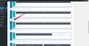
First thing you need to do is assign a unique CSS Class to the section you would like the Diagonal border to be on top of.
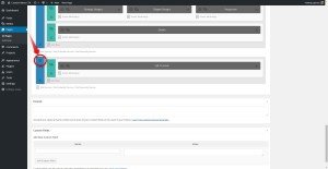
1. Open the section settings
***Do not miss this step next step***
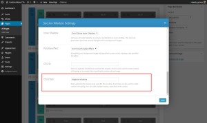
2. Scroll down to the bottom and assign it the following CSS Class: left-diagonal
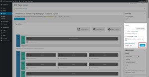
3. Select Save then update page.
The Magic of CSS
Now lets start to dazzle things up a bit with some CSS.
If you are working with a child theme you can go to Appearance>Editor and open your stylesheet. If not go to Divi>Theme Options. This will open up the ePanel. Now scroll down until you get to the Custom CSS box on the bottom of this page.
Add this CSS.
/*------------------------------------------------*/
/*----[Left Diagonal Lines - By Geno Quiroz]------*/
/*-----------------[Quiroz.Co]--------------------*/
/*------------------------------------------------*/

#et-main-area { overflow: hidden;} /* Hides all the items that float over the right margin */

.left-diagonal {
z-index: 1;
padding-top: 0px;}

.left-diagonal::after {
position: absolute;
content: '';
pointer-events: none;
top: -150px;
left: -25%;
z-index: -1;
width: 150%;
height: 50%;
background: inherit;
-webkit-transform: rotate(3deg);
transform: rotate(3deg);
-webkit-transform-origin: -3% 0;
transform-origin: -3% 0;}

@media only screen and ( min-width: 1901px ) and ( max-width: 2500px ) {.left-diagonal::after {top: -150px; height: 85%;}}
@media only screen and ( min-width: 1501px ) and ( max-width: 1900px ) {.left-diagonal::after {top: -131px; height: 68%;}}
@media only screen and ( min-width: 1001px ) and ( max-width: 1500px ) {.left-diagonal::after {top: -116px;}}
@media only screen and ( max-width: 1000px ) {.left-diagonal::after {top: -90px;}}
Using The New Divi 2.5 Module Custom CSS Options
Using the Divi Module CSS Class option is an easy way for you to keep the code inside the module along with the content. This is great if you want to save this section in your Library and use it in other places or pages.
1. Open the section settings
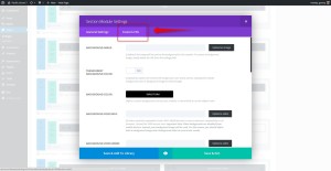
2. Select Custom CSS
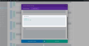
3. Insert this part of the CSS into the Main Element
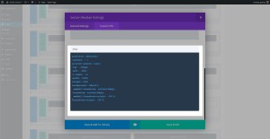
4. And while you are still in there, add this to the After Element
5. Now you will still have to add this this little bit of CSS to the ePanel or Stylesheet to prevent the element from overflowing to the right and to keep it optimized for mobile.
/* Hides all the items that float over the right margin */
   #et-main-area { overflow: hidden;}

/* optimized for mobile */
   @media only screen and ( min-width: 1901px ) and ( max-width: 2500px ) {.left-diagonal::after {top: -150px; height: 85%;}}
   @media only screen and ( min-width: 1501px ) and ( max-width: 1900px ) {.left-diagonal::after {top: -131px; height: 68%;}}
   @media only screen and ( min-width: 1001px ) and ( max-width: 1500px ) {.left-diagonal::after {top: -116px;}}
   @media only screen and ( max-width: 1000px ) {.left-diagonal::after {top: -90px;}}
And that’s it. I added the mobile queries that help make this work in larger screens and smaller screens to save you from headaches and wasted time.
Be sure to comment below and let me know how this worked for you. Would also love to see how you used it on your own projects.
Cheers!
Well that’s all for now. I hope you find this article useful.




Great tutorial Geno, The tutorial really do help Divi website to stand out.
Thanks a lot Quiroz, the best Divi resources I’ve found. Can you make a tutorial on how to fix the Reply button showing weirdly on Mobile devices in portrait mode or when the browser width is really small ? It just looks so bad. I do notice that it’s happening on your site right now. Thanks in advance !
Just for you 🙂 https://quiroz.co/fixing-the-divi-reply-button-on-mobile-devices/
This is what I needed! Thank you Geno 🙂
How do i make it in other direction ?? that starts from right ? ….
check this one out… https://quiroz.co/how-to-create-diagonal-lines-between-sections/
by the way 🙂 thanks a lot for this share 🙂 really apprisiated.
Thanks Geno! Amazing tutorial!, Your pages is one of the most complete for the Divi Theme. Gracias!
Hi Geno,
Can you publish a code for 3 & 4 steps as a text to copy it?
It’s very difficult to type a code looking for an image (step 4)
Thank you very much!
Igor
Thank you Geno. I tried the code above on a local test site, copying and pasting into the child theme stylesheet and it worked fine. But then I noticed that the width of the module overruns the right side of the page, There’s a horizontal scroll bar now at the bottom that when moved shows about 5″ of white space to the right with part of the diagonal section continuing to the right. It seems the overflow isn’t hidden. Is there something I missed?
Again, thanks so much for offering these nifty codes.
Rachelle
Try changing this….
#et-main-area { overflow: hidden;}to this…
#et-main-area { overflow: hidden!important;}Thanks for the speedy reply. The problem seemed to have fixed itself after I added some modules below the diagonal, but I put in the new code anyway. Thanks again…
Great tutorial, thanks!!! I however have one comment and one question. The comment is on step 2, you say to use the css class of left-diagonal, yet the screen shot shows “diagonal-shadow”. Now the question. I am trying to use “left-diagonal” (sans-quotes) on IE 11 and it will not work, and I cannot for the life of me figure out why. I was able to get the big-triangle one to work, so unless there is something in the CSS code that IE 11 does not like. I have even tried to add -ms-transform:rotate(3deg); /* IE 9 */, and nothing. Any help you can offer would be GREATLY appreciated!!!
Oh, and trying to add it to the top row (text box) for now until I get the bugs worked out.
So I did some playing around some more and finally got it to work. Not sure why it cannot be done this way, but found out that that particular style cannot be used on the the very first row for some reason, or at least I have not found out a way to do it as of yet. Anything other than the first row and it works fine in IE 11, chrome, etc.
Thanks for sharing Shawn.
Thank You!, Thank You!, Thank You! Did I say Thank You? Awesome code!
Hi Geno,
On http://dev.alfasun.be I’ve tried to add a image background to a left diagonal section but it distorts the image. Any idea on how to fix it?
Sorry Nick. Unfortunately this one does not work well with images in that section. I don’t have an alternative for that one yet.
Hey Geno. Thanks so much for all your tutorials. For some reason, I’m getting a white gap in my section when I do this. Any idea why?
Hi, it’s now easy way to adjust the angle a few degrees.
Have tried a little bit forward to back without success.
Input is received with thanks.
Hey, liked the angle, but is there an easy way to adjust the angle a few degrees.
Have tried a little bit forward to back without success.
Input is received with thanks.
Geno, great tutorial, thank you!
I have not tried it yet, but can this effect work with an image ?
So in the example above you would have an image instead of the color block that is being diagonally cut off?
Thank you.
You can have an image above the sectional divider so that the image is being covered. BUt this will not work if you try to use an image background beneath the sectional divider. The angled divider is simply a colored rectangle that has a slight rotation. By making it the same color as the section below you are giving the appearance of it blending but its really sitting behind the section below it.
Hey Geno,
Great tips, thank you.
However, on mobile the top of the diagonal line is slightly overlapping a CTA button I have in the module above. Looks great on desktop, but on smaller screens the slant is covering the button. Any ideas?
Yeash you can add more padding or margin below the CTA. I usually do it in the Row Settings. Adjust it for mobile settings so that it does not give you too much padding on desktop.
Splendid Tutorials, you rock!
Hi Geno,
I’ve an issue with this snippets with a big screen. at 2200px the line because right, how its possible to solve this?
You can adjust the CSS a bit to allow for bigger screens. Below is a line of CSS from the tutorial that you can adjust for bigger screens. It is not clear what exactly you are wanting to do, but you can change the height, move it up or down by adjusting the top, and you can add a width larger than 150% if you want the diagonal to reach farther.
@media only screen and ( min-width: 1901px ) and ( max-width: 2500px ) {.left-diagonal::after {top: -150px; height: 85%;}}I did exactly what you requested but I am still getting the right side extended. Any tips?
Is your site online so that we can take a look at it? That helps us see exactly what is going on.
i have a strange problem when using this code. i get the diagonal but it seems overlapping to another background. you can see it here: http://www.carlo-grassi.it
Hi Carlo! It looks like you are using a semi-transparent color, and that is what is causing the effect you are seeing. For this tutorial you should use a solid color, if you want that lighter blue from your site it looks like it is #B1D2EC.
Hi I dont see the CSS class section as per your image using Divi 3. Help?
Hello Natasja! The CSS class section is still there in Divi 3.0. Getting to it is different if you are using the visual builder, but if you exit the visual builder and edit the page it will look just like the tutorial.
Using the visual builder, you get to the CSS Class by clicking the Gear Icon on the section, then you’ll see the CSS tab.
The original diagonal-shadow works perfectly for me, but for some reason the diagonal border from the left looks jagged and awful like I drew it in Microsoft Paint. Have I done something wrong?
I’m not sure what could be causing that. If you have a link we can take a look to see if we can spot an issue.
Hey Geno, thanks for this.
How can i do it to the bottom of a section so the diagonal runs over an image in the section below it?
Thanks.
Hi Quintin! You could probably do that by adjusting the z-index for the diagonal and the section below it. We do not have a good example to show you at the moment though. If you want to provide a link to the site we can take a look and try to get you some CSS to get you started.
And can i do it on a footer?
How do i do the line coming from the top right?
Thanks in advance 🙂
Hello again! It is possible to do this in the footer, but it can get pretty complex. The easiest solution might be to save the section to the Divi Library as a Global Module and add that as the footer to the bottom of your pages. That doesn’t work in all scenarios, but it is pretty easy to do.
For the diagonal line going the opposite direction you can see this other tutorial from Geno: https://quiroz.co/how-to-create-diagonal-lines-between-sections/
How do I create a divider/ call to action section – with just this height. I want it to small underneath my slider. At the moment, it seems to be too large and covers too much of my slider image/text.
Ideally I’d like it like this – http://www.divithemeexamples.com/divi-theme-showcase/studio-28-divi-child-theme/
Where it says, Hire a professional photographer.
At the moment, it’s looking like this. http://www.adecare.com.au
Hi Jennie! You can adjust the angle of the diagonal and that will help. The tutorial uses 3deg, but you could try 1deg, 1.5deg or 2deg.
Another thing you can do is move the whole divider down a little bit by adding a little margin to the left-diagonal class.
.left-diagonal { z-index: 1; padding-top: 0px; margin-top: 10px; }Hi how would you get the effect on both the top and bottom?
You would use the same snippet on the section below it.
Thanks. one more question if I have a image in the section and add the code it breaks the photos sometimes displaying multiple images or not at all.
I think we would need to see the page to try and diagnose that issue. Do you have a link you can share?
Nice post.. I have been searching for a long time to make a inclined footer site for my website. Your article and comment helps me to make understand more easier.. thanks again…
This is great! Can anyone point me to a tutorial for making the divider change shape as the user scrolls? Like this: https://www.themepunch.com/
Hi Geno I am having trouble trying to get the diagonal border that starts from the left to work – see http://www.skyside.co.za/test/ – I used the css as per your article but have landed up with this effect. Would really like to try and make it work – any assistance would be greatly appreciated. I also noticed that if I copied the css to Appearance>Editor nothing happened but if I copied it to Divi>Theme Options – I got the effect shown on the site – why is this?
Sorry Geno I think I have sorted this out now. I was using a transparent colour background which was throwing it out! Still don’t understand tho why the css did not work when I copied under Appearance>Editor
It might be a caching issue preventing you from seeing changes in the Appearance > Editor. Either with your browser or the caching on your hosting account. I use Siteground and have to clear the cache on my cpanel everytime I make changes. Its a pain sometimes.
Hi,
I keep getting the white gap in between. I already tried #et-main-area { overflow: hidden!important;} but no result. Would appriciate it if someone could help me out! Thanks 🙁
If I want a line between the two segments, in an other color like on this picture, how can i do that? Here is the picture: http://solveigbekken.net/wp-content/uploads/2019/01/img1.png