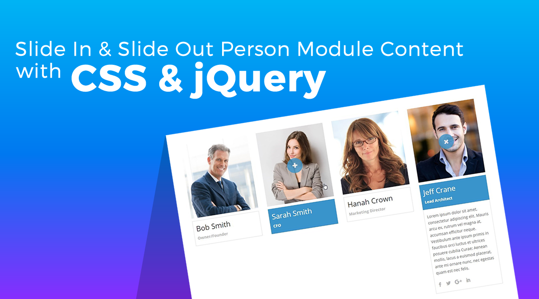
I recently had a client project that required me to modify the Person Module so that the Content and Social Media icons are hidden until the user clicked on the Person Image or Person Name. Then the user could also hide the content by clicking on the image or name a second time.
After much contemplation, I realized that the easiest solution was to use a little jQuery along with my custom CSS. And the result turned out pretty fantastic.
In this tutorial, I am going to share with you how you can slide-in / slide-out content using standard Divi modules, some custom CSS, and a little jQuery. Let’s unlock the power of Divi Modules, Custom Classes, CSS & jQuery combined.
Let’s Get Started
Creating the Modules
The first thing we are going to do is create the modules and assign some custom classes to them.
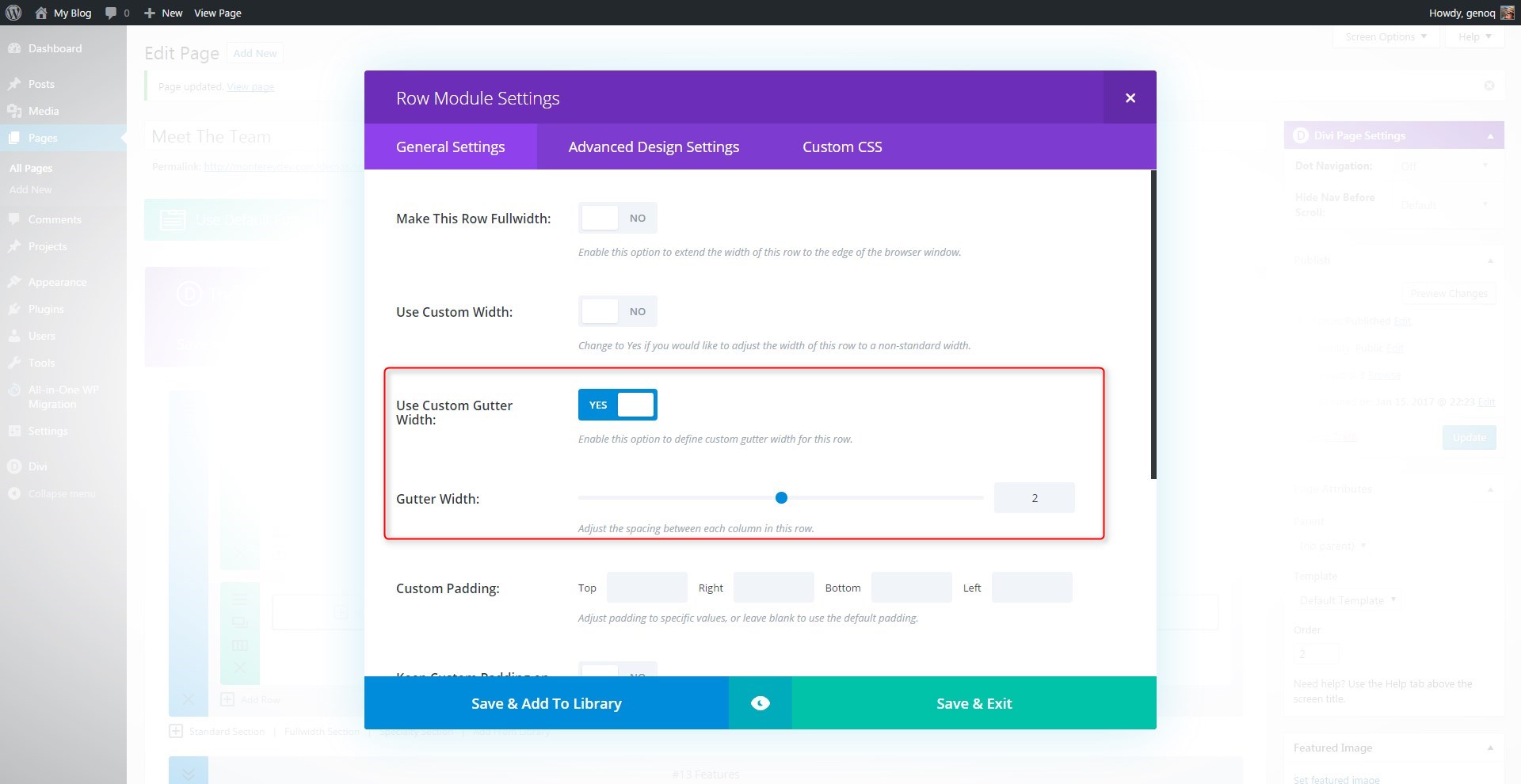
1. In the section you want to add the modules, create a new 4-column row and change the gutter width to 2
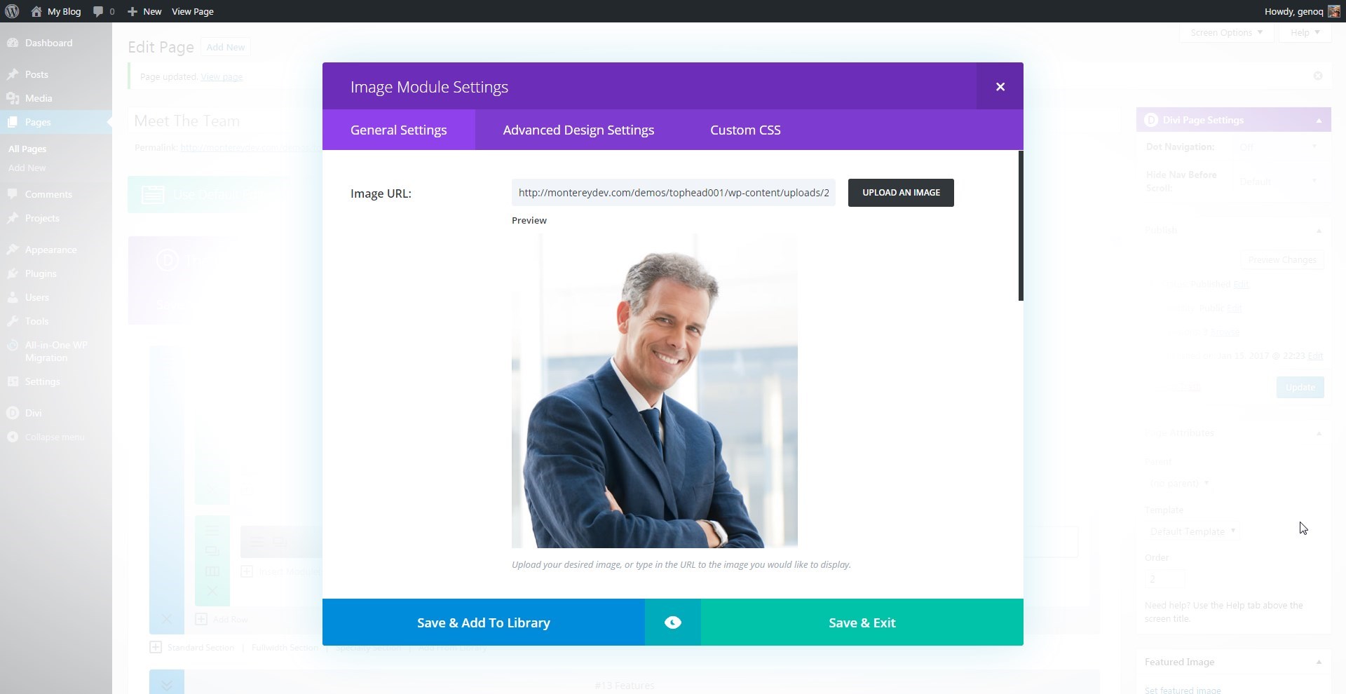
2. In the first column you will Insert an Image Module and then upload your person Image. I recommend a minimum size of 500×550 for best results on tablets when the columns switch from 4 to 2.
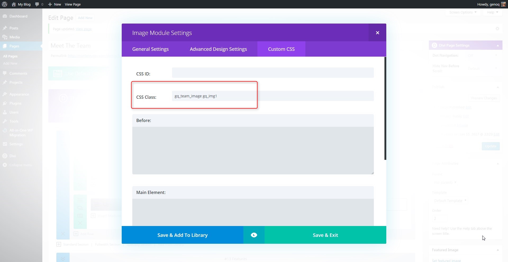
3. Before you save the module, open up the Custom CSS Tab and add two custom CSS classes: gq_team_image gq_img1 *keep a space between the two classes
4. Once you save that Module, you can add a new Text Module underneath. This Text Module will include the Name and Title. Assign the name an “H1” tag and keep the title as it is. Don’t woirry about the style for now, we will style this module using CSS a little later.
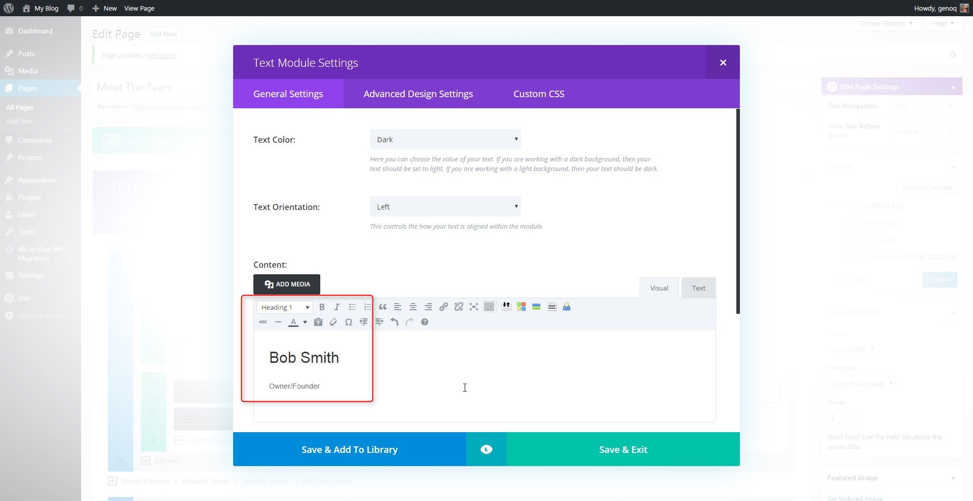
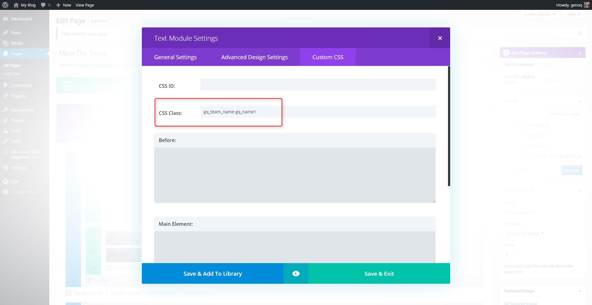
5. Before you save the module, open up the Custom CSS Tab and add two custom CSS classes: gq_team_name gq_name1 *keep a space between the two classes
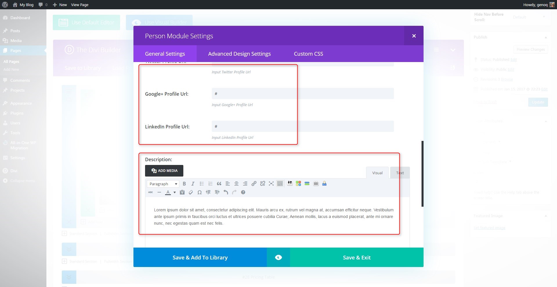
6. Now below that you can insert a Person Module. In this module you will only add Social Media urls and the text in the description field. Do not add name, title or an image to this module.
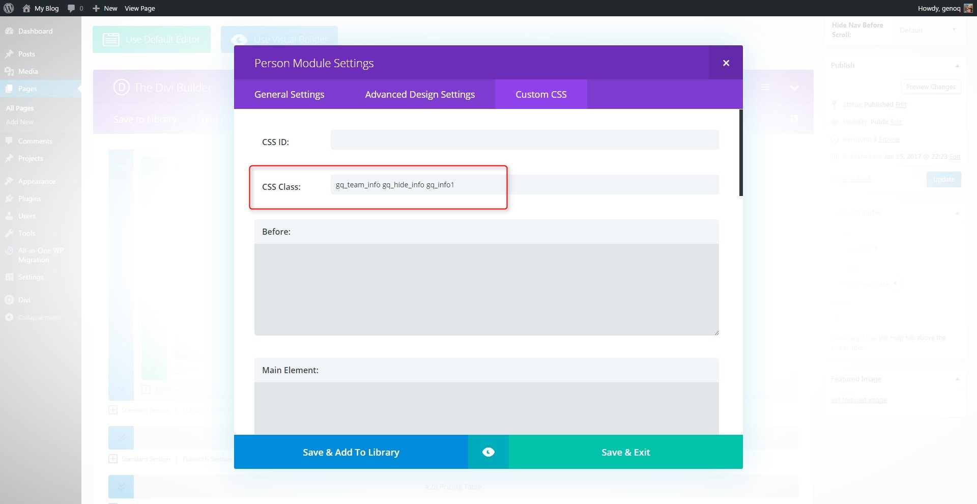
7. Before you save the module, open up the Custom CSS Tab and add THREE custom CSS classes: gq_team_info gq_hide_info gq_info1 *keep a space between the three classes
8. Now you will repeat the process for the next 3 columns. The fastest way to do this is to use the Duplicate feature for each module and then drag the duplicates over to the new column.
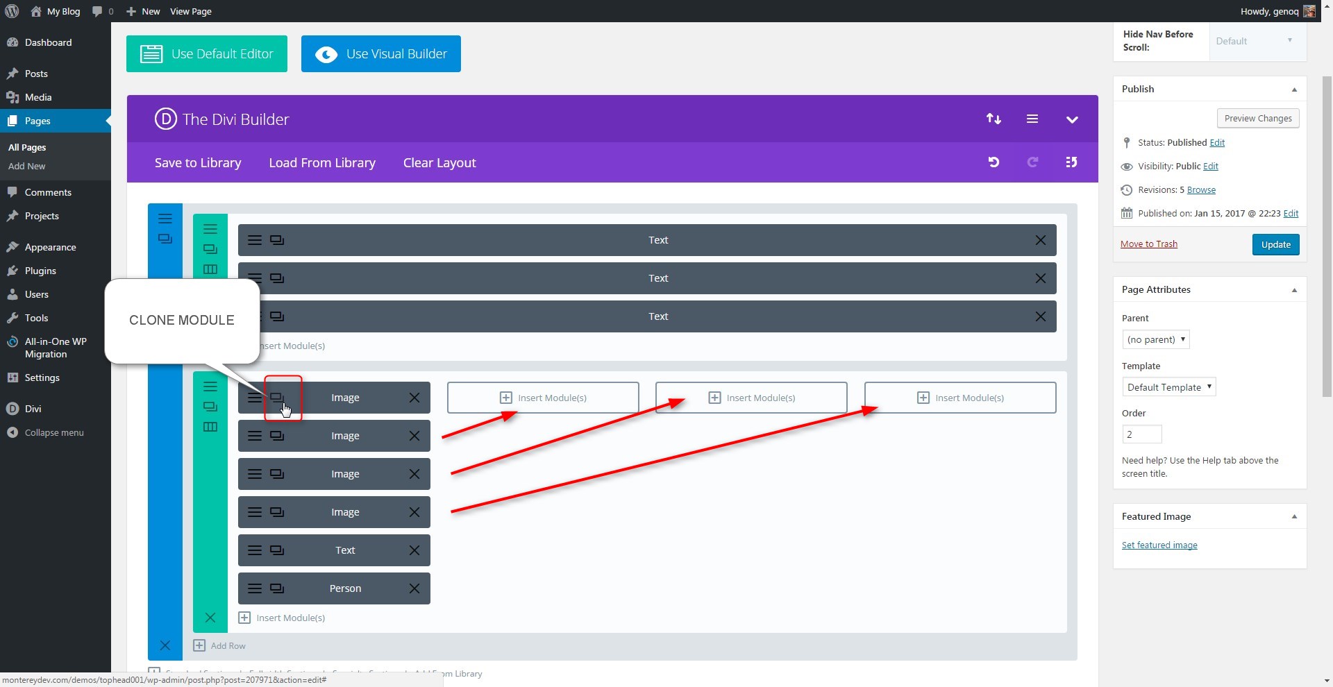
9. You will notice on the classes above, each one ends with the number one. Each column should have it’s own unique #. For example the custom css in the modules in the second column should look like this:
- Image Module: gq_team_image gq_img2
- Text Module: gq_team_name gq_name2
- Person Module: gq_team_info gq_hide_info gq_info2
Be sure to update all the modules in the 2nd, 3rd, and 4th columns
Adding The Custom CSS
To do this you will need a basic child theme as we will be adding code to the functions.php file located in the child theme.
10. This first set of CSS is going to set the basic style to the various modules. These rules include z-index adjustments, custom padding, borders colors and transitions for the slide-in and slide-out.
/*------------------------------------------------*/
/*-----------[GQ SLIDE-IN + SLIDE-OUT]------------*/
/*------------------------------------------------*/


/* general styles */

	.gq_team_image {
		z-index: 1;
   		position: relative;
		background: #fff;
   		cursor: pointer;
		padding-bottom: 10px;
   		margin-bottom: 0px!important;}
	.gq_team_name {
		z-index: 1;
   		position: relative;
		background: #fff;
   		border: 1px solid #e0e0e0;
   		padding: 15px 10px;
		cursor: pointer;
		margin-bottom: 0px!important;
		-webkit-transition: all 0.3s ease-in-out;
   		-moz-transition: all 0.3s ease-in-out;
   		transition: all 0.3s ease-in-out;}
	.gq_team_name h3 {
   		font-size: 18px;
   		line-height: 25px;
   		font-weight: 500;
   		text-transform: uppercase;
   		padding-bottom: 0px;
		-webkit-transition: all 0.3s ease-in-out;
   		-moz-transition: all 0.3s ease-in-out;
   		transition: all 0.3s ease-in-out;}
	.gq_team_name p {
   		font-weight: 700;
   		color: #b4b4b4;
		-webkit-transition: all 0.3s ease-in-out;
   		-moz-transition: all 0.3s ease-in-out;
   		transition: all 0.3s ease-in-out;}
	.gq_team_info {
   		border: 1px solid #e0e0e0;
	   	border-top: 0px;
    	padding: 15px 10px;
		margin-bottom: 0px!important;}
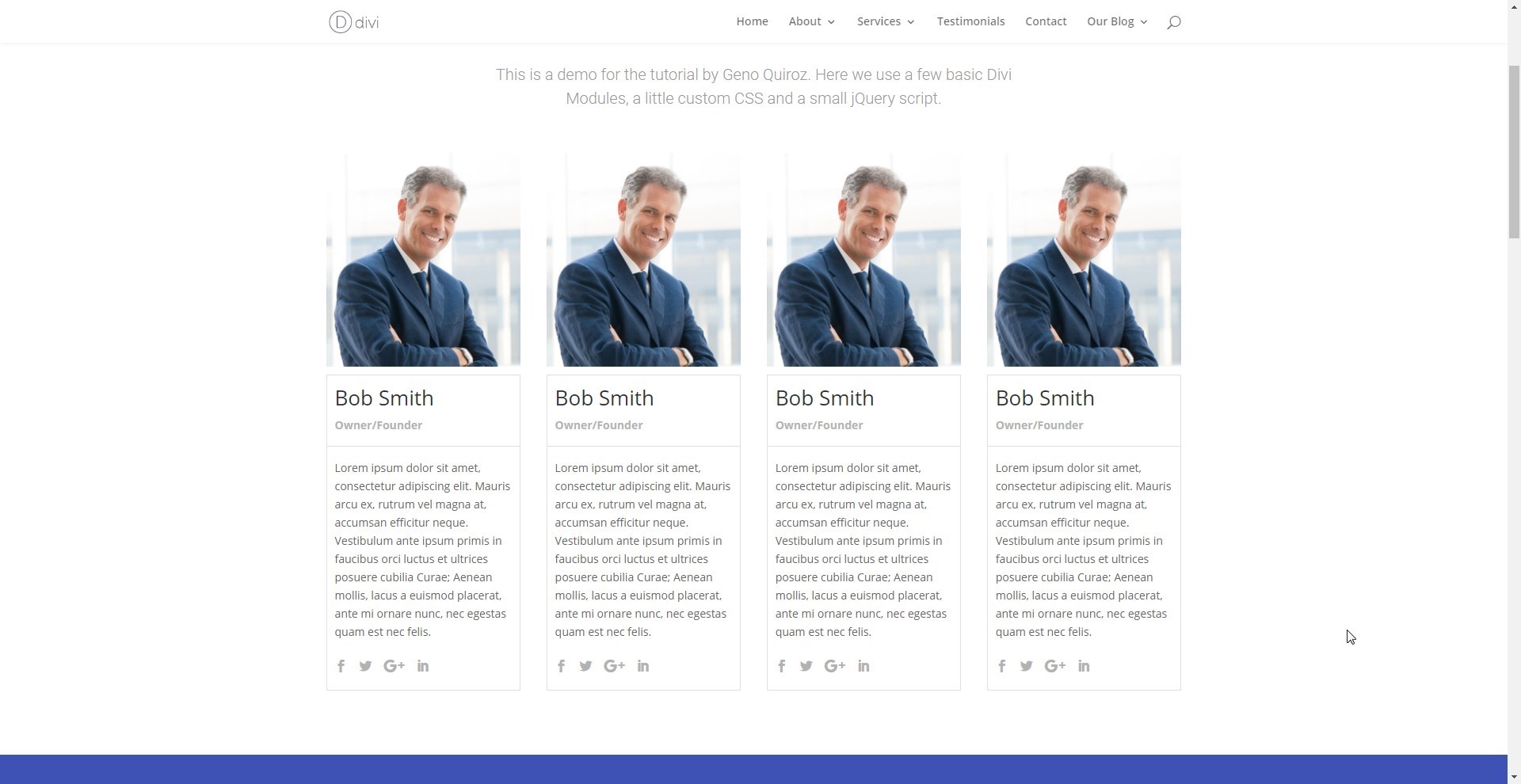
At this point your page should look something like this.
11. This next set of CSS will set the transition effects that our jQuery is going to assign and unassign. I call them the hide + unhide states.
/* hide + unhide states */

	.gq_hide_info {
   		margin-top: -100%;
   		z-index: 0;
   		position: relative;
   		opacity: 0;
		max-height: 200px;
		-webkit-transition: all 0.8s ease-in-out;
   		-moz-transition: all 0.8s ease-in-out;
   		transition: all 0.8s ease-in-out;}
	.gq_hide_close {
   		opacity: 0;
		max-height: 0px;
		-webkit-transition: all 0.8s ease-in-out;
   		-moz-transition: all 0.8s ease-in-out;
   		transition: all 0.8s ease-in-out;}
	.gq_unhide_info {
   		margin-top: 0%;
   		z-index: 0;
   		position: relative;
		opacity: 1;
		max-height: 1000px;}
	.gq_unhide_close {
   		opacity: 1;
		max-height: 1000px;}

	@media only screen and (max-width : 980px) {
		.gq_hide_info {
			margin-top: -10%;
			max-height: 0px;}
		.gq_unhide_info {
    		margin-top: 0%;
			max-height: 1000px;}}
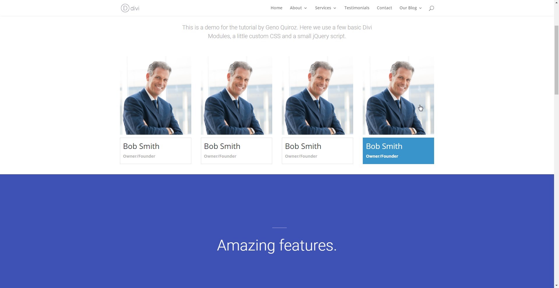
12. This piece is not necessary but adds a nice touch. By adding this set of rules, we will add hover effects to the contents within the Name Box. So if the user hovers over the image, the Name box will change to blue and the text will change to white. Same thing happens when they hover over the name box. Clicking on the image or the Name box will trigger the slide-in and slide-out so this is a good way to let the user know that something will happen if they click on these areas.
/* hover states */

	.gq_team_image:hover + .gq_team_name, .gq_team_name:hover {
    	background: #3994cb;
    	border: 1px solid #3994cb;}

	.gq_team_image:hover + .gq_team_name h1,
	.gq_team_image:hover + .gq_team_name p,
	.gq_team_name:hover > h1,
	.gq_team_name:hover  > p {
   		color: #fff!important;}

	.gq_hover_name {
    	background: #3994cb;
    	border: 1px solid #3994cb;}
	.gq_hover_name h1, .gq_hover_name p {
   		color: #fff!important;}
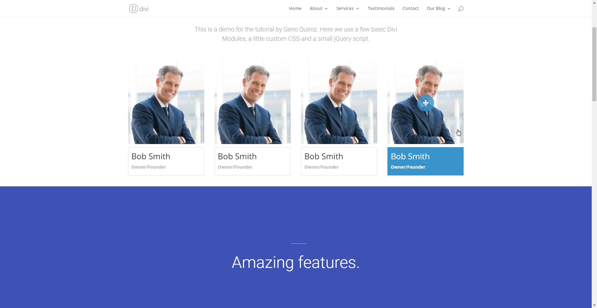
At this point your page should look something like this.
Add an Image Overlay
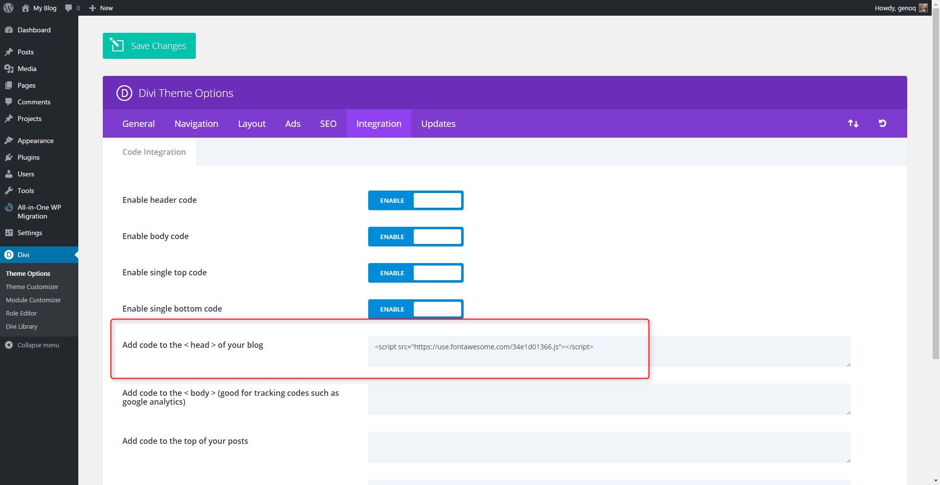
13. On this next bit off CSS we are going to apply an overlay to the image. So that when you user mouses over it, a FontAwesome icon will appear. It will be the “plus” icon letting the user know there is more. And the the slide-inb is triggered with the jQuery, that symbol will change to an “x” icon. And when clicked on again it will trigger the content to slide-out To do this you will first need to grab a line of code from Font Awesome. So go to this page and give them your email so they can send you the code you need. http://fontawesome.io/get-started/
14 Once you get your email, copy the script, go to Divi Theme Options > Integration and paste the script where it says Add code to the < head > of your blog
15. No go back to your stylesheet and add the following code to the rest of your custom CSS
/* image overlay */

	.gq_team_image:before {
   		position: absolute;
   		color: #fff;
   		font-family: "FontAwesome";
   		content: "\f067";
   		font-size: 22px;
   		background: #3994cb;
   		padding: 27px 19px;
   		border-radius: 50px;
   		opacity: 0;
    	margin-top: 45%;
		left: 50%;
   		margin-right: -50%;
   		transform: translate(-50%);
		-webkit-transition: all 0.3s ease-in-out;
   		-moz-transition: all 0.3s ease-in-out;
   		transition: all 0.3s ease-in-out;}

	.gq_team_image:hover:before {
   		opacity: .8;}

	.gq_close_icon:before {
		position: absolute;
   		color: #fff;
   		font-family: "FontAwesome";
   		content: "\f00d";
   		font-size: 22px;
   		background: #3994cb;
   		padding: 27px 19px;
   		border-radius: 50px;
   		opacity: 0.8;
    	margin-top: 45%;
		left: 50%;
   		margin-right: -50%;
   		transform: translate(-50%);}
Now your page should look something like this.
Adding the jQuery
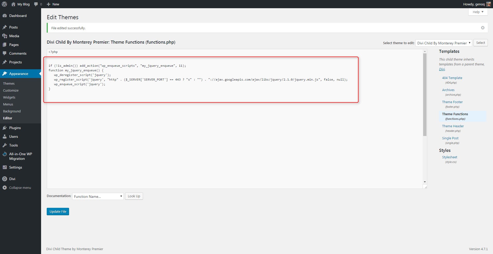
To do this you will need a basic child theme.
The first thing we will have to do is enqueue the jQuery library kit. This took me a few trial and errors because the most recent library is not compatible with Divi. Fortunately after going back to several releases I found the one that is. We will be working in the functions.php file of your child theme so please make a backup before you do this. If your site breaks after editing the functions.php, you just have to move the backup up copy of the functions.php file back in there using your ftp manager or cpanel file manager.
16. In the functions.php file located within the child theme you will add the following code after <?php
if (!is_admin()) add_action("wp_enqueue_scripts", "my_jquery_enqueue", 11);
function my_jquery_enqueue() {
wp_deregister_script('jquery');
wp_register_script('jquery', "http" . ($_SERVER['SERVER_PORT'] == 443 ? "s" : "") . "://ajax.googleapis.com/ajax/libs/jquery/2.1.0/jquery.min.js", false, null);
wp_enqueue_script('jquery');
}
Your page should look like this unless you already had other code in there.
17. Now you will go to Divi Theme Options > Integration and paste the following jQuery into the field that says Add code to the < body > (good for tracking codes such as google analytics)
<script>
// toggle staff content on click by geno quiroz
$(document).ready(function(){
	$('.gq_img1, .gq_name1').click( function() {
		$(".gq_info1").toggleClass("gq_unhide_info");
		$(".gq_name1").toggleClass("gq_hover_name");
		$(".gq_img1").toggleClass("gq_close_icon");
	});
	$('.gq_img2, .gq_name2').click( function() {
		$(".gq_info2").toggleClass("gq_unhide_info");
		$(".gq_name2").toggleClass("gq_hover_name");
		$(".gq_img2").toggleClass("gq_close_icon");
	});
	$('.gq_img3, .gq_name3').click( function() {
		$(".gq_info3").toggleClass("gq_unhide_info");
		$(".gq_name3").toggleClass("gq_hover_name");
		$(".gq_img3").toggleClass("gq_close_icon");
	});
	$('.gq_img4, .gq_name4').click( function() {
		$(".gq_info4").toggleClass("gq_unhide_info");
		$(".gq_name4").toggleClass("gq_hover_name");
		$(".gq_img4").toggleClass("gq_close_icon");
	});
});
</script>
This is for those interested in learning a little about what the jQuery is doing. We have 4 basic functions, one for each column.
Each of the 4 main functions is saying that when a user clicks on the image or the name box in that column, then do the following things.
- For the info module, apply the unhide class
- For the name module, apply the hover effect class
- For the image module, apply the hover effect with the “x” icon instead of the “+” icon
And by using .toggleClass, we are saying when the user clicks again, reapply the original classes.
This is just one example of how we can unlock the power of Divi’s custom classes, CSS and the power of Javascript.
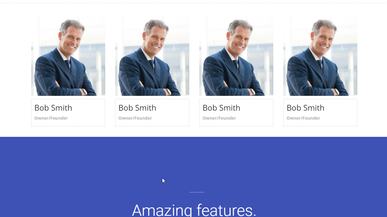
That’s it. Now your page should be working something like this.
Once you start playing around with this type of stuff you will find you can do all sorts of amazing stuff in Divi, Custom Classes, Custom CSS and jQuery.
Have fun!
Well, that’s all for now. I hope you find this article useful.


Great tip
Cool stuff Geno!
Wow Geno this is really cool! Unfortunately, I can’t get the jquery to work. When I enqueue the library in my functions.php file, none of the jquery on my site works anymore. Any idea what I’m doing wrong?
It is possible that it is conflicting with a plugin or something else that is using a different jquery library. It took me awhile to find one that was compatible with the most recent version of Divi. The most recent library is not compatible with the most recent version of Divi.
That makes sense. Thanks for the quick reply!
Excelent resource!
Thanks Elisandro 🙂
This is nice, but how do i get the links in person modul to open in a new window ?
Are you referring to the social media links? It is in the module settings.
i found a solution 🙂
I added this to a site, and for some reason it isn’t working properly. For some reason, it’s pulling the entire page down instead of just the person module. I’ve really played with it, and I can’t figure out why.
I am sorry you are having that problem. There could be a number of factors. Have you tried modifying the margins and padding in the code?
Geno, thanks for this great tutorial. i followed everything through and it worked fine. I am certain my client is going to love this.
Awesome!
This is incredible, and works great. I like it a lot ore than the toggle module. It broke my parallax background, but I just changed it to css parallax so the background would resize with the unhide. Do you know how to make it work when you have more than 4? I tried both adding more to the script (img5, name5, etc), different class names (gq_extra_img1, gq_extra_name1, etc), and even separate scripts, but it usually made hide and unhide stop working altogether.
Yeah you should be able to add more rows by adding new classes and adding the script.
The code that went into the functions file blocked all the javascript for the rest of the site. Great concept if I was able to get it to work without blcoking the rest of the site’s javascript.
Hi Tara. It might be conflicting with another plugin that is calling up a different version of jquery. I just tested it with the latest version of Divi and it still works great.
Hey Geno… This works like a treat, however my clients long bio runs past the end of the box and through the section below. Is there a CSS setting I should adjust?
I would have to see how it is rendering. Do you have a link?
Hi Geno, it’s a great script, and I love the concept. However, it seems that it doesn’t work with Safari browsers (but maybe it’s just my website, because I don’t see why not?). Plus I would need to display the 4 images in 4 rows, and have a signle row to display the hide/show description below, in a different section. Would that be possible? Any idea?
I have been going in circles with this setup. 🙂 It seems that the functions.php edits cause the site to malfunction. I have attempted to replace the jquery.com versions (2.2.4, 2.2.3, 2.2.2, 2.2.1, 2.2.0, 2.1.4, 2.1.3, 2.1.1, 2.1.0, 2.0.3, 2.0.2, 2.0.1, 2.0.0) I attempted a few earlier and later versions on a long shot. Same results with each attempt. With the custom functions.php turned off / restored, the site returns to normal. Would love to get this running. Have been at it too long to turn back! 🙂
seems I must have a similar Jq problem. The css works nice but when I add the script the image disappears. Hover text still works
I think it depends on which version of Divi you are using. This works on 3.0.67 and higher.
I’ve been using this for a while now, and love it. Sadly, the image overlay stopped working with the last version of DIVI. Any ideas why? Also, I have to give it a huge bottom margin, otherwise it sits slightly behind the next section when closed.
I will take a look and let you know what I find.
Geno, cool stuff and great tutorial. I have a few of your Themes as well:-) I was able to get it to work, except I had issues with images and header not correctly showing on Chrome and Firefox on PC and Mac. Works fine on Mobile and Tablet. I worked with ET and reverting back to jQuery 1.8.3 seem to resolve browser issues. Unfortunately, I lost all the collapse / hide capability across all browsers and devices now. Do you have any ideas to help me resolve the above.
Site is currently in development, I can share offline if needed.
Not sure. There might be other conflicts with other plugins as well. It could take some time to troubleshoot your specific case.
I have made it to step 16 with no problems. For some reason the text is not expanding. This is perfect for the site I’m working on. HELP!
Probably still need to do a hard refresh to clear your browser…
Windows
Firefox: CTRL F5
Chrome: Shift F5
MacOS:
Chrome: Shift Command R
Firefox: Shift Command R
Also be sure to clear any plugin or server cache that may be running behind the scenes
Hi Geno, thank you for the amazing tutorial.
Do you have any clue of how can I make the image become another image when hover?
Thank you
I have been meaning to do a tutorial on that.
Is it possible to achieve something similar with different module and on click it will show a full width row from the bottom I have set for that particular coloumn? Thanks
Yes it is. It just requires changing the classes used in this one to match the modules you are wanting to use.
Hi Geno
Awesome tutorial! Thank you
Is it possible to use these clide out cards on multiple rows? (I have a site with 10 team members)
Thanks!
Thanks Cathy. Yes you can have multiple rows.
Hi Geno – I love this tutorial and as always appreciate your Divi expertise. I decided to give it a whirl and got everything working fine on my own local demo but was having trouble getting the font-awesome overlay effect to show on the image hover. I checked your demo page and noticed it wasn’t showing there either. I was wondering if possibly something had changed internally in Divi since the tutorial was written or if I was just missing something really obvious…lol. I’m pretty sure I’ve inserted the CSS as shown. If you have any thoughts, I’d appreciate any ideas you have on troubleshooting it. Thanks again!
Yeah it looks like something changed. I will take a look.
Love this solution, but am wondering about the Font Awesome hover as well.
Hi, Gino. This is Excellent! Thank you. I just have an issue. When showing up thee person’s info, it overlaps the bottom section. Any clue why it happens?
http://iasdmorristown.org/nuestro-equipo/
Not sure but try modifying the heights and margins in the “hide + unhide” CSS.
Gino, sorry to bother you again. I’m still stock with my last issue I submitted in the comments. Please can you see if there’s a solution? I will really appreciate your help.
Blessings.