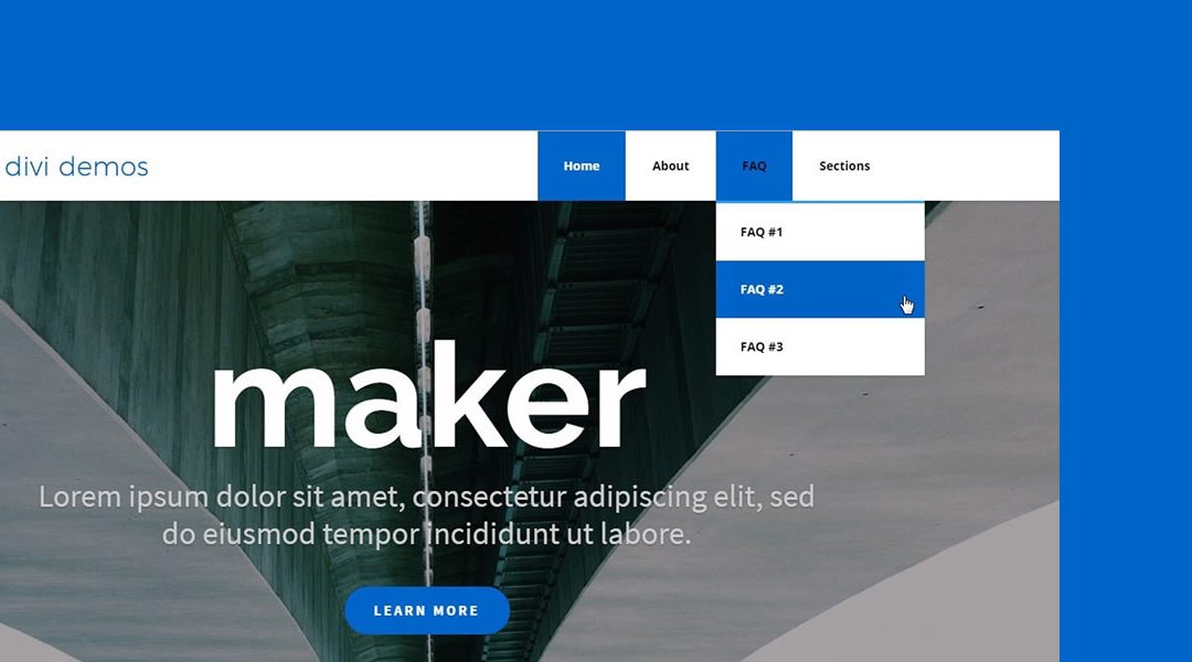
In this Divi tutorial I am going to show you how to create large square main menu buttons in your Divi main menu.
I used this technique on the main menu for one of my recent projects.
For this demo I have not made any changes to the header customizer settings other than to disable the search icon and make the header text bold. This is ideal for menus that dont have a lot on menu items. If you have too many menu items, it might help if you can change the header settings in the customizer to fullwidth.
This is what we need to do in the CSS to make this happen:
- Remove the drop down carrots and adjust the padding for items that have a drop down menu.
- Adjust the top navigation and the top menu link padding and margins.
- The CSS will adjust most of the link colors and the background colors.
- Make adjustments in the sub-menu to give it a similar effect.
- All the CSS will be applied only to devices over 981px wide. The media query is included in the CSS
The Magic of CSS
Now lets start to dazzle things up a bit with some CSS.
If you are working with a child theme you can go to Appearance>Editor and open your stylesheet. If not, go to Appearance>Divi Theme Options>ePanel>Custom CSS (which is located at the bottom of the ePanel)
/* ----------------------------------- */
/* Menu - Active Item Background Color */
/*           by Geno Quiroz            */
/* ----------------------------------- */

@media only screen and (min-width : 981px) {


/* remove carrot from menu with drop down */
	#top-menu .menu-item-has-children > a:first-child, #et-secondary-nav .menu-item-has-children > a:first-child {padding-right: 0px;}
	#top-menu .menu-item-has-children > a:first-child:after, #et-secondary-nav .menu-item-has-children > a:first-child:after {display:none;}


/* menu padding */
	#et-top-navigation {
		padding-top: 0px!important;
		font-weight:100;}
	#top-menu li {
    		margin-left: -3px;
		padding-right: 0px;}
	#top-menu li > a {
		padding: 33px 30px 33px 30px!important;}


/* remove color fade in on menu text */
	#top-menu a {
		color: #000;}

/* current menu item colors */
	#top-menu li.current-menu-item {
		background-color: #0065cb;} /*change background color here*/
	#top-menu li.current-menu-item > a {
		color:#fff!important;}

/* menu item hover colors */
	#top-menu li:hover {
		background-color: #0065cb;} /*change background color here*/
	#top-menu li > a:hover {
		color: #fff;
		opacity: 1!important;}


/* current menu ancestor background color */
	.current-menu-ancestor {
    		background-color: #0065cb;} /*change background color here*/
	.current-menu-ancestor a {
    		color: #fff!important;}


/* sub menu adjustments */
	.sub-menu {
    		padding: 0px!important;}
	#top-menu li li a {
    		padding: 19px 5px 19px 8px!important;}
	.current-menu-ancestor .sub-menu a {
    		color: #000!important;}
	.current-menu-ancestor .sub-menu a:hover {
    		color: #fff!important;}

}
Notes
I have marked the 3 places where you will need to change the buttons background color to your own. Those items are marked: /*change background color here*/
If you change font colors in the customizer, they may override this CSS. For example if you change the font colors in the Fixed Header Customizer settings, they will override this and you will have to adjust accordingly. In some cases if you are using a child theme, you may have to add additional CSS into the Divi Theme Options CSS Panel to override the customizer settings.
On the other hand I do recommend playing with the Primary Header background colors in the customizer settings to give it some additional styling options. For example try changing the background color to Black and the Font to white and watch how it just POPS!!
Have fun!
Well that’s all for now. I hope you find this article useful.


Perfect timing, just what I need for a very demanding client! Thank you as always Geno
Hi Geno,
Thanks, another great tutorial. However, it’s making our menu spread on to two rows and it looks pretty ugly, is there a way to ensure that the menu remains on one line?
Thanks,
Tim
http://imgur.com/a/8DIKU
Hi Tim! There are probably a few ways to handle this. One way is to adjust the font size and padding, stepping down through various sizes. Here is an example:
	@media only screen and (max-width : 1334px) {
		.container.clearfix.et_menu_container, #top-header .container.clearfix {
    			max-width: 100%!important;
    			width: 95%!important;}
	@media only screen and (max-width : 1270px) {
		#top-menu li a {font-size: 16px!important; padding-left:5px; } }

	@media only screen and (max-width : 1160px) {
		#top-menu li a {font-size: 14px!important; }}

	@media only screen and (max-width : 1010px) {
		#top-menu li {
			padding-right: 18px;}
		#top-menu li > a {
    			padding-left: 7px!important; }}
That is not a one-size-fits-all solution, you’ll have to adjust the font sizes, padding values, and max-widths according to your menu. Hopefully it helps get you going in the right direction though.
Hi Jerry,
Thanks for the quick response! I played around with the padding in the original code, and I think I’ve found something that works. I’ve also played around with the colours to match our swatch, but I’m trying to change a particular font colour from black to white but I can’t find a fix. It’s the sub-menu hover font colour… it changes from white to black, and then stays black (image attached).
http://imgur.com/a/YTBgY
Hmmm… That’s hard to diagnose from a picture. If you have a link to the site we can take a look at it.
Looking really great!! Is there a way to use this style for the fullwith menu module?
Hello Adrian! It is possible… I didn’t do extensive testing, but if you replace all the references to “#top-menu” with “.fullwidth-menu” it will get you started in the right direction.
Thanks, tried it and works!
Just for Info: if you’re using a one page design with anchor links in the menu, the current Link won’t work (as all menu items will show up as current)
Awesome! Glad it worked for you. Thanks for the info about one page designs, it is good to know.
This is awesome! How do I change the hover text in the sub menu so that it’s white against the blue background? The other challenge I’m having is how to change the vertical distance between each sub menu link, as there is too much space in between. I’ve tried adjusting the padding and it didn’t work. Thanks so much!
Hi Wes! The CSS in the tutorial does set the submenu text to be white on a blue background on hover. You might want to double check that the code was copied over ok.
As for the vertical space between submenu items…I don’t really have an answer for you. You can use something like this CSS to get part of the way there…
.sub-menu a { height: 15px; }But it doesn’t work well with the code from this tutorial. I’ll let you know if I get some time to work that out, but no promises. 😉
Hi!!! great post! but for one page Websites there is a problem with the primary menu! 🙁
Hi Hector! For one page site you probably need to modify the CSS to remove references to the current item.
For example:
/* current menu item colors */
    #top-menu li.current-menu-item {
        background-color: #0065cb;} /*change background color here*/
    #top-menu li.current-menu-item > a {
        color:#fff!important;}
I would start by commenting that out and see how far that gets you.
Hi Jerry,
Is it possible to do this for the top menu? I’d like our ‘login’ menu item to look like a square button by changing the background colour.
Thanks!
Hi Kelly! Yes, that can be done. The code would need to be modified a bit, but you can assign the CSS class to the menu item and then play with the CSS to get it looking how you want. If you get the class setup on the menu item, give us a link and we can help you with the changes to the code.
Hi Jerry/ Geno,
Thank you for a great post. Love it.
I have applied the relevant code but am getting some strange white space around the menu upon hover. It is white space to the top and left.
You can see it on this page:
http://mybeautifulcar.bombinatewebdesign.com/
Any suggestions would be greatly appreciated.
Patrick
Looks like you got this sorted. Looks great.
Great tut Geno, I’ve implemented this on one of my clients website but when you hover the menu items, the text colour has a slight delay to transition from orange to white, could you assist?
Sure. Can you send me a link to your site?
Can’t share it here, can i send you it any other way?
You can use the contact form.
Hi is there a way to make it taller in height as I made the logo larger because it was way too small for both desktop and mobile screen, this is what I added:
.et_fixed_nav #logo {
max-height: 90px;
padding:5px 10px;
}
#logo {
max-width: 30%;
min-width: 120px;
position: absolute;
top: 0;
}
#logo {
display: inline-block;
float: none;
margin-bottom: 0;
max-height: 54%;
transition: all 0.4s ease-in-out 0s;
vertical-align: middle;
}
thanks I love the look of the menu but the logo now overlaps the menu ever so slightly, thought maybe it is the padding but them would the drop down padding also change?
If you send me a link to your site I can take a look 🙂
Or you can try using parts of the overlapping logo tutorial to make it overlap into the header section. I use it all the time. https://quiroz.co/the-overlapping-divi-logo/
Hi!
Congratulations for the post!
It is really helpful and it is exactly what I am looking for.
Although I could not find the way to change the background and the text color of the active menu links on independent menu modules only.
I am working with a main website menu and fullwidth menus on different pages, where I would like to apply the changes.
So, I don’t want changes on the top navigation, but on the fullwidth menu modules in different pages of the websites.
Each page has internal links (modules IDs), where the fullwidth menus point at. Below is an example of one page:
Menu links: module_1, module_2, module_3
http://www.example.com/#module_1
http://www.example.com/#module_2
http://www.example.com/#module_3
I would like to change the background and the text color of the active menu links.
Can you give me a hand, please? 🙂
live page under construction:
https://www.griffdog.com.br/produtos/camas
pass: macacosmemordam
Looking forward to reading you!
Cheers,
pEdRO!
Any help? :-/
Hi Pedro. Thanks for visiting and for taking the time to comment. What you are looking for requires a different approach. The folks over at Ayanize have sought to address this issue and have provided a tutorial. Hopefully this will point you in the right direction. https://ayanize.com/snippets/how-to-highlight-current-menu-items-on-a-one-page-site-in-divi/
This is awesome!! I would like to actually leave the search on there, how would I do that? P.s. You rock!
It is possible but you just need to customize the css for the search icon to align correctly.
Geno, can you take a look at the hover state of my main nav wen on a submenu item and tell what to change to make the text white
http://wsjdesign.net/fundraising/you-can-too/
Looks like you got it figured out. Looks great.
Hi Geno, first of all thanks for the tutorial!
Question Geno, what are the additional css for setting height on the navbar on mobile?
Thank you!
I think the menu looks great on my website but can I get the cart icon also at the same height as the buttons?
I don’t like how the cart icon sits all the way at the top. Thank you.
ps. don’t mind the warning that the site is not safe, I am waiting for Comodo to activate my certificate.
Hi,
This is exactly what Ive been looking for with a few tweaks.
For some reason the logo disappears and I need the search icon to stay but it seems to have moved up. Is there any quick fixes for that?
Thank you again for this!
Actually I just got the search icon positioning working by adding some margin to the top.
#et_top_search {
display: block;
float: right;
position: relative;
width: 18px;
margin: 35px 0 0 22px;
}
Now, when I click on the search icon the menu fades and moves down is there a way to just make it disappear instead of sliding down and fading out?
Now I just need to find out where the logo went!
Hi. Great tutorial, thank you!
I managed to use the code on the fullwidth menu but for some reason I can not get the text color to change when hovering or when active. Any chance you can help me figure out what I’m missing? Here is the site in question so you can see what’s going on.
http://barrettwealthconnection.tbgl.net/who-we-are/
Thanks so much for this post. Is there a way to have no fade or the font color? I just want the font color be instant
Thank you very much for this tutorial!
I used the code you provided that helped me alot but still i’m not able to make a menu like this ( http://themes.muffingroup.com/be/splash/ )
I want those white borders between menu items.
I kindly request you check that web address i sent you and if possible provide us the CSS Code I’m pretty sure that I’m not the only one who will use it. there are many who really needs this too!
I Look forward to your response.
Sher
Are you referring to the borders in the mega menu drop downs?
Exaclty what I wanted for my website redesign! Thank you so much for the great tutorial 🙂